Blush pink has been an on-trend color for almost a decade. Patone's Roze Quartz Color of the Year back in 2016 catapulted the color to the top of color trends and it's remained there in some form or another ever since.
But how are designers using this ever-popular shade in 2024? How has it evolved from current to classic? We spoke to designers who love and use the color to find out the best ways to use these dusky, earthy pinks, no matter what your style, and why it's as timeless as it is trendy.
5 rooms that prove blush pink is timeless
Decorating with pink is incredibly versatile, especially in its more earthy forms. It can work in any room, from a kitchen to a bedroom, and pairs well with other shades too.
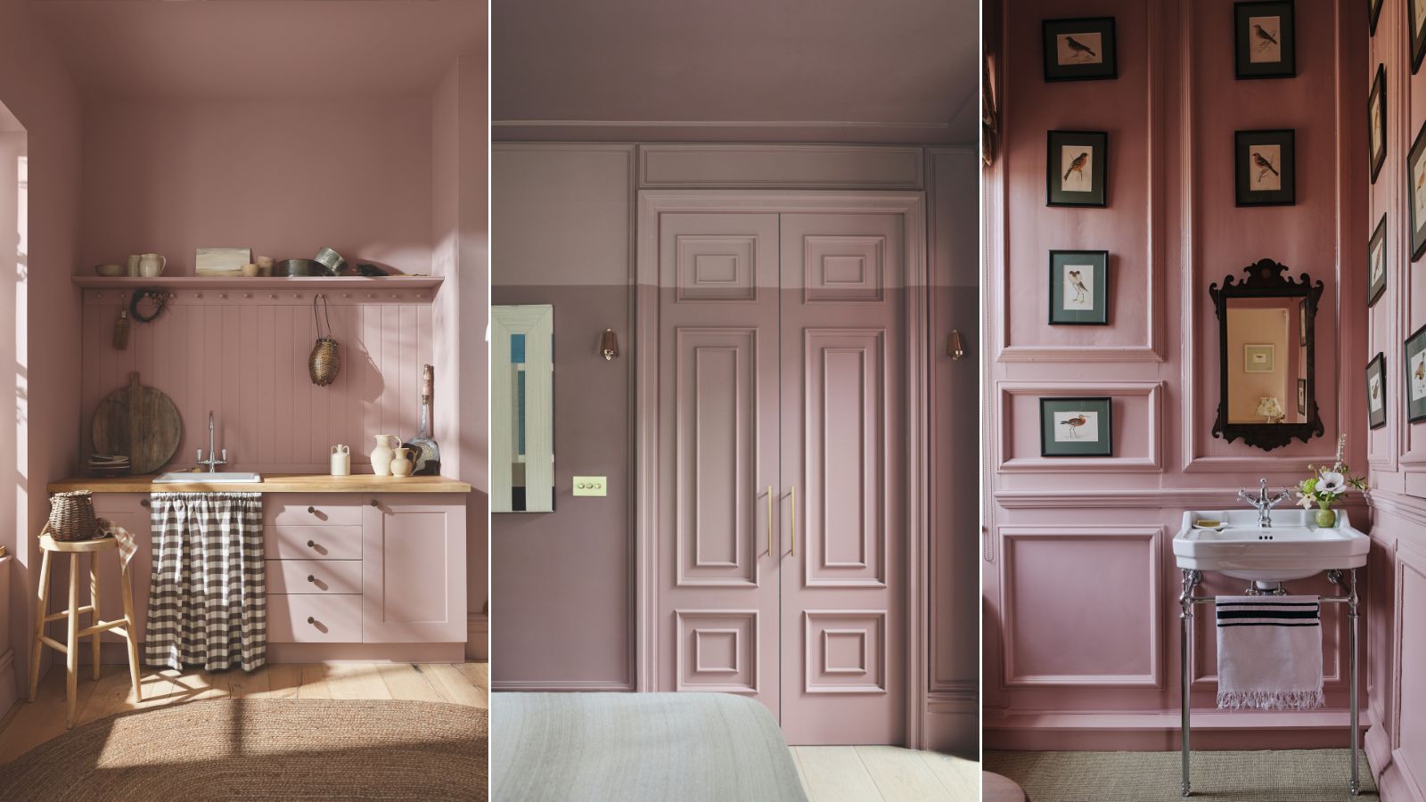
1. Make a kitchen cozier
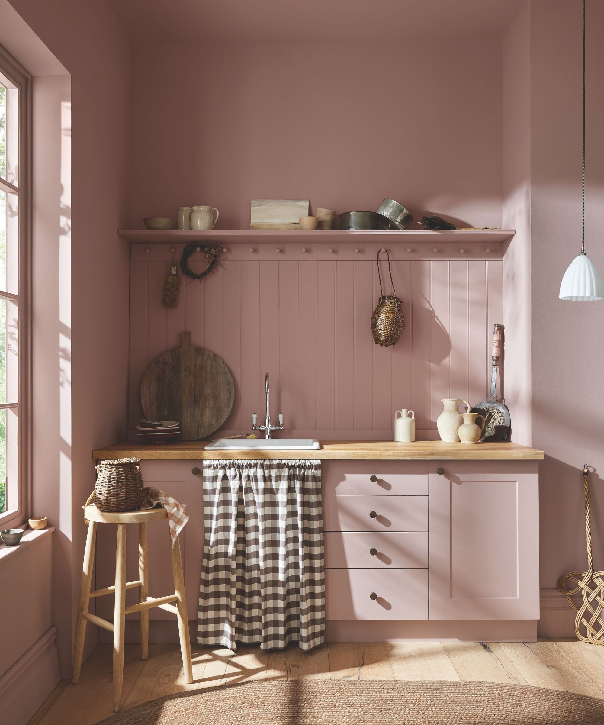
Cathryn Sanders, head of creative at Earthborn describes one of her favorite dusky pinks, 'Flora's Tale', as a 'deep pink balanced with earthy tones that give it a timeless quality and a look and feel that could be lifted straight from the pages of a fairy tale.'
She continues, 'It is an easy way to add coziness to a room and evokes feelings of comfort and nostalgia. Its floral roots create an inviting atmosphere ideal for hosting and dining in, so the kitchen might be the perfect place to start with this new shade.’
2. Go for a two tone effect
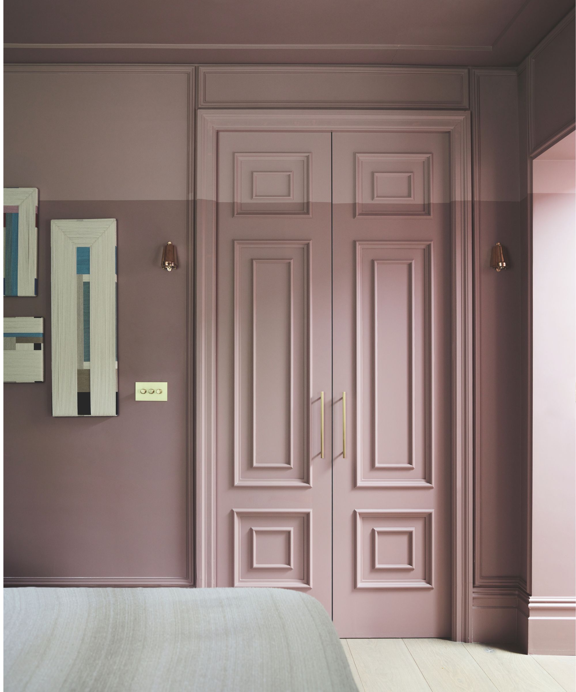
Gunter & Co paired two shades of pink to create this cossetting bedroom, adding visual interest and breaking up the height of the room. Irene Gunter, the founder and creative director tells us, 'The lower wall color is Rouge II by Paint & Paper Library, and above is Rouge II mixed with white, a bespoke color our contractor created for us.'
She continues, 'The two shades work beautifully in this lower ground-floor bedroom. We chose these for the bedroom because it is on the lower ground floor which receives less natural light and we wanted the space to feel warm, cozy, and enveloping. We thought a plaster-like finish but a warmer, deeper shade would be ideal.'
3. Create the most welcoming of entryways
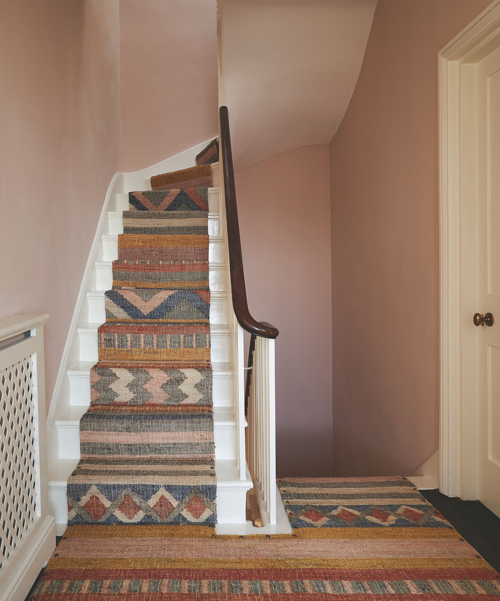
For this stairwell, Olivia Outred Studio chose to decorate with Jonquil by Edward Bulmer. Founder Olivia explains, 'The stairwell spans four floors and an entrance hall so we wanted it to be welcoming and warm, and to complement the rooms leading off from it, as well as the stair runner.'
She continues, 'We used Jonquil – a beautiful color that changes from warm brown to light plaster pink depending on the light. It sits nicely with other warm tones, such as oak floorboards or natural jute or seagrass rugs, and for walls, it sits well with creams and off-whites.'
4. Use blush pink somewhere unexpected
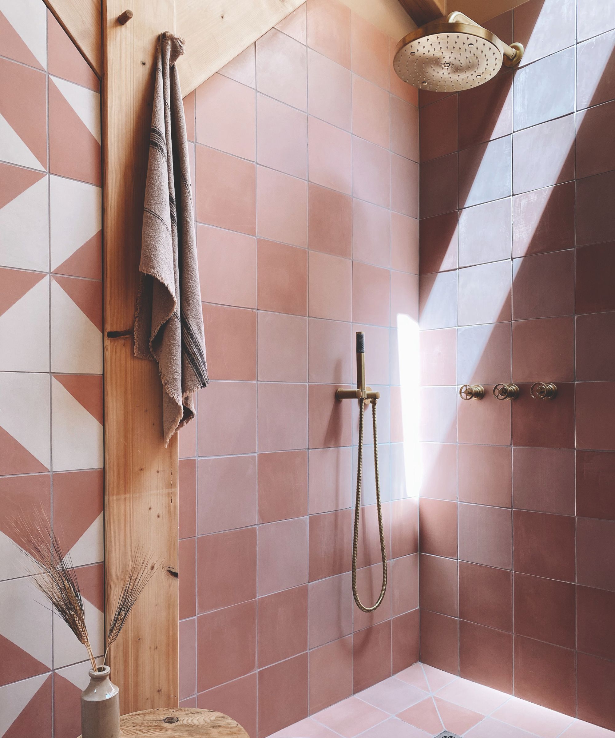
Speaking off this pink bathroom, Lee Thornley, the founder of Bert & May says, ‘Pink isn't an obvious choice for a bathroom, but it offers bags of character and charm, and by incorporating pink tiles in multiple shades you can create depth and versatility.'
He goes on, ‘The combination of the earthy and contemporary pink shades in this bathroom provides instant warmth and calmness. Chalky pink tiles pair well with off-white and natural materials, or for a more unexpected color combination, try pairing it with green which can also work wonderfully with pink’.
5. Soften a bathroom with blush pink
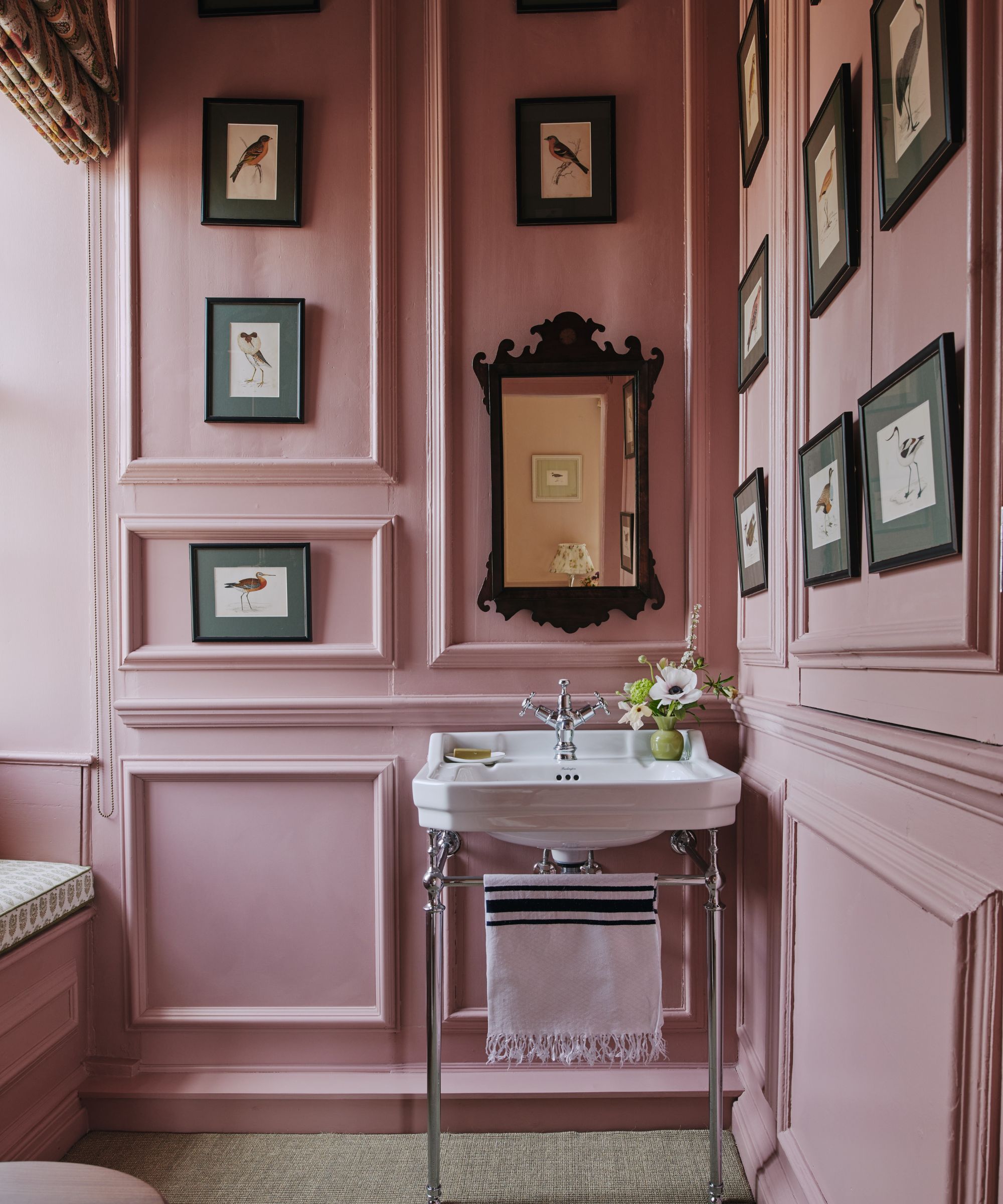
When speaking to Carlos Sanchez-Garcia of Carlos Garcia Interiors about this space, he warned, ‘Bathrooms can easily become cold with large blocks of white on sanitaryware.' For Carlos, using color on walls is the perfect way to counter this.
For this bathroom, he chose to decorate the walls in Edward Bulmer’s Nicaragua. He describes the color as 'warm without being too hot, plus it is dusky and smoky, adding coziness.'
See, blush pink is a surprisingly versatile choice that deserves to be free from its overly straightforward connotations of 'girliness' and 'trendiness'.
With the right shade of dusky pink, i.e. one with orange undertones to ground it, it is a cosseting color that evokes feelings of calmness. Its warmth means it sits harmoniously with the brown neutrals and natural textures many of us want in our homes today, yet it's much more charming than a beige.