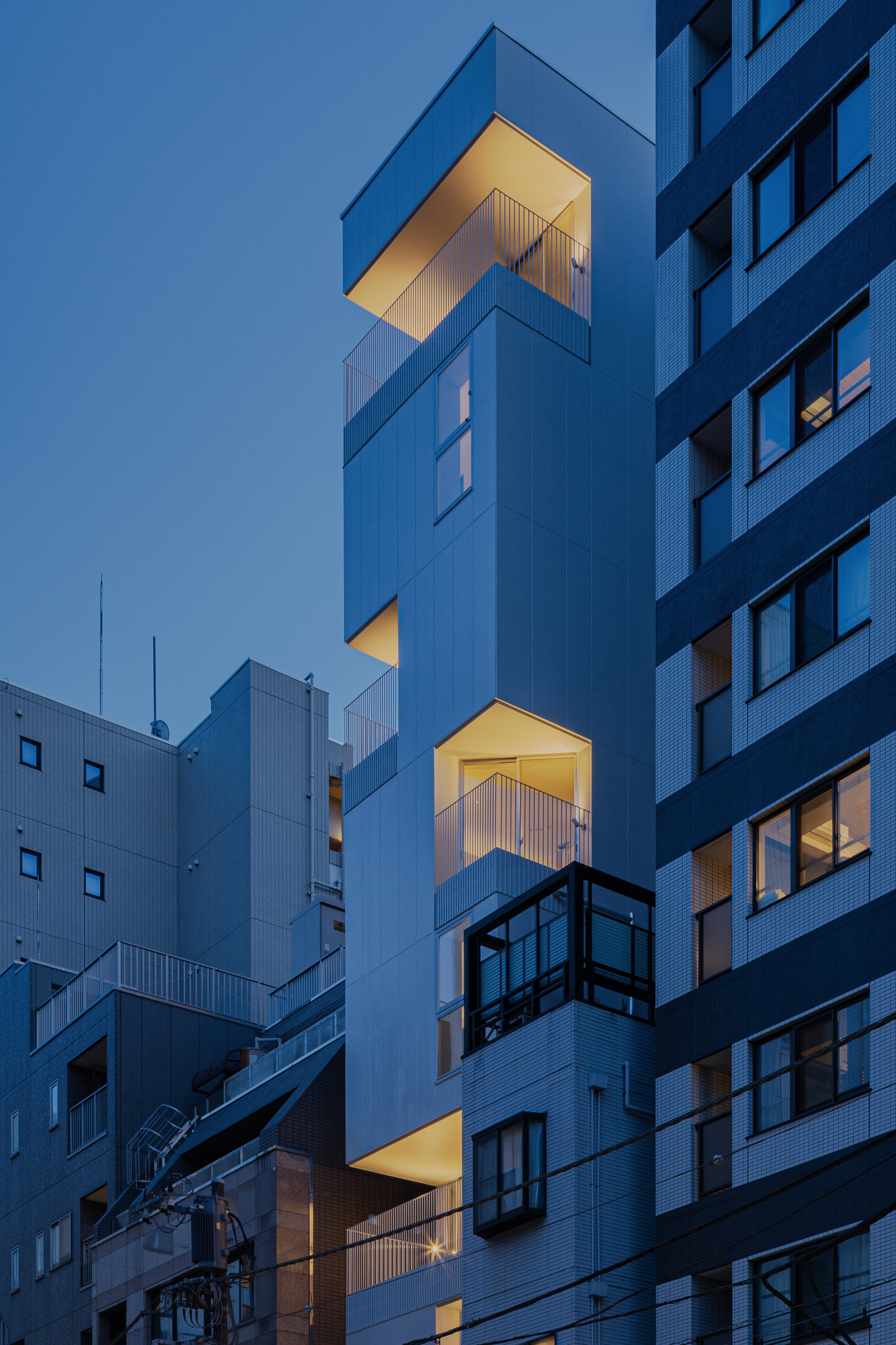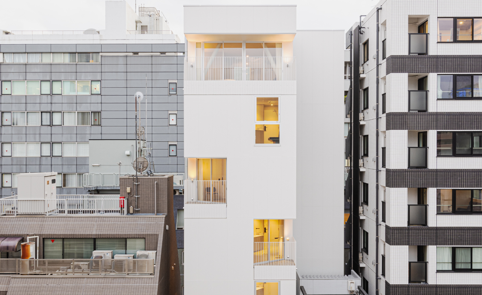
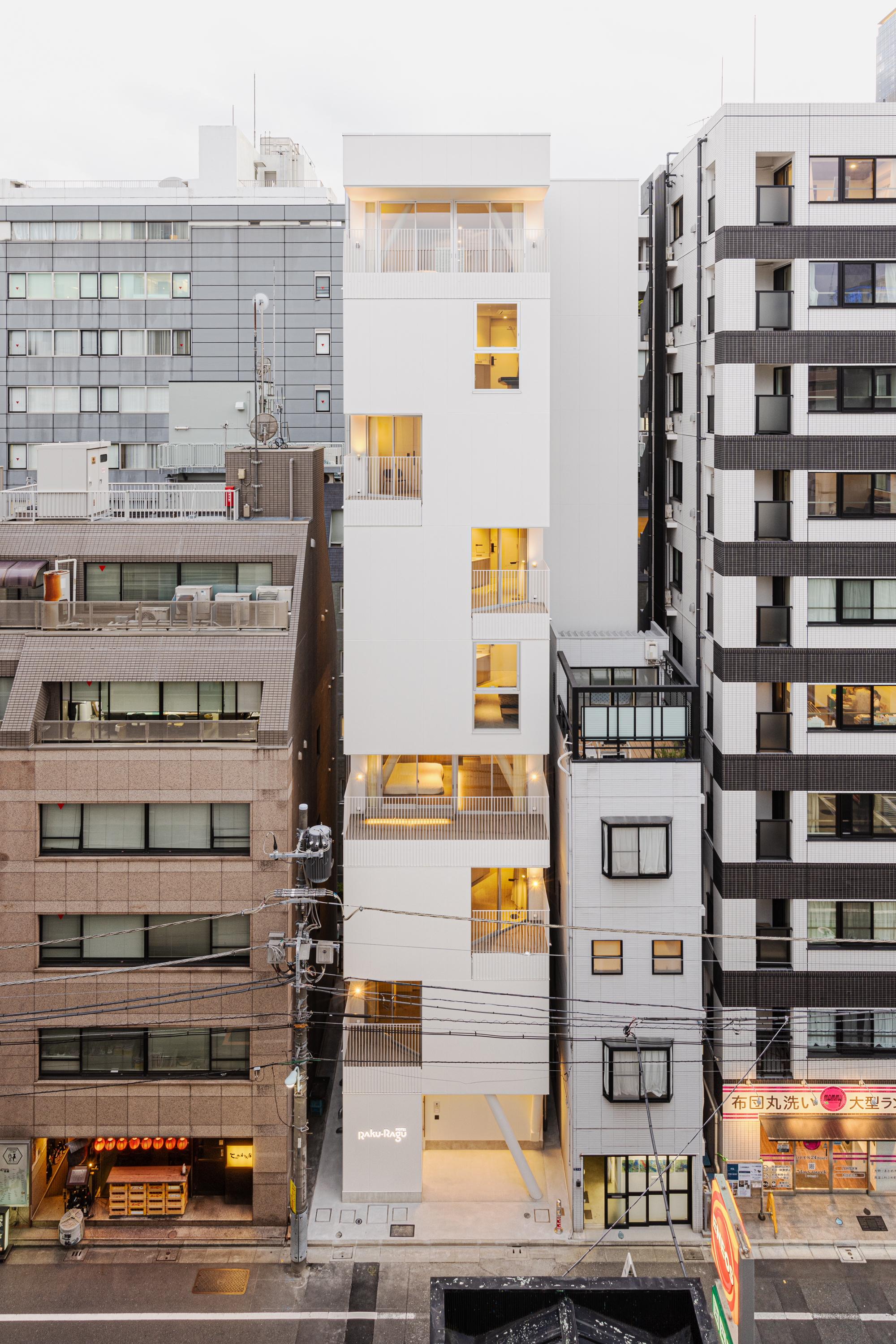
A former parking lot between two buildings, spanning just over 80 sq m, may not sound like the obvious site to build a new hotel – even in building-packed Tokyo. Yet this tight footprint was the springboard for Hotel Rakuragu, a uniquely tall and narrow contemporary structure, rising to nine storeys in height between its neighbours in the Nihonbashi district.
The skinny on slender Hotel Rakuragu
The new hotel, which opened in earlier in March, with 14 guest rooms, was brought to life by Kooo Architects, a studio based in Tokyo and Shanghai, with a design rooted in a deep sensitivity to its compact inner-city location.
The tall white structure is minimalist and abstract, with a lantern-like façade with an irregular scattering of cut-out windows and angular balconies, each positioned to maximise natural light, as well as privacy from the surrounding buildings.
‘This kind of hotel could only happen in Japan,’ Ailu Yang, of AM Limited Company, the owner of the new hotel, tells Wallpaper*. ‘We want guests to feel a sense of inner peace while staying at this hotel, almost like being in a modern temple.’
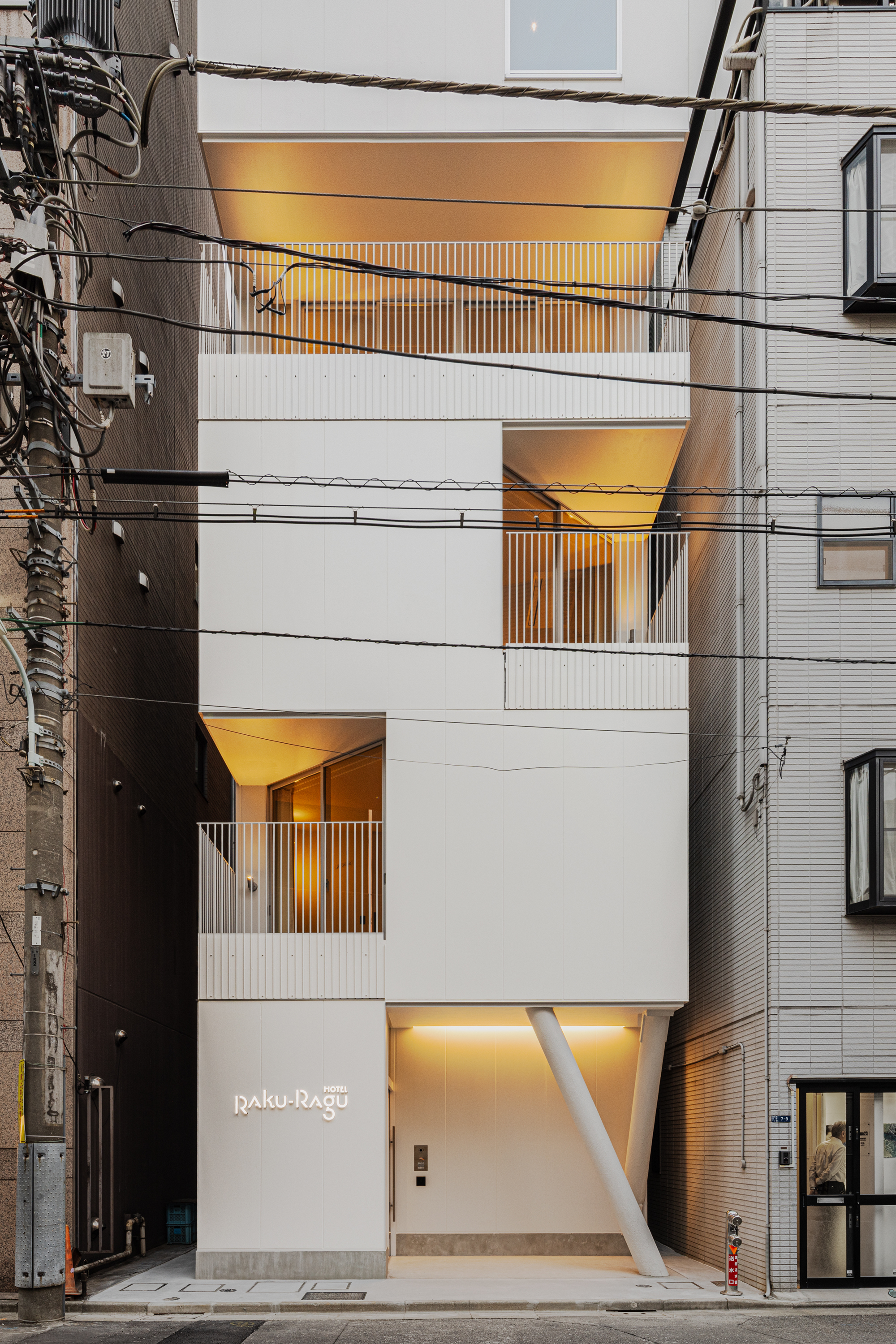
A minimal white aesthetic characterises the hotel, both inside and out. Spanning a floor plan of 60.66 sq m on a lowkey back street in Nihonbashi, two white angled pillars sit like abstract artworks at its base – a clue into its structural form, which was strengthened using both a braced frame and a rigid frame.
‘The building site itself is quite small,’ Shinya Kojima, co-founder of Kooo Architects, tells Wallpaper*. ‘But by observing the shape of the buildings on either side and the shape of the buildings opposite the site, we were comfortably able to find an outward opening direction on each floor, even in a densely built-up area.’
Ayaka Kojima, co-founder of Kooo Architects, adds: ‘The first major feature of the building is its structural form, which is designed to give the building a characteristic appearance of a hollowed-out white rectangle. There are no pillars on the balconies so as not to block the guests’ view of the outside.
‘The facade has a sense of rhythm: some balconies on each floor are hollowed out in a triangular shape on either side, while others have large balconies along the entire front side. This allows for a certain degree of freedom in the arrangement of the columns.’
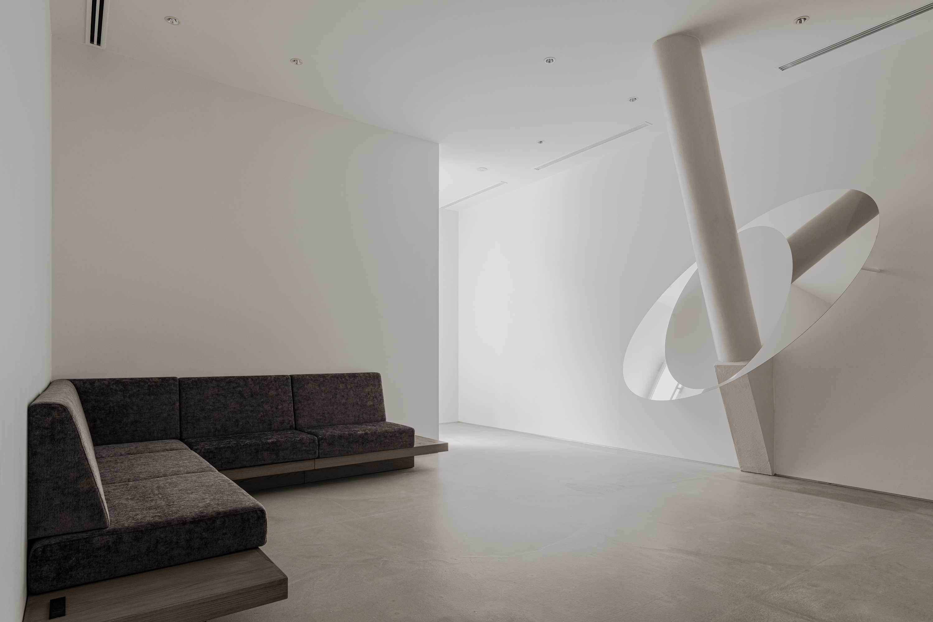
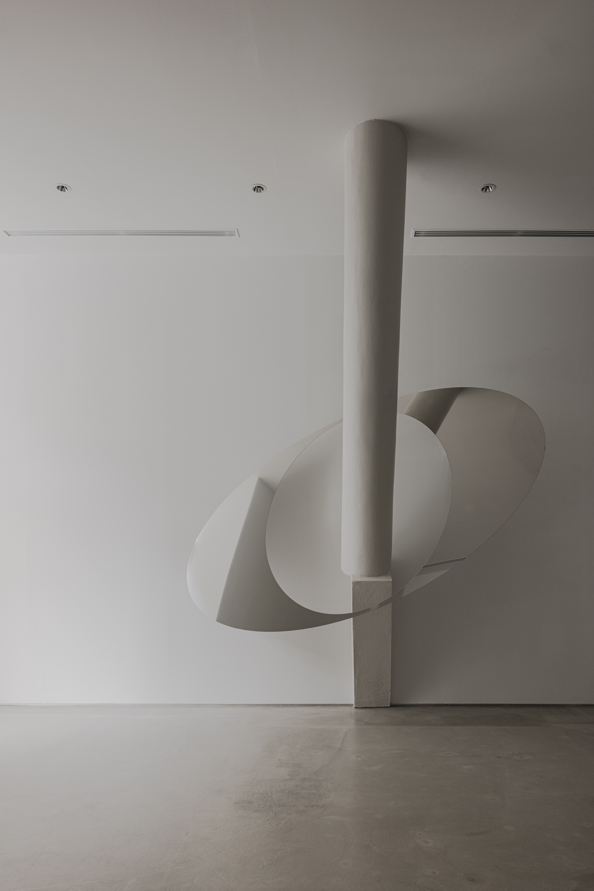
Upon entering, the simple lobby space, with its white walls, concrete floors, grey seating and white front desk, is minimal, modern and functional, with the added touch of an elliptical mirrored sculpture hovering around another white pillar – a bespoke artwork created by Tokyo design studio We+.
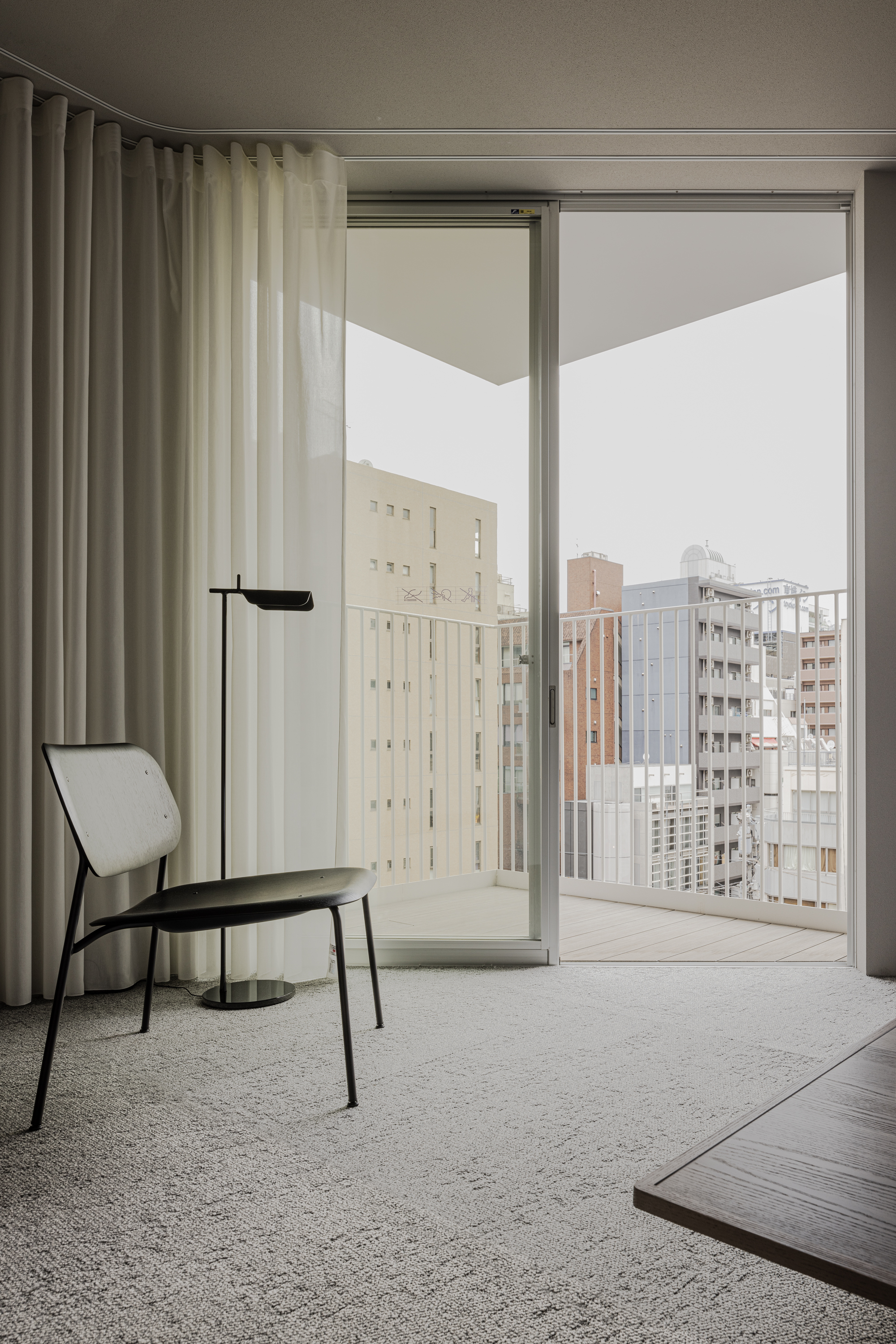
An elevator carries guests to the upper levels, each home to just one or two guest rooms, ranging from a compact 13 sq m to a more spacious 35 sq m, many with plant-lined balconies or large cut-out windows.
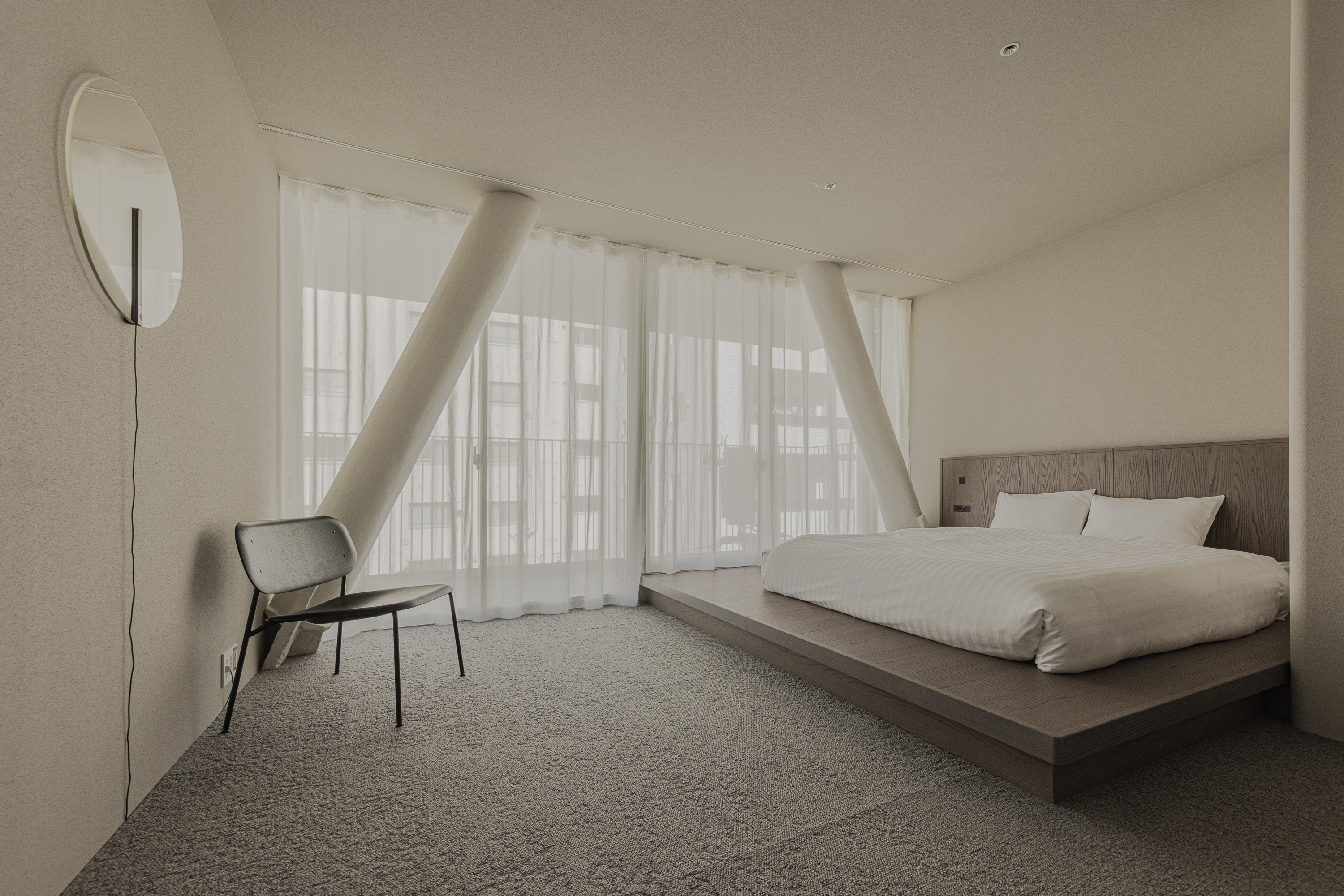
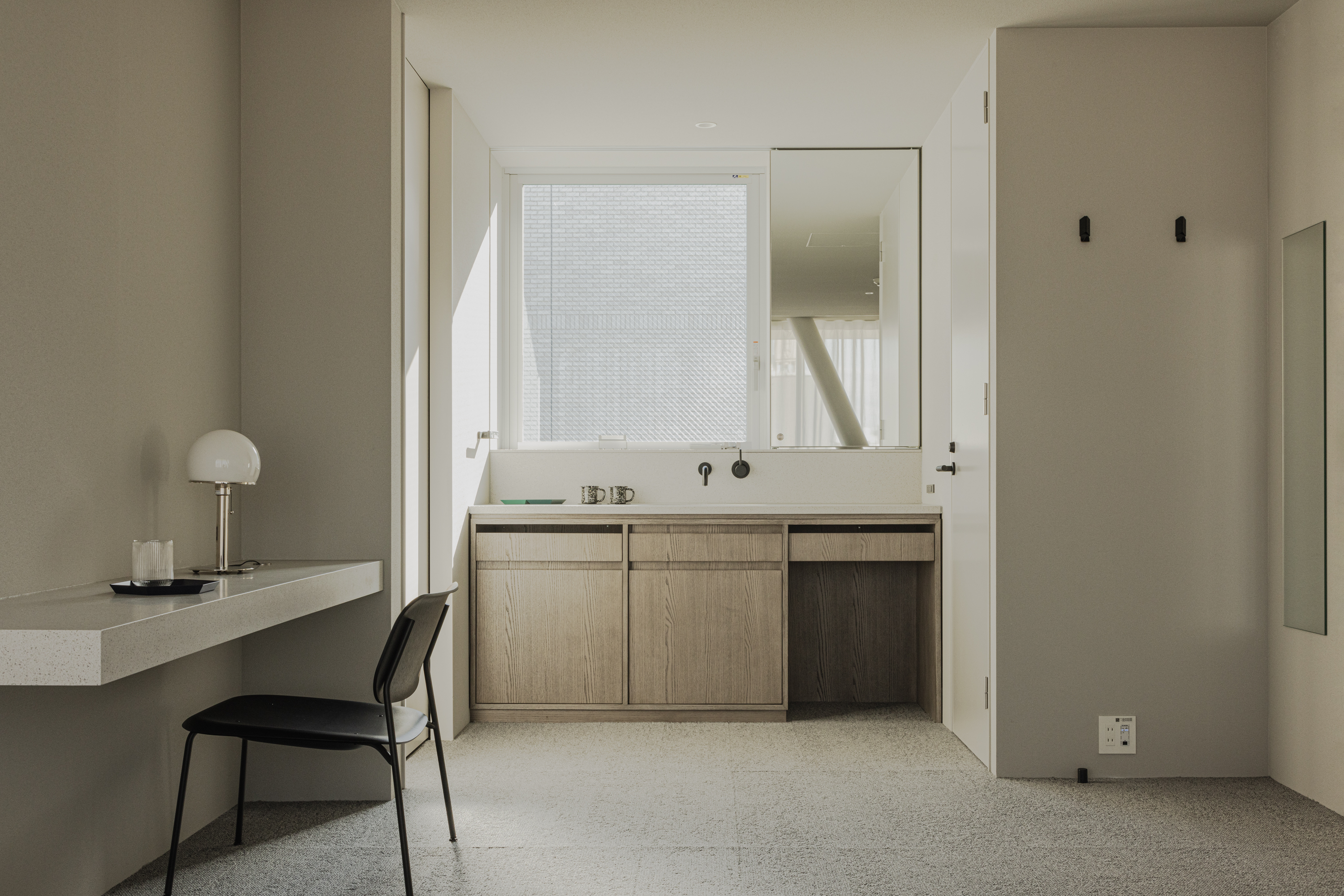
Despite the no-frills foundation, the rooms are enhanced by a contemporary softness in the textures, materials and palette – from the diatomaceous earth wallpaper and the curved edges of all wall corners to the woven grey carpets, low wooden bed platforms, circular mirrors and light curtains.
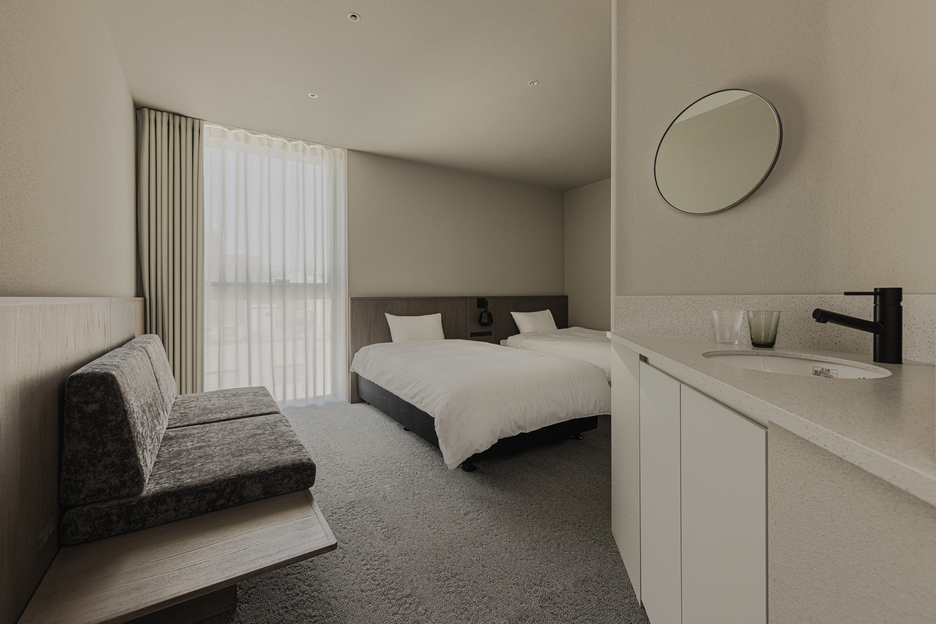
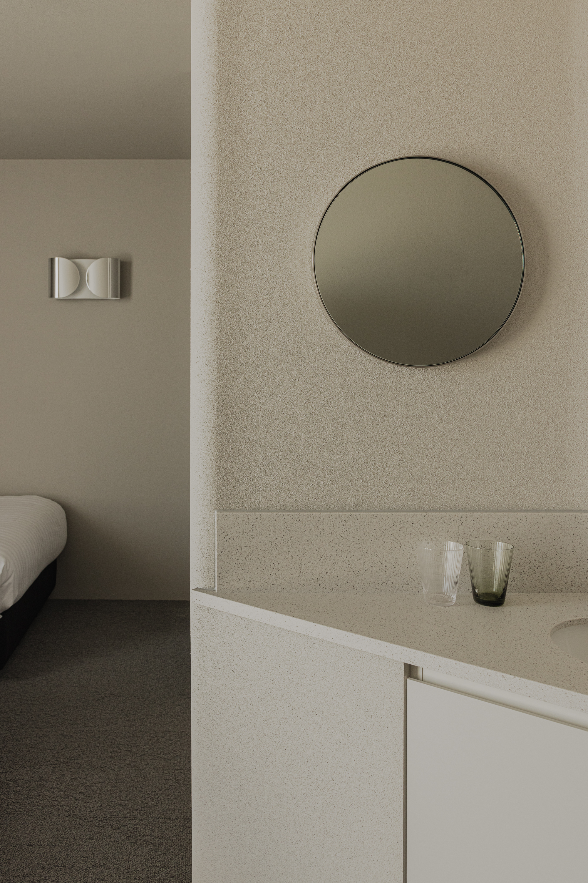
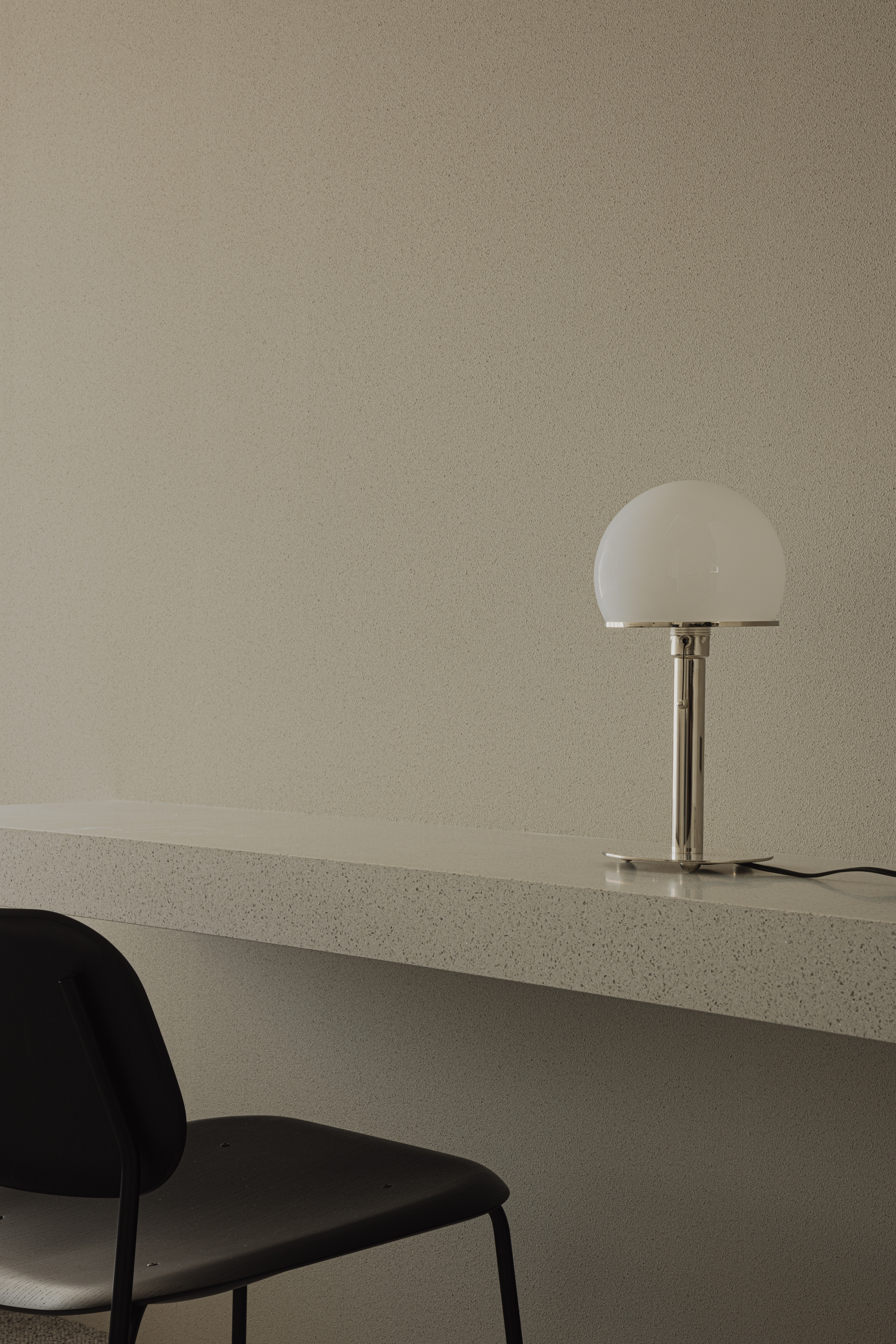
The building’s unique DNA is also present throughout; a scattering of angled white floor-to-ceiling columns, which have a functional role of supporting the building, are transformed into an architectural feature in a number of guest rooms.
‘We tried to create a layout and select materials that allow guests to fall asleep comfortably and wake up in the morning sun,’ says Shinya Kojima. ‘For this reason, diatomaceous earth wallpaper is used on the walls, with the idea that light can also be felt through the texture of the wallpaper.’
A music theme also quietly underpins the hotel – from the name, which references ‘ragtime’ in Japanese to the jazz soundtracks in the lobby (QR code-accessible in-room playlists and jazz event ticket sales are also planned).
