Magazine covers are a delicate art form that requires thoughtful design to stand out on shelves. Whether you're opting for a classic look or taking creative risks, it's all about grabbing the audience's attention – preferably for the right reasons, unlike Esquire's new magazine cover.
After the reveal of its new spring issue, Esquire was lambasted by design fans who weren't best pleased with the cover design thanks to its anti-design aesthetic. With minimalist visuals and disjointed typography, the cover was surprisingly controversial despite its unassuming first impression, proving that creatives are sticklers for the design details.
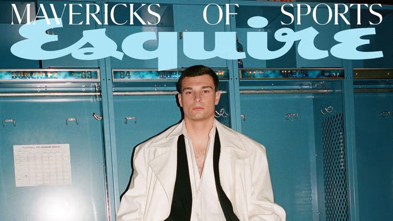
The spring 'Mavericks of Sports' edition features NFL star Fernando Mendoza sitting in a locker room, rocking an undone suit and large duster jacket. While the conventional imagery and breezy blue-and-white colour palette give the design a clean feel, there's one specific detail that had graphic designers up in arms. The typesetting.
"This makes me irrationally mad in so many ways," a user on the r/graphic_design subreddit wrote, alongside an image of the controversial cover. "Anti-design and leaving big rivers between words like this is quite on trend right now," another user offered, while one user countered, "Anti-design in Esquire makes about as much sense as bananas in a lasagna."
This makes me irrationally mad in so many ways from r/graphic_design
The backlash raged on with one user commenting, "Breaking design rules is fine if you know what you’re doing, but there’s a special place in design hell for whoever micro-managed this abomination." Another wrote, "I kind of see what they were trying to do — punchy, stately, dramatic. But very poorly executed. Such a shame," while one user joked, "Even the type is manspreading."
For more magazine cover stories, check out why Timothée Chalamet’s bizarre Vogue cover exposes a much bigger issue or take a look at The New Yorker cover that was a huge slap in the face for censorship.