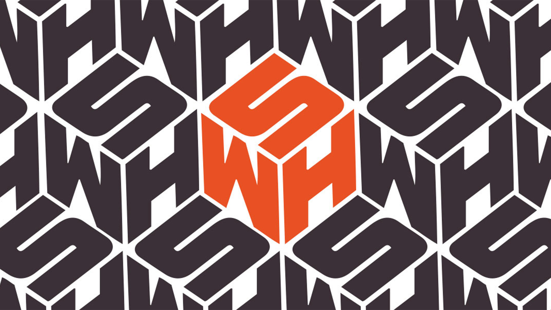
In a late contender for the least popular rebrand of 2023, UK newsagent WHSmith revealed a new logo at the end of December, adorning a handful of its stores with simplified 'WHS' branding. The clinical looking wordmark drew immediate comparisons to the NHS logo, and left pretty much everyone baffled.
The brand later explained the move, telling Creative Bloq it was testing the new signage as a "pilot" at a "small number of locations". Even so, it managed to make a huge splash online, with customers and design experts alike weighing in on the new look. One of the best logos of all time, this ain't.