From a design perspective, there's never been an Apple software update cycle as controversial as last year's. The company introduced Liquid Glass, adding a soft and transparent design language to its entire product line – and not everyone was happy with the results.
But while the dust has generally settled on the aesthetics of iOS 26, with iPhone users seemingly getting used to the new look, one bunch is proving harder to please: Mac users. And rather than app icons, its the menu icons that are drawing particular ire.

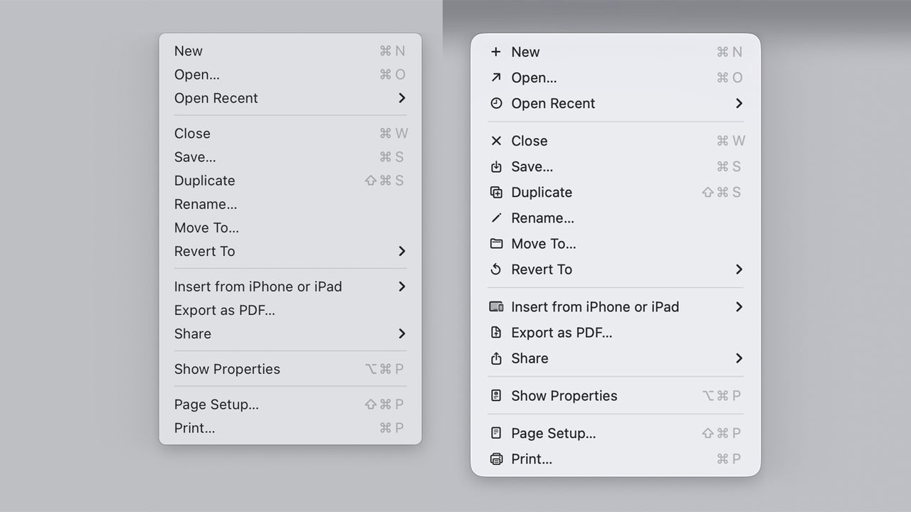
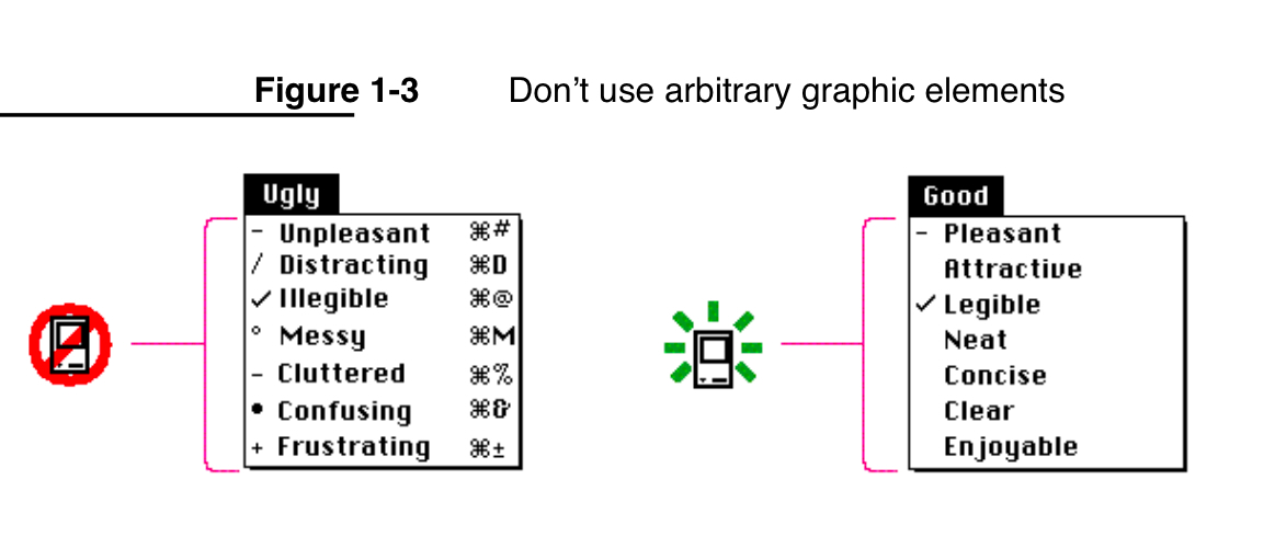
Designer Niki Tonsky has launched a detailed deep dive into the iconography of MacOS Tahoe. Titled 'It’s hard to justify Tahoe icons', the blog post describes macOS Tahoe's icons as "unpleasant, distracting, illegible, messy, cluttered, confusing and frustrating," citing, of all things, the 1992 Macintosh Human Interface Guidelines.
Tonsky argues that UI icons across macOS Tahoe are more cluttered and less consistent than ever before. In one example, Tonsky finds over ten different icons for creating something 'New' within various apps.
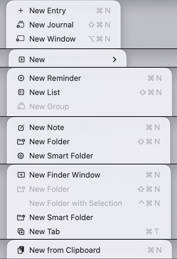
Even worse, Tonksy claims, is the fact that several apps use the same icon to denote different actions.
And Tonsky isn't alone. Web designer Jim Nielsen launched a similar tirade last month, claiming that macOS Tahoe's menus are just too busy. Nielsen also suggests Apple is going against its own guidelines, citing the line, "Don't use other, arbitrary symbols in menus, because they add visual clutter and might confuse people."
Tonksy blog post was recently shared on Reddit, where users echoed his sentiments. "I 100% agree," one user comments. "I’ve been using Macs for 30 years and suddenly I feel like it’s my first time using a computer because nothing looks quite like what it is."