Get all your news in one place.
100's of premium titles.
One app.
Start reading
Creative Bloq
Creative Bloq
Technology
Joe Foley

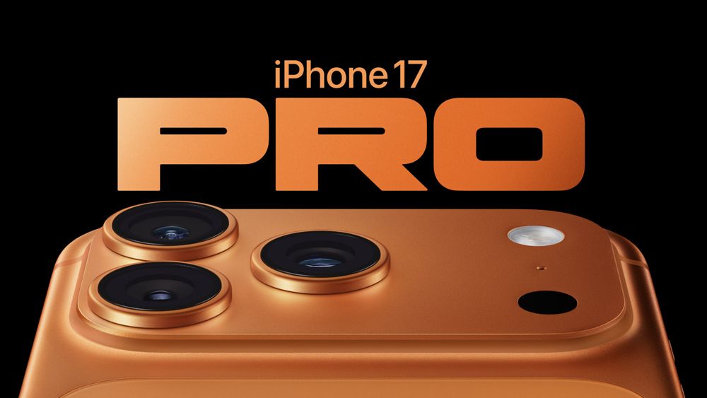
Hardly anybody spotted this clever iPhone 17 Pro typography Easter egg

Apple iPhone 17 Pro typography.

Apple's know for its attention to design details (we'll forget about the Magic Mouse for now). But sometimes it focuses on details so subtle that barely anybody notices them.

We have several doubts about the new iPhone lineup. What's the point of the iPhone Air? Do we really want a cross-body iPhone strap? And why isn't there a black iPhone Pro? But if there's one thing that Apple got right, it's the perfect shape of the 'O' in the iPhone 17 Pro typography.

Sign up to read this article
Read news from 100's of titles, curated specifically for you.
Already a member? Sign in here
Related Stories
Top stories on inkl right now
One subscription that gives you access to news from hundreds of sites
Already a member? Sign in here
Our Picks
Fourteen days free
Download the app
One app. One membership.
100+ trusted global sources.