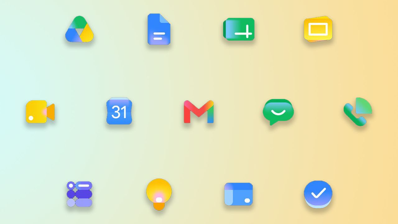
Ever since Google 'unified' its app icons (a.k.a. making them basically indistinguishable from one another), many have been calling for an update. With criticisms over the designs' clarity and accessibility, Google was accused of prioritising its brand aesthetic at the expense of legibility. But the good news is, it finally seems to have learned its lesson.
In a complete revamp, Google's new icons are a vast improvement from their predecessors, with unique logos that feel distinct yet unified thanks to their gradient design. Even the Google logo itself has seen a number of iterations across the years, but the brand consistently proves it isn't afraid of evolution, for better or for worse.