What you need to know
- Google launched its redesigned Chrome Web Store this week.
- The search giant previously announced the makeover in August with a limited preview.
- The facelift includes additional extension categories, a more prominent search bar, and curated collections for users.
Among Google Chrome’s key features is its vast repertoire of extensions that bring new functionalities to the web browser. While Chrome’s extensions are all made available on the Chrome Web Store, the library has maintained the same look and feel for ages. However, that changed when Google announced a revamp of the Web Store in August and offered us a limited preview of its new look, which is now live.
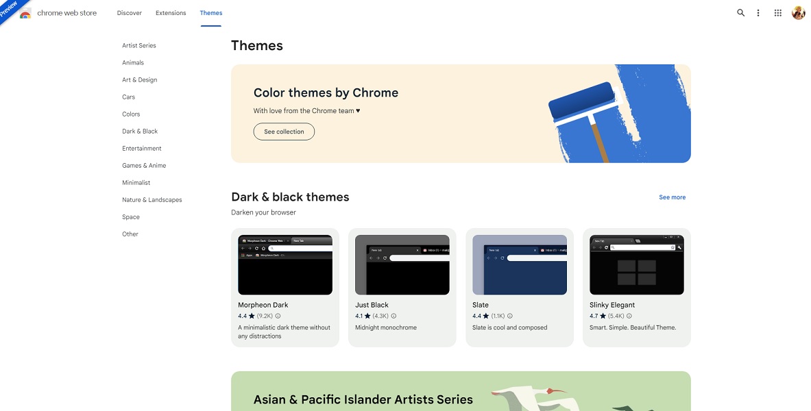
The search giant introduced in a company blog post its freshly redesigned Chrome Web Store, which is brandished in a new look now available to all users. The digital store’s refreshed design draws inspiration from Google’s Material You design language, giving Chrome’s library of extensions a modern aesthetic that is on par with the rest of Google’s ecosystem.
“Inspired by our Material You design language, the new store has fresh color palettes, updated card styles and improved icon legibility that all better complement Chrome’s overall look,” Google said in the announcement.

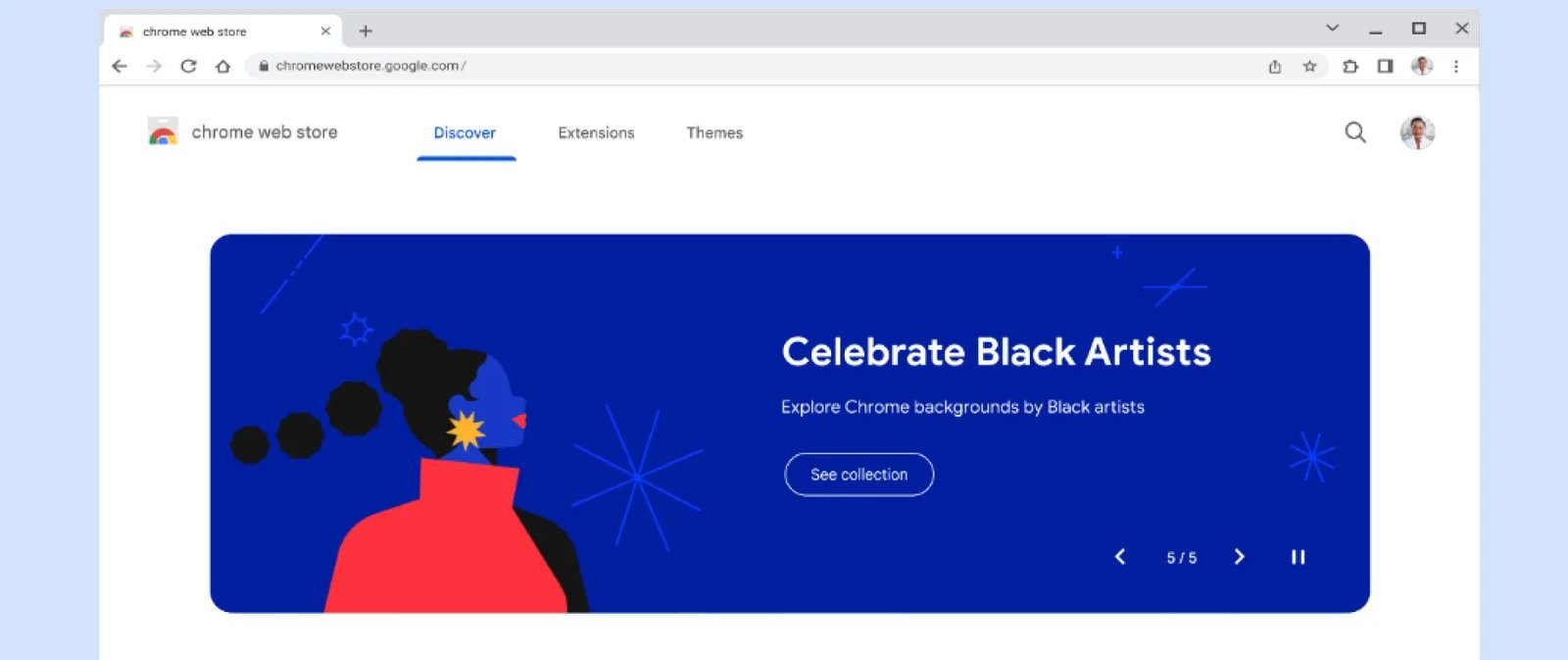
Notably, the redesign migrates the search bar to the top right of the screen, which allows for easier navigation. The update also equipped the search bar with the ability to “filter by all items or featured extensions and themes to find exactly what you want.”
The sleeker and cleaner UI also introduces a rotating list of highlighted extensions and themes, visible at the top of the Discover page. This is followed by the top categories section as well as the recommendations section.
The makeover also debuts curated collections, including new categories such as AI-powered and shopping extensions, as well as extensions tailored to the user’s individual downloading history. Elsewhere on the Chrome Web Store’s new UI are new tabs for “Extensions” and “Themes,” each with separate recommendations.
The digital store’s facelift seems to be part of the tech giant’s broader efforts to bring its assets closer to its Material You design language since Chrome itself recently received similar treatment.


