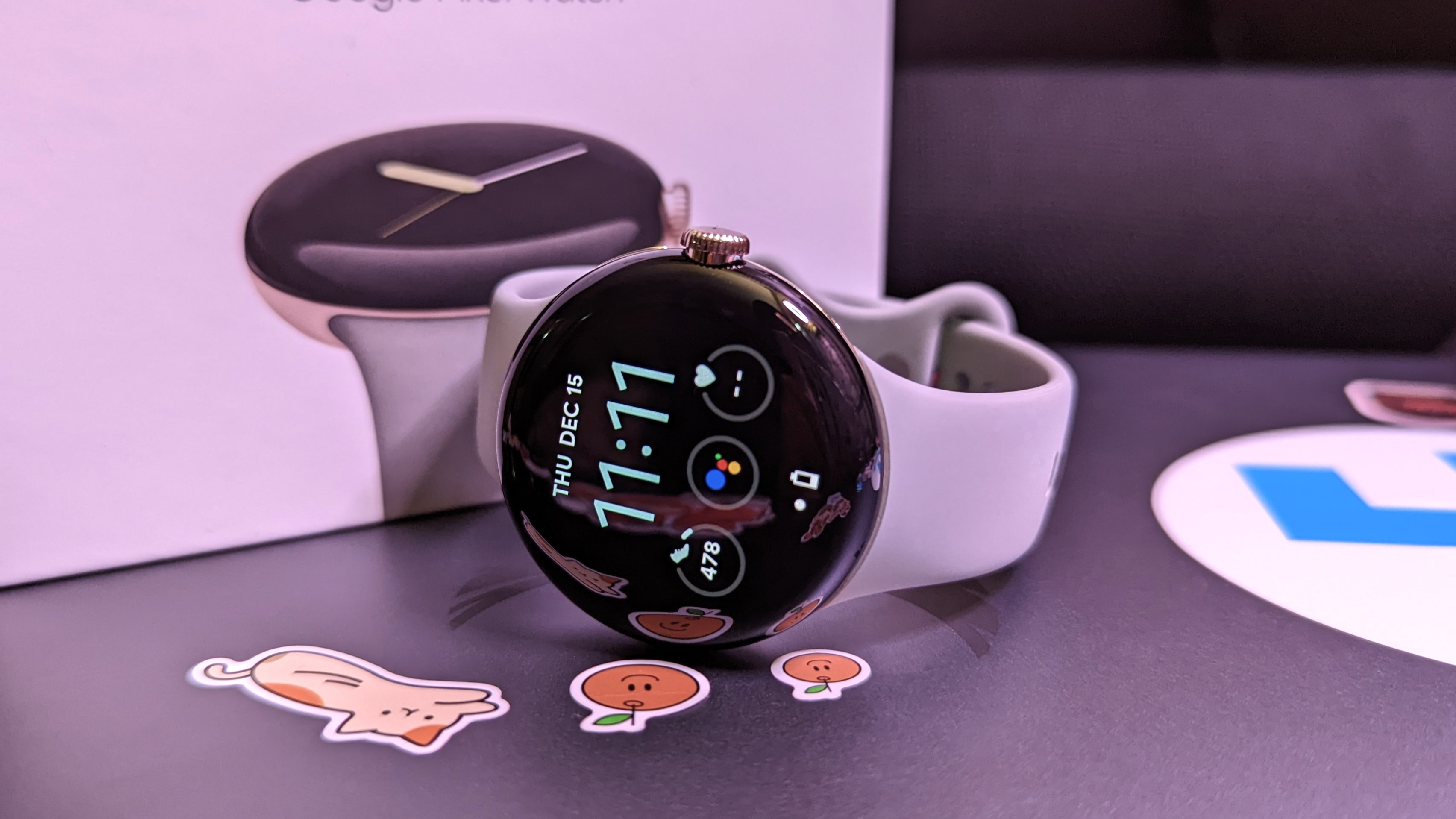
The Pixel Watch is easily one of our favorite smartwatches. After years of rumors and leaks, Google gave us a smartwatch that not only looks great but it runs Wear OS incredibly well and even brings Fitbit into the mix. As Google's first smartwatch, it's quite impressive.
However, the Pixel Watch is far from the best Android smartwatch on the market, and there are a number of things Google can learn from its first year with its own smartwatch hardware. The company may likely introduce the successor to the Pixel Watch later this year, so if it does, there are some ways we think Google can improve on the experience with the Pixel Watch 2.
Better battery life
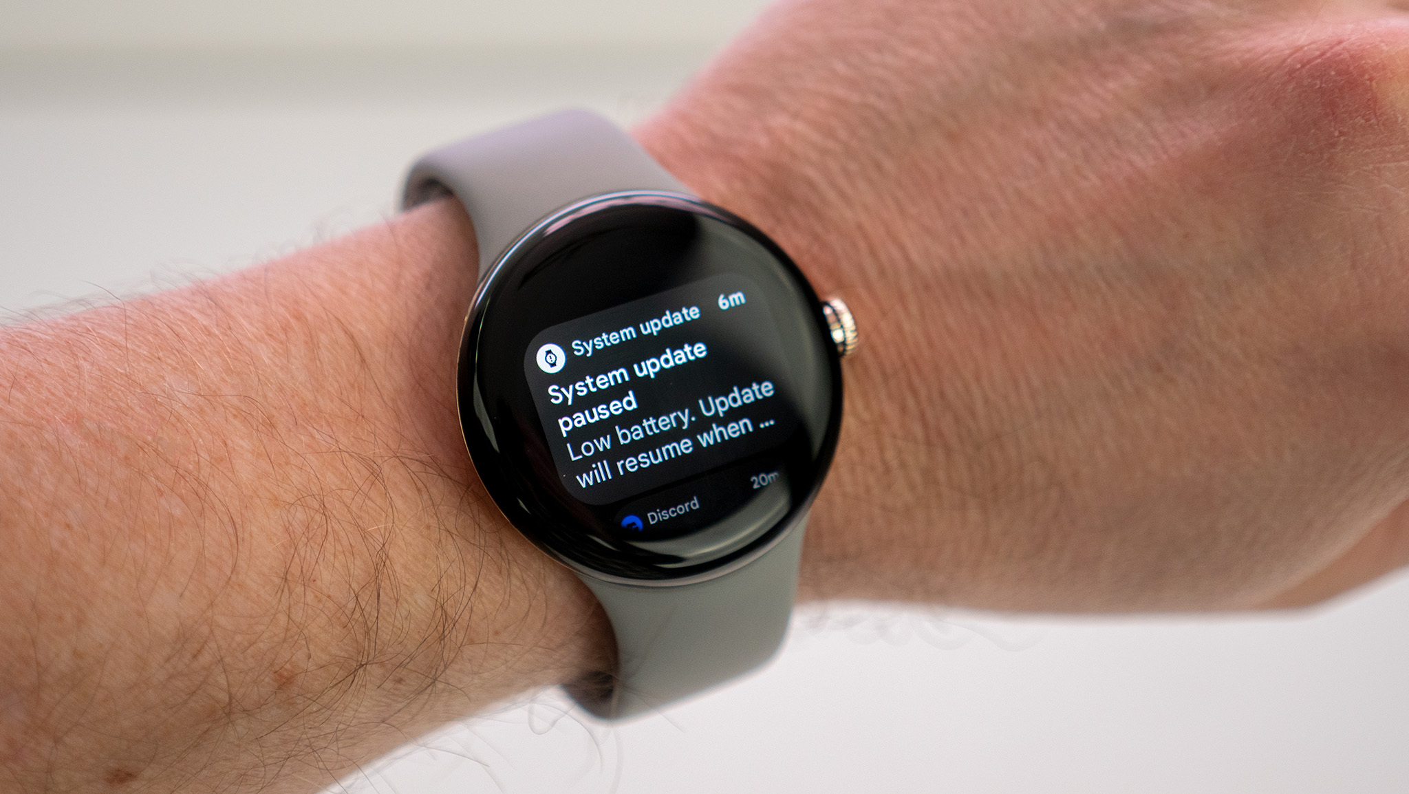
While the Pixel Watch is a great smartwatch, Wear OS isn't exactly known for being easy on the battery. In our experience, the watch lasts roughly a day on a single charge, maybe a day and a half if we're lucky. It's not exactly known for longevity, which doesn't bode well for Google's first smartwatch.
With Google's next-generation Pixel Watch, the company needs to try to set a standard with battery life. Pixel smartphones have pretty great battery life, so the watch needs to match.
Of course, it might help if Google used a more up-to-date chipset. The company is apparently using the Exynos 9110 chip, which is built on a 10nm process. It performs very well but is not as efficient as Samsung's newer Exynos W920 chip used in the Galaxy Watch 5 series. Perhaps using the newer chip alongside a dedicated co-processor will help improve battery life.
Refine the design
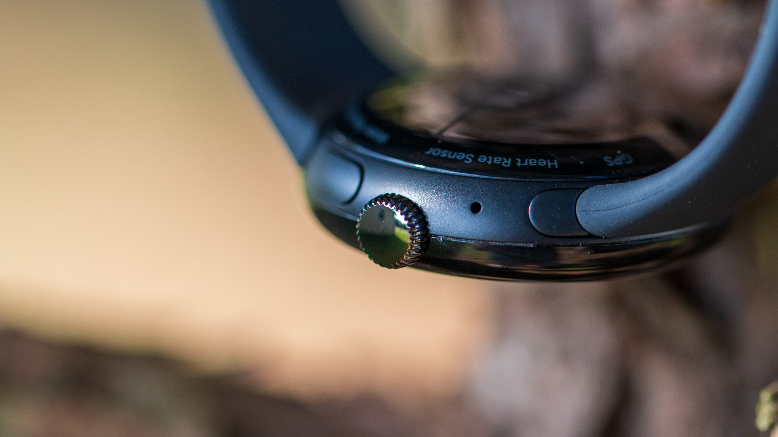
Having a crown on a smartwatch isn't exactly unique. For watches that don't have capacitive or rotating bezels, à la Galaxy Watch, it's a handy addition that makes navigating menus a little easier. However, the placement of the crown can be an issue for some.
One complaint Fossil smartwatch owners have is that the crown can get in the way when working out because of how one's hand is often positioned when performing certain workouts and exercises. It can cause unwanted button presses, and if your hand is held in place long enough, you can accidentally power your watch off. It's a bit of a hassle when you're trying to use your watch to track your workout.
Google might want to consider moving the crown, so it's not placed at the center. Similar to how Samsung and Mobvoi place two buttons at the top and bottom while keeping the center button-free, Google could place the crown on the bottom while the multitasking button could remain in its place (this would obviously be different for left-handed users that wear their watches on their right arms). This way, the crown isn't digging into your hand during workouts.
And speaking of the button, Google should make it so that it's not so flush with the chassis and consider changing its position so that it protrudes from the side and not from slightly under the watch; that way, it'll be a bit easier to press.
Bigger screen and more sizes
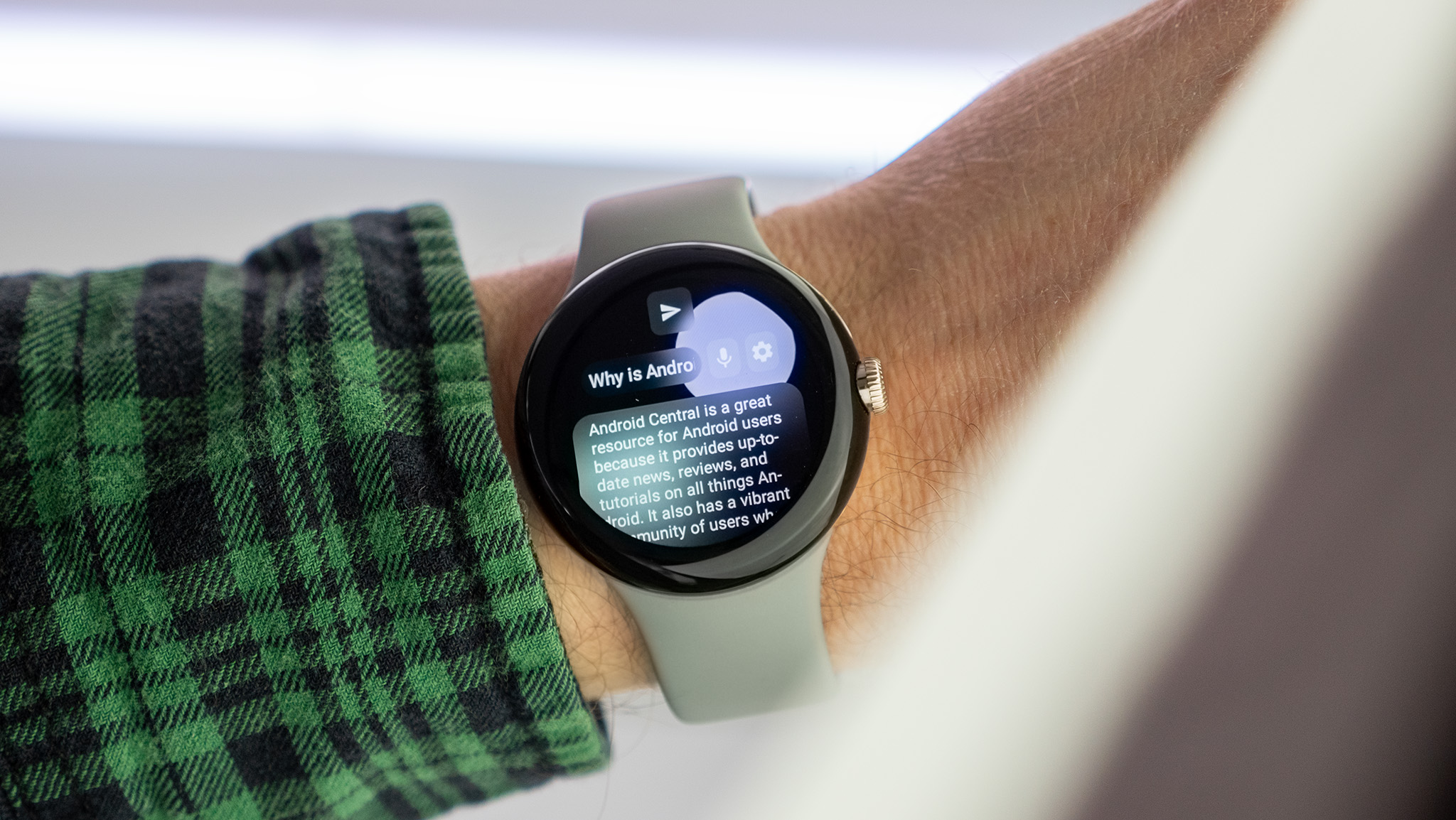
Many of the best Wear OS watches are available in more than one case size. However, for some reason, Google opted for a one-size-fits-all smartwatch. Unfortunately, the 41mm case size is on the smaller end of smartwatches.
Google should introduce a second larger size for the Pixel Watch 2, at somewhere around 43mm or 44mm. It should also come with a larger display for both models. 1.2 inches is pretty small — even the smaller Fossil Gen 6 models have closer to a 1.3-inch display. Smartwatches aren't really where one goes for content, but reading notifications and things would be a lot easier with a larger display.
And on that note, Google needs to do something about those bezels. They're not as bad as we once thought they'd be, and they blend pretty seamlessly with the display, which is a nice touch. But when using the watch, the bezels are quite noticeable.
More (cheaper) third-party bands
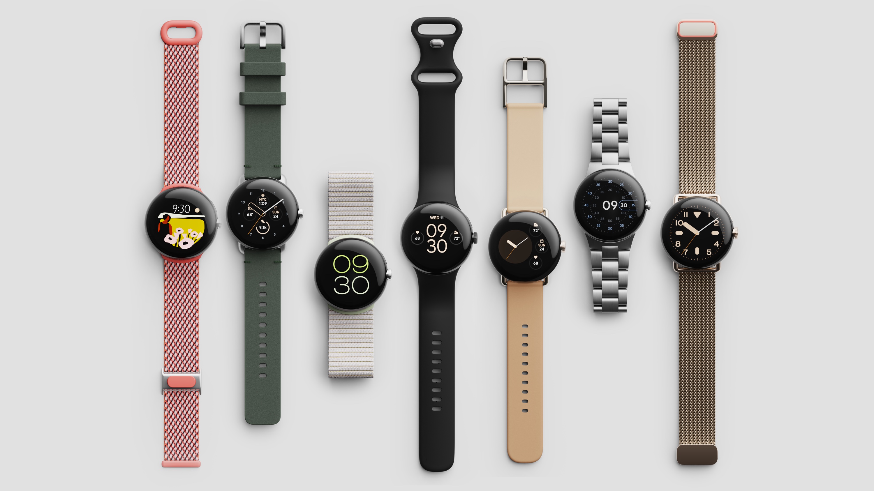
Part of the Pixel Watch's charm is the fact that, like the Apple Watch, Google went with a proprietary connector for Pixel Watch bands. However, while they may look nice, they can limit the selection for third-party bands as opposed to other Android smartwatches like the Fossil Gen 6 that go with more standard connectors.
One of the biggest complaints among Android Central staff when it comes to the Pixel Watch is that there needs to be a bigger selection of third-party bands. Not only is the current selection of third-party bands small, but many of them look cheap, have loose connections, or just completely fall off.
It doesn't help that Google's first-party bands are very expensive. The company really needs to partner with third-party accessory makers so we can have a larger and better selection of official bands at more affordable prices.
Qi wireless charging
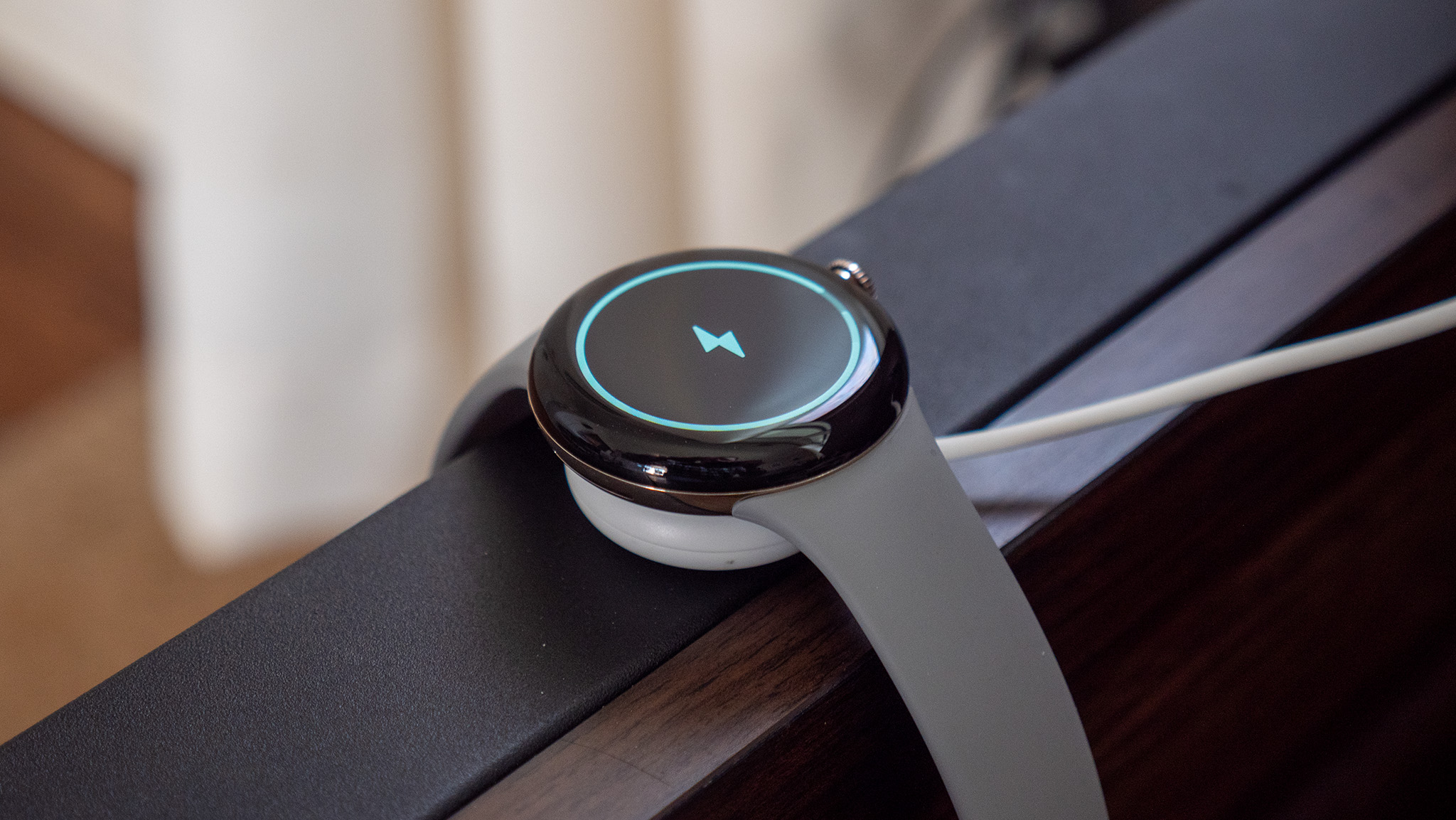
One of the biggest problems with wearables is all the proprietary charging solutions. No two wearables have the same charger, and it can be quite obnoxious for those of us with multiple smartwatches or wearable devices. And while legislation is being put in place for USB-C to become the standard across smartphones and larger devices, smartwatches don't have such rules.
Some smartwatches, like Samsung's Galaxy Watch line, have some form of wireless charging, but you won't find Qi charging support, which has become a standard for smartphones and is even compatible with many wireless earbuds. Fossil states that it did not include Qi with its Gen 6 smartwatch because it's slower and it would make the watches thicker. However, the convenience of wireless charging may outweigh those complaints, especially if you want a relatively quick top-up and you don't have your watch charger around.
Last year, there was a lot of hullabaloo about wireless charging on the Pixel Watch, which isn't officially supported. However, it's a feature we would love to see on the next version, even if it means a slightly thicker device.
More features
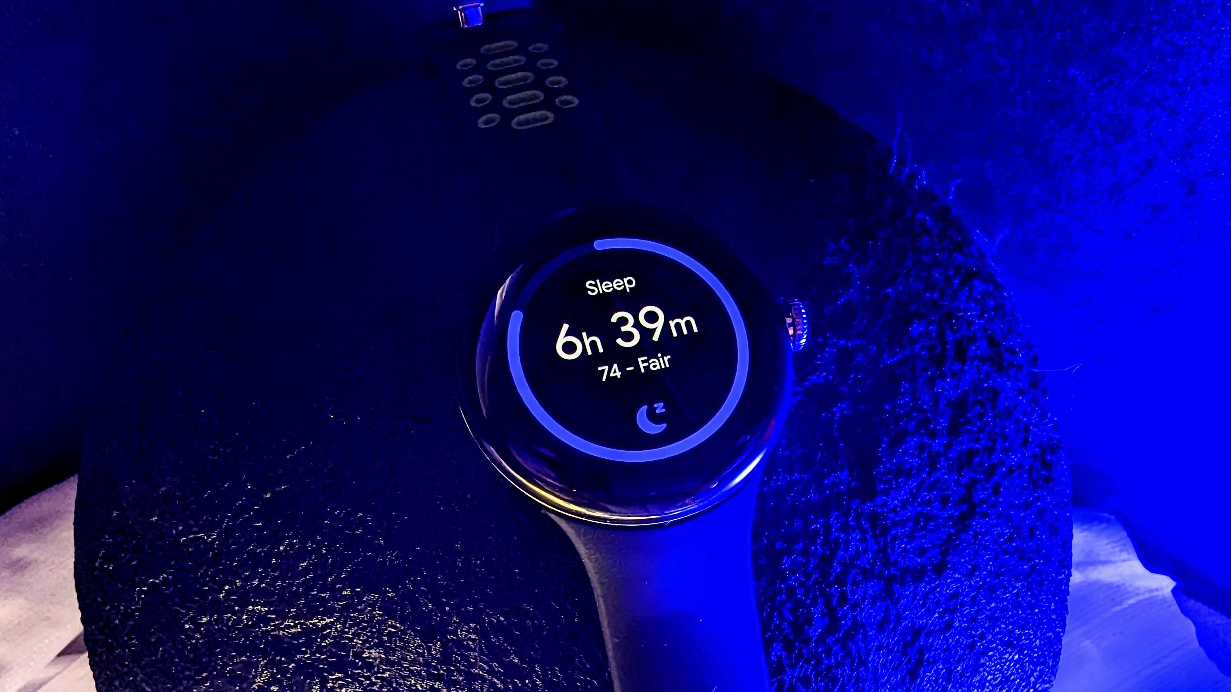
Google has been gradually adding more features to the Pixel Watch, which is nice. However, there are some features we would like to see the company include with the launch of its next watch.
For starters, we would like the option to customize the buttons. Right now, Pixel Watch users are at the mercy of whatever Google has assigned for the crown and the button, and there's no way to change this. Even on Fossil smartwatches, users are able to customize the double-press of the crown. And while the app switcher function of the button is plenty useful, Google should offer some level of customization for the button.
Other features we would love to see include more ringtone customization, more "classic" style watch faces from Google, and the option to customize the quick settings menu. The watch should also sync modes with a smartphone, so when a Pixel goes into Bedtime Mode, the watch should sync with the phone instead of having to manually turn it on. This should also apply to Do Not Disturb and alarms.


