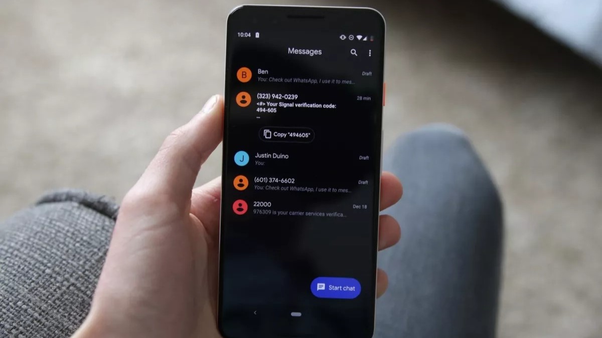
What you need to know
- The latest Google Messages beta brings new UI changes.
- The update removes the persistent search from the top and ditches the navigation drawer.
- The options under the nav drawer will likely be moved to different sections within the app.
Google Messages has recently been put through a couple of UI changes. As part of its redesign, a new change ditches the navigation bar in favor of a much cleaner look.
Like the Gmail app, Google Messages has a search bar with a hamburger menu for the nav drawer and your Google account on the other side for access to other settings. A new update, noted by 9to5Google, removes the nav drawer and the search bar for an updated look.
Instead, the redesign now has a Google moniker on the left, followed by the magnifying glass icon for search.
The nav bar under the three hamburger lines currently includes Starred, Archived, Spam & blocked, Device pairing, and the option to Choose a theme. With the update showing up for some beta users, these items, apart from the "Choose theme" option, are now being moved to your Google account overflow menu, which already includes "Your data in Messages," "Messages settings," and "Help & Feedback" options.
The "Choose theme" option is seemingly moved deeper to the settings menu, notes 9to5 (as shared in the screenshots below). Categories have also been slightly redesigned from the previous carousel view. You can see some of the before and afters below:
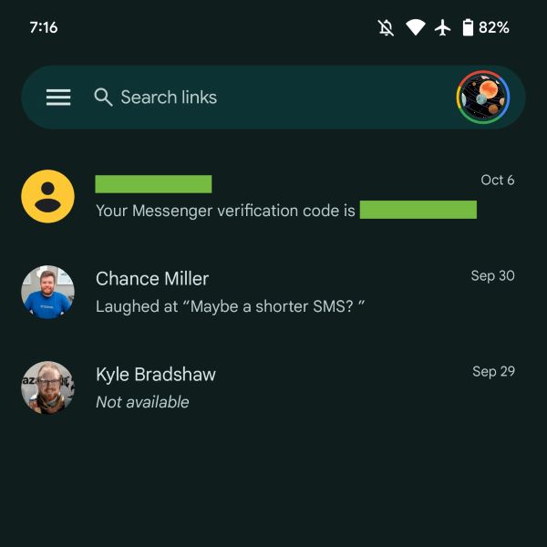
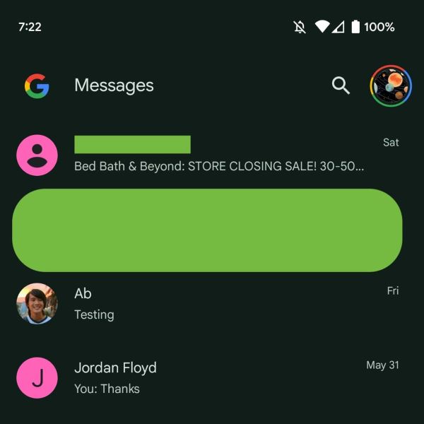
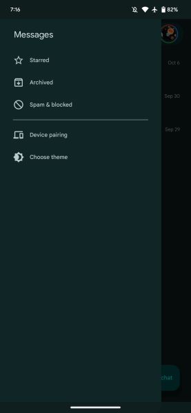
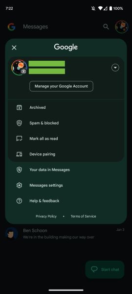
The redesign is part of the 20230608_01_RC00 update of the Google Messages app in the beta channel. The wider availability of the feature is yet to be determined, but so far, we have not noticed the changes on our devices.
It's an interesting move for Google, as the nav drawer was introduced into the app early last year. However, it seems it may not have been a popular change, and users are probably more likely to seek these options from the account menu anyway since that's where most settings live.


