What you need to know
- Google Contacts' new "Create contact" page, previewed earlier this year, is now rolling out with version 4.39.53 of the app on Android.
- The design is cleaner and more organized, cutting out the old clutter and focusing on key details.
- Essential fields like phone numbers and emails are now pill-shaped buttons, with the "Add phone" option pre-selected but removable.
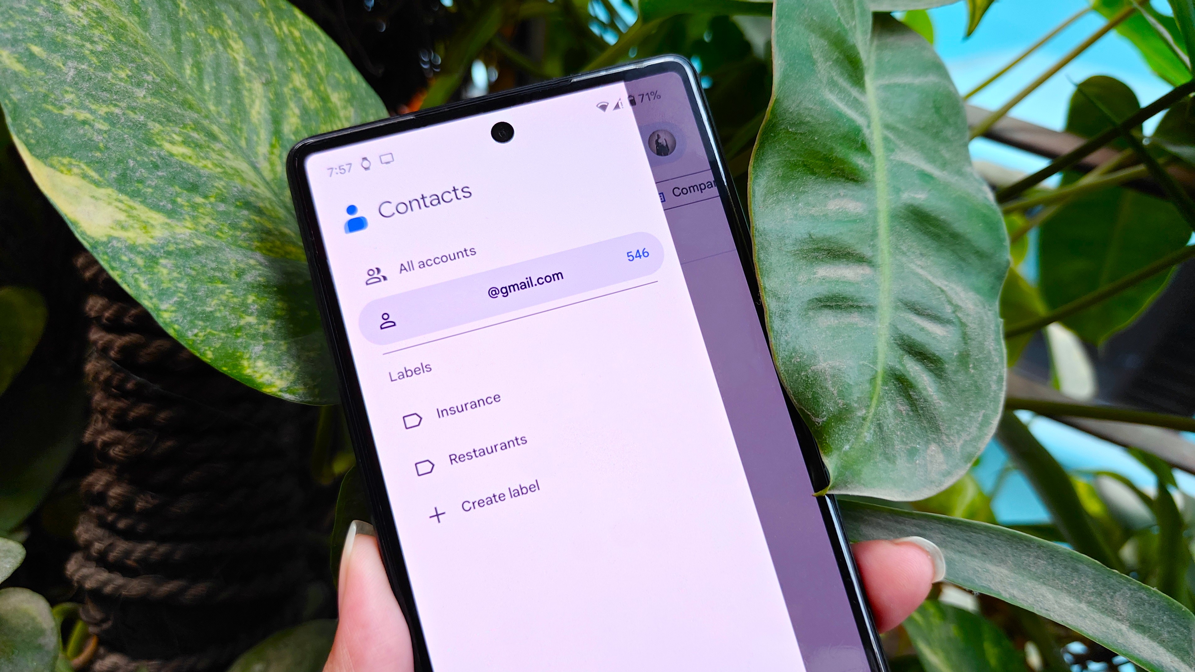
Google previewed a redesigned “Create contact” page in its Contacts app earlier this year, and now it looks like the update is finally being rolled out to a broader set of Android users.
According to Mishaal Rahman’s post on the Android subreddit, the new interface is rolling out with version 4.39.53 of the Google Contacts app (via 9to5Google). The refreshed design focuses on a cleaner, more organized look, highlighting key details upfront while cutting out the previous clutter of excessive fields.
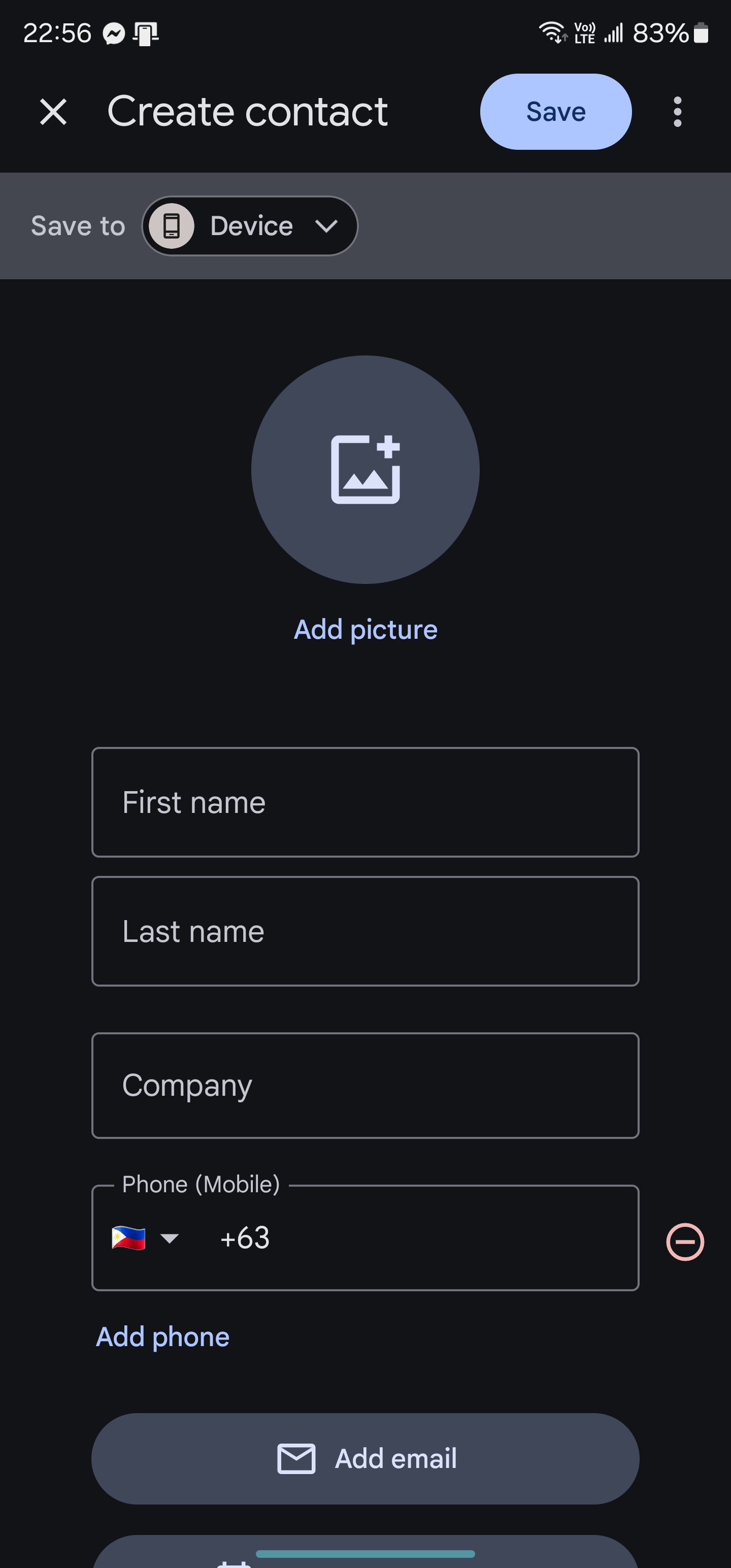
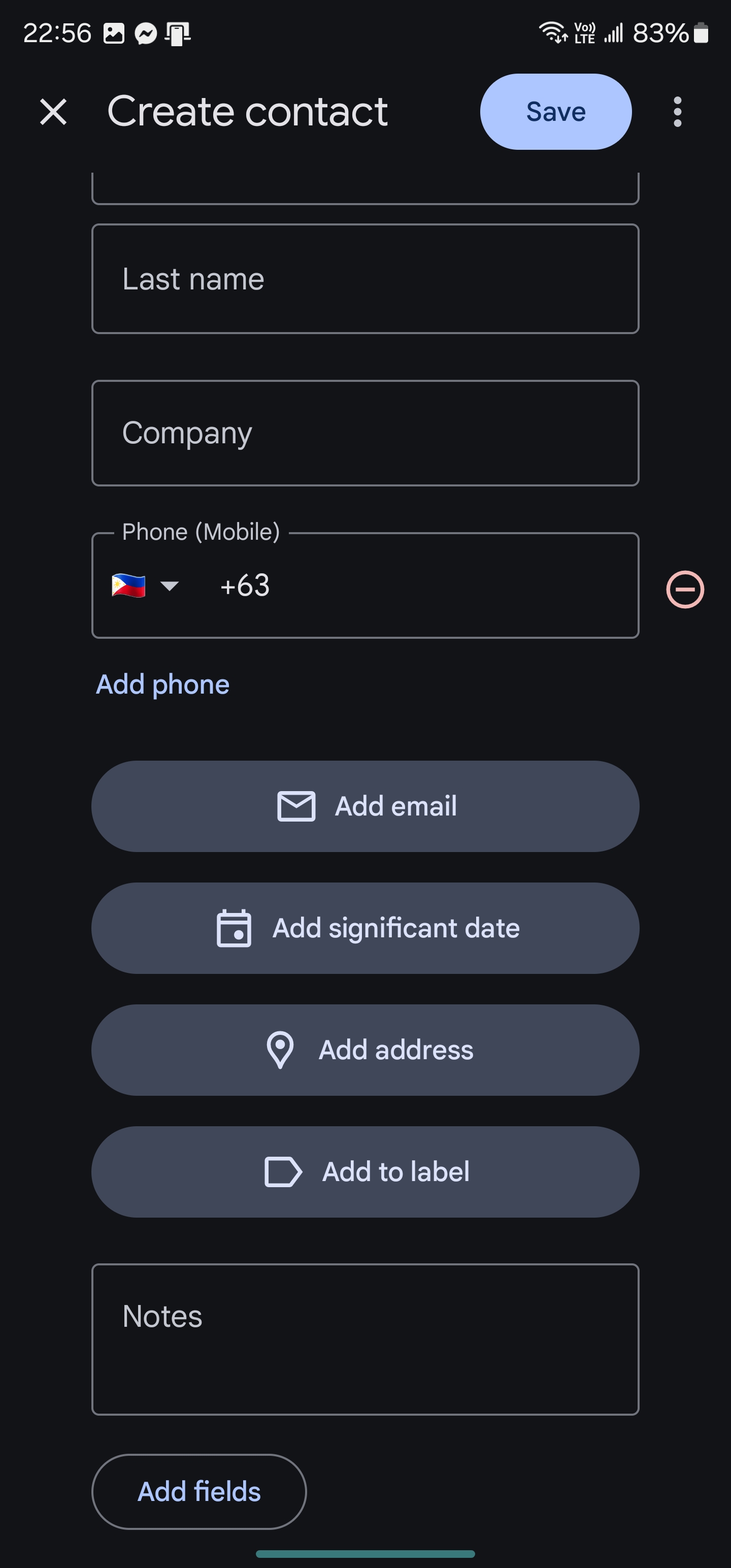
The updated Create contact page keeps the key features from before—like adding a profile picture, first name, last name, and company—but simplifies the extras. Now, essential fields like phone numbers, email addresses, important dates, and labels are shown as separate pill-shaped buttons. The "Add phone" option is pre-selected, but you can easily remove it by tapping a red button.
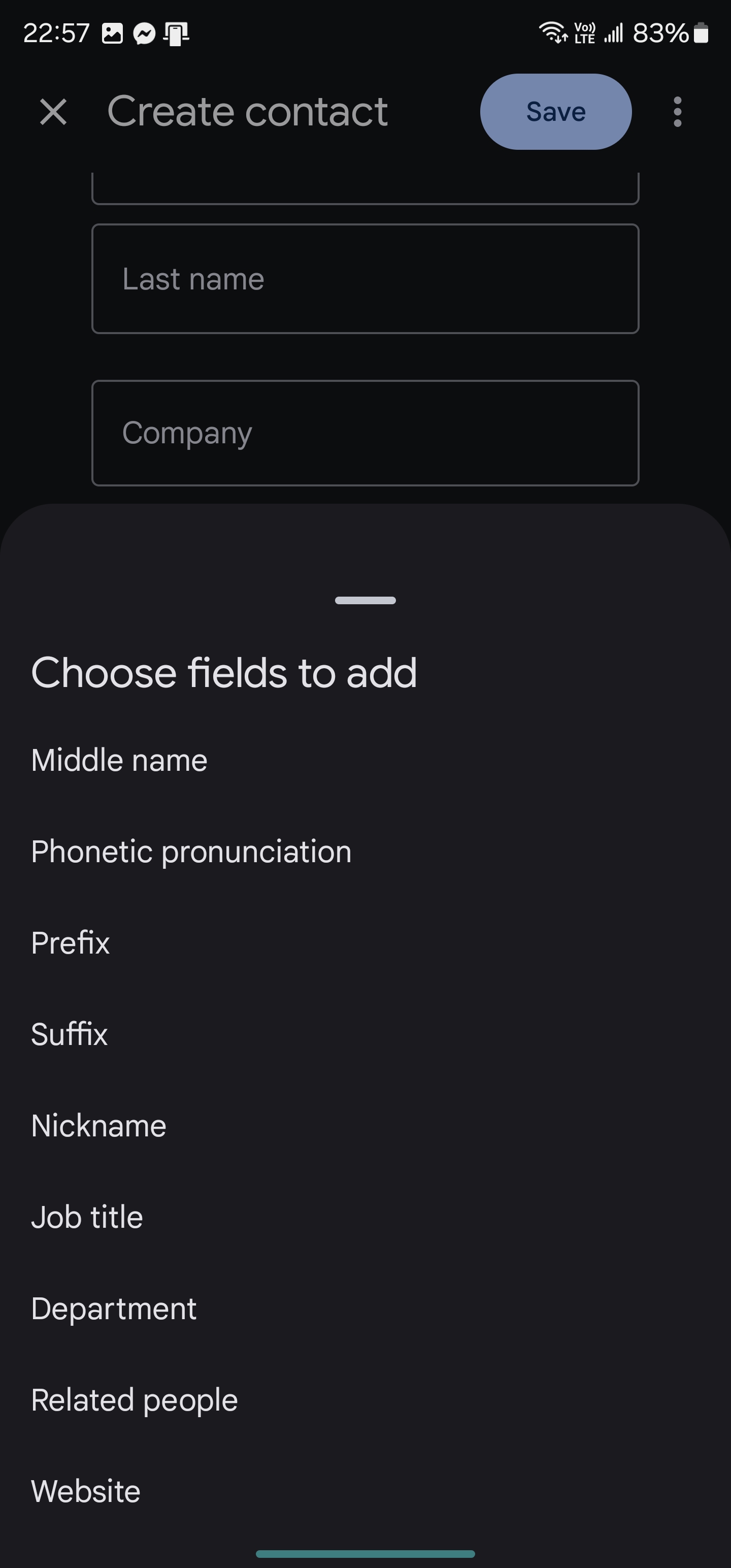
As you scroll down on the page, you’ll find a text field for adding notes and a button to reveal more options. Tapping the "Add fields" button brings up a sheet with extra fields like middle name, phonetic pronunciation, prefix, suffix, job title, website, and other details.


Unlike before, where choosing "More Fields" added all optional fields at once, the new design adds only the selected field from the "Add fields" sheet. This change simplifies the page by avoiding an overload of unnecessary options, making it easier for you to find and enter just the details you need for each contact.
The updated design is a big step up from the old one, cutting down on clutter and making things more straightforward. It's smart of Google to highlight the phone number field right off the bat, since that’s often the most important detail when you’re adding new contacts.
The redesign also removes the icons next to each field. With the fields now centered on the screen, this tweak makes everything easier to see and use.
The new Create contact page is being rolled out widely with version 4.39 of Google Contacts through a server-side update.


