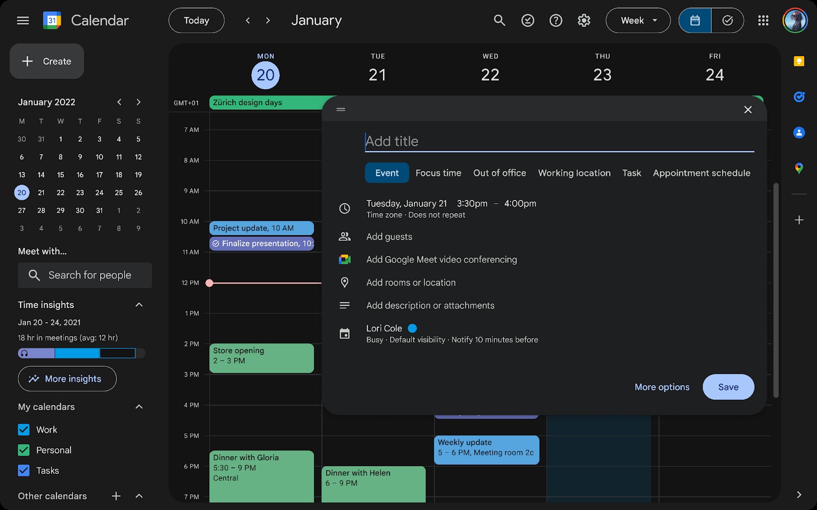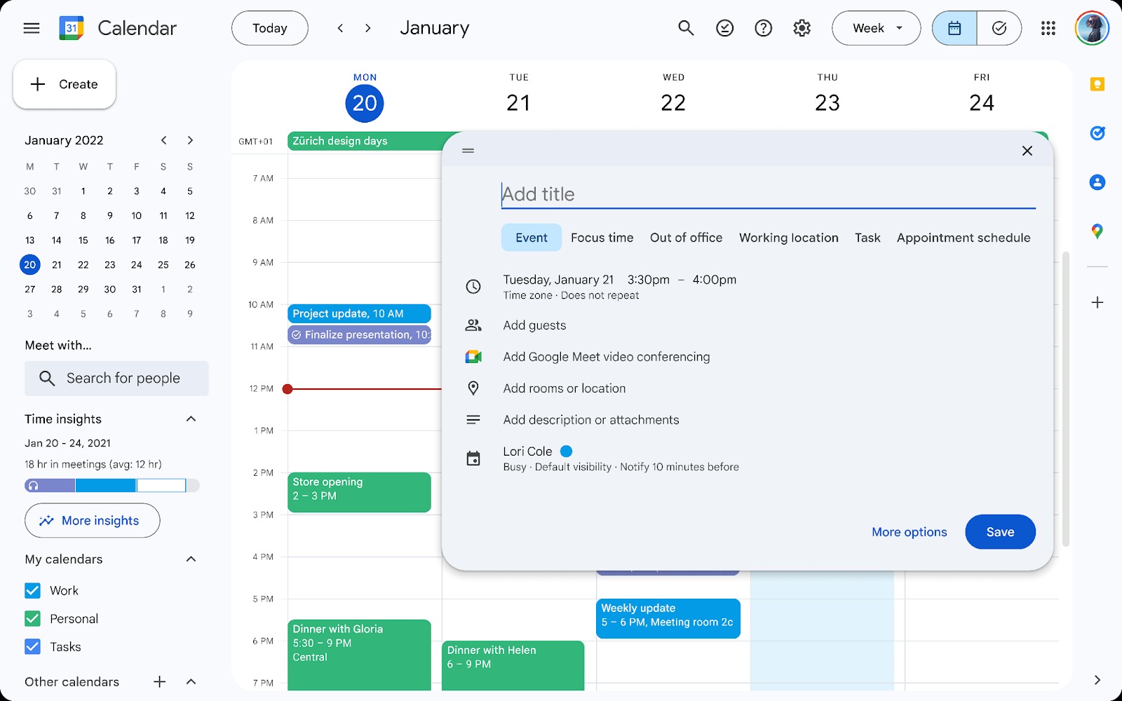
Starting today, you will soon be able to get dark mode when using Google Calendar alongside a refreshed UI with several changes. The update follows similar UI refreshes to other Google products, including Gmail, Drive and Docs.
As part of the redesign, Calendar is getting rounded corners from the main view to the sidebars, which also adopt a new light blue background. It matches the look that other Google products have received.
In a blog post, Google noted other "Material Design 3" design changes:


- Controls (like buttons, dialogs, and sidebars) that are more modern and accessible
- Interface typography that uses Google’s custom-designed and highly-legible typefaces
- Iconography that is legible and crisp, with a fresh feel
The big change is that Google Calendar is finally getting a dark mode that can be set as your default or toggled between with the standard light mode. The primary calendar is much darker than the menus and containers.
If you've received the update, it can be found in the theme options section under the Settings gear icon and then clicking Appearance.
Google does note that this update may affect Chrome extensions that alter the visual look of Calendar and Chrome.
"It may impact the experience of installed Chrome extensions that are active when using Google Calendar," the blog post warns. "As a result, these extensions might not work as expected. We recommend contacting the developers of those extensions to report any potential issues."
Additionally, the tasks.google.com site has received the same update.
As with most Google software updates, this is a rollout over the next few weeks. So you may not immediately have access to the refresh. Google says it is coming to “all Google Workspace customers, Workspace Individual Subscribers, and users with personal Google accounts.”


