It's Typography Week here at Creative Bloq, and we're exploring everything from the history of type to the forces shaping the future of fonts. And, of course, that also means exploring the impact of typography in branding, where fonts play an instrumental role shaping the identities of all kinds of companies, including their logos.
Many famous logos use bespoke fonts, which allow a brand to ensure a distinct visual asset. But while these are sometimes designed from scratch, even bespoke corporate fonts are often modified versions of existing typefaces; sometimes even of free fonts.
In some cases, the modification of a font for a logo might be as subtle tightening the kerning, while in others, the shapes of specific letters may be altered significantly. In some cases, a brand may even make a logo by combining letters from different fonts. Below we round up 10 examples of fonts in famous logos that show just how powerful the right typeface can be – and how some fonts have been adapted to suit very different brands.
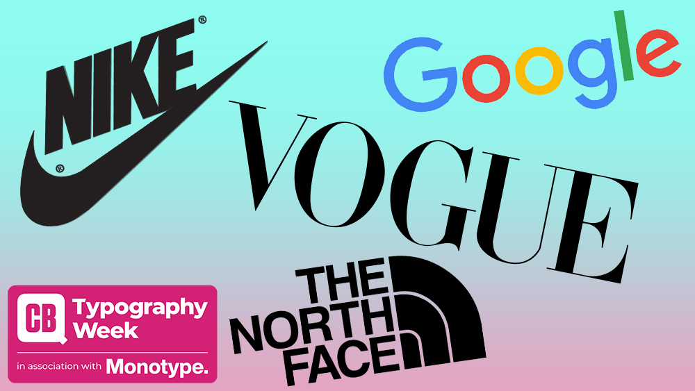
01. The Google logo: Product Sans
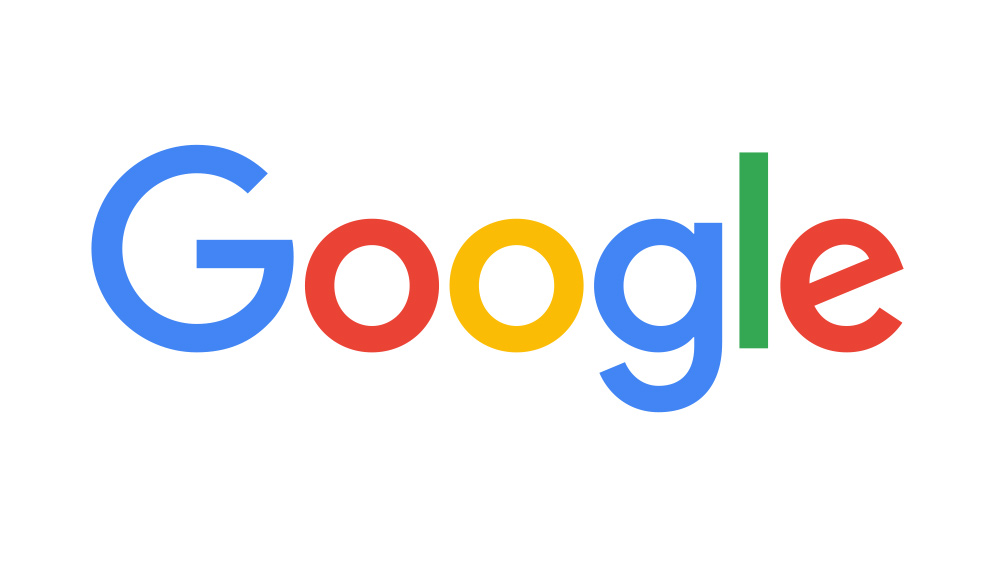
Google uses its own font Product Sans for most of its typography needs, and the Google logo is no exception, although the font was modified slightly. The smooth curves give it a friendly and approachable but balanced feel, and the clean lines reflect Google's aim for simplicity and accessibility in its usercentric UI and UX design. Product Sans is also used for the logo of Google's parent company Alphabet. I have bad news if you want to use Product Sans in your own projects, though. Google owns the font and only allows it to be used for Google products.
02. The BBC logo: BBC Reith
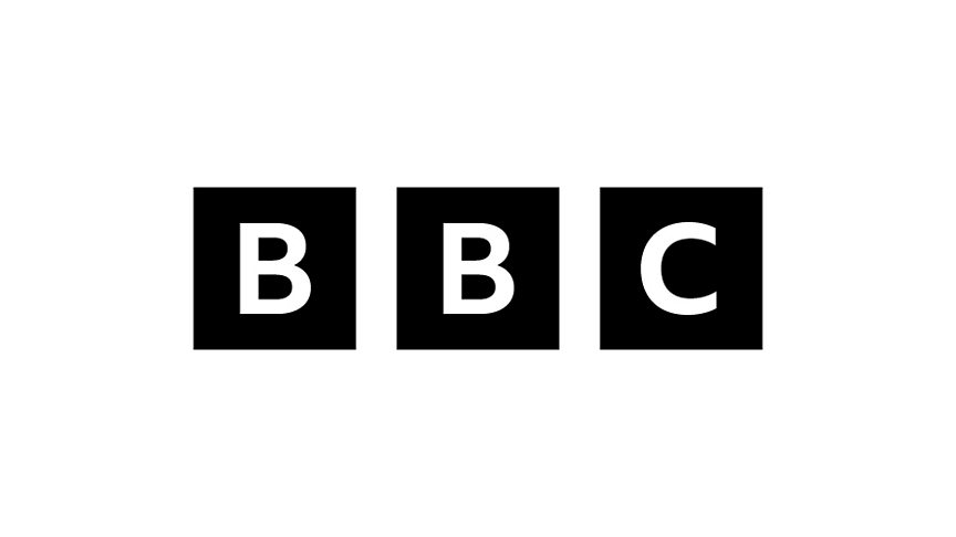
The current BBC logo also sports a clean bespoke sans serif typeface. The BBC Reith font family is named after the broadcaster's founder, John Reith, and was introduced in 2021. But the typeface was based closely on the previous BBC logo, which used Gill Sans, a humanist font designed by Eric Gill and first released by Monotype way back in 1928.
Gill Sans was adopted for the BBC logo in 1997 to give a sense of robust authority and timeless reliability while also eliminating some of the problems with the previous logo, including the need for antialiasing when used at small sizes. Its flexibility made it ideal for using in infinite variations for different brands, departments and channels.
Benetton's Benetton Sans was also based on Gill Sans, while John Lewis and Tommy Hilfiger also based logos on the typeface. And a world away from these clean aesthetics, the Toy Story logo appears to be largely based on Gill Sans Heavy Bold, highlighting just how versatile this typeface can be!
03. The Nike logo: Futura Bold
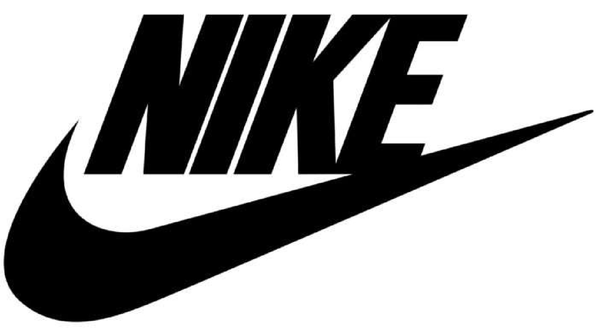
The Nike logo is so recognisable that the iconic swoosh is often used alone. But when the brand does use type, it's usually Futura Bold Condensed Oblique. This font's bold geometric letterforms make a big impact, while the slant amplifies the dynamism of the swoosh, conveying a message of speed and athleticism.
Like Helvetica, which we'll see shortly, Futura has been used as the basis for many, many bespoke brand typefaces with varying amounts of modification, from Absolut Vodka to Volkswagen. Supreme has created a business out of slapping its name on hoodies using a heavy oblique variant of Futura in white on a red rectangle.
04. The Microsoft logo: Segoe
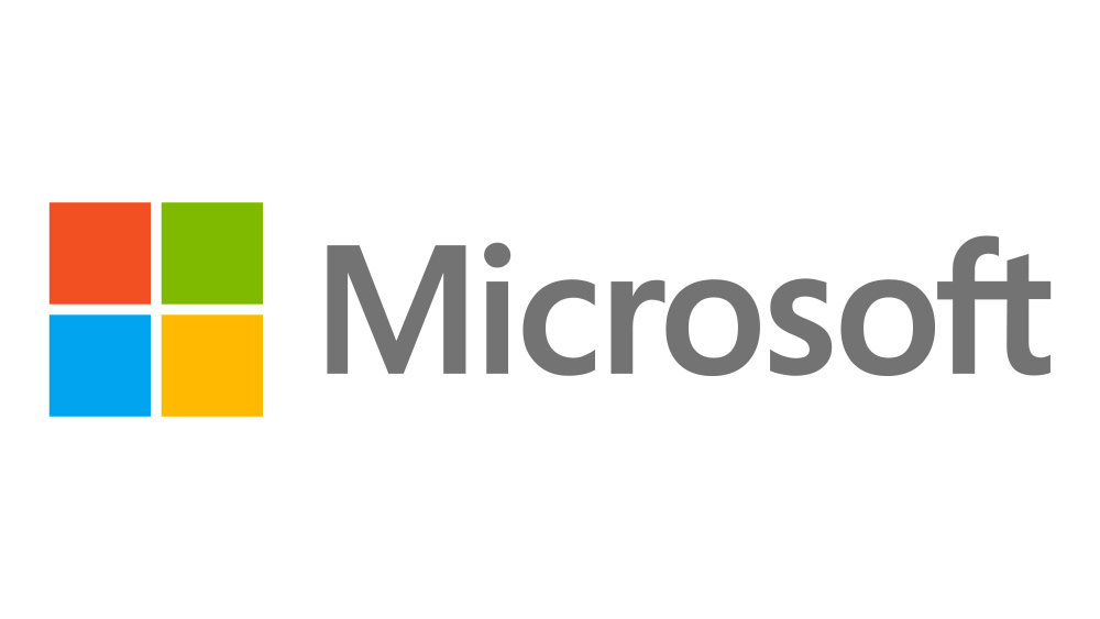
Designed by Steve Matteson for Monotype, Segoe is now a registered trademark of Microsoft. Along with the Segoe UI sub-family, it's used for everything from the Microsoft logo to brand communications and as the default operating system font in various Microsoft products.
Taking a humanist approach, the font was designed to be user-friendly across a wide range of weights. The kerning appears to have been tightened a little for the logo. The clean, legible look of the logo is very, very different from how the Microsoft logo looked in 1980. Unlike Google's Product Sans, Segoe UI is available for anyone to use and comes installed in Microsoft products like Word.
05. The Vogue logo: Didot
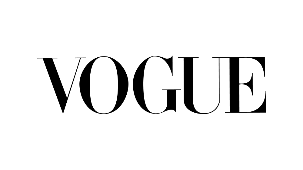
Typography is everything in the Vogue logo, which looks distinct despite using no colour or other visual elements. And yet it's not a bespoke typeface. Since 1955, the magazine has been using Didot, a digital font based on the work of the French type-making family of the same name in the late 18th century.
Typically, Didot can be challenging to use digitally because of the difference between the thicker and thinner verticals, which often requires optical sizing, but its refined, elegant feel is perfect for Vogue's identity, and for fashion branding in general – it's also used in the Zara logo (with some very heavy kerning!) Adrian Frutiger's Linotype Didot is available in MacOS.
06. The North Face logo: Helvetica
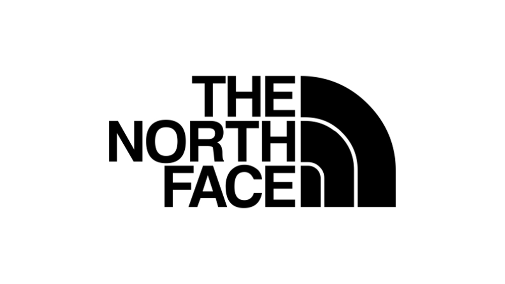
We've already mentioned Futura, but the absolute king of sans serif typefaces for logo design is Helvetica. It's just so versatile: bold and declarative when used in all-caps in The North Face logo, dynamic when used in italics in the Energizer logo, and friendly and approachable when used in two colours in the Kinder logo. It seems there's nothing that this eminently legible typeface can't do.
07. The Casio logo: Microgramma Bold
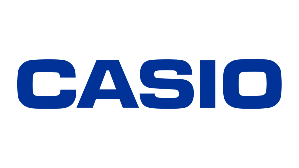
Casio Computer Co is one of those brands that's seen no need to do anything other than tweak the colour of its logo over the past few decades. It's been using the same classic logotype since 1972, and why change when you have an asset that's so recognisable?
The logo appears to be based very closely on Microgramma Bold, which was designed by Aldo Novarese and Alessandro Butti for the Nebiolo Type Foundry in 1952 and became popular for technical illustrations in the 1960s. The wide, blocky but rounded sans serif characters remain a perfect fit for a brand most famous for its calculators and digital watches.
Today, the font has the slightly retro feel typical of anything that was considered technological or futuristic in the 60s and 70s. That's enhanced by the fact that the typeface was used heavily in in sc-fi movies and series, including Alien and Star Trek. Novarese also designed the very similar Eurostile, which added lowercase letters.
08. Calvin Klein: ITC Avant Garde Gothic
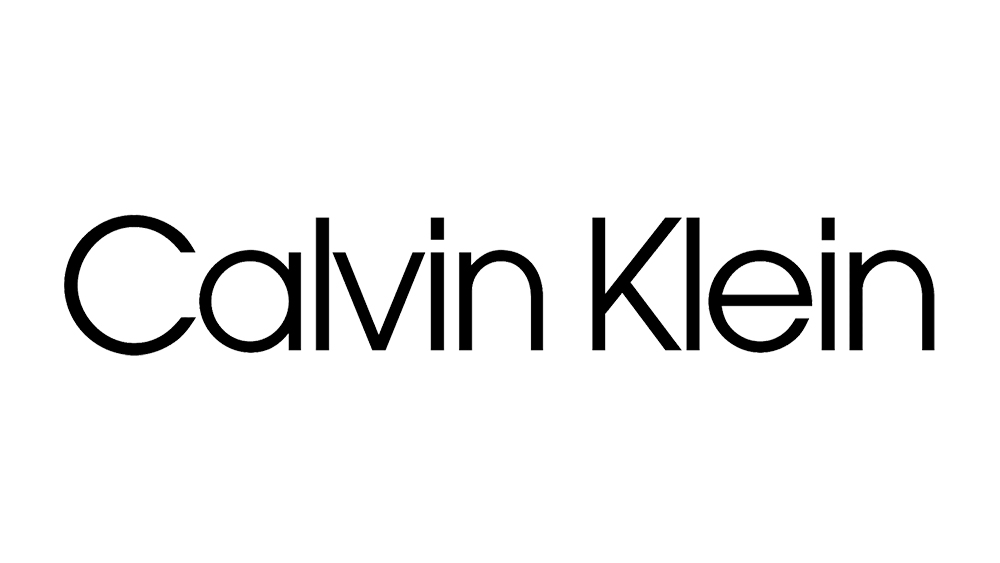
Calvin Klein's changed its logo several times over the years, tweaking the weight of the letters and even going all-caps for a period. But it looks like all of the designs, including the capped logo used between 2017 and 2020 have been based on modifications of the same typeface: ITC Avant Garde Gothic. The clean sans serif fits the brand's minimalist approach, which has always emphasised a modern simplicity. Reduced kerning is used to look sleeker and more compact.
09. KFC: Friz Quadrata
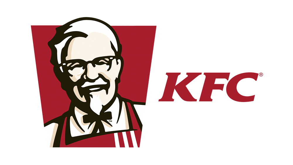
The KFC logo emphasises the brand's heritage and tradition, for which a serif typeface works perfectly. The font in question seems to be a modified version of Friz Quadrata, which was designed by Ernst Friz and Victor Caruso for Visual Graphics Corporation back in 1965. It's quite heavy for a sans serif, which makes it ideal for a short three-letter logotype, and it has enough detail to make those mere three letters look unique.
10. Twitter: Pico
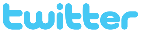
10. The Twitter logo: Pico
The Twitter logo is no more, but for anyone still wondering about that unusual font, it looks very much like the cute Pico Black designed by Masayuki Sato of Maniackers Design back in 2001. The exception is the 'e', which has been made to look more standard than Pico's option. Coincidentally, 'pico' happens to be Spanish for 'beak', which seems fitting for the blue bird. And the X logo? Er... it's just a unicode character (U+1D54F).
For more on typography in branding, see our piece on fashion's most unreadable logo design and our recap of the history of fonts in branding.
This article was produced as part of Typography Week, held in association with Monotype.