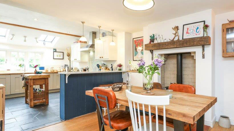
The renovation of our Edwardian cottage took around five years in total. This sounds like a long time - and it also felt like a long time! The reason why it took so long was that we did most of the work on a DIY basis, taking it from a dilapidated and cramped property to a bright and spacious home suitable for our young family.
Our budget was tight so wherever we could we shopped around for the best possible prices on both products and any labor we had to call in. That said, there were certain features and items that we were comfortable spending more on.
Here, I explain the five things we paid a little extra for in our house renovation in the name of quality and comfort and why I am still so happy we did.
1. Our composite bi-folding doors
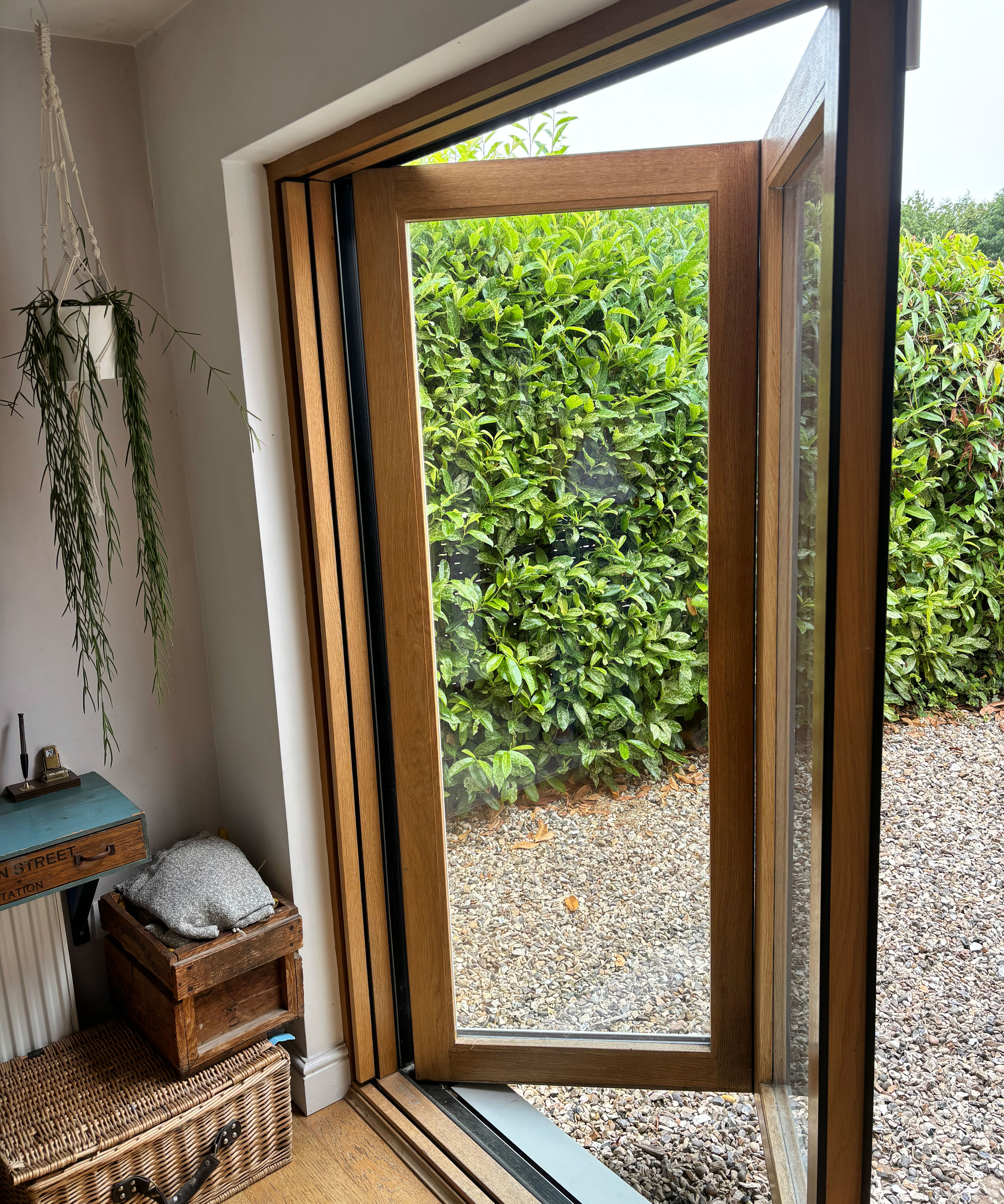
There are certain features and products in our cottage that, no matter how many times I see or use them, never fail to give me a little burst of happiness – and I count our bi-folding doors amongst them.
The doors lead from our snug out into the garden and we are aware there are cheaper bi-fold door ideas that we could have found – the thing is these doors are just so brilliant and we needed something a little extra for the doors that we were fitting in this room.
We sometimes use the snug as an extra guest bedroom. We have a daybed in there and the room leads off into a shower room too. We use a room divider, like this JAXPETY 4-Panel Wood Louvered Room Divider from Amazon, that clips between the arch that separates the snug and the dining area to turn it into little private sleeping quarters with access to the patio. All of this meant that we needed a way of shutting out the light that the bi-folds bring in.
Our bi-folds were from Centor. They have not only an integrated blackout blind which slides horizontally out of the frame where it hides during the day, but also an integrated fly screen that pulls out from the other side when needed.
Internally they have a warm oak frame while externally they have a low-maintenance powder-coated light grey aluminium frame so they really give us the best of both worlds.
They glide open beautifully and everything about them is easy to use. In short, I'll definitely be installing a new set in our next project.
2. Good quality paint
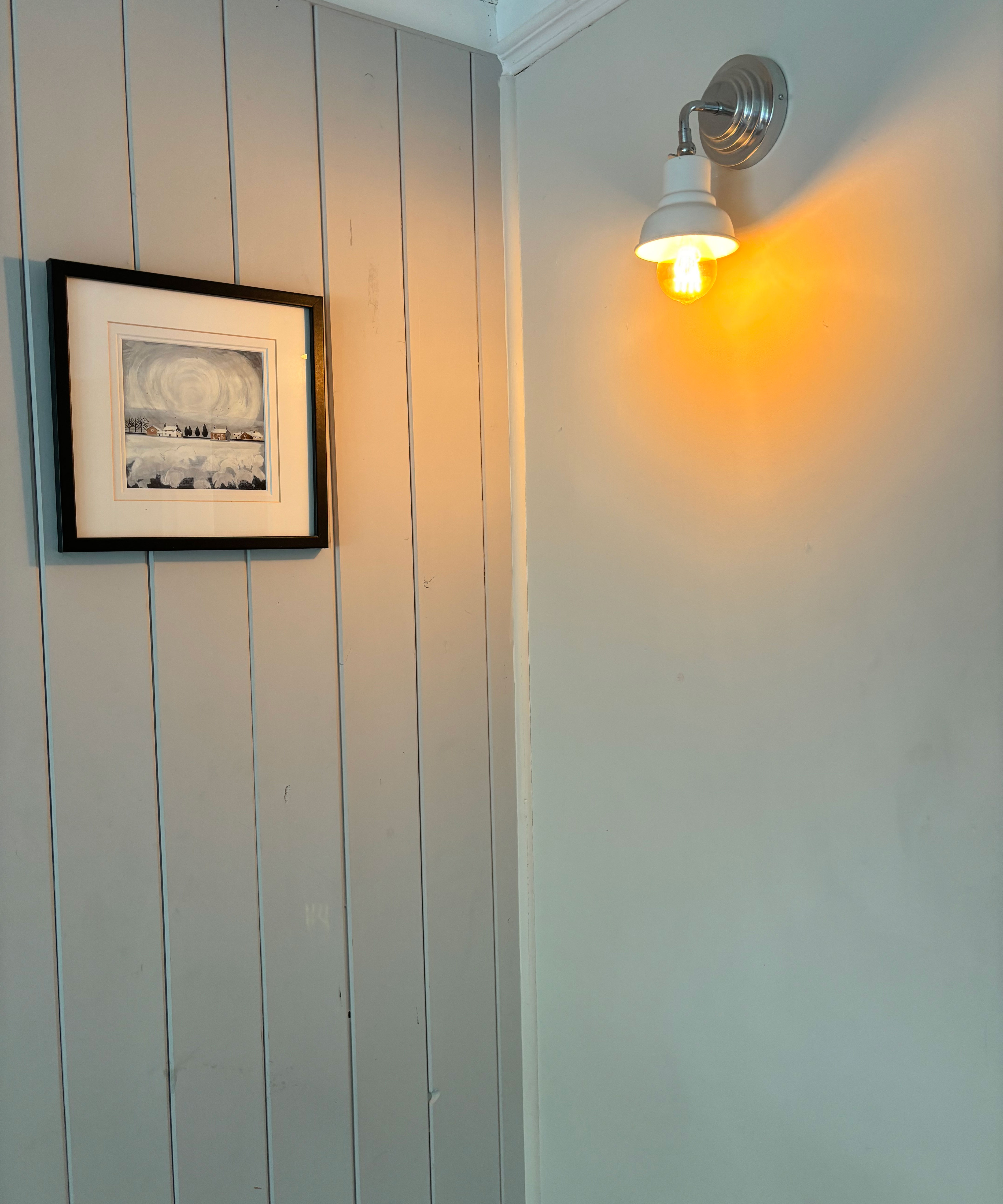
In some rooms of our house we used cheap paint – and my goodness you can tell. Not only was it hard to apply, but even though we were no newcomers to painting walls it went on patchily and required numerous coats. Right now I am staring at my very patchy kitchen ceiling and reminding myself it needs to be repainted soon – this time with good-quality paint...
Thankfully we learned our lesson pretty quickly after the unsatisfactory results we achieved in the kitchen and, when it came to painting the other rooms of our home, we invested in far higher-quality paints which went on like a dream and hardly seemed to need a second coat.
We mainly used Farrow & Ball, particularly in the principal rooms such as the living room and main bedroom. However, we did find that Valspar, available from Lowes, was a good, lower-cost alternative with a close color-matching service for other rooms, such as the kids' bedrooms.
3. Our wood burning stove
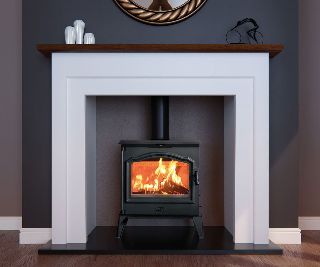
It never fails to amaze me how much heat our wood-burning stove kicks out – and how quickly after lighting it does this.
We spent some time researching the best stoves and ended up choosing one from Esse. While it isn't huge, it emits a serious amount of heat is an absolute cinch to light, and keeps burning. It is located in the dining area of our largely open-plan ground floor and manages to heat all of it effectively – far more so than the open fire that we have in our living room.
Our home is really cold – pretty much all year round, apart from on the occasional hot day when the first floor feels like an oven. Having this wood burner on the go almost makes it possible for us to turn off the central heating in the cooler months so it was definitely worth the initial outlay. We sometimes use a stove fan to help spread the heat out and the GALAFIRE 4-Blades Heat Powered Wood Stove Fan from Amazon is a great buy as it comes with a thermometer.
4. Durable, solid sanitaryware
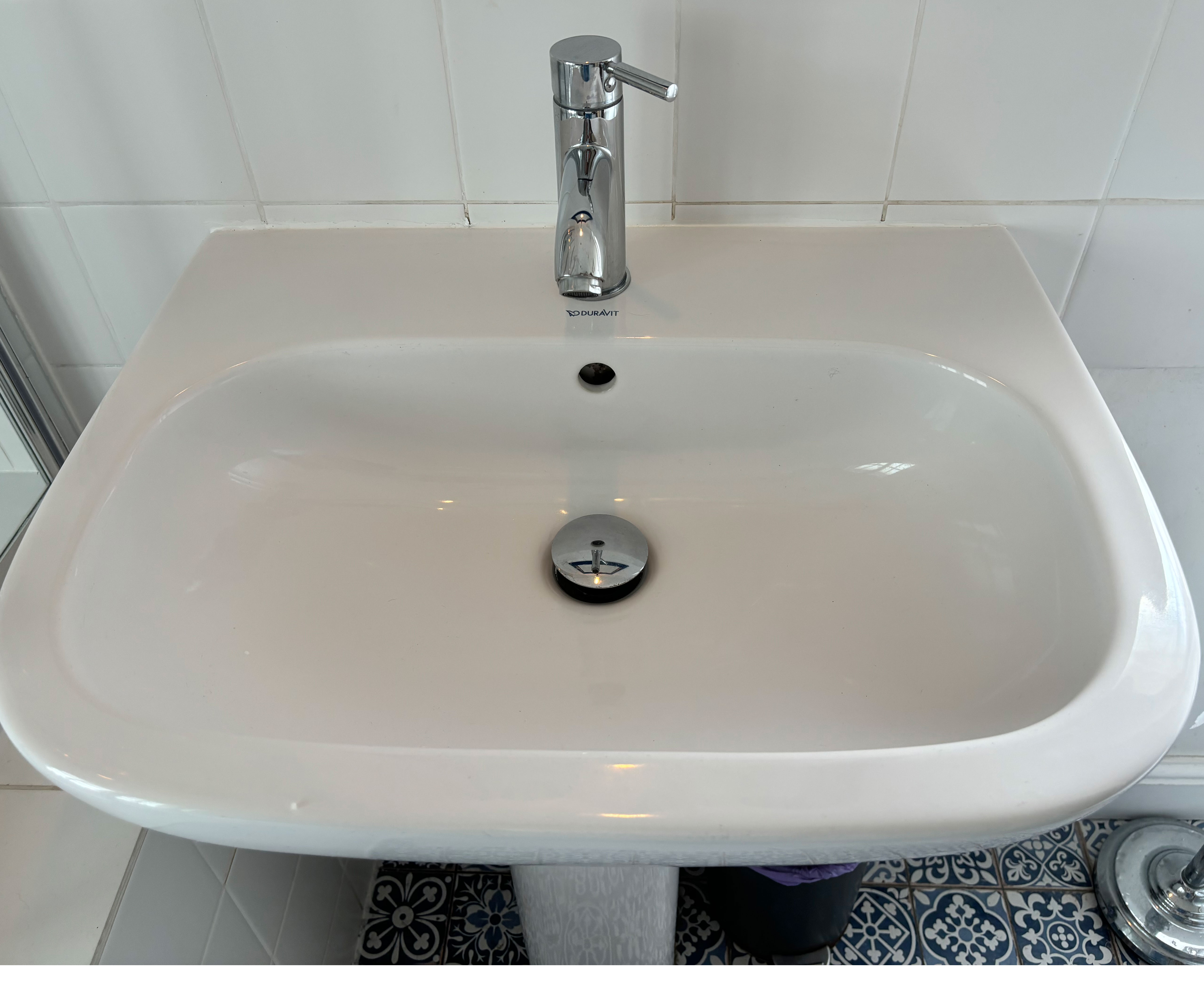
There are certain things that are just so worth spending a little more on in order to get something that looks and feels like it will last – and bathroom sanitaryware is one of them.
In both our homes we made sure we swerved the very cheap bathroom suites, which often looked flimsy or as if they would chip or crack easily. Instead, we opted to pay a little more for items that would last and those with a timeless design which we were certain wouldn't quickly date and mean us having to update the bathroom before necessary.
We opted for washbasins and toilets from Duravit's Happy D range. Our washbasins are a pedestal design which we chose as they had a classic kind of look. Next time I would probably opt for a built-in or wall-mounted model just because I like the clean lines they offer.
The bath was a steel model from Kaldwei which we set into a timber frame we constructed ourselves before cladding the whole thing in plain white tile.
I am happy to say that all the sanitaryware still looks as good as the day it was fitted – it has never chipped despite daily use from children (now teenagers), discolored or dated.
Next time we renovate I fancy going for something a little more contemporary, perhaps something like this Kohler Caxton Undermount Rectangular White Bathroom Sink from Lowes.
5. Nice light fittings
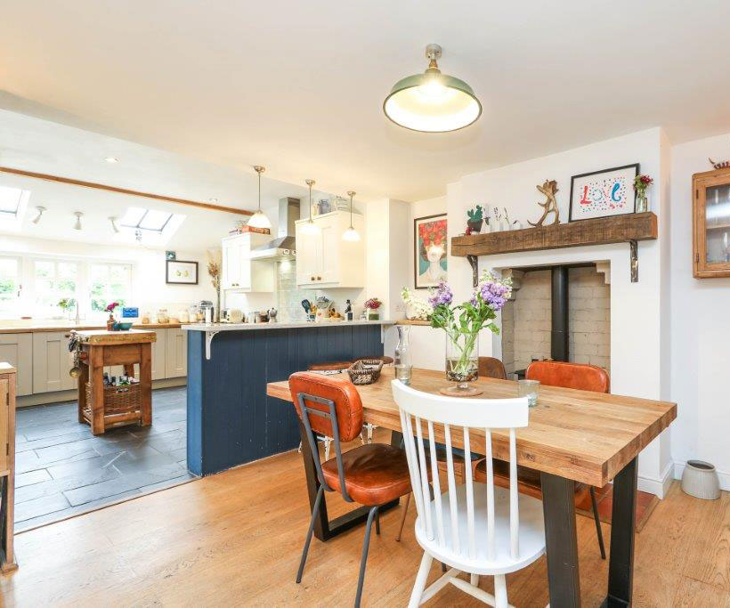
That old saying, 'the devil's in the detail' really rings true when it comes to home design. There are certain smaller fittings that I wish we'd spent a little more on actually – the white plastic electrical outlets that are visible, such as the ones on the wall over our countertops would have looked better in a brushed metallic finish, for example.
When it came to our light fittings we were adamant that they had to be just right and if that meant spending a little more then so be it.
For our kitchen lighting ideas, we have used several different light sources. Cream-colored enamel directional spotlights over the sink area, a range of recessed downlighters for background lighting, and three low-slung fluted glass pendants over the breakfast bar. I love all of these and the way they can be operated individually, depending on what's happening in the room, as well as altogether when needed.
In the dining area as well as in the main bathroom my husband found industrial light fittings online and sourced Edison bulbs (like GE’s Vintage Style LED 60-Watt Replacement Amber ST19 light bulbs from Lowes) to fit them as we wanted a rustic, exposed finish.
I love our bedroom lights – although we actually managed to save her. We made them by stringing corded flex out on hooks from a central fitting and suspending exposed bulbs from them.
While the lighting design ideas you opt for will obviously be tailored to your own style and home, I would really advise you to prioritize putting time and effort into the planning as well as being willing to spend a little more on the fittings you love.
Shop glass wall lights
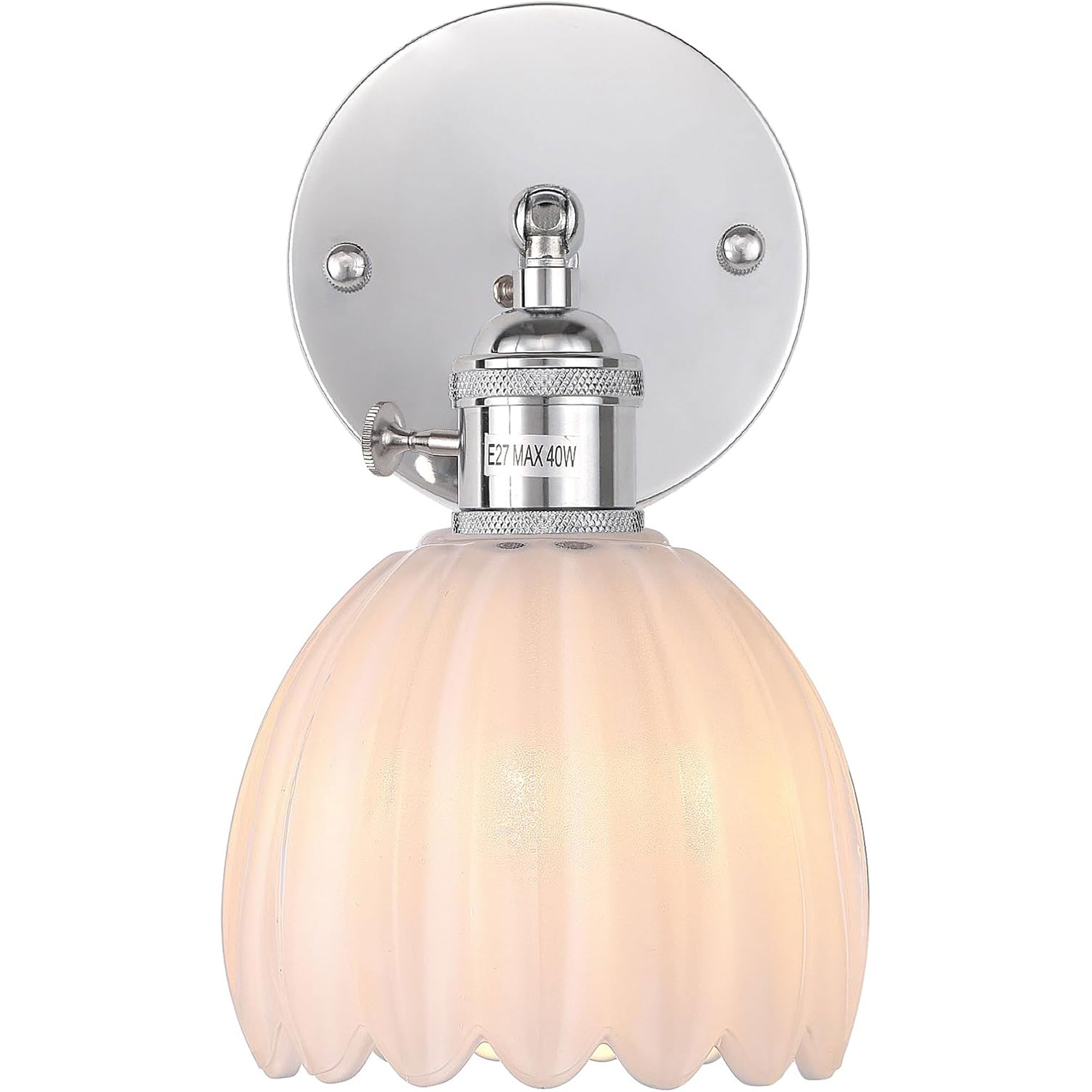
Price: $49.99
The pretty design of this glass tulip light is so elegant, plus it comes in lots of colors, including an on-trend green. It would look lovely in a bedroom, but either side of some artwork over a fireplace would be good too.
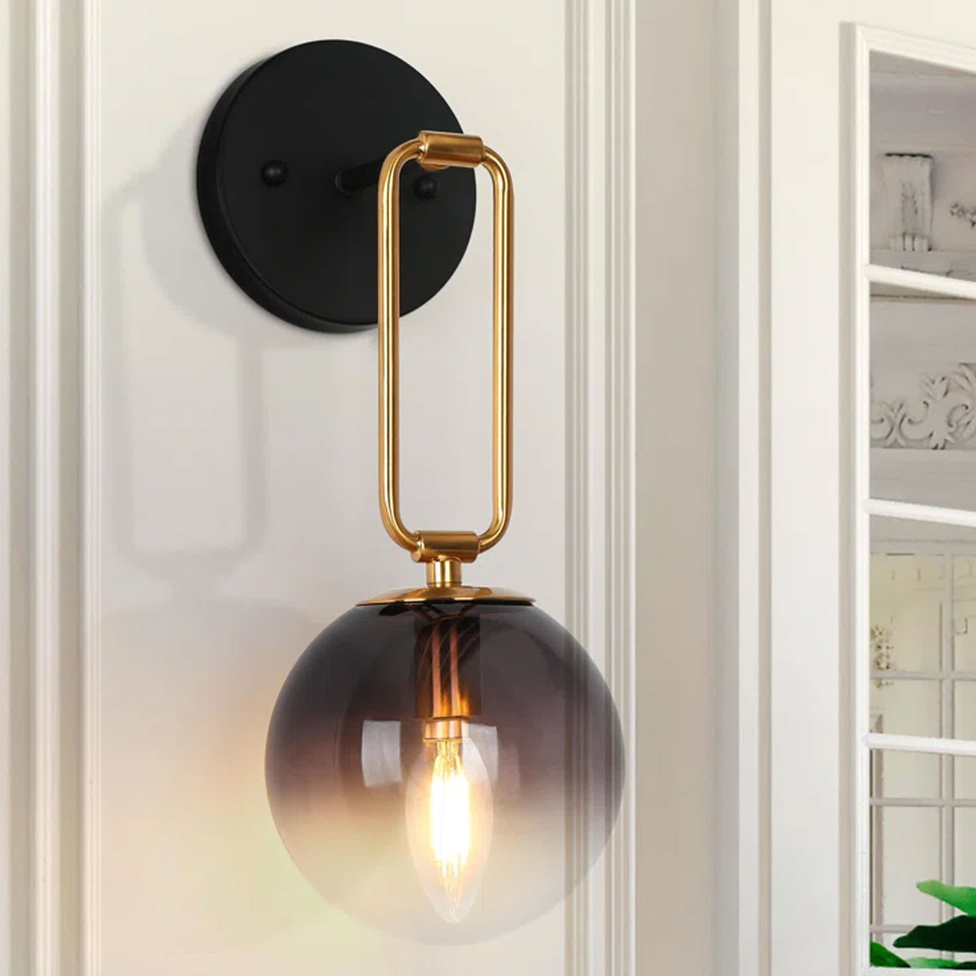
Price: $99.99
This wall scone manages to be both classic at the same time as modern, with the combination of black, brass, and smoked glass giving it a very striking appearance. Even better, you can fit it to shine either up or down the wall.
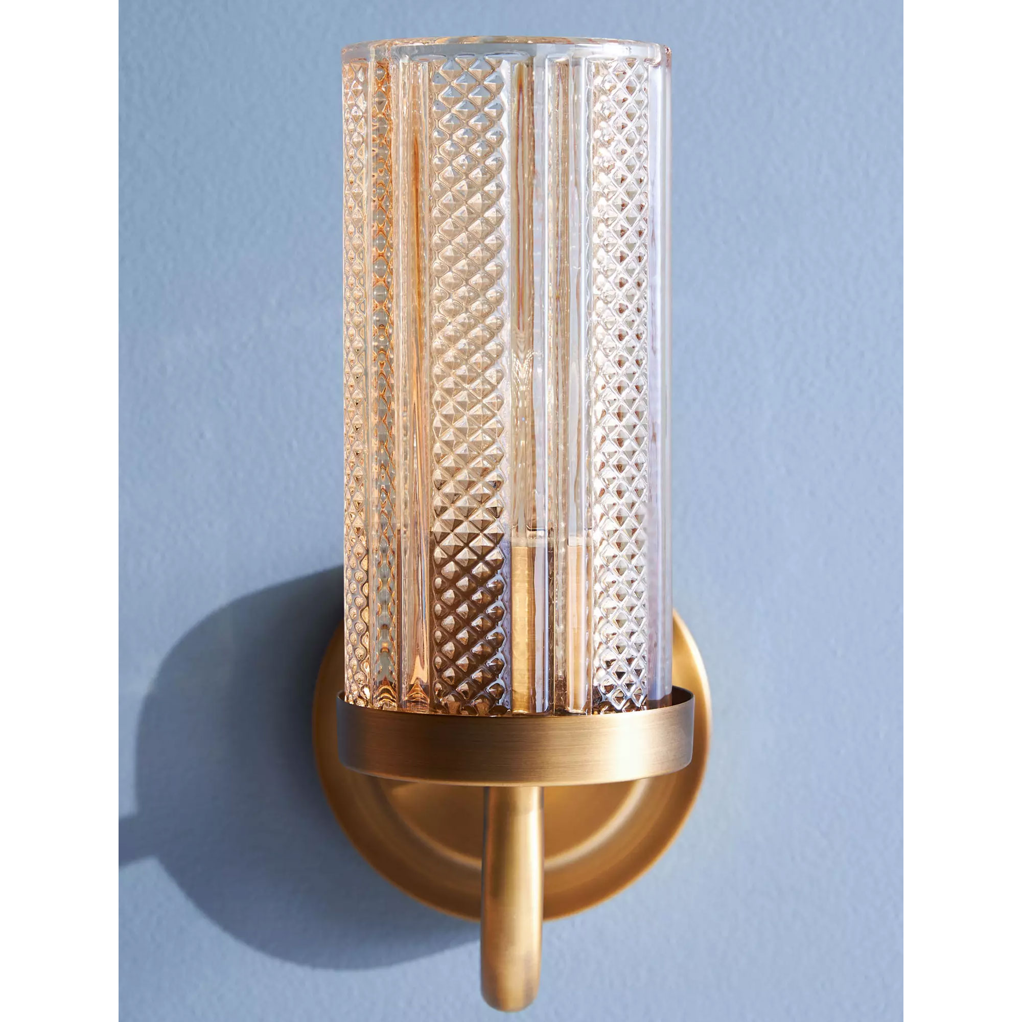
Price: $228
This stylish wall light features a lustered glass shade that gives it just a hint of an Art Deco feel. A pair would look amazing on either side of a bathroom mirror as would several in a row, lined up down a hallway or landing.
We took on the role of project managing our extension and renovation which was, at times, stressful. If you are thinking of doing the same, check out our guide on how to project manage an extension or renovation.


