Decorating our homes comes with a lot of decisions and doubt, even for the professionals. We sat down with interior design authority Emily Henderson to talk about how we can make a home that represents our interior design style, that feels comfortable, and brings us joy when we step inside.
Joining us on a call from her farmhouse sunroom in Oregon, Emily shares her rules for making a living room that feels cohesive, a bedroom that helps us drop off to sleep, and a kitchen that feels characterful.
'What's kind of annoying about design is it's both an art and a science,' says Emily, 'and if you know the science, you can go crazy with the art. But it's important to know the basics and then take the risks, right?'
Emily Henderson's design rules for a beautiful home
If you know the rules, you can break them – here are Emily's design rules for a home that feels visually balanced, warm and soulful. We spoke to Emily as part of her work with Samsung Frame and the Samsung Art Store.
1. Choose large-scale furniture for small rooms
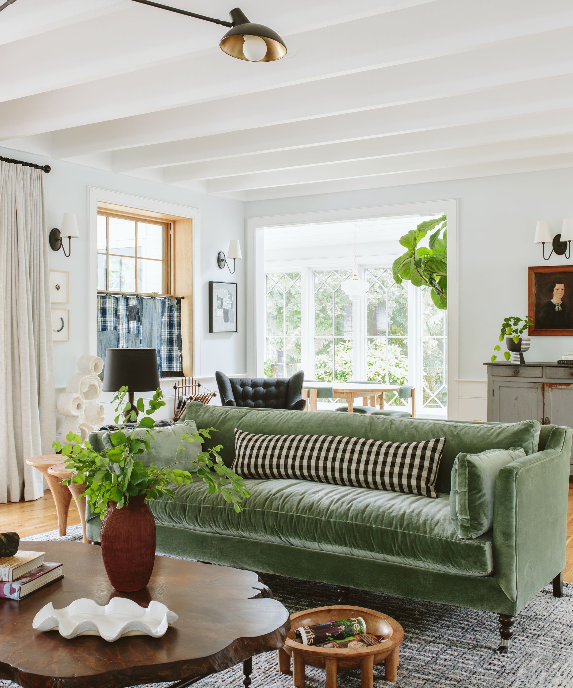
We often assume that a small-scale couch or loveseat is the only option in a small living room, and furniture of small proportions can definitely work, but Emily recommends doing the opposite.
'I used to say if you have a big room, get big furniture, if you have a medium room get medium furniture, small room, get small furniture, and that still generally is the rule, except with a small space,' says Emily. 'I have found that a small space with less, but larger furniture works so much better.'
So shoving the sofa against the wall, and making it big-scale and loungy will actually make your small living room look bigger, says Emily, and you'll use more of the square footage of the room that way.
A U-shaped sectional maximizes the floor space that you can actually use and creates a social and cozy conversation area.
This sofa comes in four different fabrics, including leather, crypton, linen and velvet, meaning you can customize it to your fabric requirements. It also comes in a number of different colors.
We love the laid-back shape, relaxed linen, and soft and subtle color of this couch. There's up to 30% off sitewide at Serena and Lily right now, so you can save on all of their fabulous sofas.
2. Thrift vintage artwork
Who hasn't felt totally overwhelmed when choosing artwork for their home? Emily says that she has 'huge compassion' for people when it comes to picking art for their homes because the feeling that our art needs to 'represent' us can be all too much pressure, and so we end up with boring blank walls.
An easy way to get over the decision paralysis, she says, is by decorating with vintage: 'I think the more vintage people can buy the better – it is way less of a financial commitment and does so much more for your home than buying something new.'
Emily goes on to say that in her 20s, she had zero budget, and everything she bought for her home was 'weird and funky, but full of creativity.' Nowadays, the designer collects artwork from local artists she loves, but in the past, she would find affordable, vintage botanical art at flea markets. 'I love vintage portraits and vintage seascapes and all those things can be affordable, it just takes time,' she adds.
3. Choose the right rug
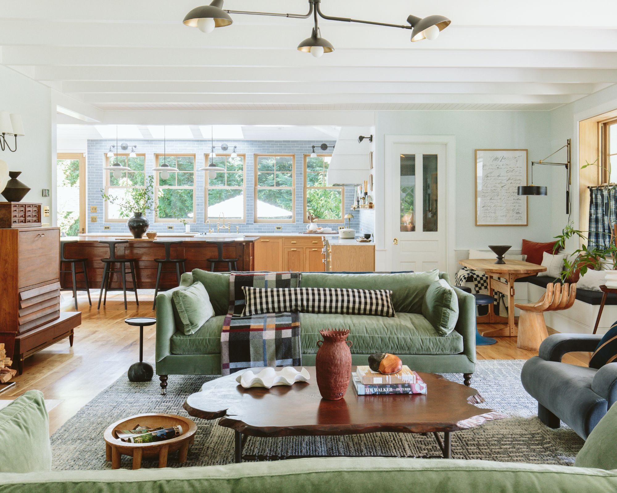
If your living room feels unfinished, it might be that it's lacking in visual balance. The key to fixing this common design dilemma is to ground everything, and large area rugs are one of the easiest solutions.
'The "too-small rug" is a big old problem,' Emily tells us. 'I think that people think that rugs are bigger than they are when they order something.' For instance, she says we often think an 8' x 10' rug will be big enough, but it's not big enough for most living rooms. 'It's tricky to lay out a room in a proper way, and getting a big enough rug that really grounds the conversation area will help the whole room feel more balanced.
'So just making sure you scale your rug big enough for your conversation area – not all the legs have to be on the rug, but ideally, your front legs would be, and then placing it so that the front legs of your sofa are – you don't want your full sofa on and then your chairs off. You think that's obvious, but it's not, there are so many times when I'm just like "Oh, we need to do some adjusting!"'
4. Design for how your life is right now
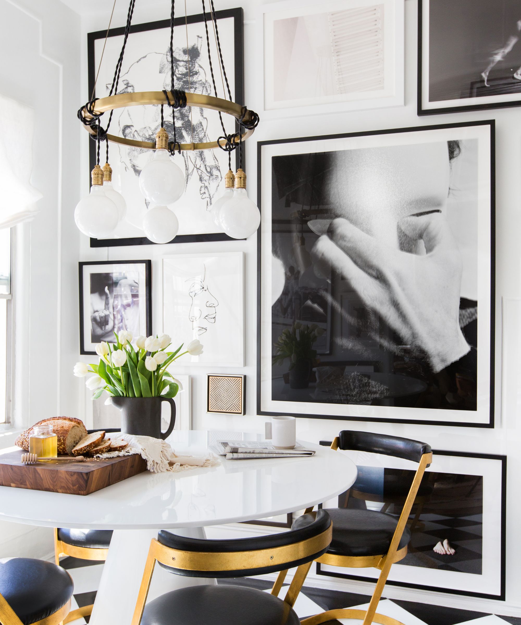
We spoke about the interior design trend for furniture you definitely don't want to sit on, like the Gufram Pratone chair, the bold use of pattern and color we often see on our social media feeds, and the fact that we can appreciate them without wanting to replicate them at home. Because, as Emily explains, what we need from our home might be more low-key and minimalist.
'Our last house was really warm and minimal and I loved living in it, truly, but it was kind of boring for other people to look at,' she says. 'Even my kids were like "Where's the color?" and I'm like, "We don't do color."
'My kids were toddlers at the time, and my life felt so chaotic, it was a mountain house so it was our second home, and when I would go there I was like, "Oh my gosh it feels so great that there's no stuff to put away."
'So when we were designing in this house in Oregon, where it's kind of grey outside and it rains, we spend a lot of time inside, so I wanted it to have more color and pattern and just to feel more eclectic and warm.'
5. Use symmetry for a restful bedroom

We asked Emily if she agrees that symmetry and balance are important when creating a restful bedroom, and she described how she went from using a quirky chair and a stack of books as a nightstand, inspired by her time as a stylist, to getting two more standard nightstands and lamps.
'When I got two matching nightstands and two matching lamps I was like, "Oh, this is a better bedroom," it just feels more calm and your eye doesn't have to figure it out, so your eye just knows, it can just calm down. If the goal of the bedroom is to calm down and sleep, symmetry helps that goal,' she says.
6. Every kitchen needs artwork
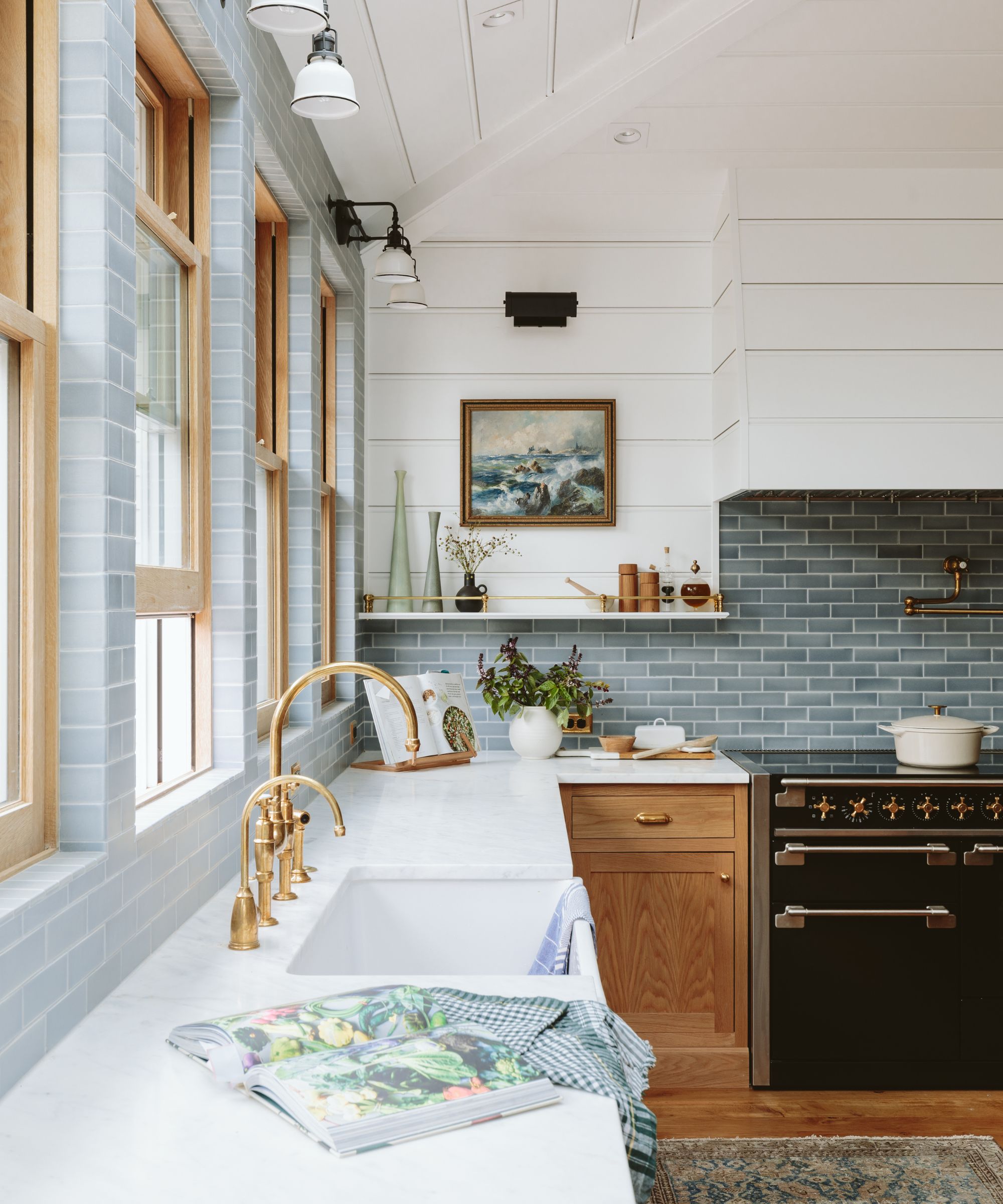
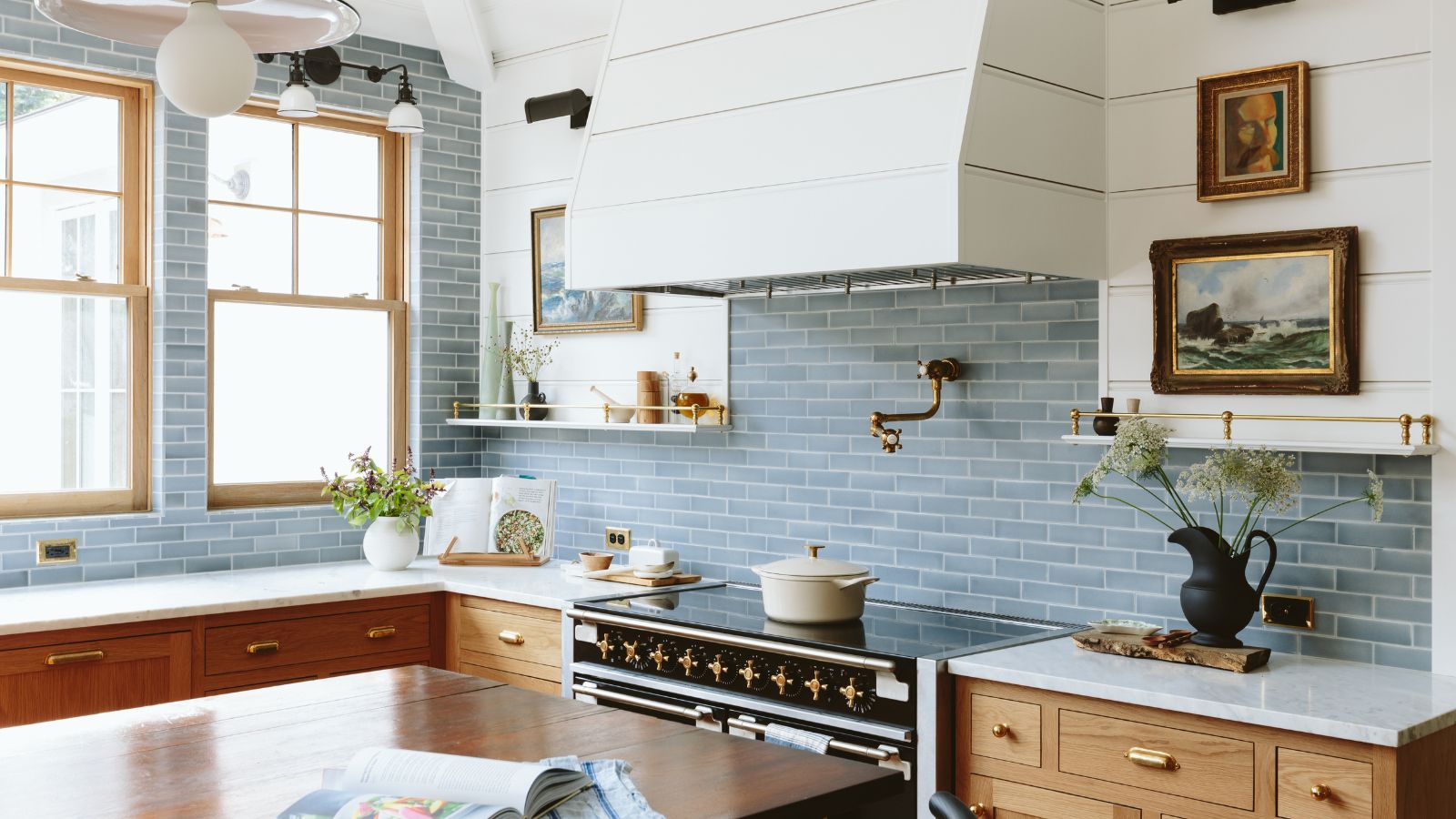
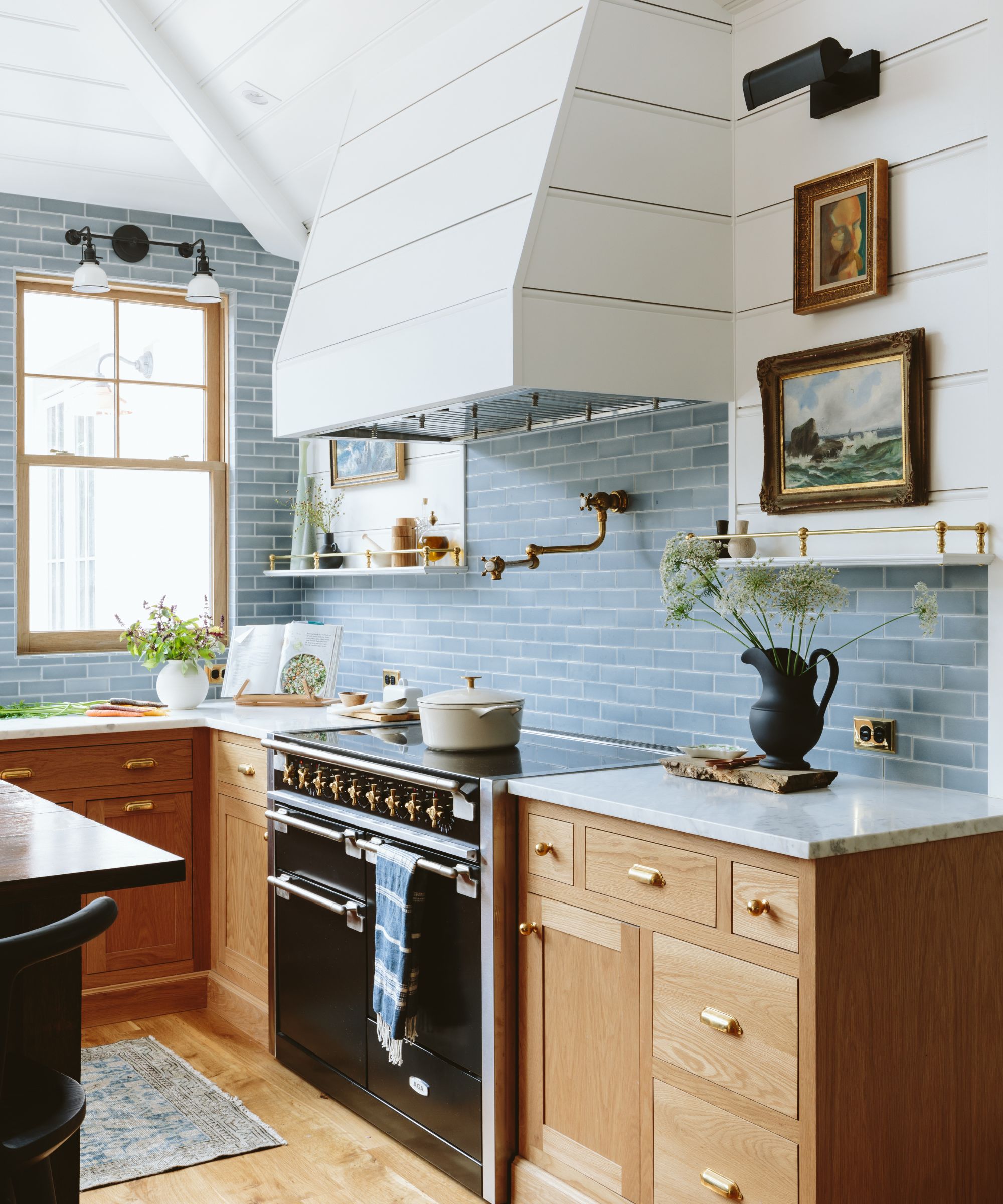
We sometimes forget how easy it is to make a kitchen feel cozy and characterful with art. For Emily, artwork in the kitchen is a must. 'I always put art in the kitchen, we've even put them on tile with Command Strips,' she says. 'I lean a lot of art, I love vintage oil still lifes of fruit, things like that. I think those are really fun in the kitchen.'
Emily designs kitchens to be timeless, and then uses artwork as a final layer, adding quirk and some very low-risk accessories that will make it look more current, trendy, or fun. 'Just stuff that you can switch out, and art is definitely the thing I lean on the most.'
This pack of 14 pairs of Command Strips holds up to 16 lbs and is practical for hanging artwork without any tools.
7. Make everyday items pretty
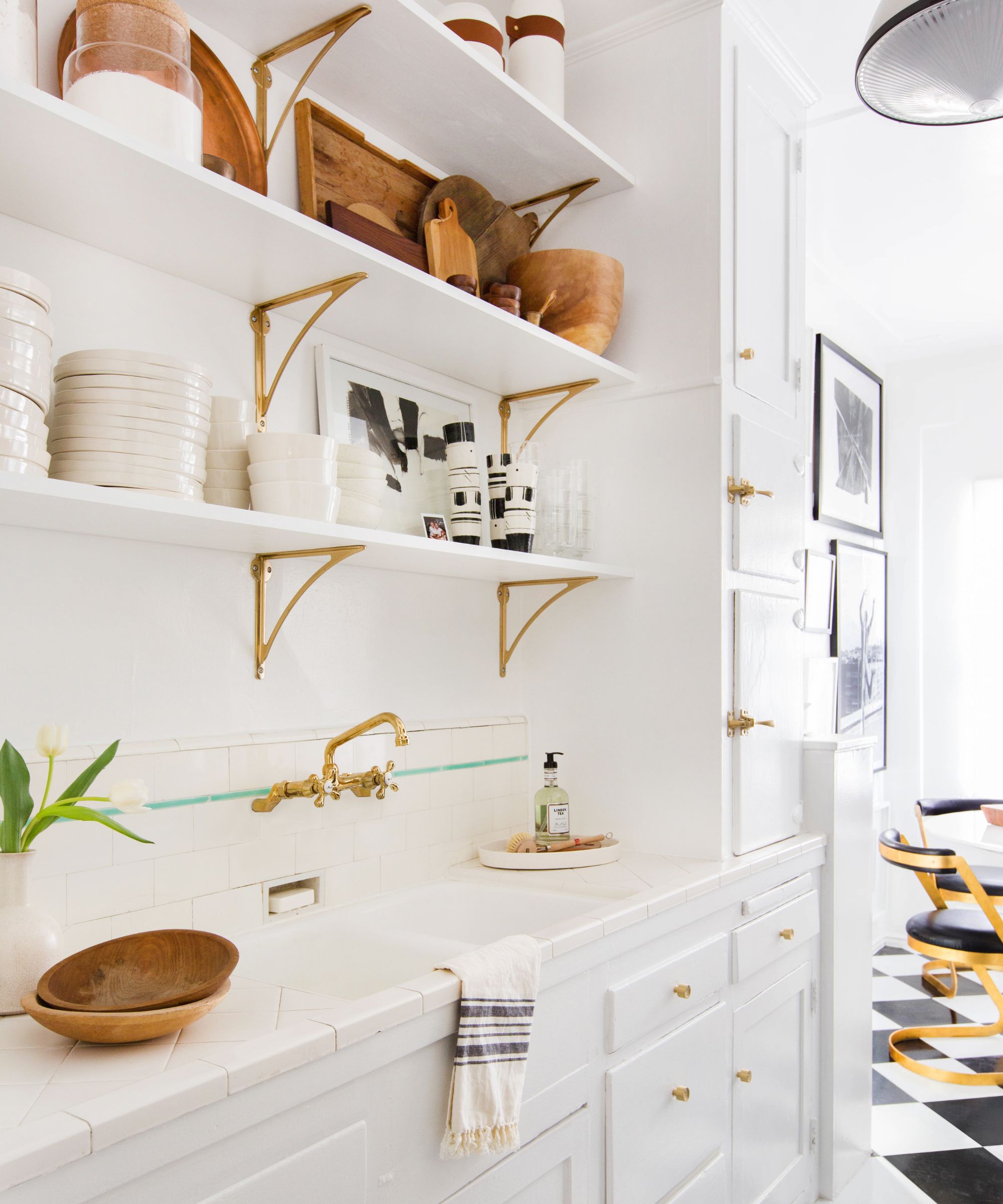
Aside from artwork, there are a few simple ways Emily makes a kitchen feel more soulful. 'I decant my oils and vinegar into pretty decanters – that's on my gift guide every year because it's not something you think to buy yourself, but it makes your kitchen counters look so much prettier,' she shares.
'I also lean pretty cutting boards, I open cookbooks on cookbook stands in the corner because I think that looks really pretty, and I cook from cookbooks so it's functional for me. I have a really pretty Chinese pot that I've had two decades that I put my utensils in.'
Seek out low-risk and inexpensive items that will add pattern, color and something vintage and it will always makes a space feel more soulful and homey.
What trends is Emily Henderson following in 2024?
'America is trying to go English so hard,' Emily laughs. 'The modern farmhouse style is on its way out but it's almost like the English cottage, the grandma and the grandpa vibe is what a lot of people here are going for.'
Think lampshades that are both pleated and patterned, and the kind of pattern clashing done by designers like Beata Heuman – Emily jokes that it's this kind of thing British people have always done is now a hot trend in the US.
'I never want people to think they have to stick to the rules but most people just want a house that they feel really good about, that represents their style, that's comfortable, that works for them and their family, and that they're not gonna regret making choices,' is Emily's perfect piece of parting advice.


.jpg?w=600)


