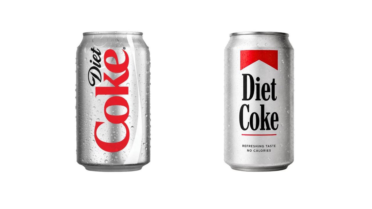
Yesterday we brought you the news that Coca-Cola has launched a new brand identity; a complete design overhaul by JKR with a strong focus on typography. This includes much more prominent use of the 'Better With' typeface created for the brand by Brody Associates in 2023. Originally created for a holiday campaign, the font is now featured at the heart of the brand's marketing and packaging.
But fans have quickly spotted an unexpected similarity. The somewhat retro serif font is being compared with the typeface for Marlboro cigarettes. It isn't the same font, but the similarity is undeniable – and plenty of social media users have pointed out the irony of a sugary drink brand seeming to take design cues from one of the most famously addictive products in the world.