Last year, Pepsi revealed a new brand identity, including a brand new (or is that old?) logo. With the trend for resurrecting heritage branding gathering page, we're seeing lots of big brands take a leaf from their own history books. But lurking within the Pepsi archives is something far more ostentatious than any of its actual brand assets.
The previous slanted 'globe' was introduced in 2008. But what not a lot if people know is that the design was accompanied by perhaps the most ridiculous, hilarious design document of all time – and people are still talking about it right here and now in 2024. (Looking for inspiration? Check out the best logos of all time.)
A leaked PDF offers an utterly mind-boggling glimpse into Pepsi's million-dollar rebrand from fifteen years ago. The design refresh centres around the word 'breathtaking' and, well, that's certainly one way of putting it. In a new interview with Fortune, Emily Zugay (who's behind some of our favourite TikTok logo parodies), says, "When these companies are spending thousands of dollars on these redesigns—even if it’s something that could take five minutes—they feel like they need to justify it, even to themselves, sometimes with a document like that: comparing it to the Mona Lisa to show this was worth the money."
The work in progress document was allegedly created by New York-based brand consultancy agency Arnell Group, and was leaked by an "industry insider" on Reddit in 2009. The whole thing is so ridiculous that some believe it's a hoax.
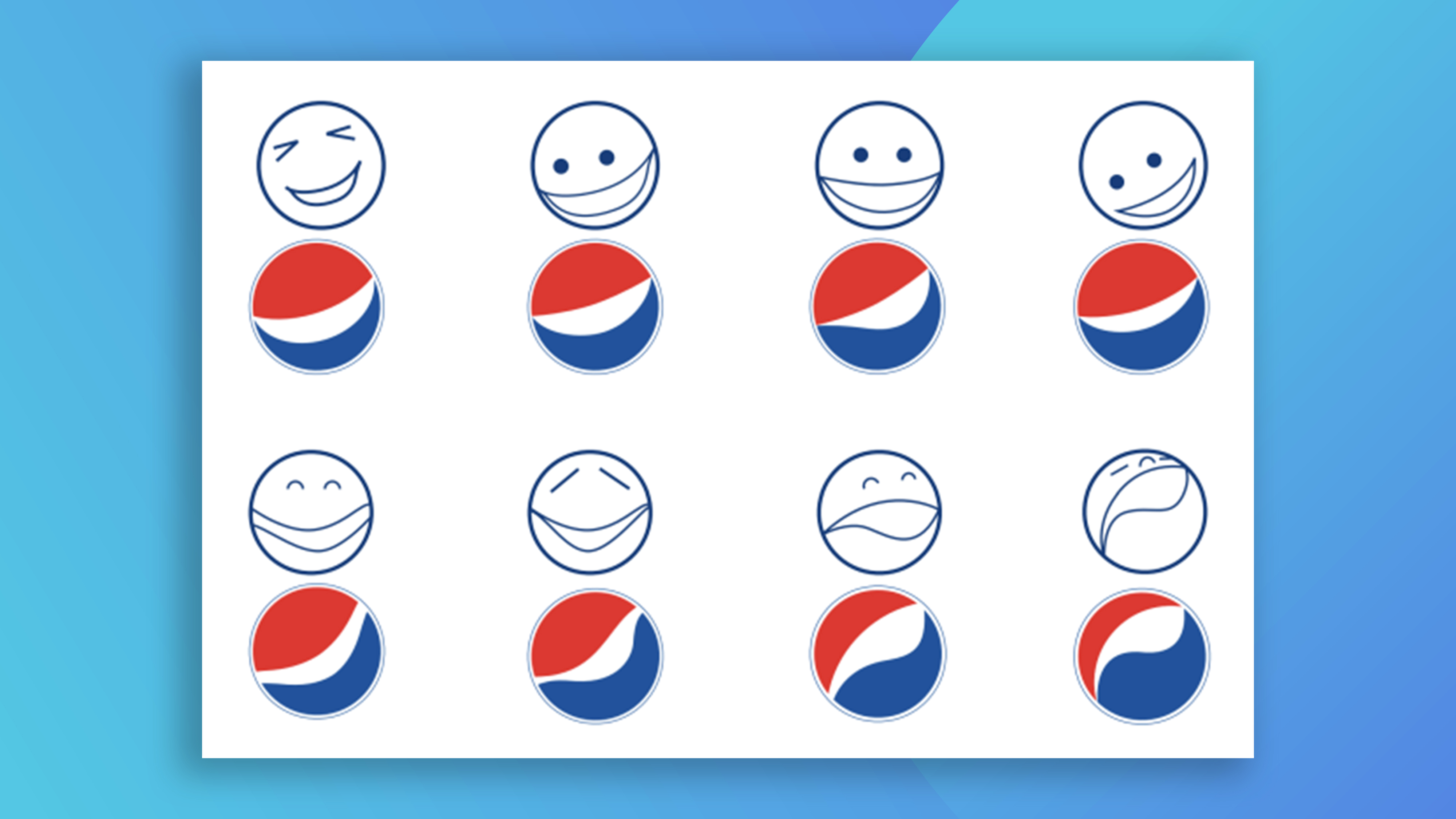
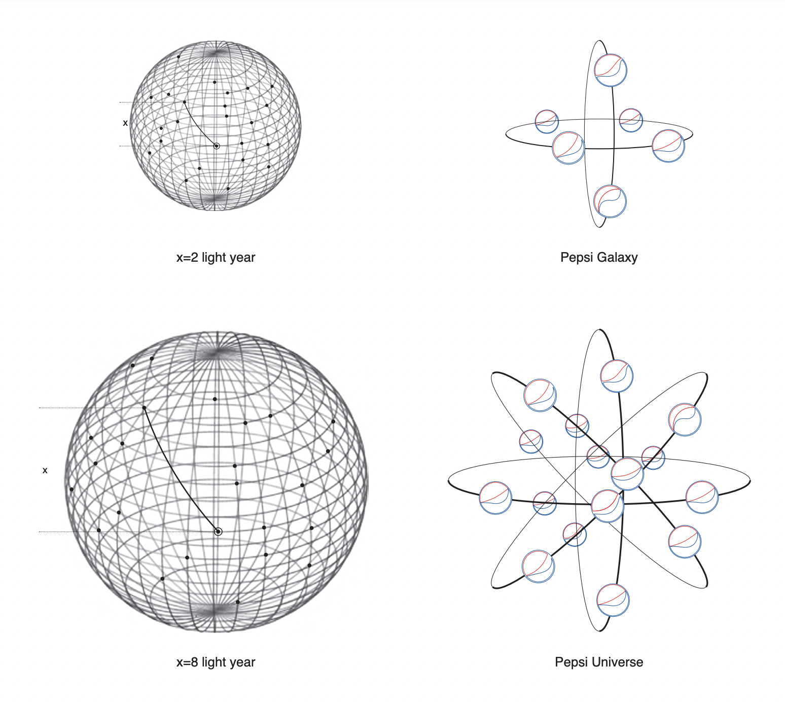
The 27-page document starts relatively normally. The designers talk about the golden ratio, and it's cool to see how those circles take inspiration from Pepsi logos throughout history. But things then move in some, er, unexpected directions. Things get deep.
goodbye to the pepsi logo whose designer was clearly insane https://t.co/ys0BP8M8rE pic.twitter.com/TfTsiXxq6bMarch 28, 2023
In memoriam to the last Pepsi logo, here's once again fragments of the utterly unhinged design document. pic.twitter.com/93JkVAcSjBMarch 28, 2023
the pepsi logo is getting replaced so lets all remember the Gravitational Pull of Pepsi in it's honor pic.twitter.com/VZN82W0EImMarch 28, 2023
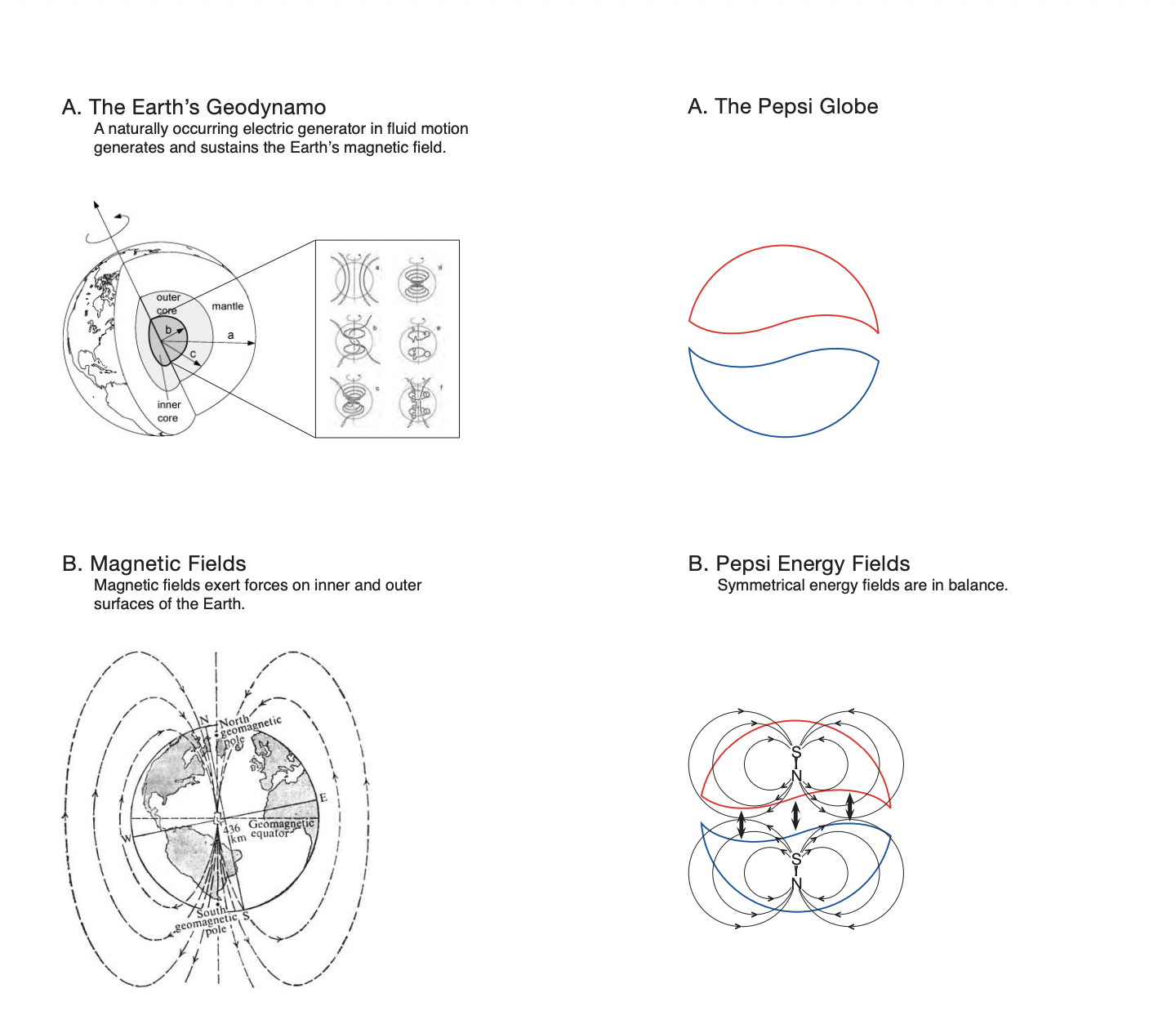
We're told about the "Emotive forces shape the gestalt of the brand identity". We are introduced to the Pepsi planet, the Pepsi galaxy and, of course, the Pepsi universe. We learn about the earth’s geodynamo – a naturally occurring electric generator in fluid motion which generates and sustains the earth’s magnetic field. And inspired the Pepsi logo, obviously. And perhaps the most preposterous claim in the entire document is that the Pepsi logo is based on the Mona Lisa.
And it seems Pepsi itself is keen to move on from the hilarious document. "Pepsi has constantly reimagined and reinvented our logo over the years—as a brand that is both timely and timeless we’ve evolved our look and feel just as our fans and consumers have evolved along with us,” the brand told Fortune this week. “The visual identity introduced in 2008 has been very successful for us over the past 14 years of the brand. That said, in 2023 we introduced the next era of Pepsi.”
Indeed, it's one of the most infamous documents in the world of graphic design, and it's just as outrageous today as in 2008. But thankfully, we're big fans of the new logo Pepsi unveiled last year.