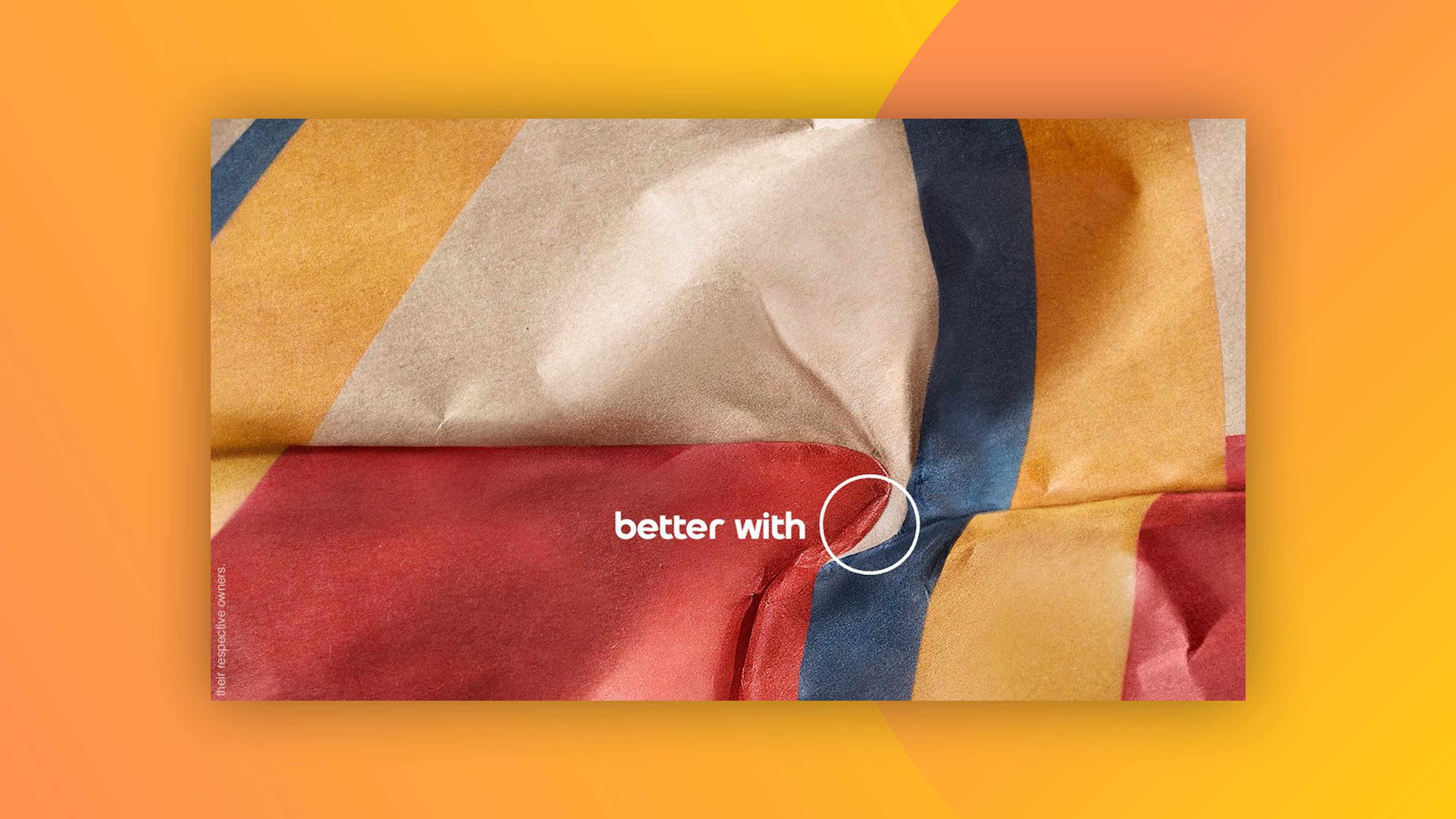
Pepsi might have unveiled a dramatic rebrand back in March, but the internet is still going wild for an ingenious print campaign based on its previous logo. Back in 2021, the soda brand launched a campaign showing its logo hiding in fast food restaurants – places where Coca-Cola is normally offered.
The ad has again (seriously, it's every other month) resurfaced on social media, and once again users are going wild for this fun, clever campaign. Across Twitter and Reddit, the ads are constantly doing the rounds – a clear sign that we might be looking at one of the the best print ads of all time.
Designed to commemorate National Burger Day (it's on 28 May, in case you didn't know), the ads are part of the brand's #BetterWithPepsi campaign, which launched earlier in the year to encourage customers to drink Pepsi with their burger, instead of the more traditional Coke.
Iconic marketing https://t.co/Q7lHEs7bx4March 11, 2023
Oh this is crazy good design https://t.co/Qrg8FTB27jMarch 8, 2023
And since the ads launched in 2021, they've enjoyed plenty of accolades, winning a ton of Cannes Lions in 2022. In a follow-up video (below), agency DDB Latina showed how the ads were created with the help of an origami artist who folded the wrappers of various famous burger chains.
Like Burger King's mouldy whopper ad, Pepsi's is a fun swipe at the competition. But if you have any suspicions that Pepsi might not take itself or its logo very, very seriously, just take one look at the brand's utterly ridiculous logo design guidelines.
Read more:


