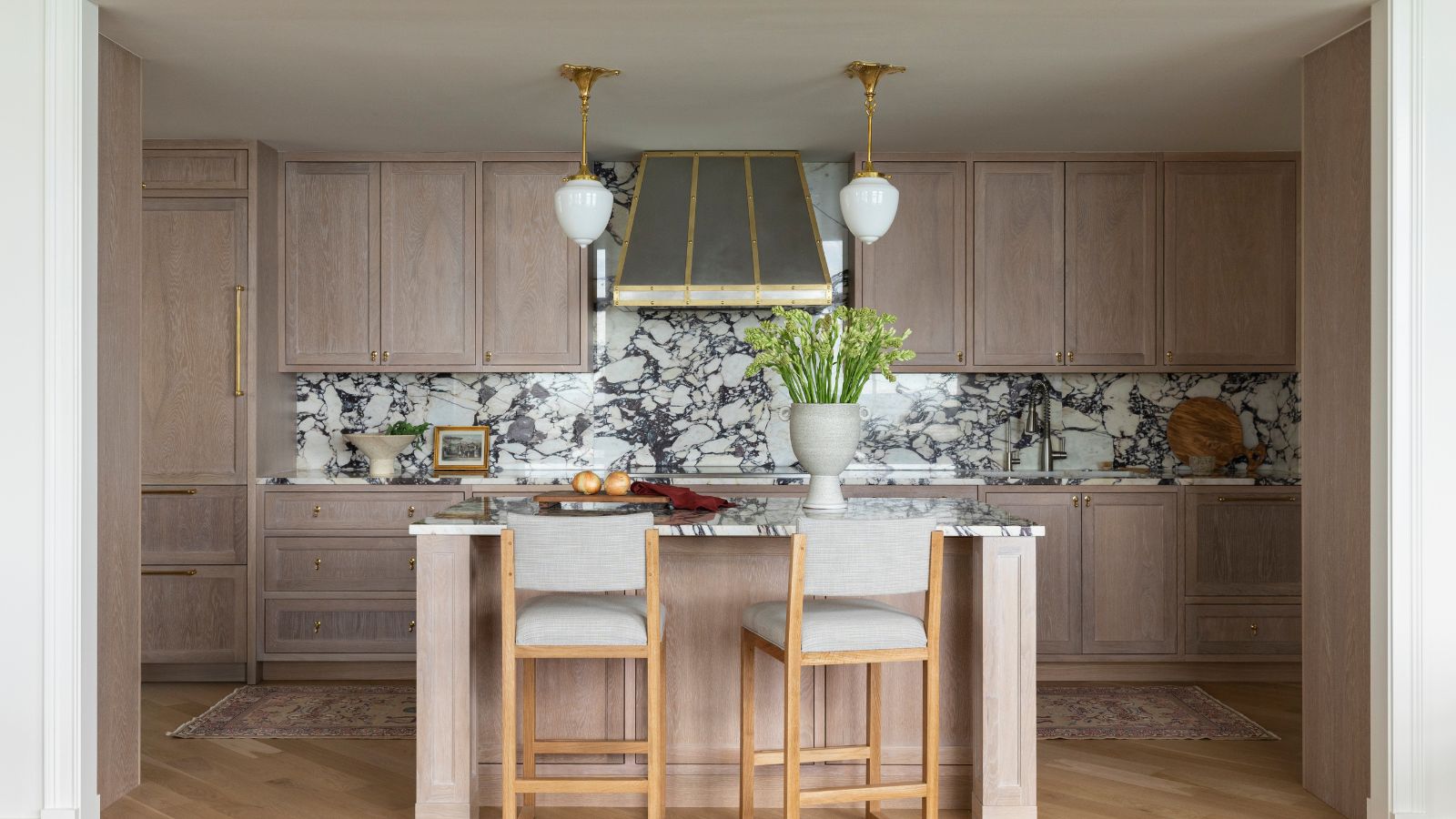
Overlooking Lake Michigan in a historic Chicago building, from the outside this high-rise condo was full of European charm and grand American style. The apartment block was built in 1926, but this particular home's interiors hadn't been touched for more than 40 years. Fast forward one year, and following a major renovation and redesign, the apartment is now truly one of the world's best homes.
We spoke to interior designer Caroline Turner, who brought about the apartment's transformation. She explains the thinking behind her choices and shows us around.
'When we took over, the unit’s interiors had last been renovated in the 1980s,' says Caroline. 'It was basically a white box in the sky. With the help of added architectural details and natural materials, we achieved a softer, more detailed look.
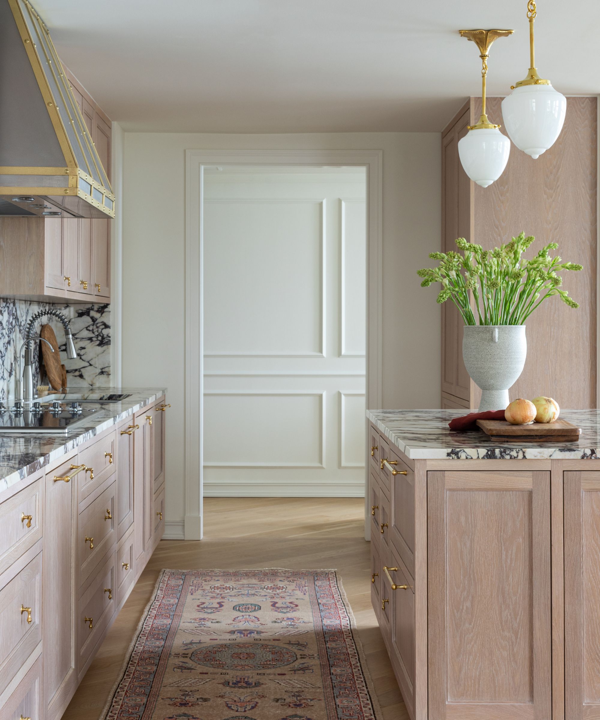
'The clients wanted a space that not only would grow with them but was personal, beautiful and easy to maintain,' says designer Caroline. 'They were looking for a luxurious and livable space. It was paramount to them that we used wholly organic materials to create a sense of unfussy sophistication.' With that in mind, kitchen ideas include striking calacatta viola marble counters and backsplash, solid wood cabinets and unlacquered brass lighting and hardware.
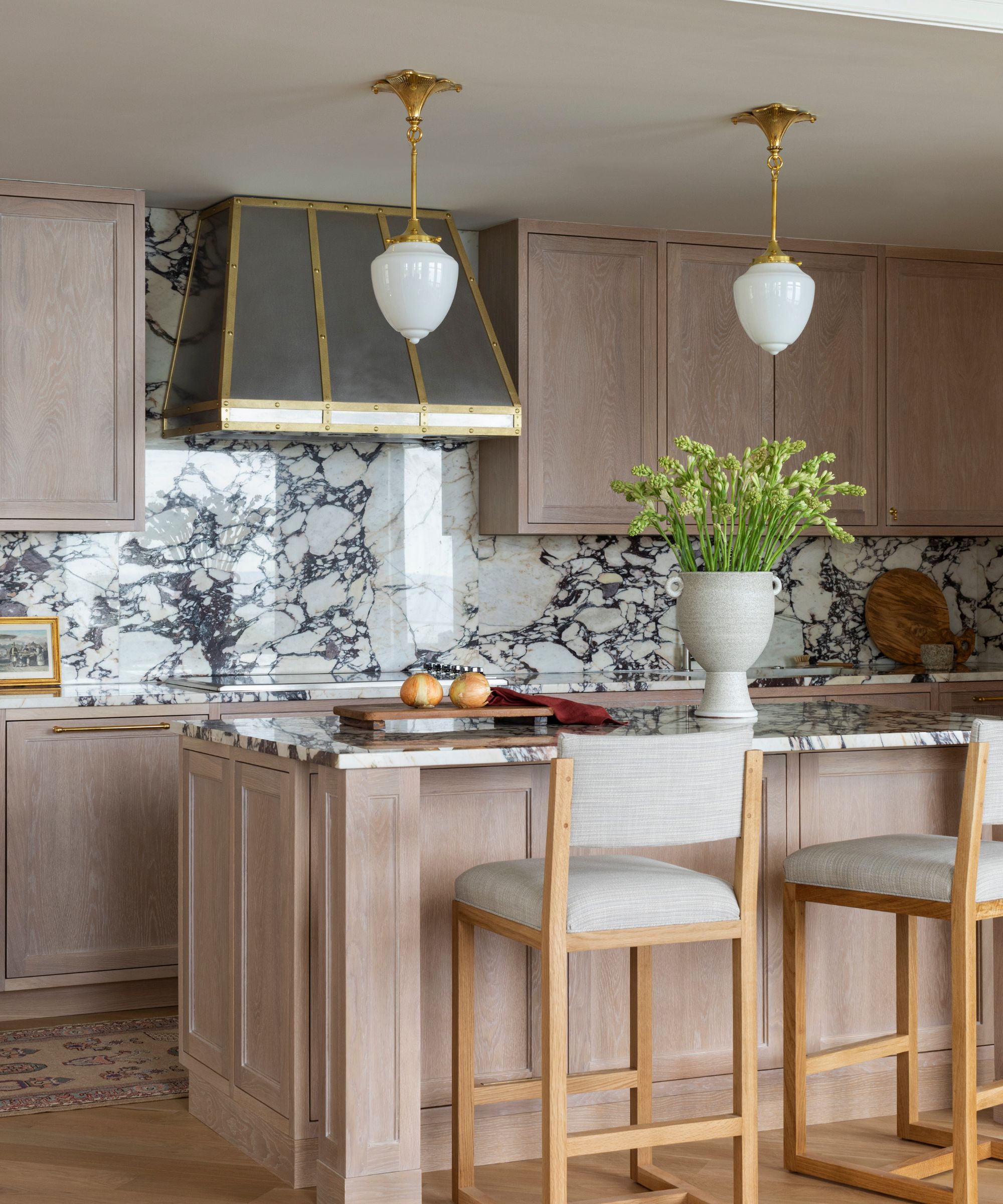
'The kitchen had probably the most dramatic overhaul. Originally a galley kitchen, the front wall was demolished to open the space and reveal the incredible view. However, instead of knocking the walls down completely, we created a cased opening so we could utilize the corners for full height storage,' explains the designer.
Millwork was designed by Caroline Turner Interiors and created by New Era Woodworks. The pendant lights are from Rejuvenation. Counter stools from Doorman Designs, and the cooker hood from Kitchen Kandy.
'I understood that architectural details would be essential to laying the groundwork for where we wanted to go. The client spent time in Paris and wanted the home to reflect European elegance while still being warm, comfortable and welcoming. We were inspired by the idea of a European aesthetic that still honors the Americana legacy of the landmark Chicago building,' says designer Caroline Turner.
The home opens straight into a gallery, so as soon as you set foot in the house, there's a first impression of strong architectural details, and of comfort and welcome, too.
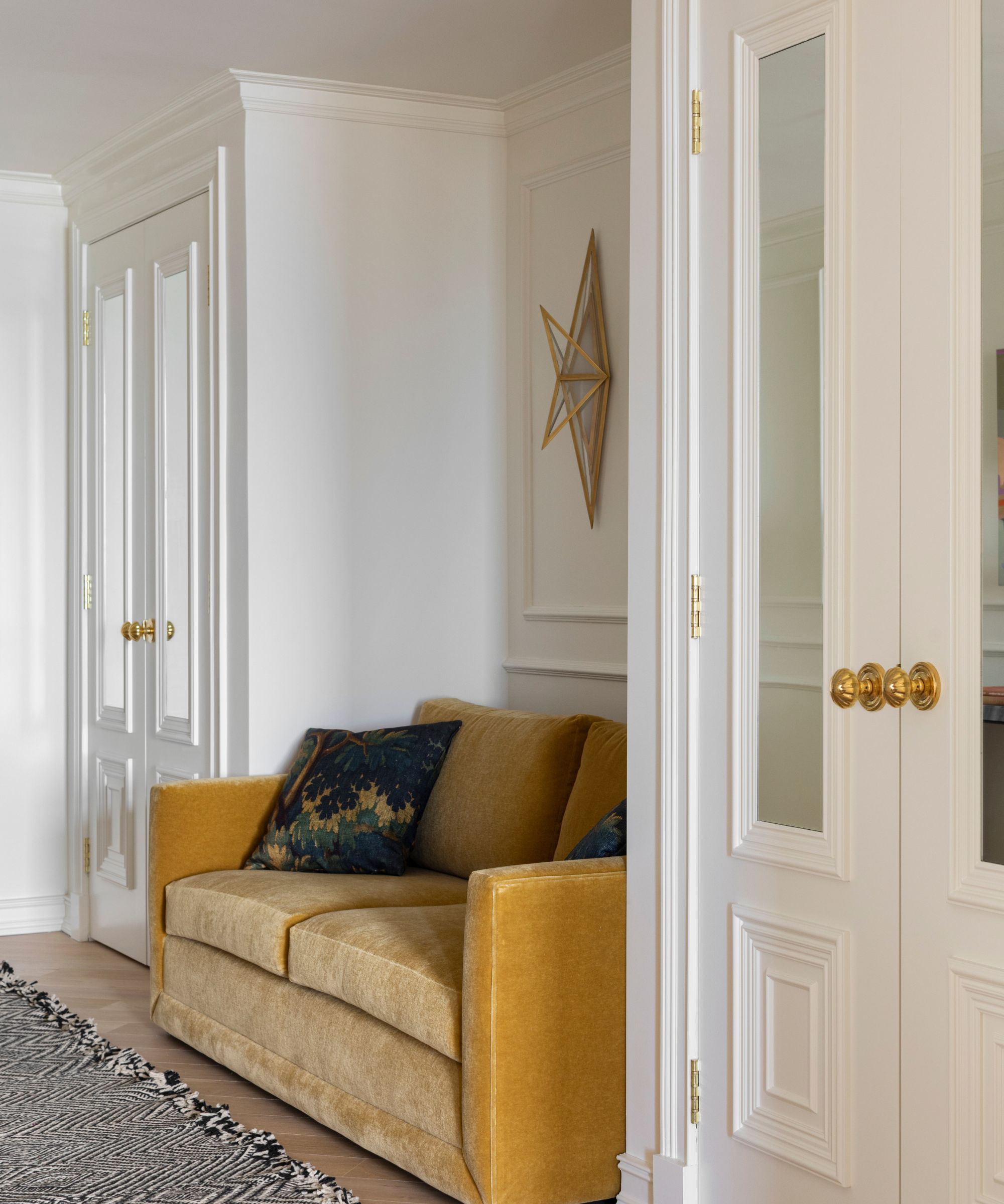
Explaining her hallway ideas, Caroline says: 'Originally the area featured a built-in console table flanked by two tiny closets. We removed the unnecessary built-in and replaced it with a mustard mohair sofa that acts as a cozy touchdown point when returning home. We expanded the closet size and added architectural details throughout with wall molding and custom mirrored doors.'
The sofa is from Maiden Home; sconces from Visual Comfort; pillow made in Dedar fabric; runner from Caroline Turner Interiors; walls painted in Swiss Coffee by Benjamin Moore.
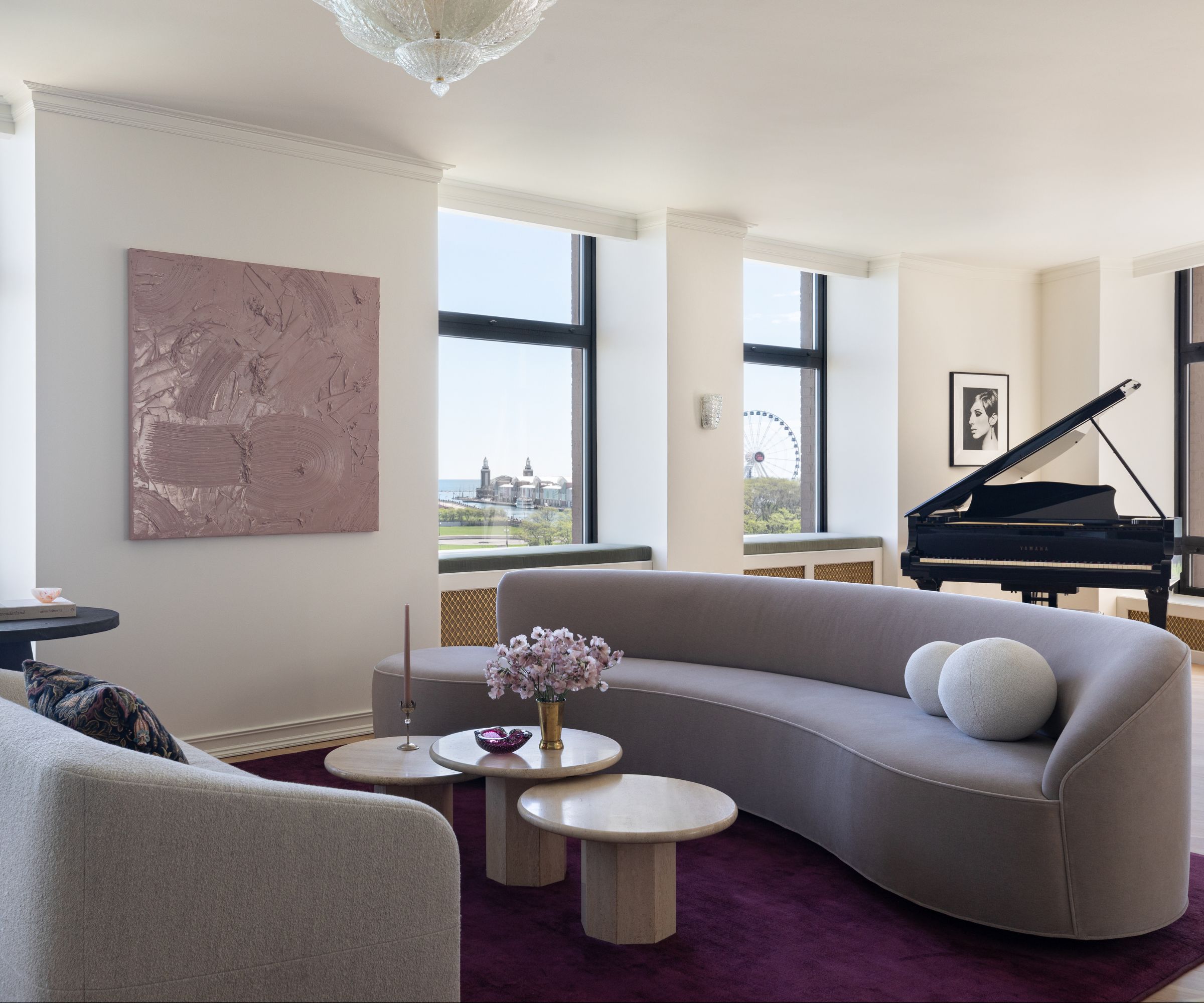
The main living, dining and kitchen spaces are open plan, and open to the gallery hallway, too. 'That connection meant that I needed to keep these spaces largely neutral. There was no termination point for the spaces to have their own identity or color story so I relied on form to help them stand apart,' says designer Caroline Turner.
Living room ideas include the following key pieces: rug from Stark; coffee tables, South Loop Loft; round black table, Crate and Barrel; paint, as before.
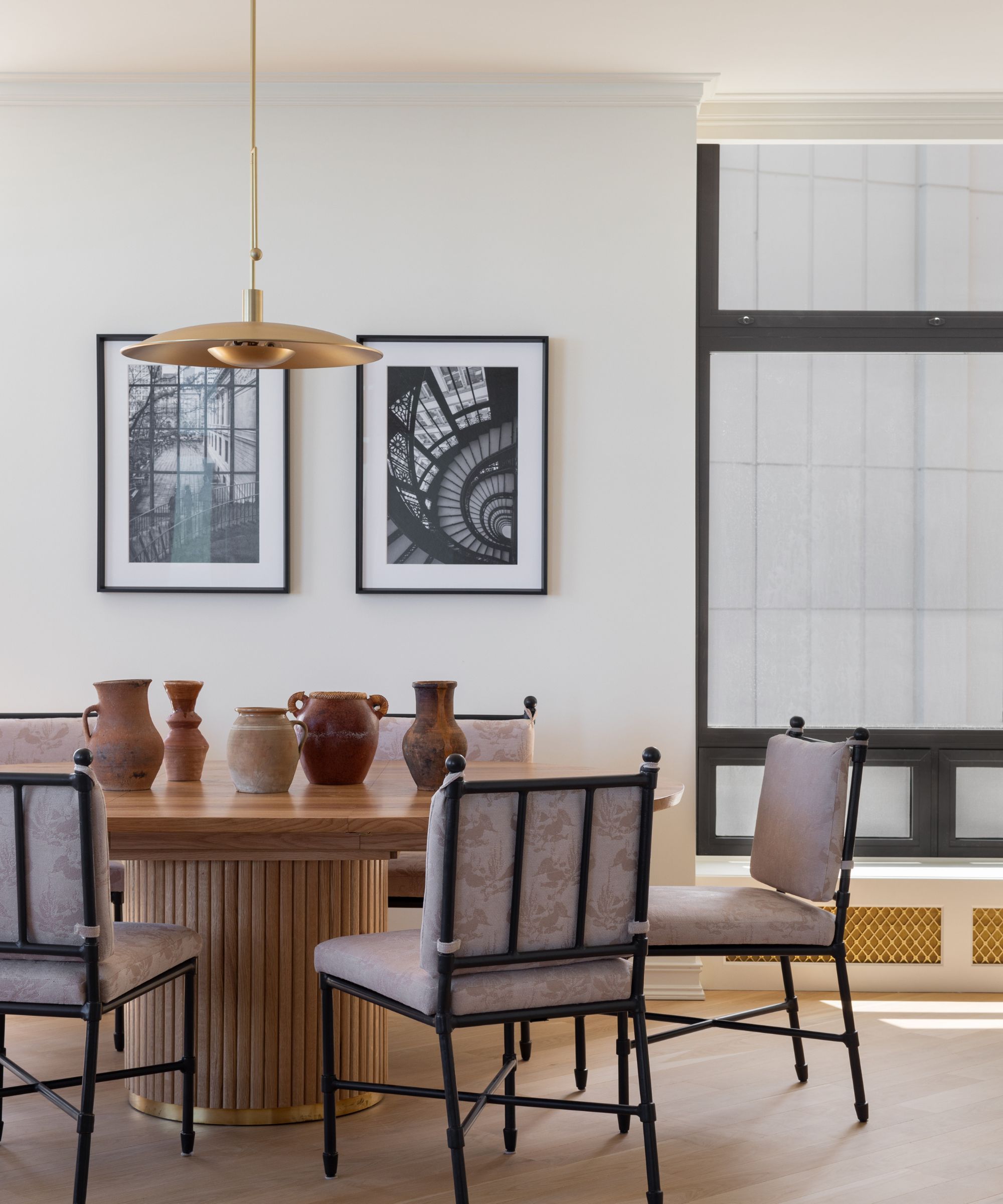
Even though the dining room is open plan to the living space, its smart aesthetic and key pieces give it a strong identity of its own. Explaining her dining room ideas, designer Caroline says the iconic contemporary pedestal table is from Doorman Designs, paired with chairs from Williams Sonoma Home with Zimmer Rhode fabric on custom cushions. A display of rustic pots adds earthiness, and references the clients which for organic materials.
'One of the details throughout the home that I love is the custom brass mesh inset into the window seats,' says Caroline. 'It adds a perfect touch of jewelry (without going full glam) while hiding the radiator coils and expanding the room’s seating.' You'll notice these window seats throughout the main space, another way of unifying the open plan area.
The pendant light is from CB2.
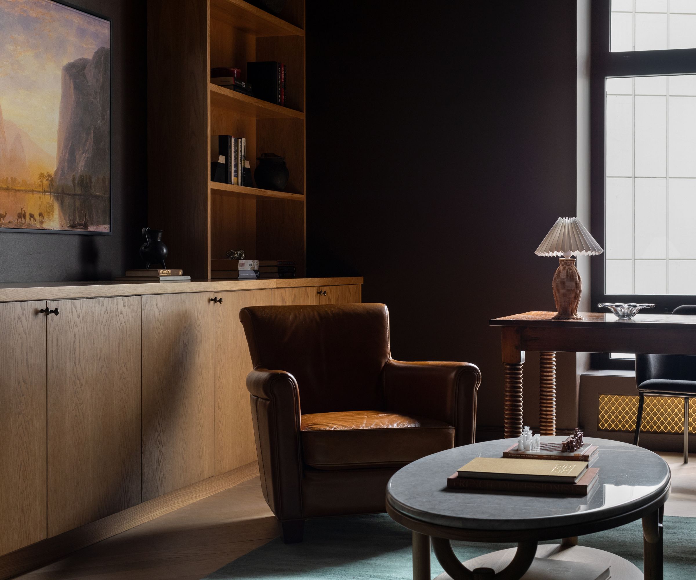
Ralph Lauren’s sumptuous and dark interiors were the inspiration behind the home office ideas. 'The majority of the work was cosmetic so I focused my energy on soulful furnishings and a classic color palette,' says the designer. Millwork was designed by Caroline Turner Interiors and created by New Era Woodworks. The rug is from Etsy; the desk chair from CB2; and the walls are painted in Tarpley Brown by Benjamin Moore.
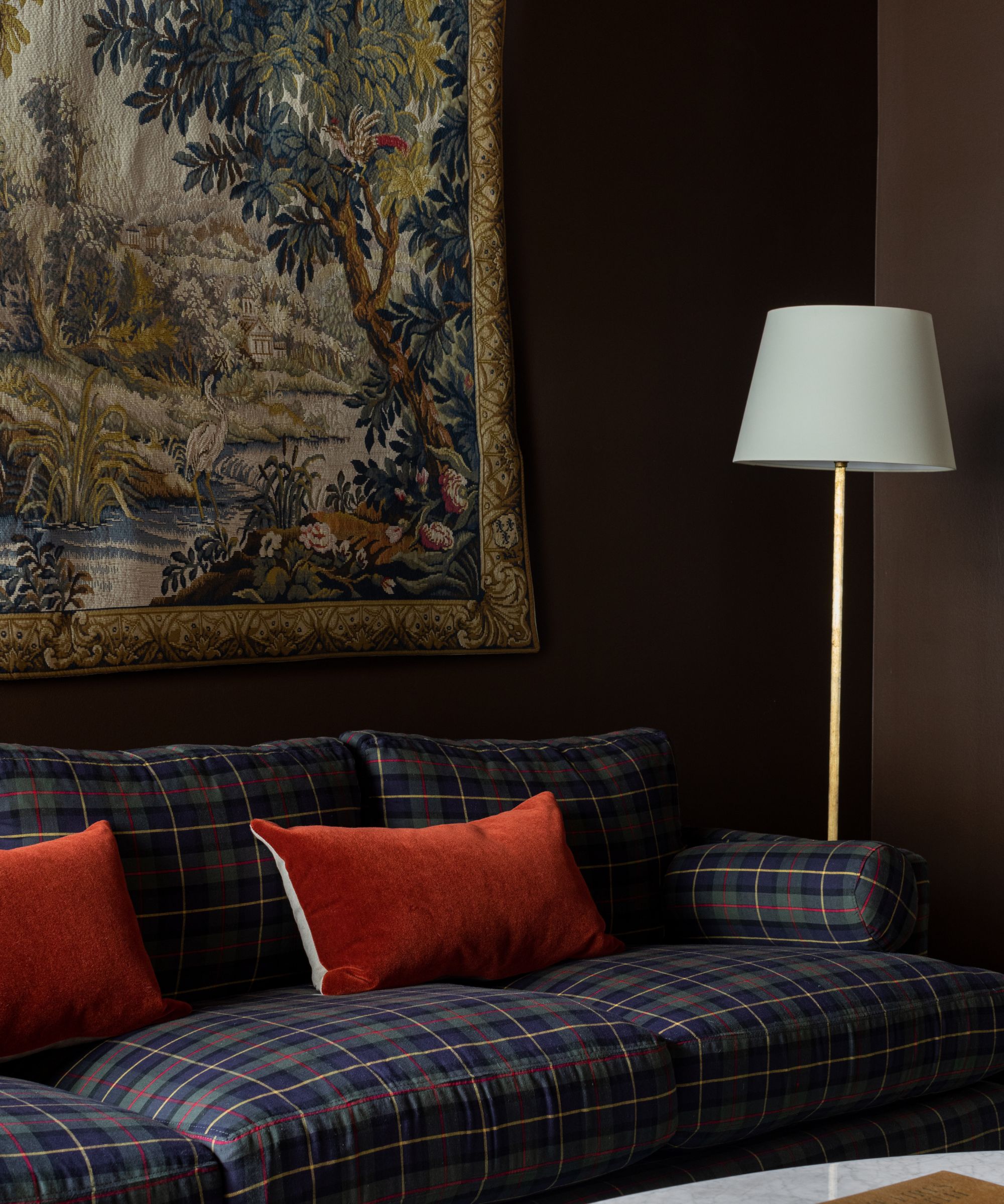
There's even space in the home office for a comfy plaid sofa for reading. The sofa is from Ballard Designs
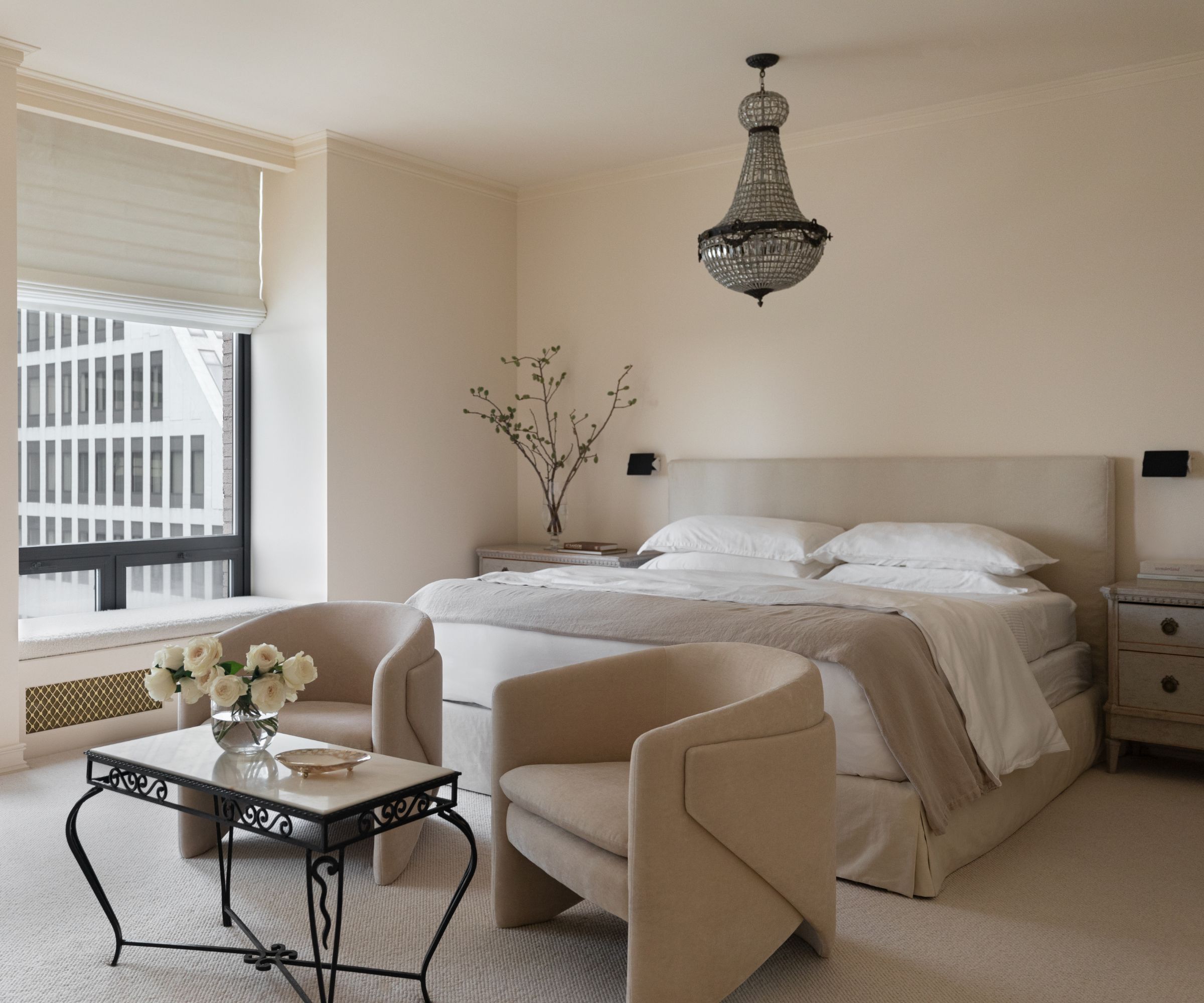
Bedroom ideas for the primary bedroom focused on textures in a neutral scheme so as to not detract from the calming, soft feeling. 'I truly believe primary bedroom suites should be a retreat from the rest of the world so my thesis for the space was “a luxury hotel suite with feeling”,' says designer Caroline Turner. And since this is a large scale room, she knew the furniture needed to be able to hold its own. 'I didn’t want it to feel stuffy or one note so I focused on a mix of antique and new.'
The nightstands are Swedish Gustavian from the 1800s. The sconces are the iconic Charlotte Perriand CP1 fixture, which create a beautiful contrast with the antique birdcage chandelier.
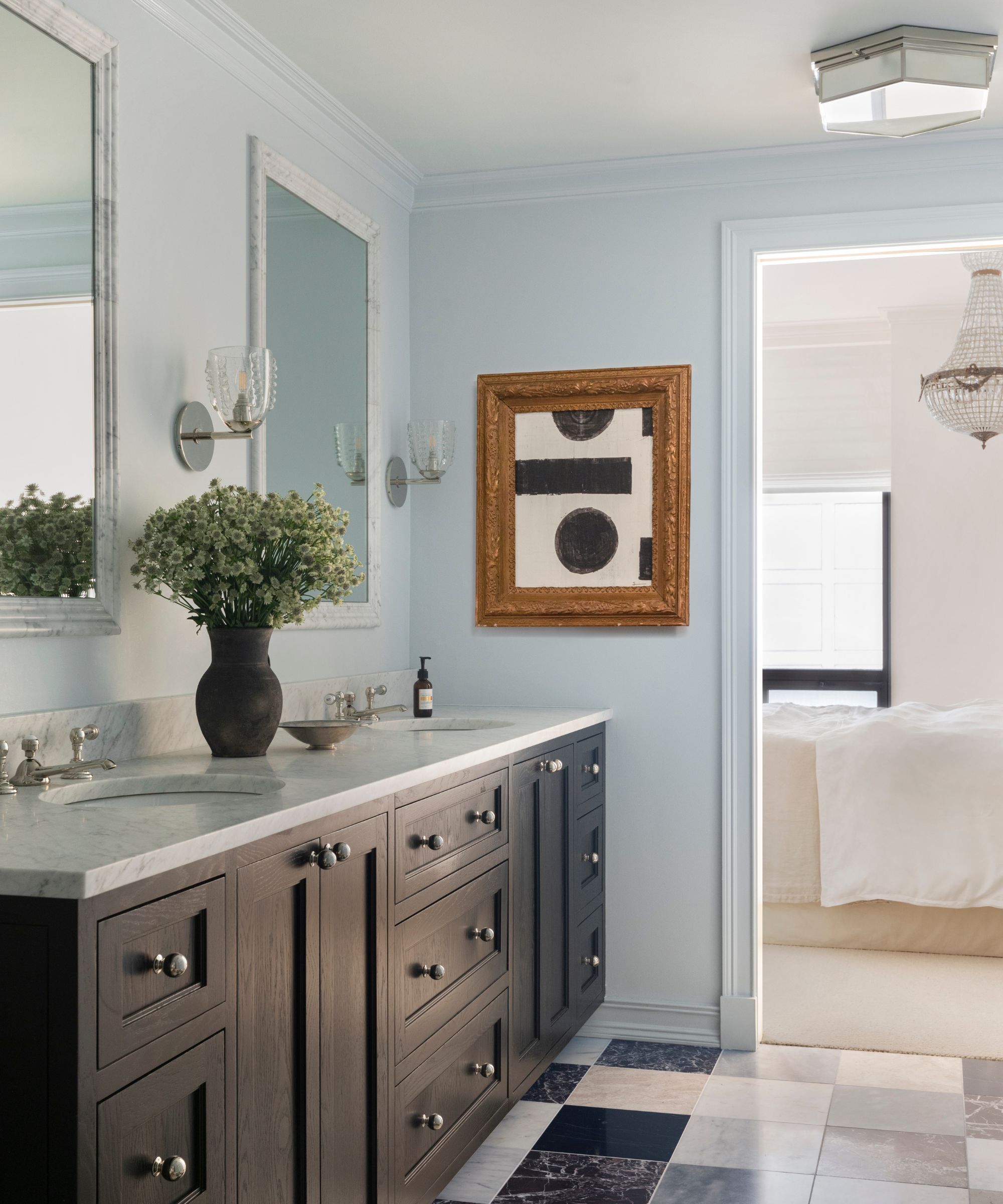
Bathroom ideas in the primary bathroom are all about creating extra space, while also continuing the individuality of the adjoining bedroom. The bathroom required a major renovation, relocating the shower to the tub’s old location and removing the tub entirely to create more space.
'The floors were a true labor of love,' adds the designer. 'I sourced 12x12 tiles from all over the world to create a custom patchwork effect. I placed the tiles on site right before install as I didn’t want it to feel too precious.' The custom double vanity was designed by Caroline Turner Interiors and created by New Era Woodworks. The ceiling light and sconces are from Visual Comfort. The artwork is from Chairish and the walls are painted in Benjamin Moore's Iceberg.
Interior design: Caroline Turner Interiors
Photography: Aimée Mazzenga
Styling: Darwin Fitz


