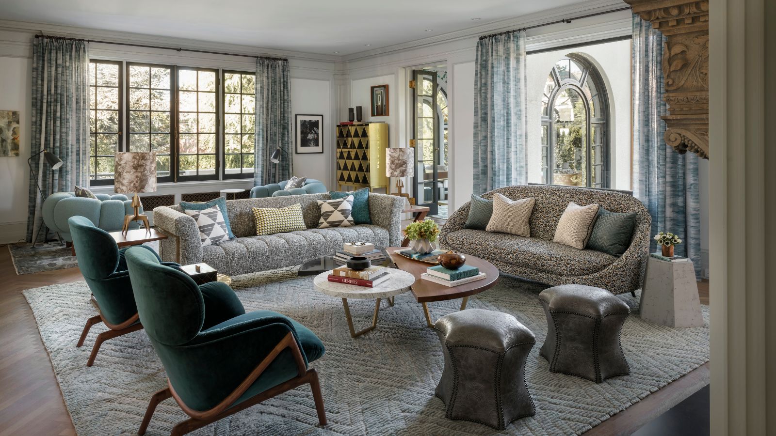
This Mediterranean Revival home was built in 1910 and although the house has been updated a number of times since then, its layout and aesthetic were very much rooted in the past. This historic property was just waiting to be brought up to date.
Luckily the home's new owners had an ambitious vision that was to put it among the world's best homes, equipping it with modern systems, while remaining good stewards of the historic residence, by restoring it to its original condition true to its era. That was quite some balance, so to ensure they got it right they called on the experts at Studio AM Architecture who were only too happy to get involved in the project, with design firm Kelly Hohla Interiors creating the finishes.
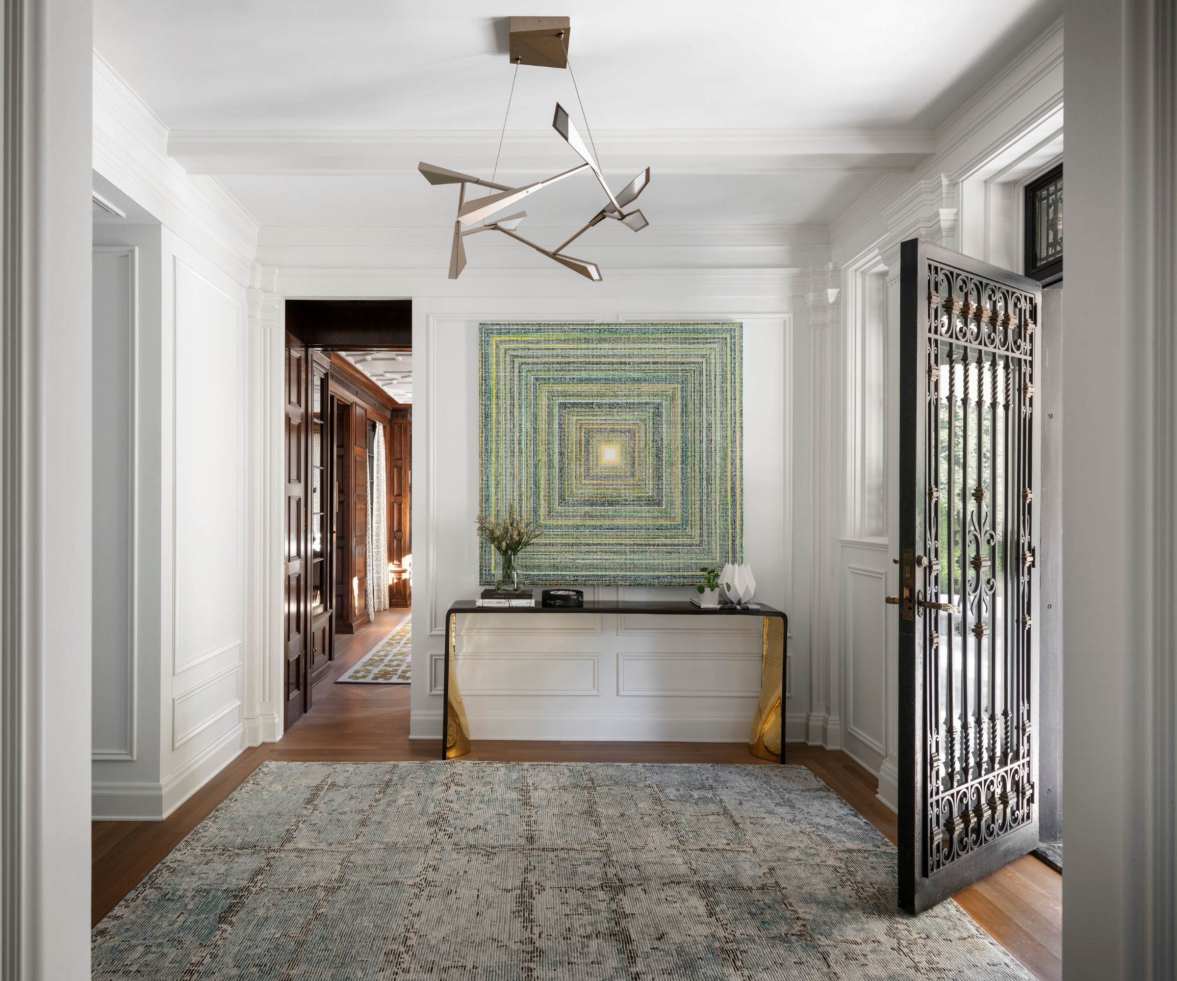
The architects' first task was to tackle the property's dated layout as it still had the traditional planning organization with segmented spaces for servants and residents. The previous entry, living room and dining rooms were formal spaces and the kitchen, butler’s pantry and larder were service areas. There was even a servants' staircase at the back of the house. Studio AM reconfigured the downstairs space, removing the back stairs to increase the scale of the entry, pictured above, and provide circulation to the mudroom, powder, and kitchen. Removing the stairs also improved sight lines to the kitchen and outdoors beyond.
Designer Kelly Hohla's hallway ideas are calm and textural, bridging the gap between the old front door and period detailing and the refreshed interiors. Note how the slim profile contemporary console, with gilt detailing, contrasts with the wainscoting and moldings while the textural modern artwork with its concentric squares design references the wainscoting in the entry.
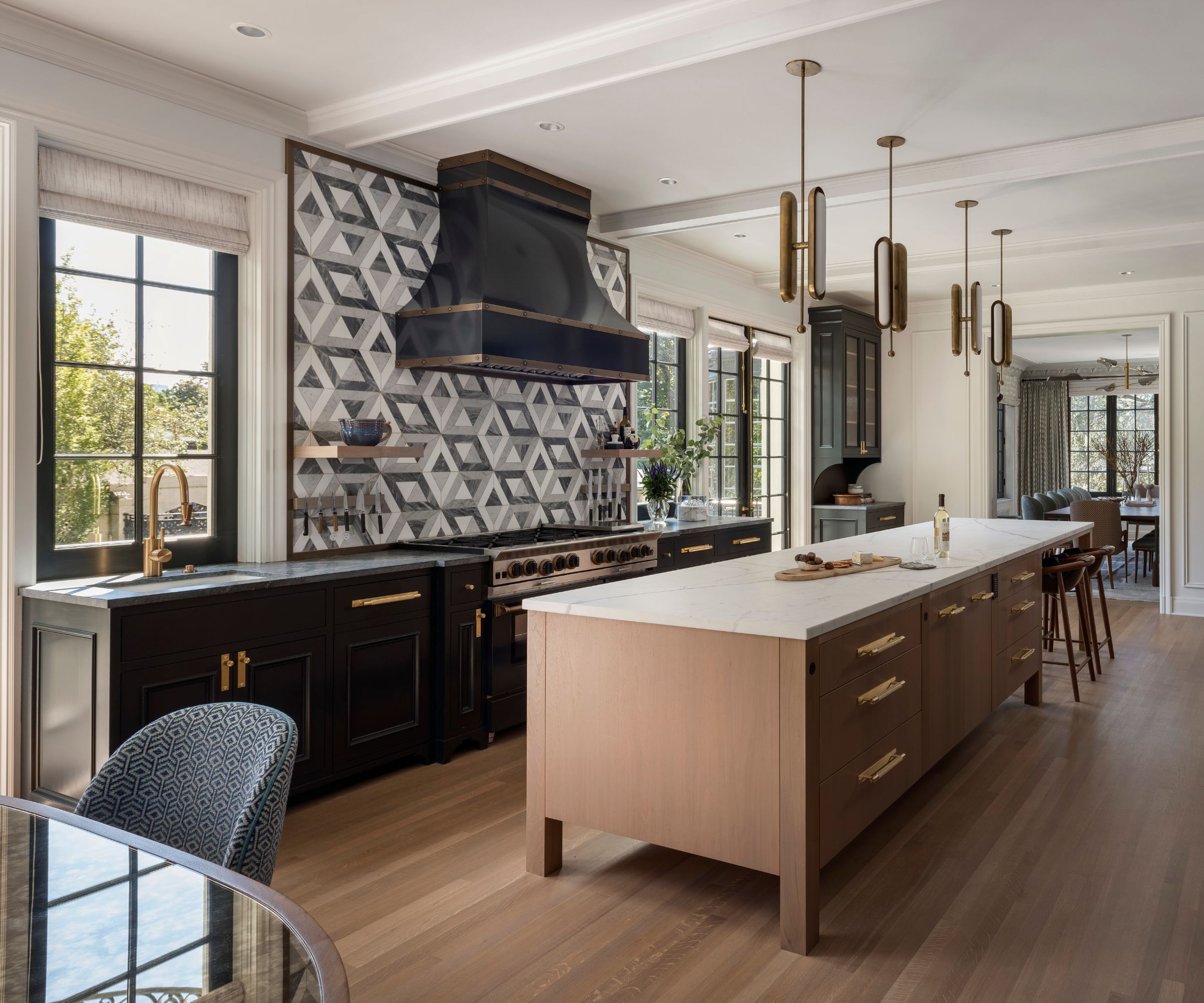
Similary, kitchen ideas play on the juxtaposition of old and new. The traditional black range hood and stove mark a contrast with the contemporary lighting choices and striking geometric tile backsplash. The midcentury-style geometric motif pops up all over this house, and looks perfectly in keeping.
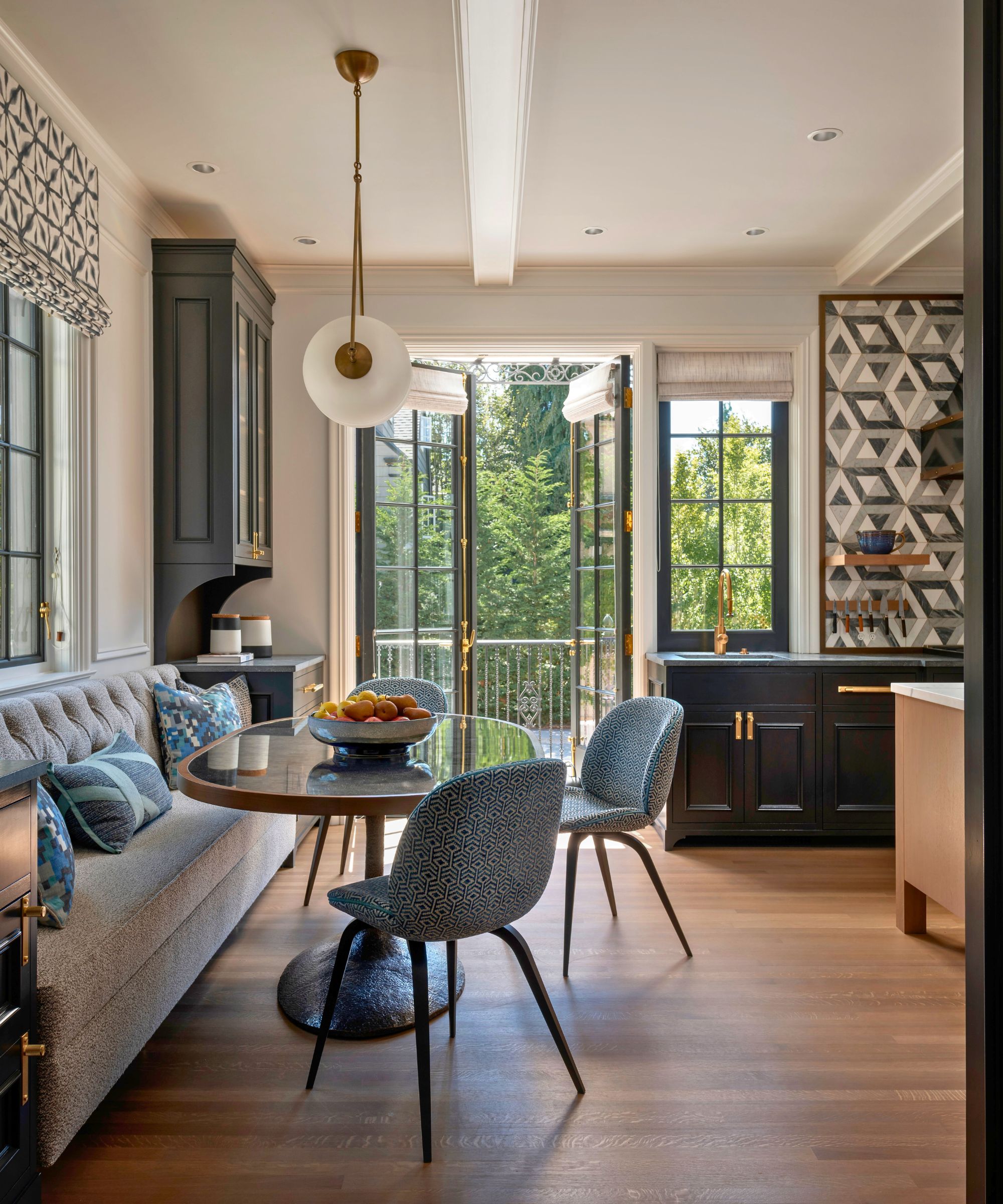
To one side of the much-improved kitchen, a relaxed dining nook with a glass table and banquette seating now enjoys an uninterrupted view of the backyard. The kitchen's enlarged windows and glass doors, together with its more open floorplan have increased the light flow into the room and have linked it up with the entertaining spaces.

The magnificent dining room leads into a small sun room. Dining room ideas include pared-back furniture, dark wood table and contemporary chairs, which allow the room's striking architecture to have its moment. When the details are as good as this, there's little need for extra embellishment.
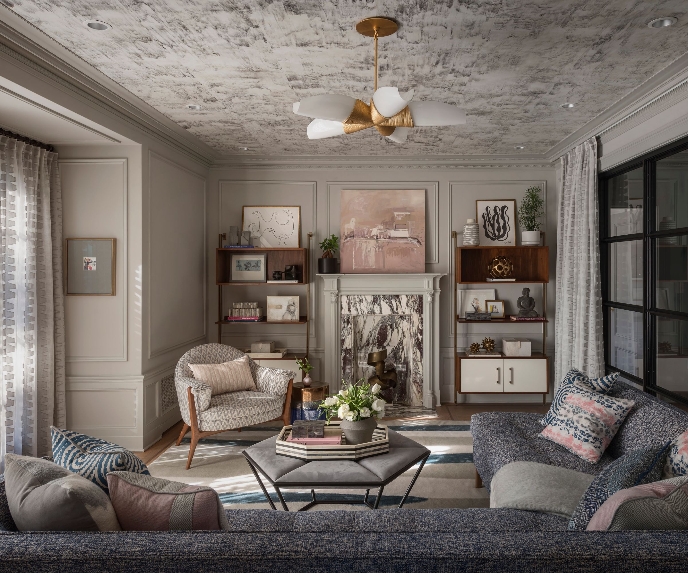
The smaller of the two living rooms, this family room is cozy and intimate. Family living room ideas include a wrap-round taupe color scheme that enhances the sense of warmth in the room. An original fire surround inspired the paint effects for the ceiling.
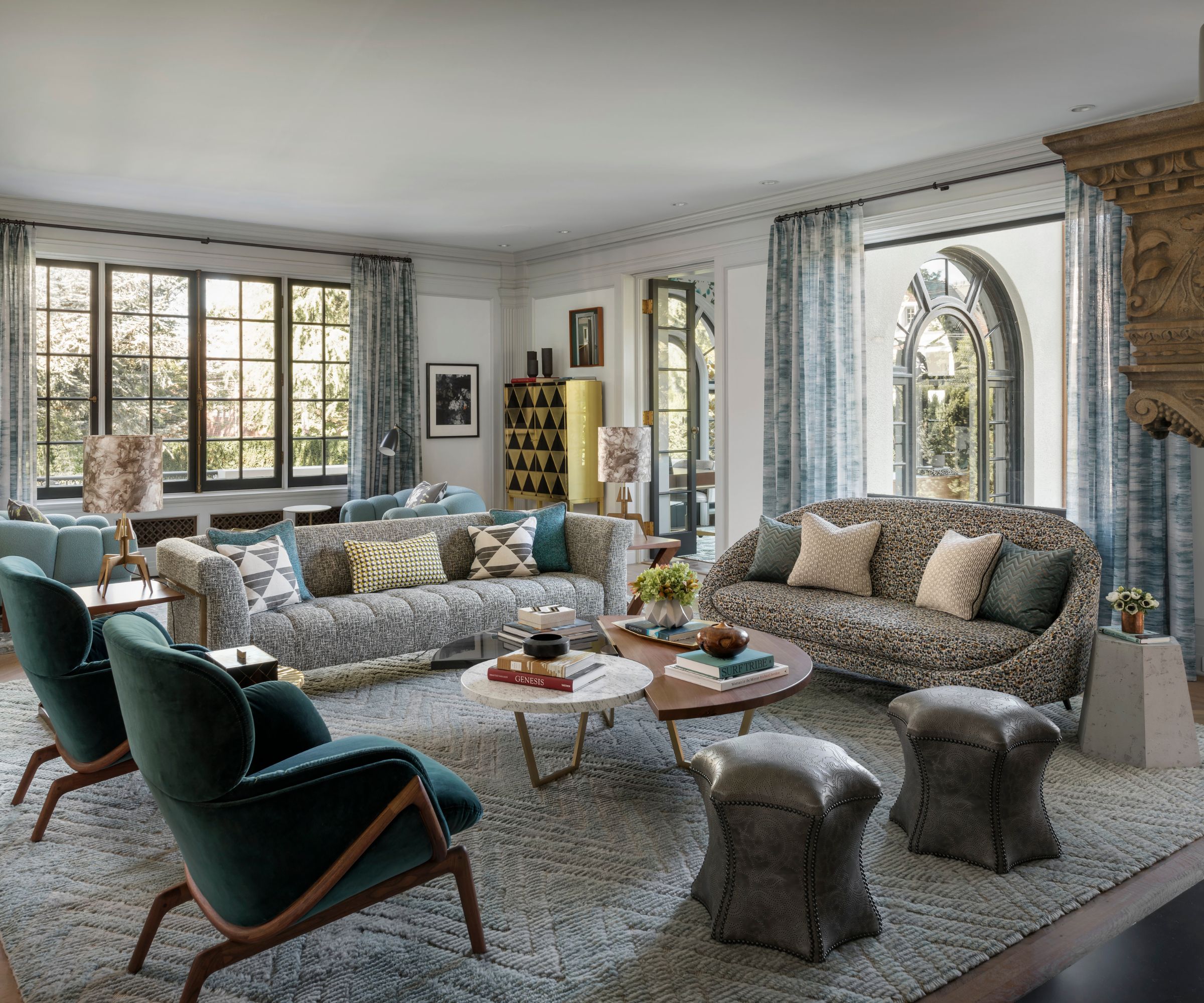
The main living room has a very different feel and aesthetic. Living room ideas here feature more formal groupings of armchairs and couches, their curved contours reflecting the home's classic Mediterranean Revival arched windows. Just seen, a decorative gilded cabinet adds a touch of contemporary glamor to the space.
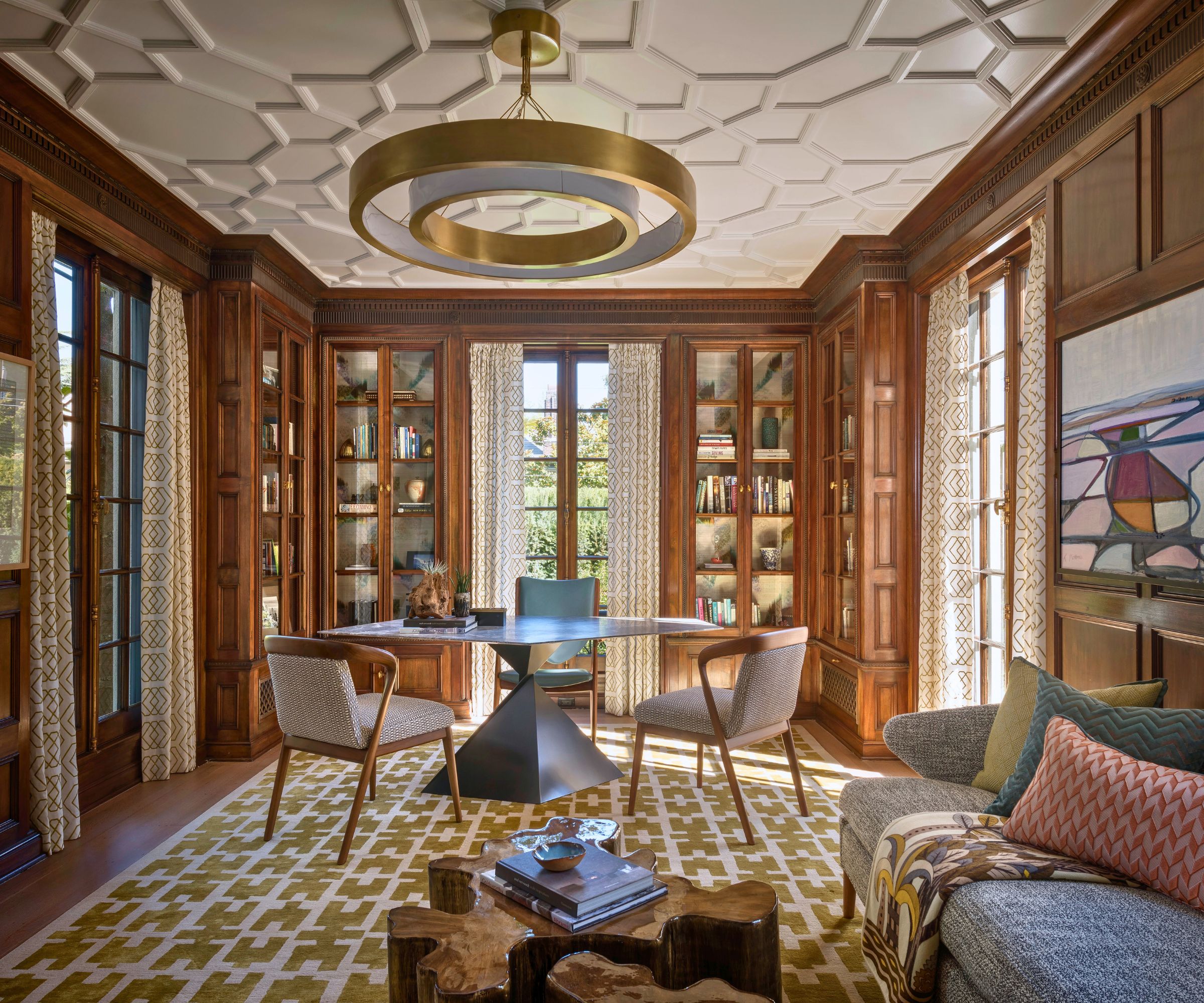
This remarkable space is used as a study. Home office ideas blend dark wood paneling and bookcases, and a decorative plasterwork ceiling with contemporary furnishings. It's no accident that the patterned rug and curtain fabric echo the ceiling motifs.
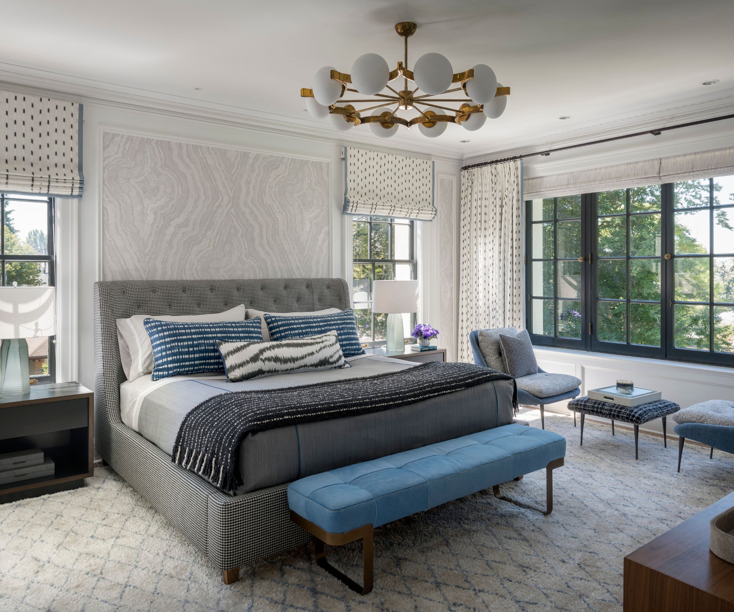
Anyone looking for bedroom ideas could surely find inspiration in this smart, yet relaxing space. The renovations added extra windows, so the primary bedroom now has more natural light. A harmonious scheme of soft neutrals with highlights of blue ties the look together, with the midcentury-style chandelier and upholstered bed being the standout pieces.
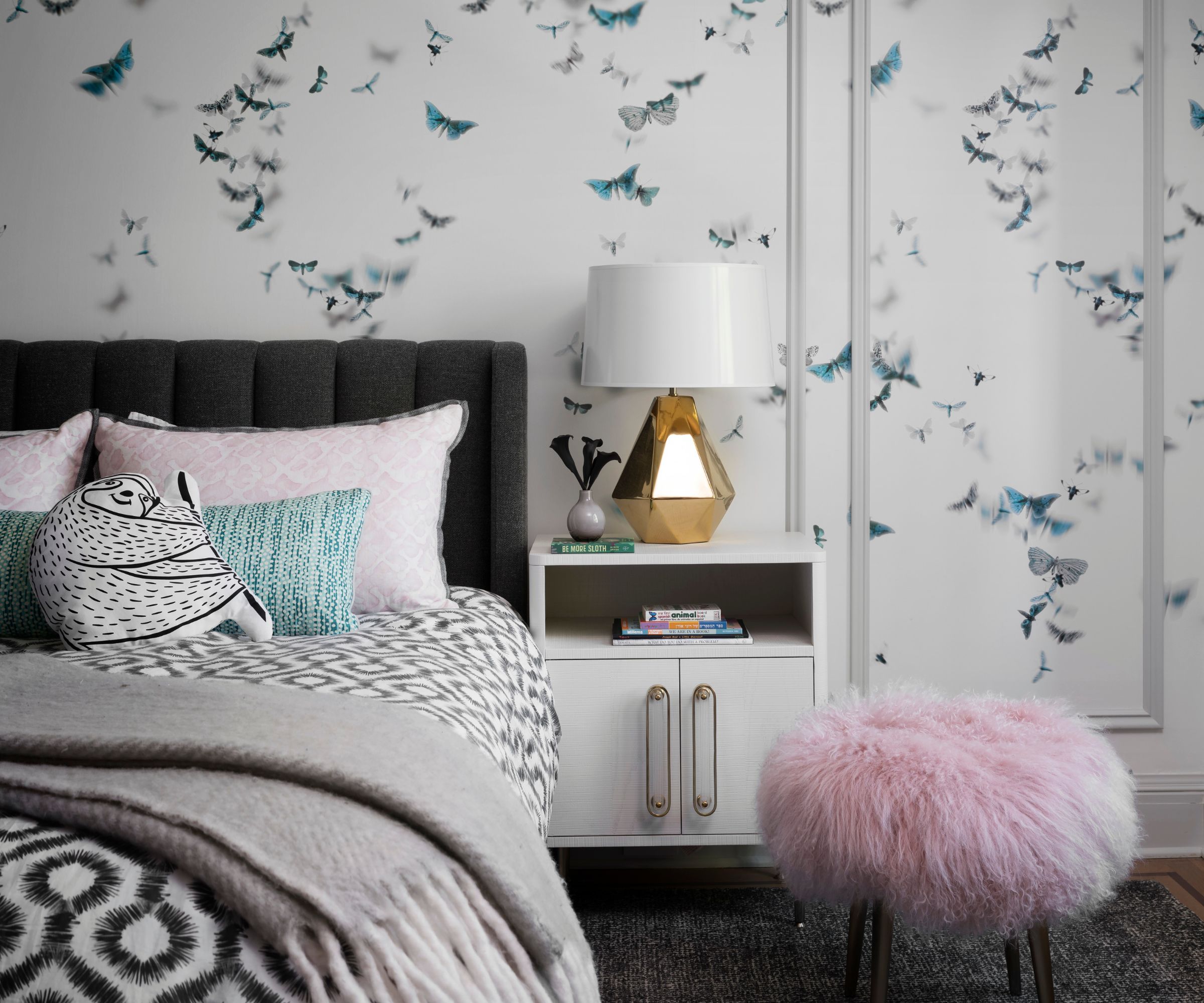
Designing children's bedrooms is a fine art, particularly if the kids are heading towards their teenage years. But take a look at this nature-inspired room with its butterfly wallpaper. It's the perfect room to grow into, with grown-up paneled walls and the owners' favorite sophisticated geometric patterns for the bedding and throw. A sassy pink stool and glistening gold lampbase add just the right amount of luxury.
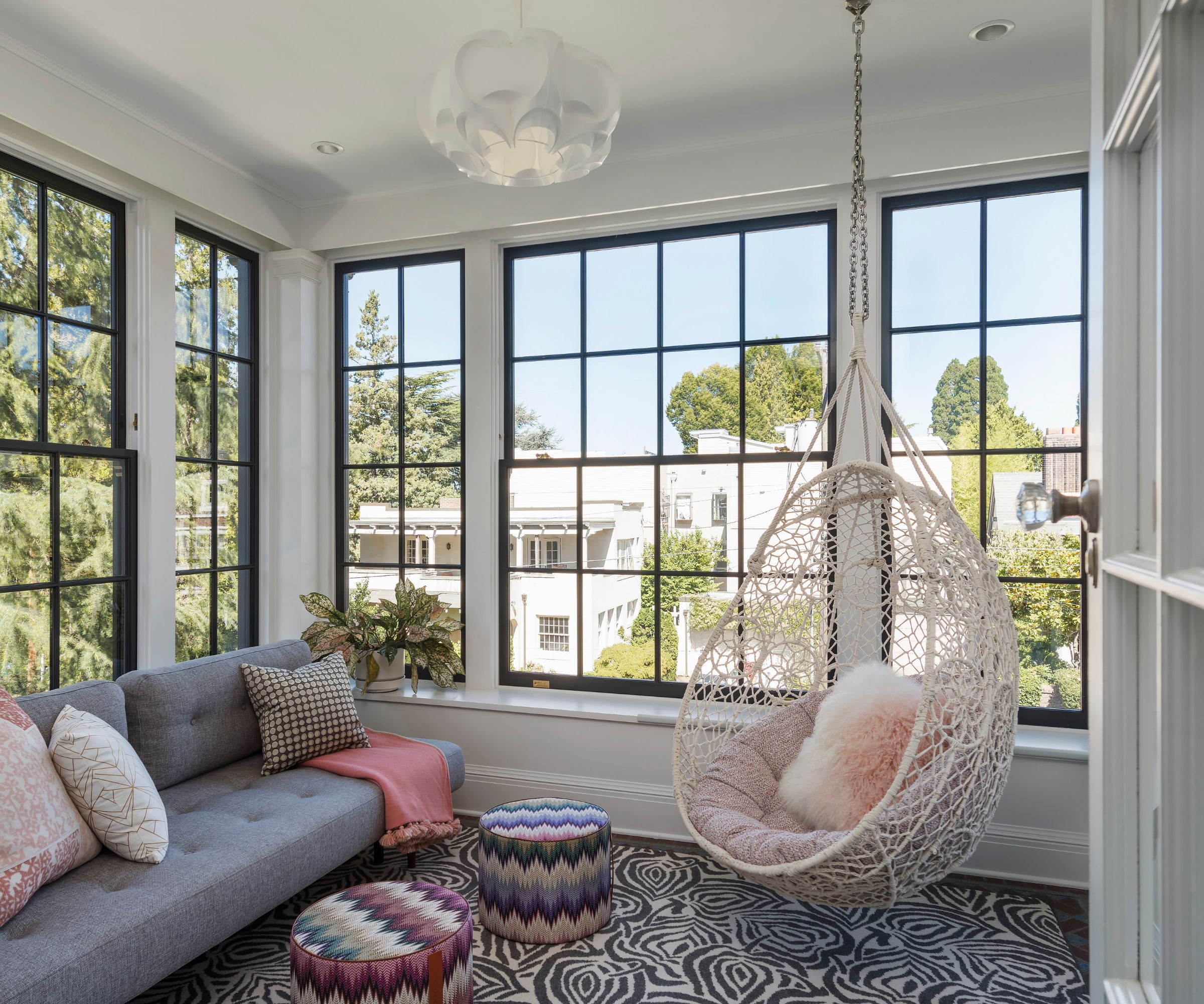
Leading off the kid's room is this cool hangout space, complete with hanging rattan chair and sofa beds for sleepovers. The den was created as a result of the renovations, as a kind of covered balcony, and with two walls of windows it's a bright and welcoming space that sees a lot of use.
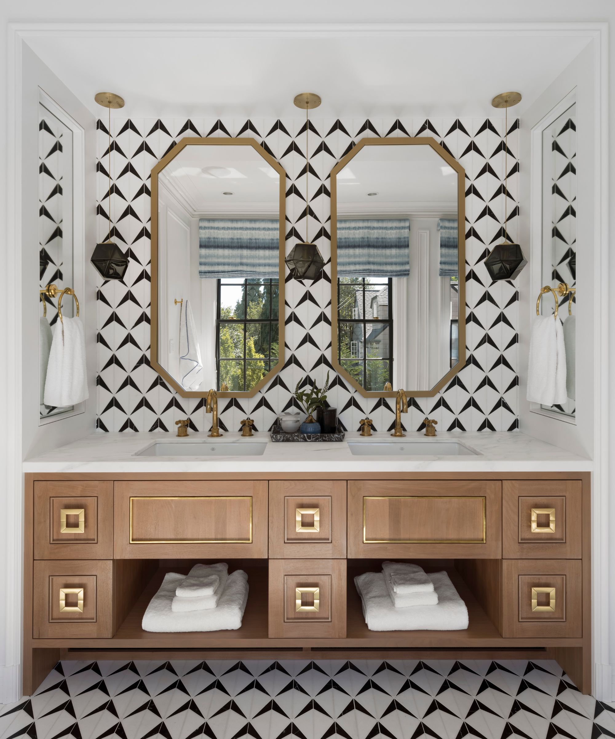
Bathroom ideas in the family bathroom showcase matching geometric wall and floor tiles, which work well here and give definition to a smaller space. We love the smart detailing, including the square drawer pulls and brass/gold fittings.
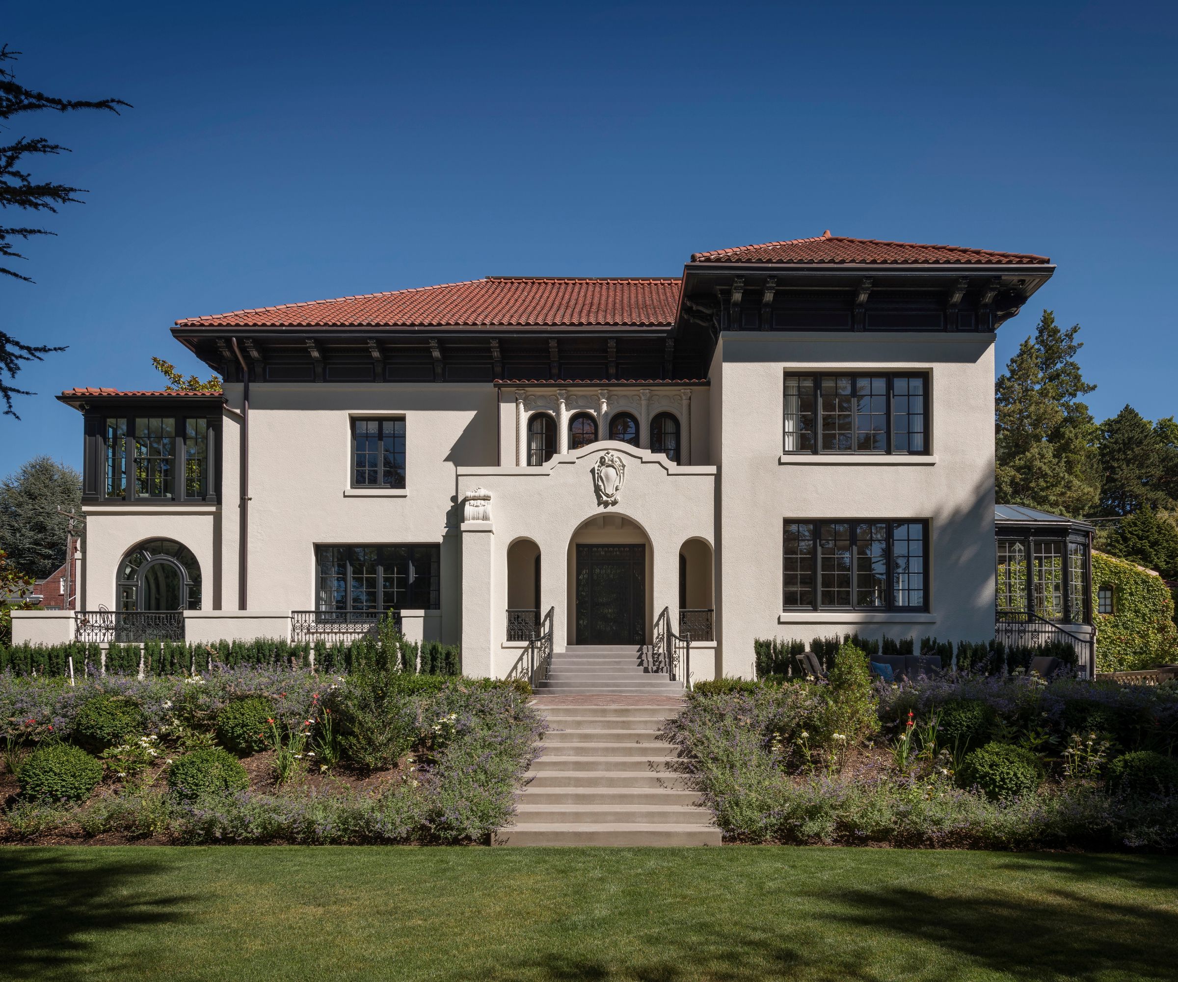
The current owners purchased the 1910-built Mediterranean revival home for their young family with the goal of remodeling and bringing it up to contemporary standards while retaining its history and grandeur. Throughout the home, systems were upgraded and modern touches were thoughtfully added with inspired design input from Kelly Hohla Interiors.
Architect Aaron Mollick says: 'We kept going back to what we hoped to achieve—creating a family house while preserving the specialness of each space. These clients have a modern sensibility and style.
'The home is not historically registered, but is well known as a local community landmark. The property was surgically deconstructed, meticulously documented and studied to ensure development retained the level of craftsmanship and timeless expression while incorporating contemporary elements of styling.' he adds. 'The home is filled with details that replicate and innovate. Hidden doors and high-tech features are interwoven into an old shell with all new systems. New methods of fabrication were employed to recreate elements of the past and allow this historic structure to continue its life as a home for the current and future generations within the context of the community.'
Architecture: Studio AM
Design: Kelly Hohla Interiors
Photography: Aaron Leitz


