I’ll be the first to admit that I didn’t think I’d ever be the sort of person who would end up with a Disney+ account. Seeing as I'm not being a 12-year-old child or a grown adult now unable to let go of their precious memories rewatching The Little Mermaid or Pocahontas on a loop, it was impossible to imagine that this would become my most used streaming service of all.
But then Disney rapidly started acquiring properties and, as the company grew, so its dedicated streaming platform began to expand. New, less child-oriented content joined the legions of Marvel and Disney properties that had essentially been there from day one. Every episode of The Simpsons, Futurama and Arrested Development all in one place, plus Nicolas Cage’s finest, courtesy of Con Air and Face Off? Sign me up.
Disney+ has grown at a startling pace thanks to these acquisitions and additions. The service has rocketed up the streaming league table to give the granddaddy of them all a run for its money. Netflix remains at the top for now, but if things continue the way they are going, don’t be surprised if Mickey Mouse ends up claiming the scalp of that big red ‘N’.
That being said, it’s not like Disney+ can’t be improved, or indeed that it can’t learn from its great rival(s). Imitation is the highest form of flattery, and from a purely selfish perspective, I would very happily see Disney filch a few of the most intuitive, and taken-for-granted features from its main competitors. There are two features that Netflix currently boasts that Disney doesn’t, and while they may be small – trivial, even – they are enough to spoil an otherwise excellent content streaming experience.

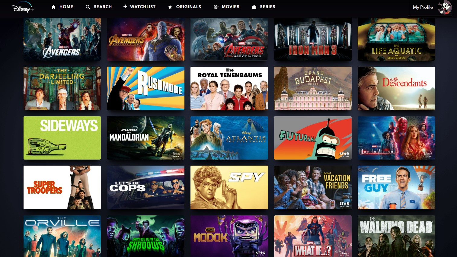
First, please could somebody sort out the implementation of Disney’s watchlist? Your watchlist is basically your saved library of movies and TV shows for you to enjoy at a later date, a permanent collection of your favourites and would-be favourites that should form the core of your user experience. Yet Disney lags behind Netflix in terms of integration, most strikingly because whenever you want to add a title to your watchlist, you have to go into that movie or show fully in order to then add it to your collection.
This doesn’t sound like a hassle, but over time, it becomes incredibly grating. In contrast, Netflix’s system, where you simply scroll through the library and use a small plus sign at the bottom right of each and every title block, is far quicker, far easier and far more intuitive. How hard can it be for Disney to just copy that?
Organisation is a factor here, too. Once everything is in your personal little library, you are left with a bulging hodge-podge of titles that is hard to navigate and unintuitive to access. Adding filters or categorisations within the watchlist itself, or even just making a binary subdivision between TV shows and movies, would at least be a start, rather than just ordering things by when they were first added. Maybe I won’t remember the fact that, on my very first day of subscription, I gleefully added 2001 knockabout comedy Super Troopers or the entire American Dad! back catalogue, and they will be lost forever at the back of the queue. (These are mere examples, I watch both with alarming regularity.)
There is also the matter of what happens when you actually end up watching TV shows. This isn’t such a gripe for movies, but the way Disney+ deals with its serialised series can drive a person insane with its lack of basic common sense. I watch a lot of TV shows via Disney, and often end up using the service's useful ‘Continue Watching’ facility that lets you pick up on the next episode wherever you left off.
Bafflingly, though, if you want to access the entire roster of episodes (you want to skip ahead or back, say), you have to come out of that show entirely rather than Disney just providing you with the full episode list during your current viewing session. Netflix allows users to simply bounce between episodes once they have started watching via a small button at the screen’s edge, but Disney forces you to go out of the selected episode, scroll around to find the show’s main tile (i.e. access it via its main page not via Continue Watching) and then select the one you actually want. Why is it so hard to let us access all the episodes via Continue Watching or during the episode itself, especially as all it would take would be a small icon on the screen or a simple click of a back button to take you into the episode list rather than back to the home screen?
These aren’t big burdens and they are far from the sort of gripes that would cause a person to discard their subscription altogether (egregious price hikes are far more likely to warrant that effect). They are, sadly, enough to ruin an otherwise blissful experience with what I consider to be the best video streaming service on the market right now. What’s more, they’re not difficult to fix, especially as they have been implemented effectively on contemporary rival platforms such as Netflix and Amazon Prime Video.
Now you'll have to excuse me, I'm off to watch Con Air again. It's in my watchlist somewhere...
MORE:
These are the best TVs you can buy
Read our review of the award-winning Disney Plus service
Here’s our Netflix review, too


