We're finally leaving the era of the clean aesthetic, where everything in the kitchen was white, light, and pristine. And as a result, 'dirty' colors are becoming all the more coveted as the antidote to clinical palettes.
It seems a strange way to describe kitchen colors, but these richer, deeper, muddier tones give the term 'dirty' a new, more appealing definition. It's about embracing a kitchen scheme that has depth and personality, rather than the stark, slightly lifeless designs made popular in years past.
And designers say it's one of the most exciting 2026 kitchen color trends they've seen in a while. Here's why these earth-adjacent, muted tones are an enduring choice, and how to get them right in cooking spaces of every style and size.
The Appeal of 'Dirty' Kitchen Colors
Mossy greens, muddy browns, and deep terracotta hues: dirty kitchen colors are taking over from the bright whites and chalky grays that once dominated trends. Clean aesthetics and extreme minimalist kitchens are no longer the desired look, with more lived-in, colorful kitchens taking their place.
In many ways, the rise of dirty kitchen colors acts as an anti-trend, with people choosing to decorate their cooking spaces (and the rest of their homes) in a way that sparks joy and feels unique, rather than following the status quo.
'The appeal comes from a desire for warmth and depth that stark white or overly saturated colors sometimes lack. These muted, earthy tones feel grounded, cozy, and incredibly sophisticated. They move away from fleeting trends and lean into a timeless, collected aesthetic. They feel authentic and less sterile than some modern finishes,' says Nicole Forina of Forina Design & Co.
It's a palette that works beautifully in almost any room of the home, but they feel most at home in a kitchen, where these rich colors add softness and subtle character without overwhelming the room.
'There's a warmth and ease to these muddied, earthy tones that feels particularly well-suited to a kitchen. Unlike brighter or purer colors, 'dirty' shades tend to be far more forgiving and less precious in a hardworking family space,' says Carina Raymond, Founder of Studio Raymond.
'They bring depth and character without demanding attention, creating an atmosphere that feels inviting, relaxed, and lived-in. As kitchens increasingly become the heart of the home, these richer colors feel grounded and timeless, which is why they continue to resonate beyond passing trends.'
As well as being a striking aesthetic choice, this color palette is favored in kitchens because of its more functional qualities. 'From a practical standpoint, they also tend to disguise minor wear, fingerprints, crumbs, and everyday imperfections better than brighter or starker finishes,' Nicole adds.
5 Spaces That Prove Just How Sophisticated 'Dirty' Kitchen Colors Can Be
While the term 'dirty' might not conjure images of such a style, this palette has proven to be a truly sophisticated choice. But its success relies on how you introduce these colors, and the finishes you pair them with. Here are three spaces that showcase just howe elevated these kitchen colors can be.
1. Embrace the Rich Tones of Muddy Brown Cabinets
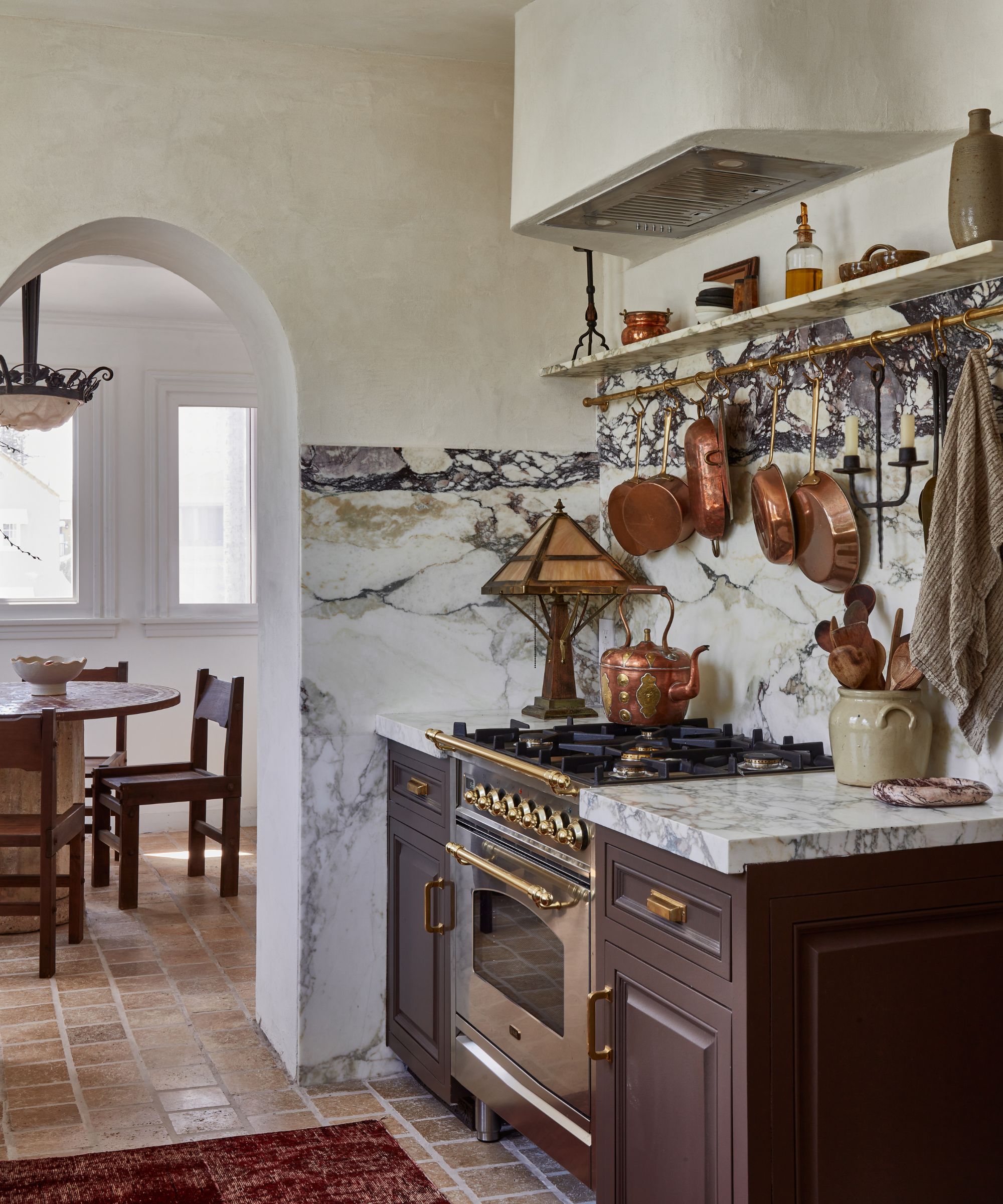
In this Spanish Revival home, the small kitchen has been transformed, not only by a striking marble but by deep brown kitchen cabinets. It not only adds a timeless feel, but it also adds depth to the design that feels far more characterful than neutrals.
'The kitchen cabinets in my home were replaced right before I moved in. They were in perfect condition, so although they aren't exactly what I would have chosen, I decided to paint them instead of replacing them. I chose Van Buren Brown by Benjamin Moore,' says Drew Michael Scott, founder of Lone Fox Home.
But the undertone is an important detail to get right. 'The brown in my kitchen leans a bit purple, which pulls in the purples from my marble. A brown that leaned a bit green probably would have looked fine, but it wouldn't have felt quite as cohesive. Lay out all your samples (wood, paint, tile, etc.) and see if any of them stand out. If they aren't jiving, it might be their undertones,' he explains.
'I find that focusing on texture also really helps. If everything is the same texture, it will feel flat and unexciting. A satin sheen on the cabinets mixed with honed marble and polished hardware will feel much more curated and expensive.'
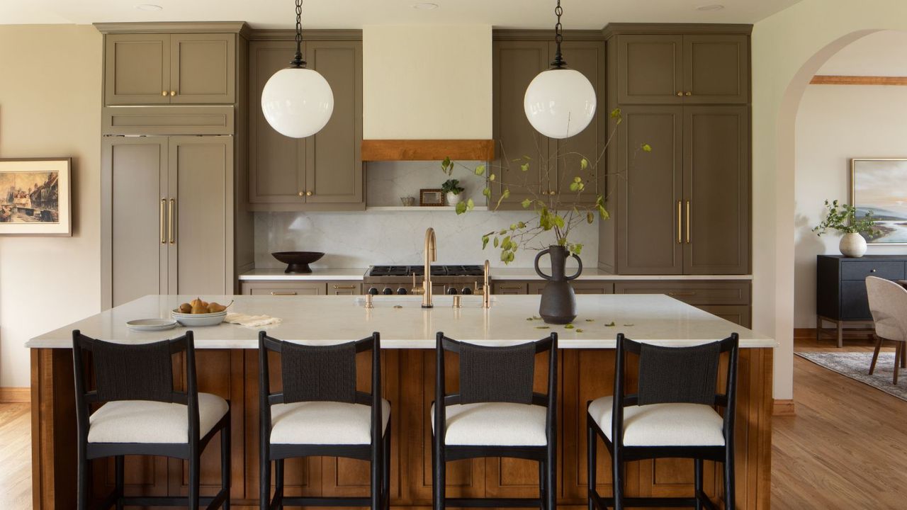
2. Add Warmth to Earth Green With a Wooden Island
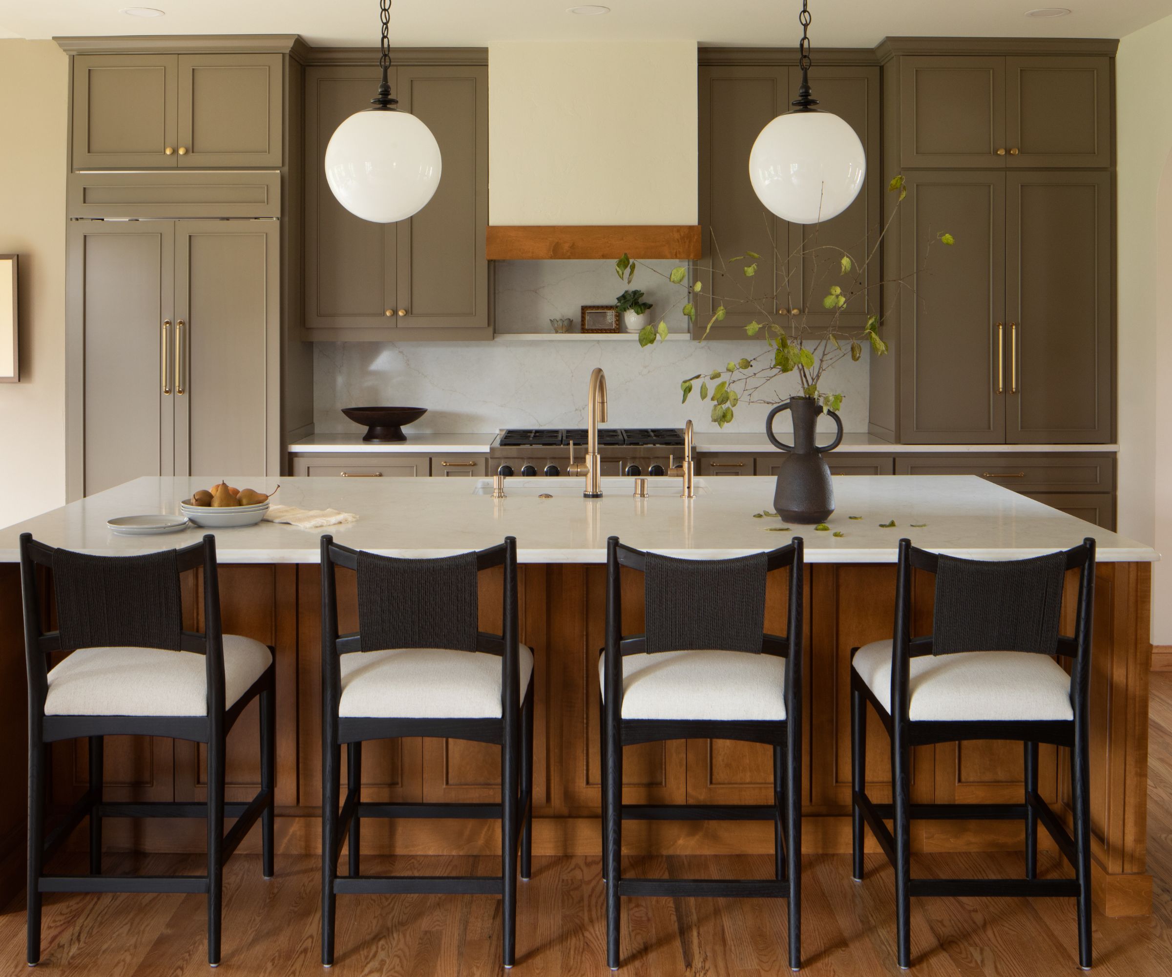
Certain shades of green fit into the emerging kitchen color palette perfectly. In this design, a mid-tone green that reads slightly muddy becomes the perfect shade to accompany the natural wood tones of the kitchen island.
'This client wanted to honor the warmth of their existing golden oak wood tones rather than fight them, and a muddy green was the perfect answer. A true, saturated green would have clashed with the orange undertones in the wood, but this earthy, greyed-out olive finds a middle ground,' says Anna Franklin, Principal of Stone House Collective.
'It pulls from both the warm and cool ends of the spectrum at once. The result is a kitchen that feels cohesive rather than overly curated, as if everything arrived at this color story naturally. The brass hardware and white stone countertops give it just enough polish to keep it from feeling heavy.'
3. Soften Deep Reds With Soft Pink Hues
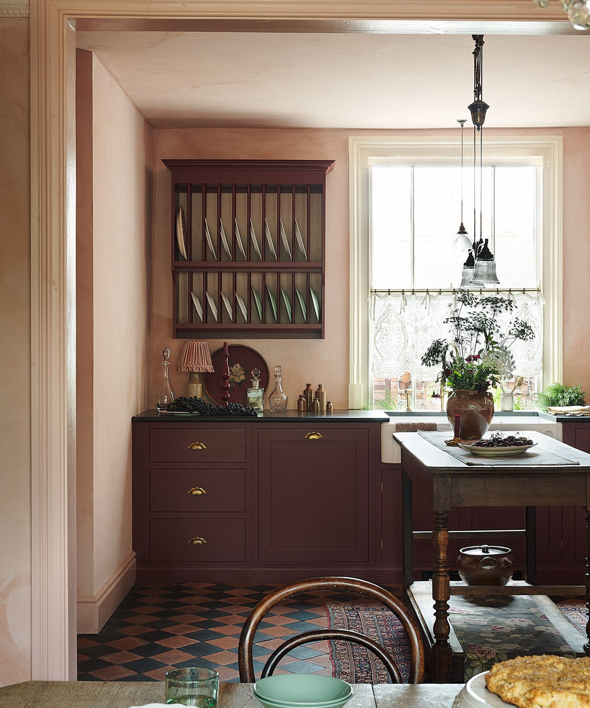
Perhaps unexpected, but deep reds also fall into the dirty kitchen color category, especially those with green undertones that give a more earthy feel. It's a color that can feel quite moody, so for a more sophisticated look, the right color pairings are key.
In this kitchen, deep red cabinetry has been softened by a very soft pink hue on the walls, applied in a texture finish to prevent the space from feeling flat. Paired with the wooden accents, the scheme feels utterly timeless, yet still rich in tonality.
4. Elevate Dirty Colors With Classic Cabinet Profiles
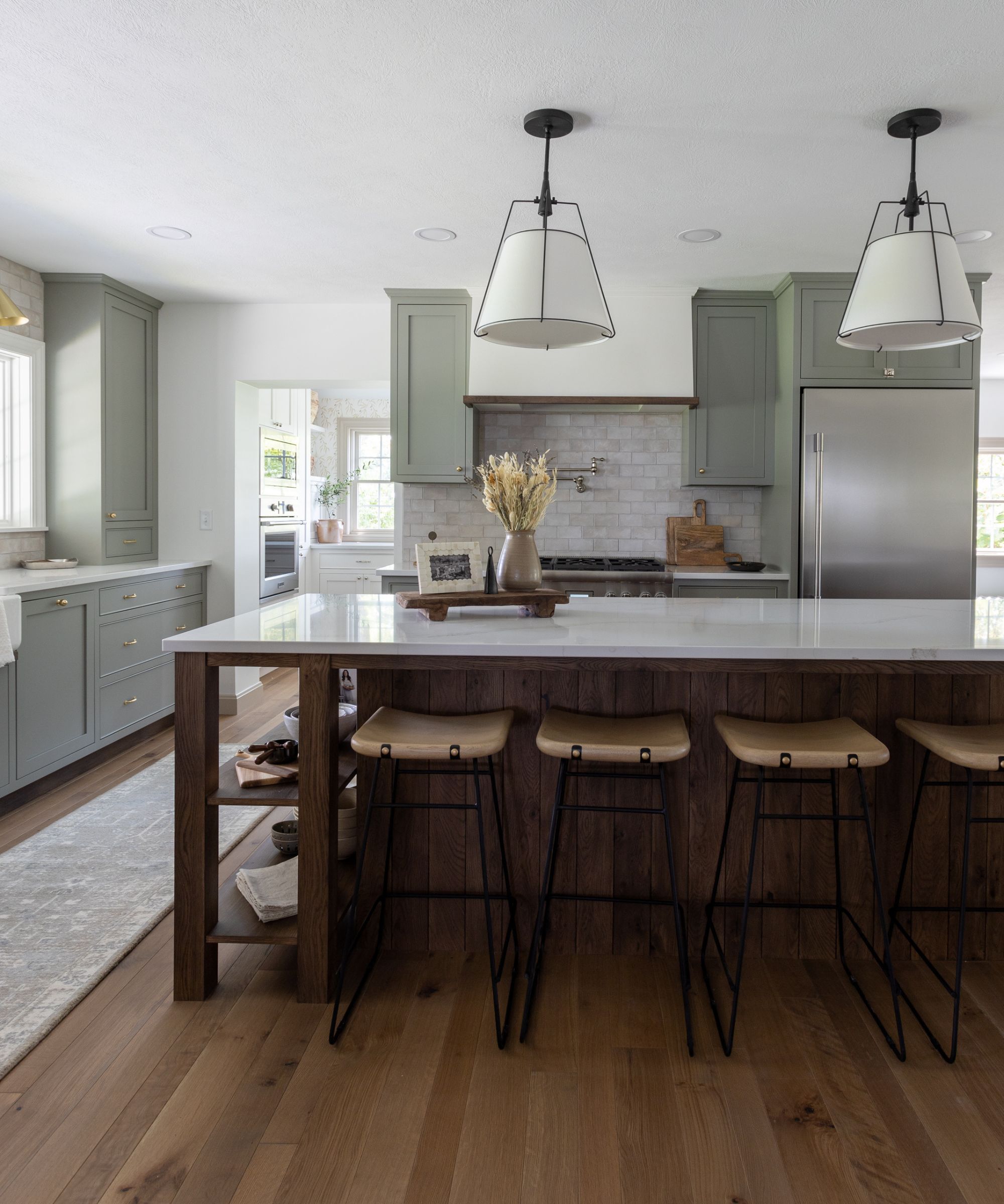
In this kitchen, the cabinets have been drenched in a gray-toned blue shade, which feels a little murkier and a bit softer than a brighter hue. To ensure the scheme still feels warm, a rich, dark wood island has been introduced, while classic shaker doors create a more sophisticated finish.
'Dirty colors are appealing because kitchens naturally need to work hard, and they create a beautiful backdrop and give you a lot of freedom for gorgeous natural stone countertops in all sorts of colors,' says Sadie Beachy, Principal and Creative Designer of S.Flynn Design + Build.
'Be intentional with the cabinet fronts, drawers, and door fronts. Inset cabinet fronts and intentional details would be our suggestion, like a shaker with a bead. We love to start with the countertop and pull one of those earthy colors out of it.'
5. Embrace Dirty Neutrals For a Brighter Scheme
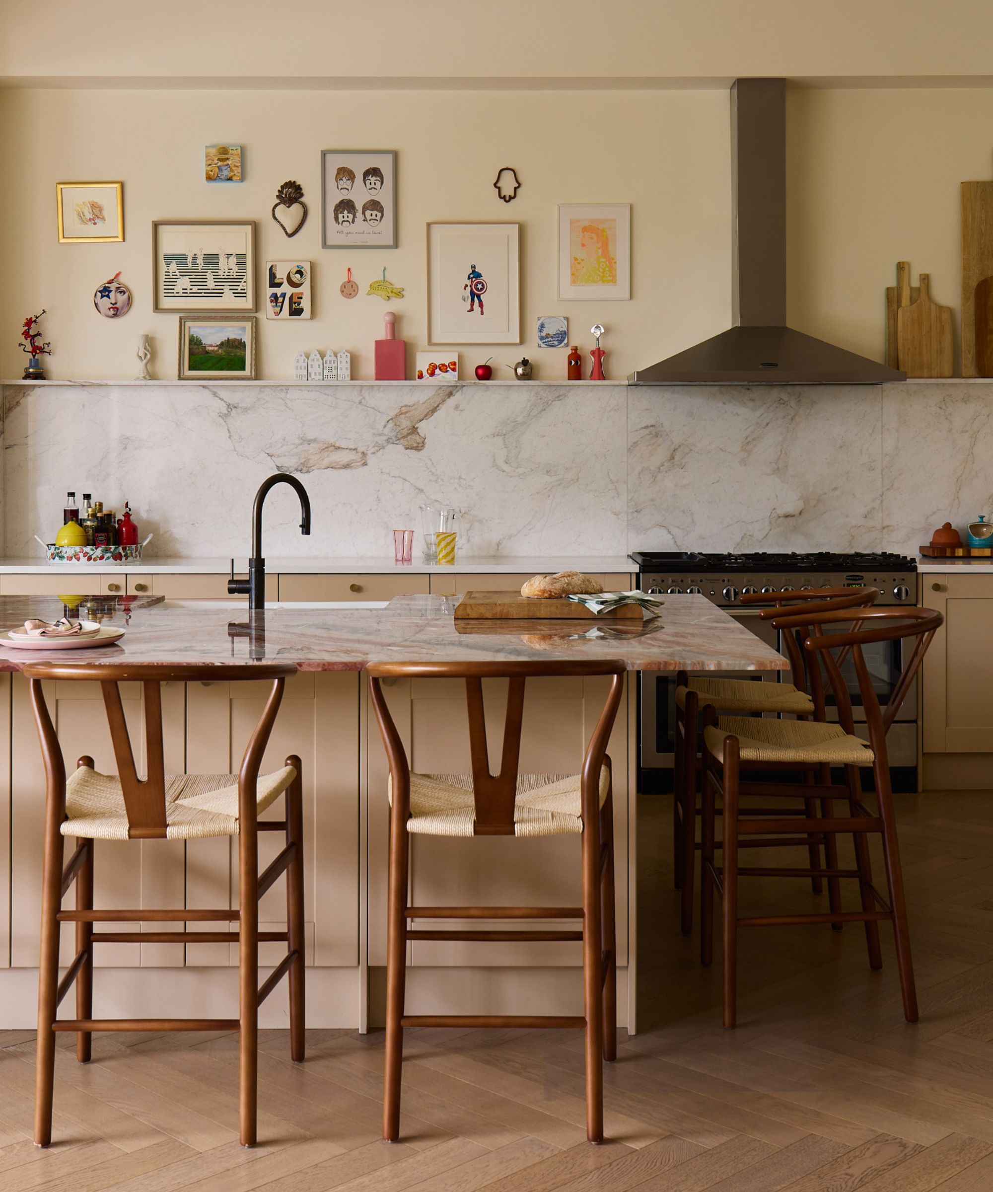
There's a misconception that dirty kitchen colors have to be dark, but that isn't always the case. Lighter tones, such as clay, mushroom, and putty, all have a slightly muddier undertone that instantly feels softer and more nuanced than stark neutrals.
'Kitchen design is often as much about materiality as it is colour, and these earthy, softened shades work beautifully because they pair so effortlessly with natural materials. Whether it's handmade zellige tiles, terracotta surfaces, warm timber cabinetry or beautifully veined marble, 'dirty' colors provide a sophisticated backdrop that allows those materials to shine,' says Carina.
In this design, marble with clay tones through the veining became the starting point for the color palette, with cabinets painted a soft clay hue that emphasises the natural stone while adding a softer, muddier finish.
'They also have an inherent connection to nature, which helps bring a sense of calm and authenticity into the space,' she adds. 'Rather than creating stark contrast, they encourage a more layered and harmonious scheme, which is particularly effective in kitchens where you want the room to feel welcoming and cohesive.'
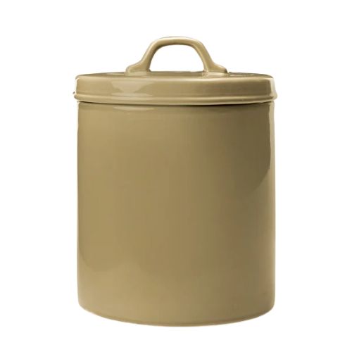
A storage canister always comes in handy in a kitchen, and this muggy green color is a great way to bring the trend into your cooking space.
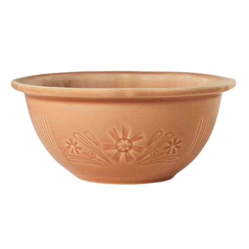
Whether they're displayed on kitchen shelves or out on your dining table, these terracotta breakfast bowls are a chic addition to your space.
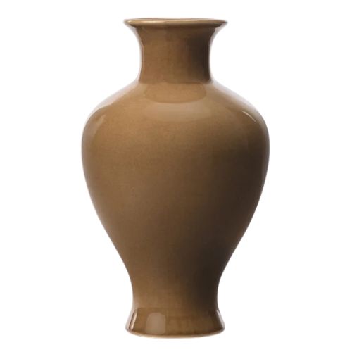
No kitchen is complete without a vase filled with seasonal blooms. This design comes in a muddy brown hue, perfect for this emerging color palette.
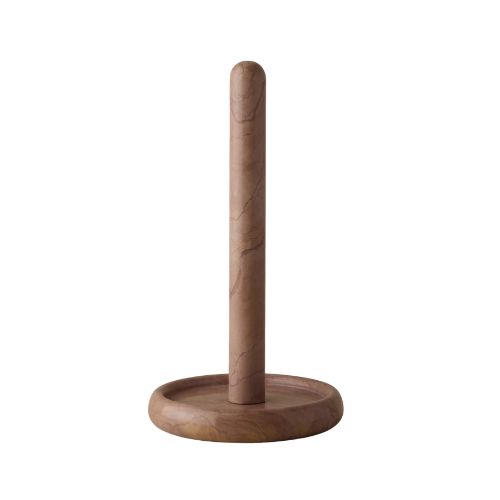
For smaller infusions of dirty colors, this moody marble paper towel holder is a great way to elevate a kitchen essential.
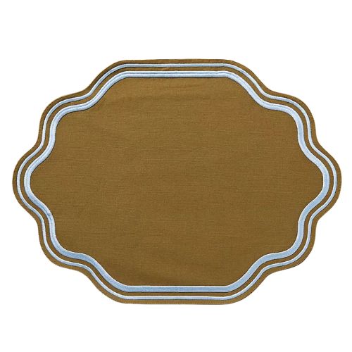
Another design for your kitchen table, this muddy green placemat features a powder blue border for a playful contrast.
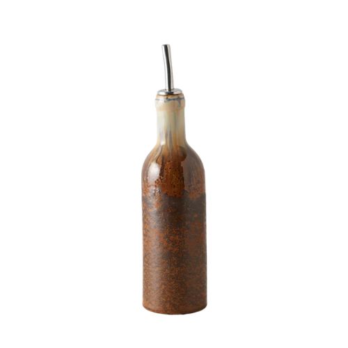
Featuring rusty red tones and murky brown hues, this oil cruet is a great way to add dirty color to your kitchen while still feeling functional.
This color palette points back to the shift we are seeing across the board in kitchen design – spaces that feel warm, timeless, and more unique than ever before. The 'dirty' colors do just that, all various tones of earthy shades that simply never date, making it easier than ever to choose the right kitchen color scheme.
Love beautiful design ideas, expert advice, and inspiring decor trends? Sign up for our newsletter and get the latest features delivered straight to your inbox.


.png?w=600)

