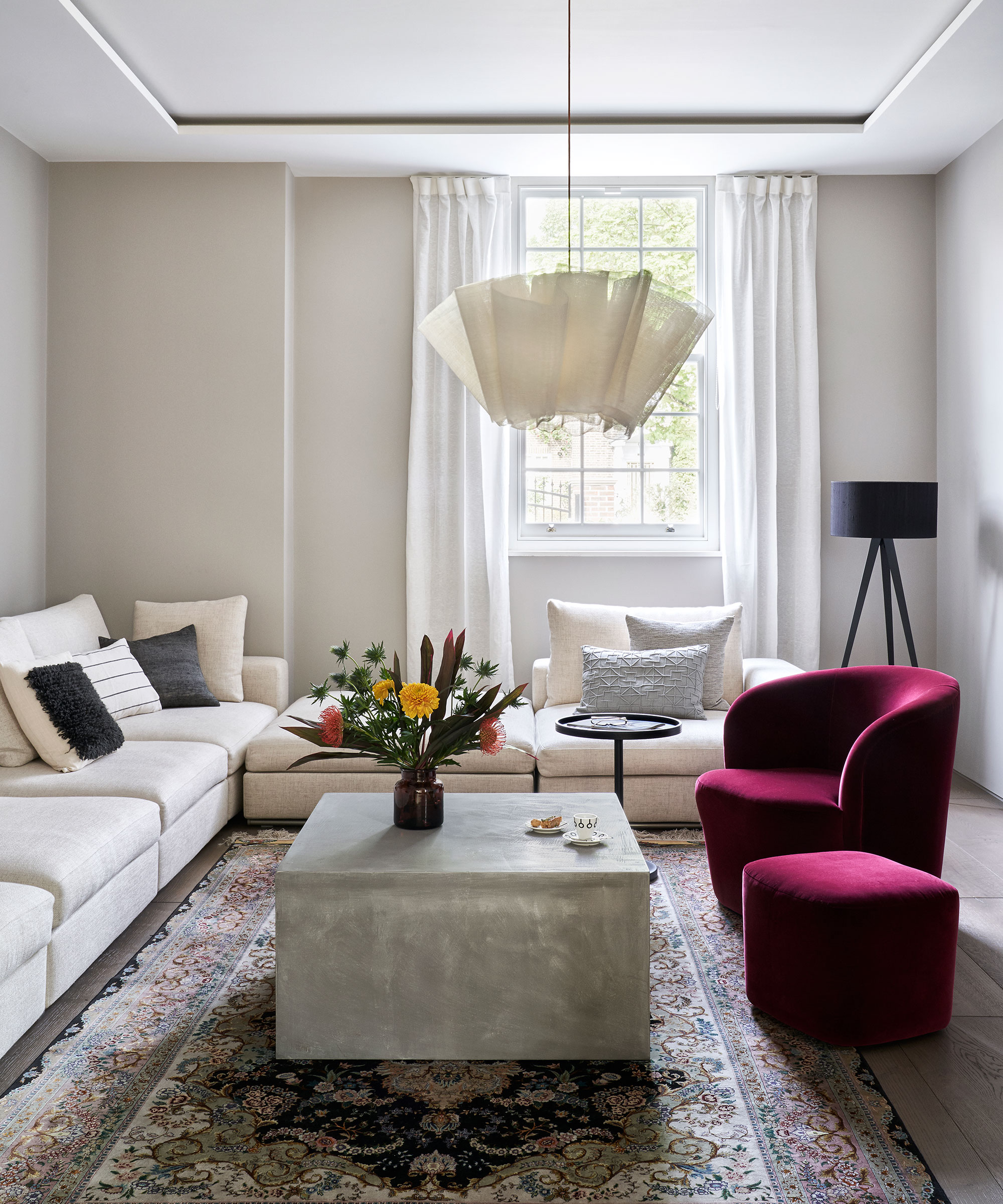
When you have people over for social gatherings, you notice when you've got the seating arrangements right. Seating plans are very important – and not just at a dinner table. I like to think of seating plans for the living room early on when designing a living room – using what I like to call 'conversational seating'.
Interior designer Stephen Shadley, the mastermind behind Diane Keaton's living room layout, is an expert in creating social spaces that sing.
Furniture arranging mistakes are rife, but you may not even know you are making them. Your space could be beautifully decorated, but unless you give the furniture you fill it with the proper consideration, its design won't look or feel right. But where to begin?
Mastering the art of good furniture placement will ensure that your home is practical and sociable, no matter the size or layout. It all comes down to size, placement and styling.
'When planning a failsafe living room, the number one rule before even considering anything decorative is to prioritize functionality first,' explains New York-based designer Kati Curtis. 'The living room is often the most utilized space in a home and often must be multifunctional. Serving as a hub for social gatherings, relaxation, and more recently, even work.'
'Therefore, every element in the room should be chosen with its practical use in mind. This includes selecting versatile furniture that offers ample seating – positioned to make a small living room look bigger and provide conversation seating. By focusing on functionality, you can create a living room layout that is comfortable, welcoming, and adaptable to your needs.'

Select living room seating that is in proportion to the size of your room – oversized sofas and armchairs can make a small room feel narrow and claustrophobic. Make sure you arrange your sofa and chairs at an angle to create a sense of depth to the room, as shown here, otherwise, if you place all seating against the walls you might end up with a narrow 'bowling alley' look. This layout is great for intimate conversation, informal entertaining and small living rooms.
'The number of chairs you set out is an important consideration,' explains design icon, Nina Campbell. 'Odd numbers are good for seating plans in general because it allows for some rotation of guests.'
'The interior designer Elsie de Wolfe wrote in 1913 that you must never place a chair on its own in a room; she was very shy herself and noted that it is always the shy person who arrives first, sits on the lone chair and then is often rooted there for the whole party. But two next to each other does not always work, either. I find that two people sitting side by side do not always speak to each other, so having an occasional chair pulled in at a diagonal can create conversational triangles.'
Shop the look

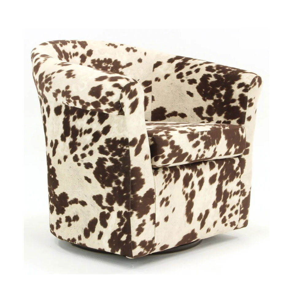
Many designers are hailing animal print as the 'new neutral'. However, when decorating with bolder designs, less is always more. Make do like Diane Keaton, and introduce one strong element, such as an accent chair, to create a unique focal point in your home.

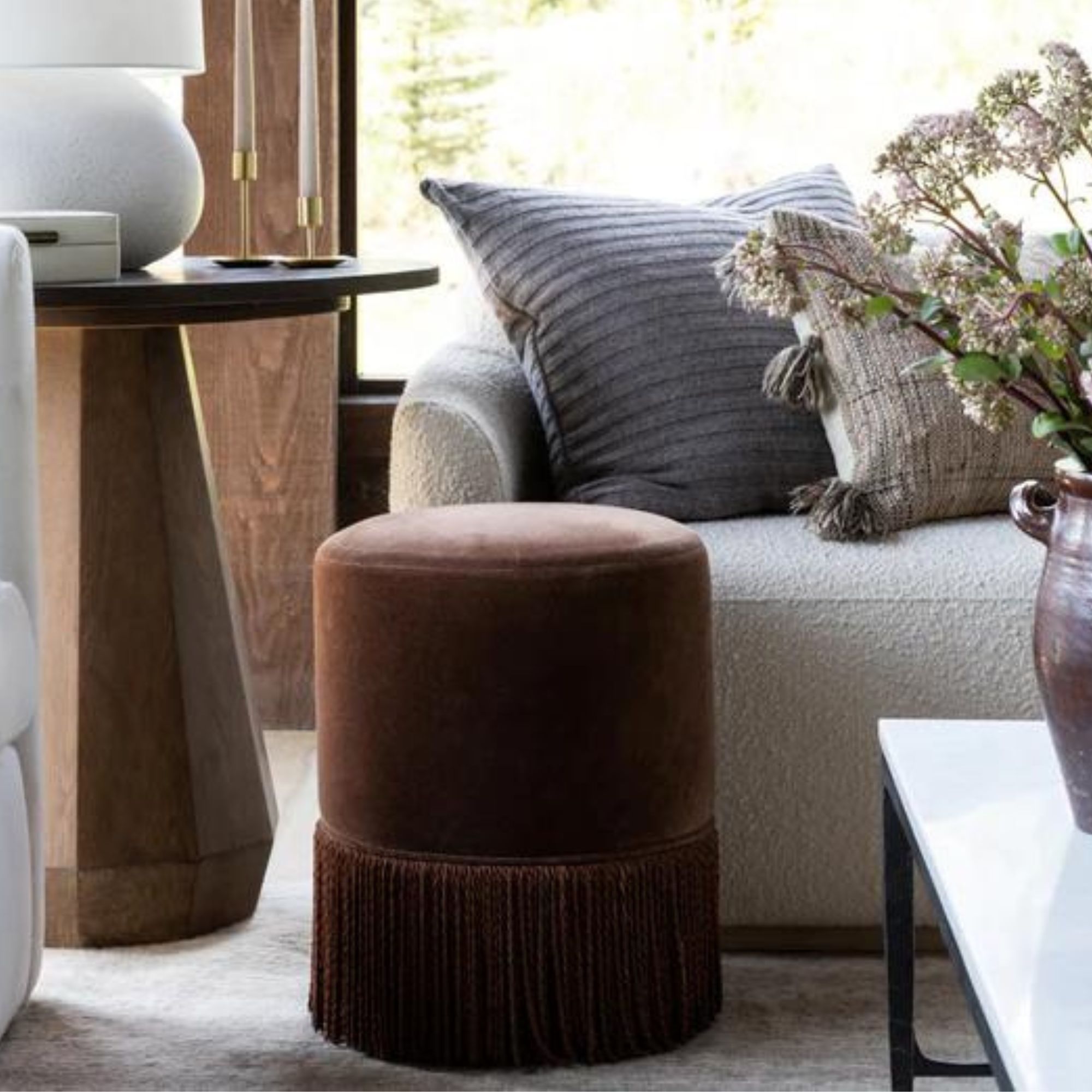
If you have a small living room, but also love to entertain, look no further than a few decorative stools that can be easily moved around and stored in cabinets when not in use. This gorgeous, earthy brown fringed stool is a personal favorite of my own – I already have two.

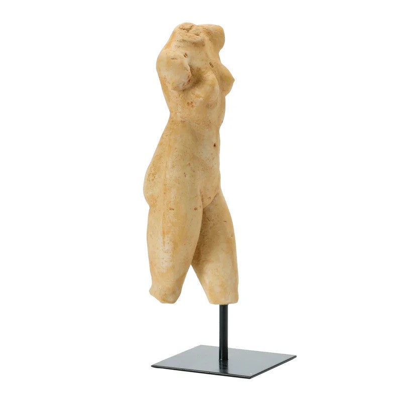
When designing a living space, it is important to have a focal. Usually that would be a distinctive architectural feature, however, I personally love to use sculptural artwork instead. Place this figurine on a coffee table and let it take center stage.


