
Get all your news in one place.
100's of premium titles.
One app.
Start reading
Homes & Gardens
Homes & Gardens
Emily Moorman

Designers share how to decorate with Sherwin-Williams' 'Romantic Period' color palette – 5 on-trend, calming neutrals for all design styles

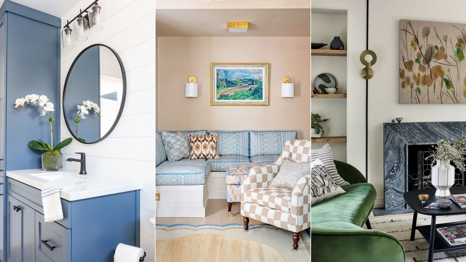
Blue and white bathroom, peach living room, white living room with colorful decor.

If you love decorating with calming neutral paint colors throughout your home, then Sherwin-Williams' latest color palette is for you. Inspired by the Romantic Art Period, this color palette is an elevated take on neutrals, and each color is incredibly versatile for many decorating styles.

While stark whites and cool grays are quickly becoming branded as bland, we're seeing plenty of appeal for earthy neutrals which provide more depth and warmth, and this palette fully embodies this cozy approach.

Sign up to read this article
Read news from 100's of titles, curated specifically for you.
Already a member? Sign in here
Related Stories
Top stories on inkl right now
One subscription that gives you access to news from hundreds of sites
Already a member? Sign in here
Our Picks
Fourteen days free
Download the app
One app. One membership.
100+ trusted global sources.