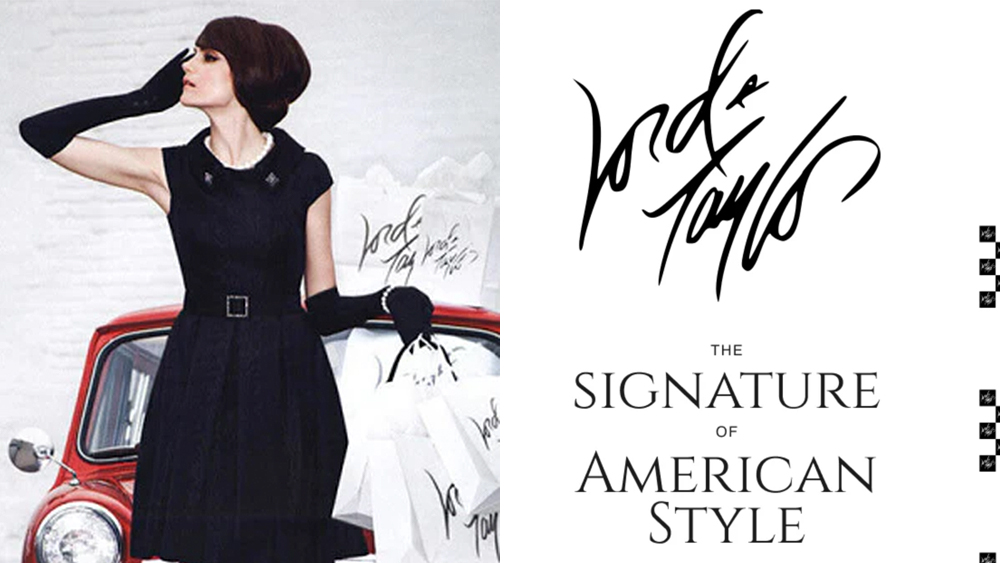
Cursive logos were all but declared dead in 2024 after even Johnson & Johnson ditched its iconic script logotype, controversially followed by Washington College. Gen Z just can't read joined up letters, we were told. But the oldest retailer in the US begs to differ.
The Lord & Taylor logo has changed as often as the legacy department store brand has changed hands in recent years, going from a sweeping cursive logo to a more legible cursive that looked like it was written in a Sharpie marker to, finally, a clean and modern Helvetica-based design. Now it's come full circle, and the new owner sees those logo redesigns as part of the reason the last comeback failed.