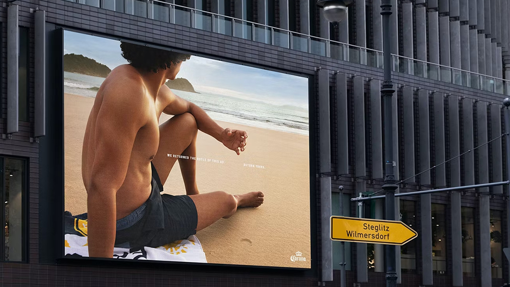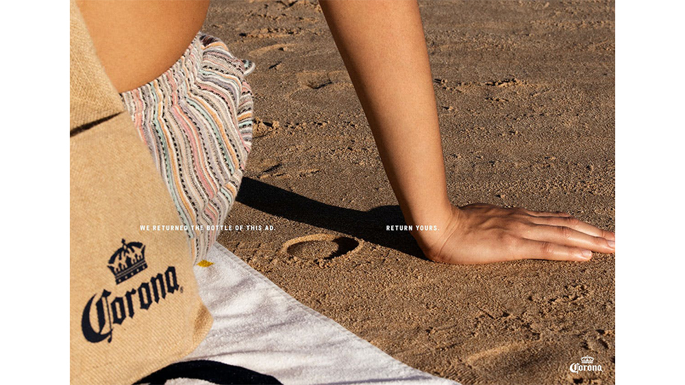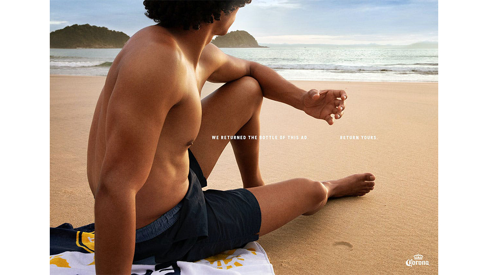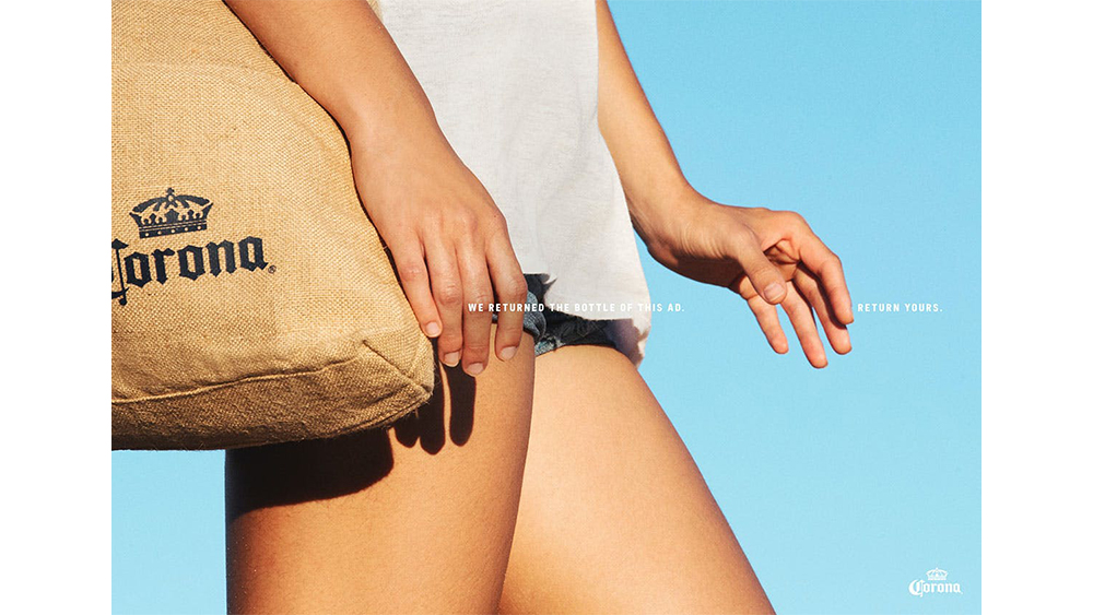
Can you spot what's missing in the advert above? We're used to seeing campaigns from government authorities to promote recycling. In a refreshing change, Ab InBev's Corona beer is putting a recycling message at the heart of a new series of ads by removing its own product.
But despite the good intentions and a nice concept, Corona's adverts have sparked some intense debate about accessible design. Some think the type should be more legible. Others can't see anything other than a shirtless man (see our pick of the best print adverts for more inspiration).


Created by David São Paulo and Bogotá and due to run in Germany, Uruguay and Brazil, the new Corona print and OOH campaign looks pretty much like what we might expect from the Mexican beer brand: sun, sea, sand and attractive people. But one thing is missing: the beer itself – at least, almost: there's just enough Corona branding going on in the tote bags and beach towels to tell us who's behind the ads.
The five photos were shot by photographer Thierry des Fontaines, and the bottles were removed, so hands are left empty and bottle imprints are left in the sand. The tagline reads "We returned the bottle of this ad. Return yours." It's a clever and commendable campaign, highlighting a problem that's much bigger than one brand as it urges people to dispose of their bottles correctly instead of leaving them to pollute the beach or sea.
But over on Reddit, the ad has generated some fierce debate, mostly due to the small lettering and the use of white text over bright areas in the photography. One person even tested the ad for contrast by running the colour hex values through the coolors contrast checker and found it to have a rating of 1.43 to 1 (a rating of 4.5:1 at the very least is recommended in order to aid accessibility for visually impaired people).
this corona ad promoting recycling from r/DesignPorn
"Inaccessible design is just bad design," one person said. "Even on a big board, making a person get closer and try to read a small white text in bright areas is too much effort, most will ignore it right away," someone else argued, while others are of the opinion that it could be dangerous for drivers. "This is terribly designed and even a novice designer should've made sure to not have that issue. to put that into perspective you shouldn't really have anything below 10.
However, others disagree. "I had a professor tell me 'It's not their job to read it, it's our job to make them want to'." one person wrote, while someone else suggested that the ad would be acceptable, at least in CMYK for its print uses.
However, accessibility isn't people's only concern with the new Corona ads. "Someone is totally going to graffiti something dirty on this," someone else said. Others criticised the poor English translation, presumably from Portuguese or Spanish ('we returned the bottle of this ad' rather than 'we returned the bottle from this ad'). Others think the whole concept fails.
"Negative space images work when the negative space is associated with the brand. That is kinda why companies have distinctive shaped things, so you can associate a shape with the product. Even IF his hand looked like it was gripping a bottle (it doesn't), it could be any bottle." "It was this many minutes before I realized there was something written next to the sexy shirtless man," someone else wrote.
Corona isn't the only brand we've seen break the rules about putting the product at centre of an ad campaign. A recent series of Ikea adverts was praised as being brave for showing that sometimes its products don't solve our problems.


