There's been a lot of talk, both in fashion and interiors, about powder blue being the color for spring 2026. It's not a groundbreaking shade for this time of year – it leans toward a pastel, after all – but there’s a very specific tone of powder blue that’s gaining traction not just as a trend, but as an enduring color with staying power beyond the changing season.
The perfect example of this muted, cool, lived-in blue is one of Farrow & Ball's best sellers: Parma Gray. Falling somewhere between pale sky and powder blue, it’s an enduringly classic hue that’s long been loved for its transitional qualities. It has been featured as the backdrop to numerous costume dramas because of its heritage feel, but it's also the perfect tone for the cool blue color trend that is on the rise in 2026.
'Parma Gray is an easy mid-blue that will add authenticity to a Regency interior but still feels thoroughly relevant today due to its clean appeal,' explains Patrick O’Donnell, Brand Ambassador at Farrow & Ball. 'A perfect choice for an elegant living room, but to be authentic, avoid a sharp white on your woodwork and look to something a little more, dare I say, ‘grimy.’'
We spoke with designers who love this on-trend, totally timeless shade to find out where it works best, the colors it pairs with, and why it’s a choice that will last for decades.
1. Create Calm in a Bedroom with Parma Gray
Decorating with blue is always a good idea in a bedroom, and Parma Gray's soft, calming qualities are perfect for a serene sleep space.
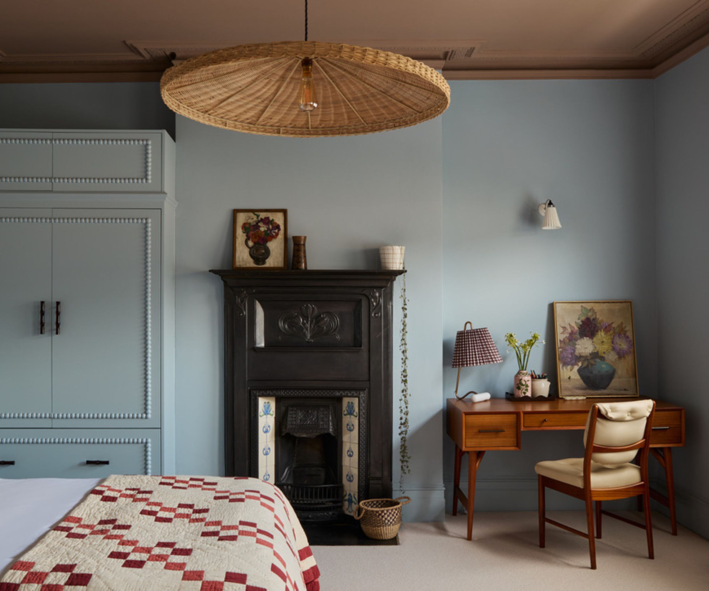
The tranquillity of Parma Gray is evident in this vintage bedroom, designed by Norwood Design Studio. Gently framing the four walls, the pale blue breathes life into the room, uplifting and brightening while allowing the period features to shine.
Kara Riggio, the studio's founder, explains, 'With natural light from the east and west that toned down the color, Farrow and Ball's Parma Gray has the right amount of saturation to make this third-floor primary bedroom feel like a soothing retreat.'
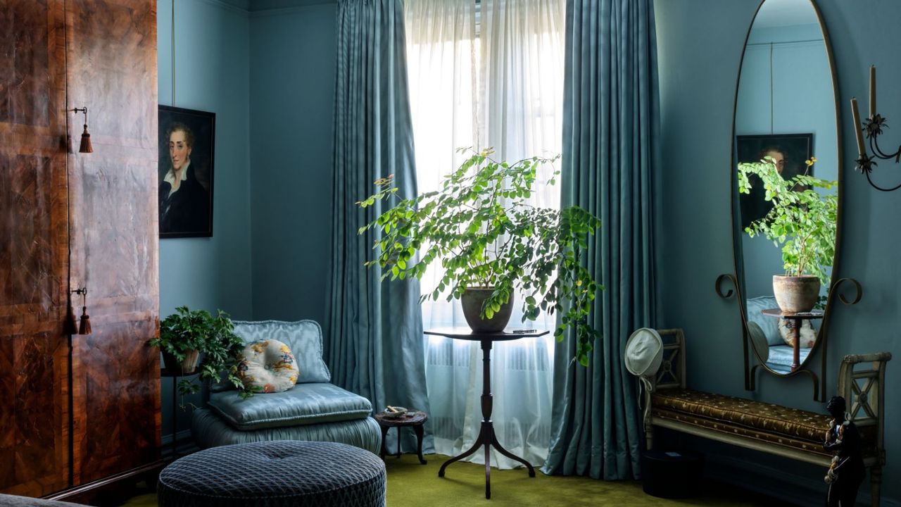
2. Use Parma Gray as Transitional Backdrop
In this living room, Parma Gray brings subtle color without compromising the integrity of the design. Providing just enough interest to enhance the space, it strikes a balance between neutral and noticeable.
Enriching the living room, Parma Gray is a clever backdrop that perfectly accentuates the gallery wall, giving the collection of landscapes even more presence and power. A rustic room layered with period details, the pale blue is sympathetic yet also refreshingly uplifting.
Bringing much-needed contrast, the blue paint is quite necessary in the room. It provides some subtle saturation against the neutral tones and gives the space some character. Transforming the living room into a transitional style, Parma Gray, when paired with the many books and antique decor, bridges the gap between old and new in the best possible way.
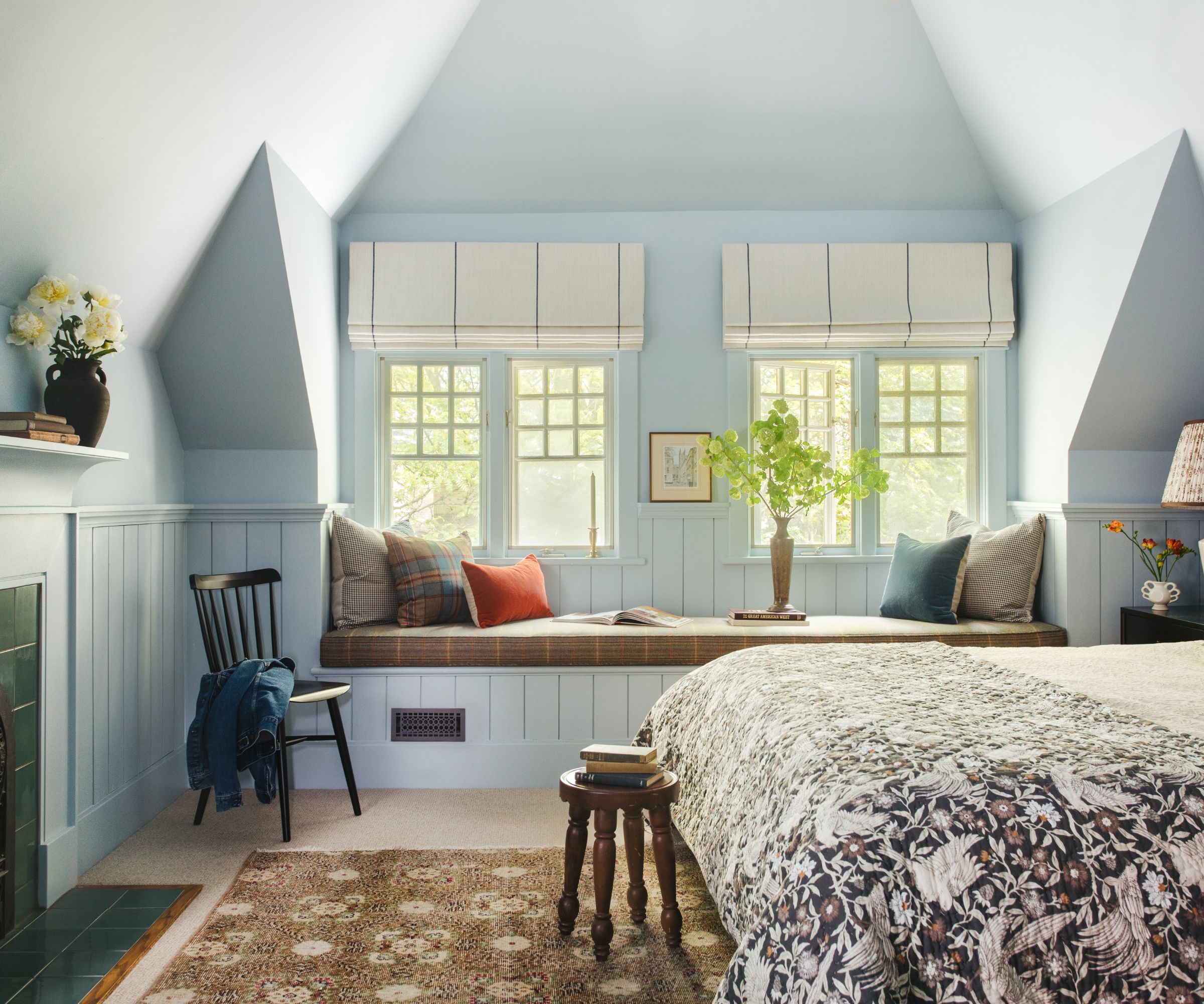
3. Pair Parma Gray with Warm Neutrals
Parma Gray is neutral and livable, capable of enriching a room with that all-important sense of serenity. It's no wonder interior designer Laura Stephens adorned all four walls of a recent bedroom project in the timeless shade.
She explains, 'I chose Parma Grey as the client was set on a blue for this bedroom. Parma Grey is a beautiful blue grey which has a real softness to it, which makes it restful and ideal for a bedroom space. It is a color which works particularly well in period properties. Here, I combined it with ‘dead salmon’ on the ceiling, rather than a traditional white. This further adds to an enveloping feel, and the warmth of the pink helps to warm the cooler tones in the Parma Grey.'
4. Inject a Heritage Style with Parma Gray
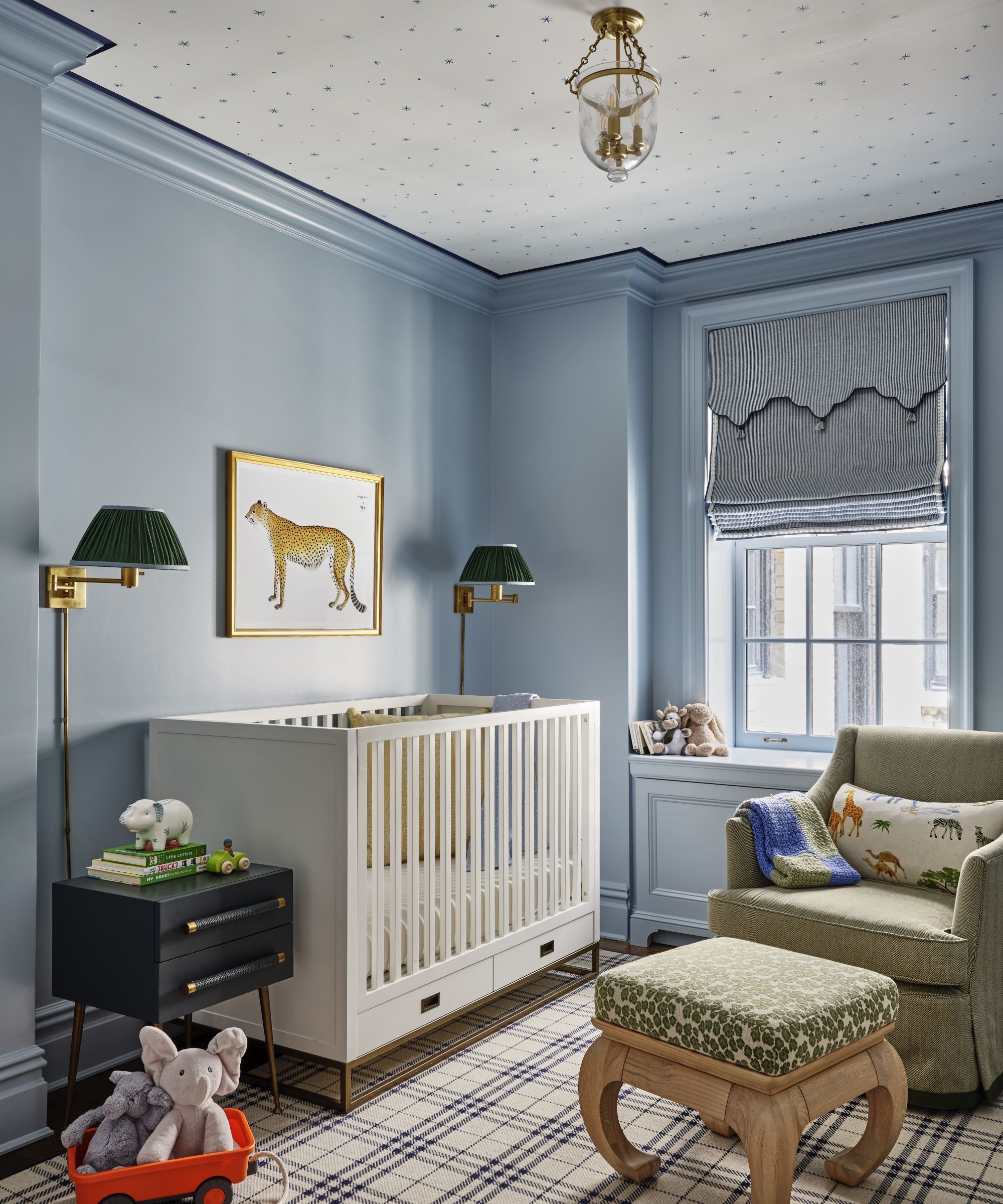
A familiar nursery color scheme, subdued pastels are always a welcome choice for a child's bedroom. Capable of gently enriching, a pale blue like Parma Gray is always a good idea in this space.
Mariel Goodson, Principal of Brass Hill Design, explains why she opted for Farrow & Ball's beloved blue. 'We selected Parma Gray to cocoon this room because we were on the hunt for a cool blue that would be appropriate in the near term as a nursery but wouldn’t read too saccharine-sweet or juvenile, the way some truer blues can. There’s a richness and depth to this mid-blue – and just enough grit in the undertone to achieve a sophisticated vibe that would suit our littlest client now but would also grow with him as a “big boy.”'
Mariel adds, 'It felt essential to wrap the whole room in Parma Gray to create a cohesive backdrop for furnishings that might evolve over time. We like to pop the millwork and trim in a slightly glossier finish to add luster and dimension.'
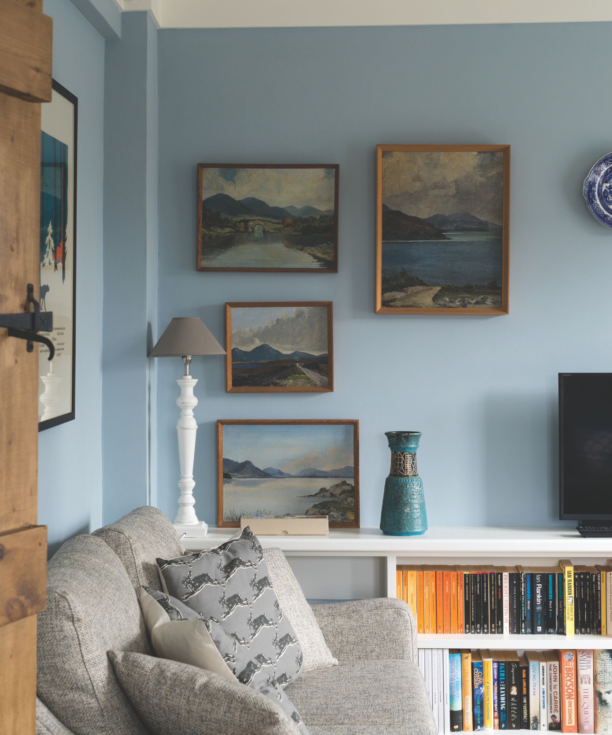
5. Create a Coastal Feel with Parma Gray
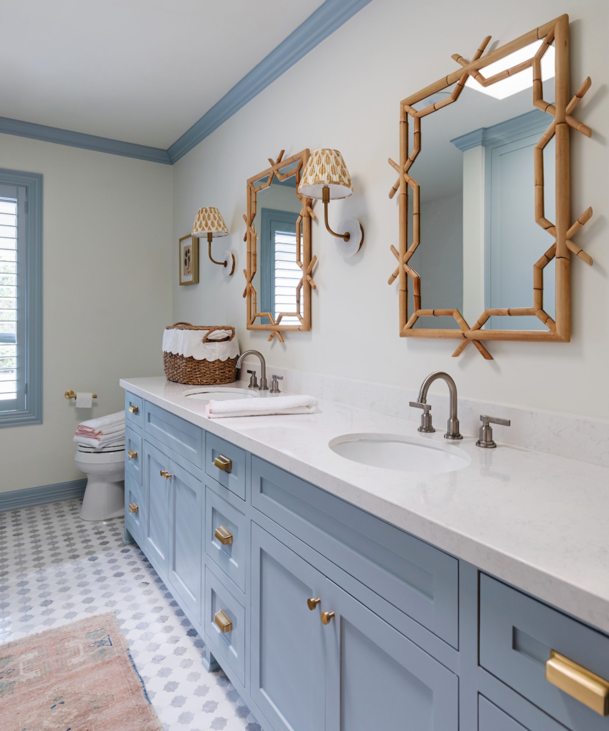
A timeless bathroom color which feels contemporary and classic all at once, Farrow & Ball's Parma Gray is deeply versatile and works alongside fixtures, fittings, and finishes of all styles.
Explaining the process behind selecting the coastal bathroom's color scheme, interior designer Francesca Herro says, 'Farrow & Ball's Parma Gray is a wonderful color for bathrooms because it is extremely versatile. Depending on what it is paired with, it can read playful for a young bathroom or elevated for a mature space. I have used this color on trims, walls, ceilings, and even custom furniture pieces, and it has never disappointed.'
She adds, 'I would style Parma Gray painted trims and ceiling with a neutral block printed textured wallpaper. This makes it super easy to pull in other pops of color for accessories (think sconce shades and artwork). If this much pattern isn't your style, Parma Gray also pairs beautifully with sleek and elegant veined gray marble. Use a variety of tile sizes in the same marble material to build interest but not overwhelm.'
Parma Gray-Inspired Picks
Perfect if you'd rather not commit to a new paint job, these Parma Gray-inspired picks are equally as timeless and will bring quiet elegance to any room.
With a soft matte glaze, the Lenora bowl is enduringly elegant. Finished in a subdued blue, it'll uplift any corner you place it in.
Featuring a pleated surface, the Tory lamp is wonderfully textured. Subdued in tone yet still vibrant, it'll bring lasting impact in a book nook or even a kitchen countertop.
For a dose of tranquillity, add this linen throw pillow to a bed or armchair. Subtle yet interesting, it couldn't be easier to transition this piece into your scheme.
Delicately fluted, this charming vase is finished in an understated blue glaze, perfect for embracing Farrow & Ball's popular Parma Gray without repainting your home.
Enhance your bookshelves with this enamel picture frame. Finished in a pale blue lacquer, it's masterfully classic and elegant.
Retro in style, the Dulton kitchen timer will bring quiet elegance and charm to your cooking space, not to mention, add some color to a plain corner.
Farrow & Ball's Parma Gray is one of the best pale blue paints on the market. Uplifting yet gentle, it's remarkable how much difference it can make to a room, infusing it with softness and that all-important sense of serenity we all crave.