As color continues to drive contemporary trends, inevitably, creative applications are sure to follow. Surprisingly, it's actually small moments like painted doors and trims that tend to have the biggest impact. And while curtains might be the first thing you think of when dressing your windows, perhaps a lick of unexpected paint would do more heavy lifting.
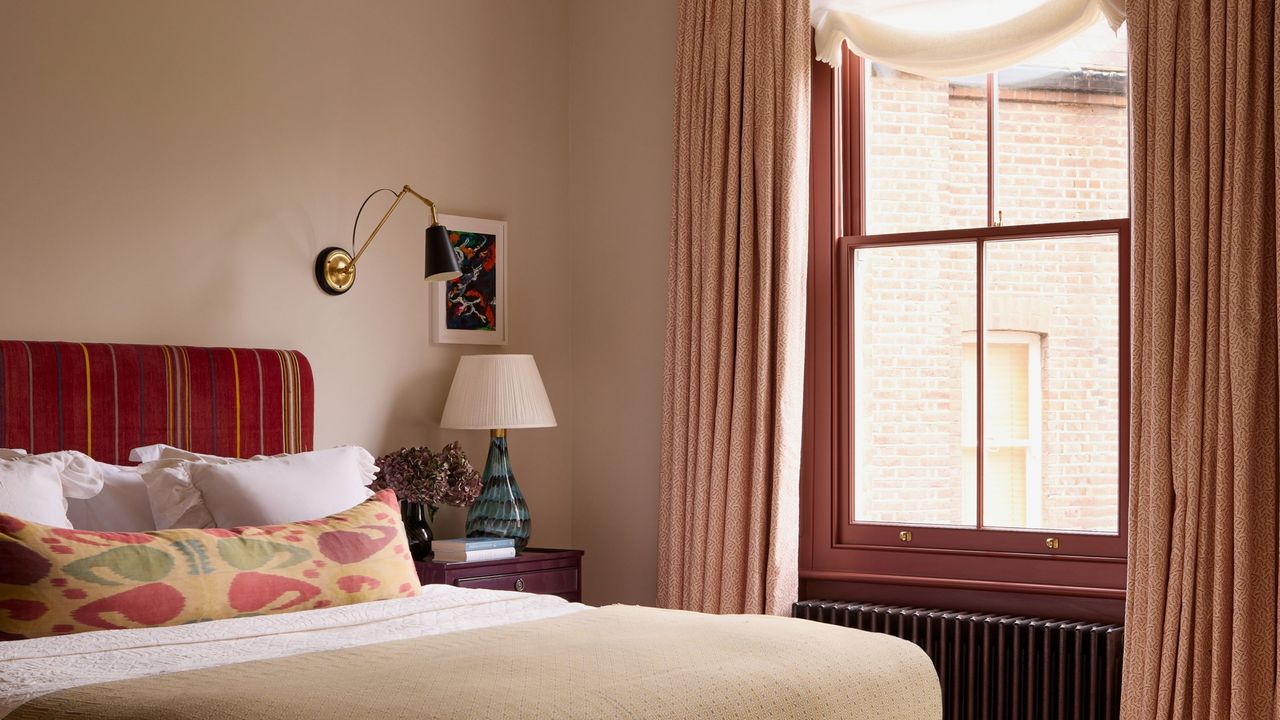
Imagine this: a soft off-white bedroom wall with a warm pop of contrasting pink on the window frames. It can be as bold or as subtle as you like, but that little bit of contrast can make a world of difference. "I think what we are seeing now is less a new interior design trend and more a revival — much like all good design," says interior designer Anna Haines. "Colorful contrast window frames allow you to bring character to a space without having to embrace a fully decorated scheme."
This colorful window treatment is simple in theory, but adds so much joy and energy to an underutilized surface in our homes. Plus, contrast window frames would be easy to do yourself in a weekend... here's what you need to know.
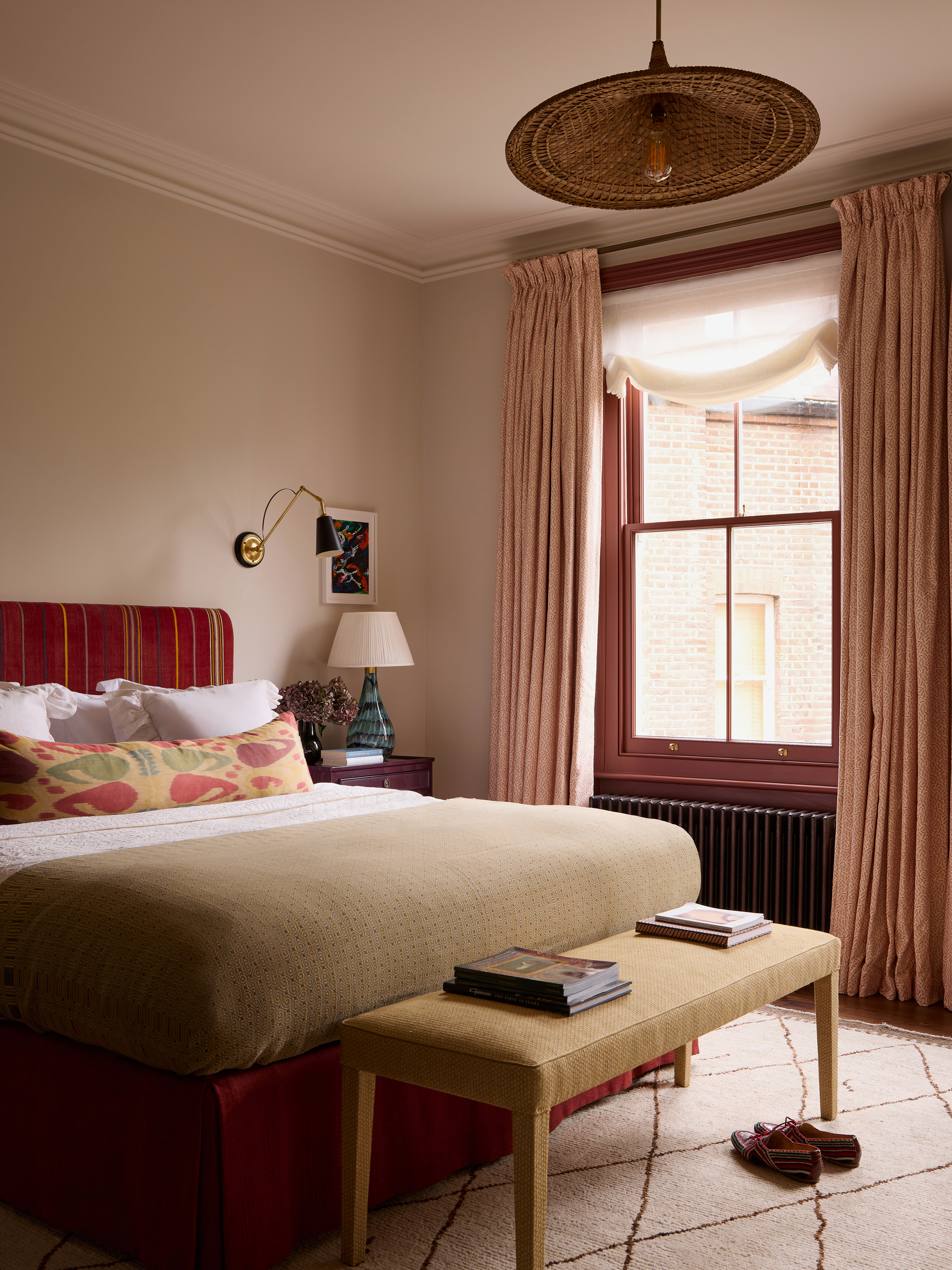
Historically, and particularly in 18th and 19th-century houses, "joinery was often picked out in deeper or different tones to highlight architectural detailing," explains Anna Haines. Painted trim helps to frame views, adds depth to a room, and draws attention to original features like a beautiful frame or architrave around a door. "It also helps introduce a sense of architecture to a room where it may otherwise be lacking," adds Anna.
And much like the 'Peek-a-Boo' paint theory, painting window frames or trim in a contrasting color is a great way for those who are a little color-shy to add personality. Helen Shaw, a color expert at Benjamin Moore, explains, "It offers an opportunity for small but striking flashes of color in unexpected places, rather than committing to a fully painted wall or large block of a hue."
Colorful contrast window frames encourage people to be brave and rebel against decorating rules, and show just how easy it can be to decorate with color. "It takes confidence to 'paint outside of the lines', but it’s one of the easiest ways to make an impressive impact in an otherwise simple space," says Helen.
Trying colorful contrast window frames in your home is as easy as learning how to paint trim and applying a little extra creativity. You'll want to get the technical aspects right, like prep and choosing the right paint finish for trim, to avoid any painting mistakes, but after that, it's all about aesthetics.
"A colorful frame is a great technique for drawing attention to architectural details," says Helen. "It helps define the structure of a room and adds depth without overwhelming the overall scheme." Window frames are oft-forgotten surfaces that we usually default to painting white. However, adding flashes of color can create moments of surprise and visual interest.
"This works particularly well in places where small glimpses of color appear as you move through a space, such as along the edges of windows," adds Helen.
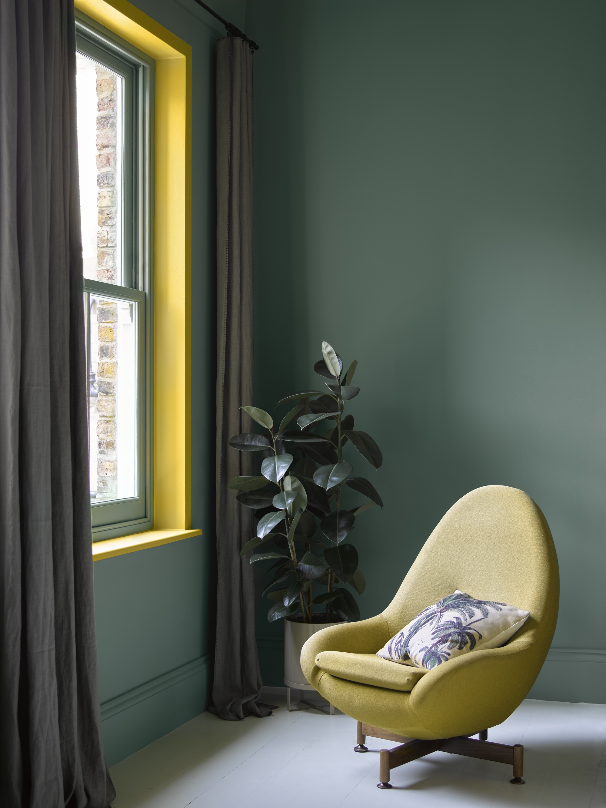
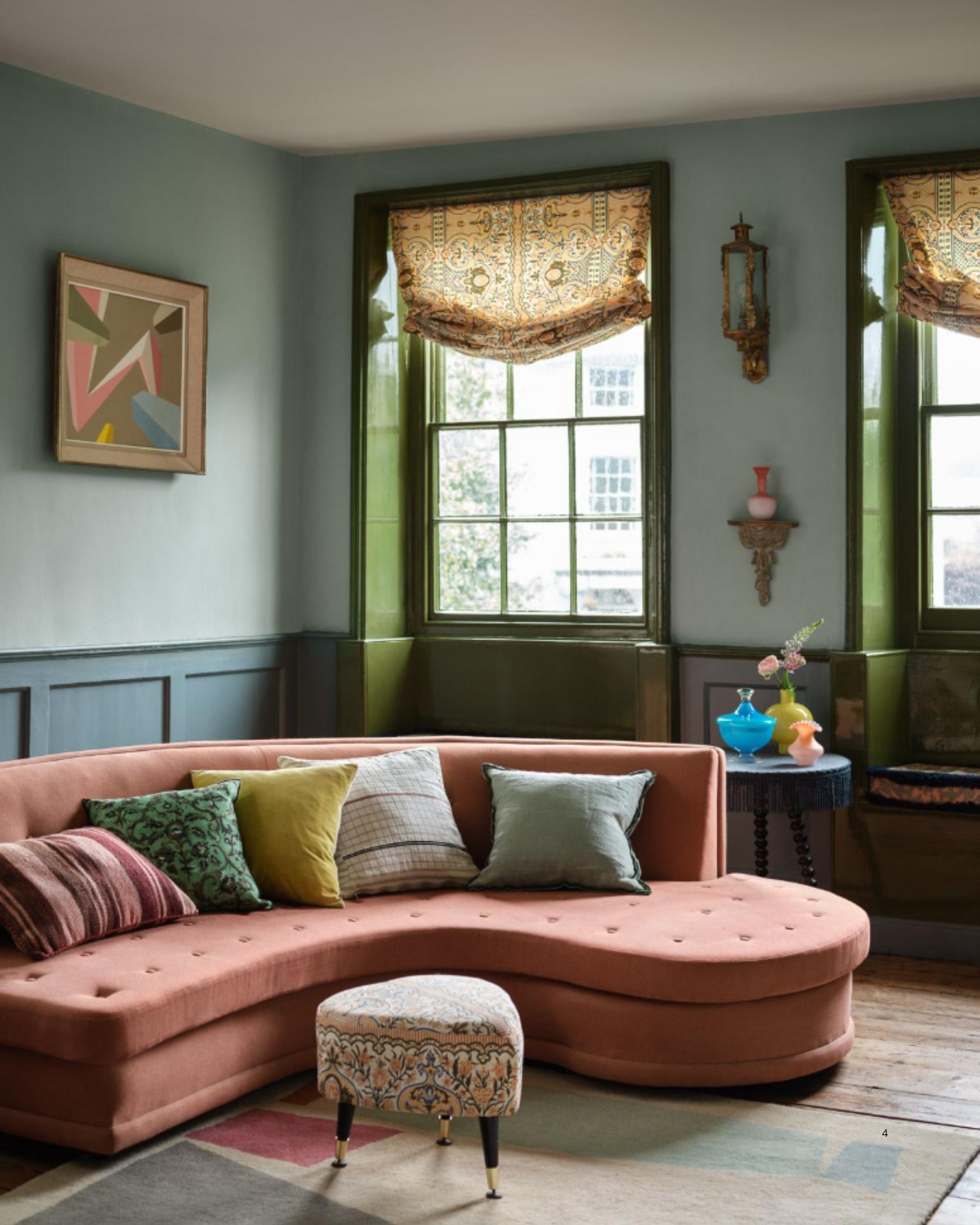
"A deep green (like Benjamin Moore's Waterbury Green) paired with bright yellow trim (Benjamin Moore's Imperial Yellow, pictured above) is a bold combination that perfectly captures the idea of using contrast to create impact," says Helen.
The richness of the green provides a soothing backdrop, while the yellow introduces a vibrant edge that draws attention to the architectural lines of the window and adds an uplifting energy.
Plus, a pop of chartreuse or acid olive green is very in touch with the latest color trends. And on such a small surface area, a painted window frame can really be a place to experiment with more playful colors.
Alternatively, "blue walls with green trim offer a more harmonious approach, whilst remaining visually interesting," adds Helen. "This combination works particularly well in spaces where you want color without overpowering the space, adding depth through a softer contrast."
I think Sap Green from Farrow & Ball would make a particularly lovely pop next to a crisp light blue/white shade like Farrow & Ball's Sizing. The pair balance each other and create contrast, but they are both still grounding earth tones.
This paint technique can be applied in whatever dose of daringness you want. A high-contrast color pop will leave a fashionable impression, while something more subtle creates intrigue without overwhelming.
And remember, you can always pair the colorful contrast window frames with furniture and accessories in the same shade to lock the scheme together.
Not quite sure about a colorful contrast? There is plenty of ways to add interest while painting your ceiling and trim the same color, too, but colorful contrast window frames perfectly tiptoe the playful-chic line.
For more color inspiration, be sure to subscribe to Livingetc's newsletter.