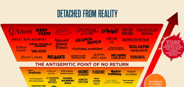
A chart that rates conspiracy theories created by Abbie Richards is going viral.
(Picture: (Twitter/@abbieasr))From straight-up bonkers QAnon conspiracy theories to your average #FreeBritney supporter—where is the line between completely unhinged, to harmless speculation based on factual evidence?
A new viral chart has divvied it up for everyone’s reference.
“Conspiracy theories are everywhere and people don't understand how harmful they are,” wrote Abbie Richards on Twitter.
She added: “I made the original Conspiracy Chart over a year ago. An update was long overdue. This is the 2021 version.”
Conspiracy theories are everywhere and people don't understand how harmful they are.
— Abbie Richards (@abbieasr) November 23, 2021
I made the original Conspiracy Chart over a year ago. An update was long overdue. This is the 2021 version. pic.twitter.com/c8STog1JUW
The pyramid graph created by Richards is sorted by the top signifying the most outlandish, dangerous theories, the bottom of the graph; or as she calls it, those that are “detached from reality.”
Some of these beliefs include QAnon, Holocaust Denial, and the theory that Sandy Hook is fake Alex Jones would like to have a word).
Conversely, towards the bottom of the chart, you’ll find theories that are “grounded in reality.”
Such as the theory that Big Tobacco lied about cancer, Watergate, Project Mockingbird, and #FreeBritney.
I’d argue that most of us would be able to agree on the level of insanity each of the theories we see on either end of the chart is, so it’s the entire middle section where things get more interesting.
In the “Reality Denial” section defined by Richards as the theories that are “unequivocally false but mostly harmless,” you’ll find theories ranging from ‘Stevie Wonder isn’t blind’ to alien abductions to the belief that the Titanic never sank.
Being that this has been created by one person alone, people, obviously, had some interesting takes on the chart. See below:
“according to this chart, if you disagree with the government or believe that rich people and ethnic groups cooperate to attain or maintain political power, then you are less sane than somebody who believes that we live in a simulation and greta thunberg is a time traveller,” one Twitter user wrote.
according to this chart, if you disagree with the government or believe that rich people and ethnic groups cooperate to attain or maintain political power, then you are less sane than somebody who believes that we live in a simulation and greta thunberg is a time traveller https://t.co/8egrGGsck1
— SP (@not_thuletide) November 23, 2021
Another argued that they found the chart helpful, writing: “This is sensible and genuinely useful.”
This is sensible and genuinely useful. https://t.co/HEVKVX4HPy
— Neil Gaiman (@neilhimself) November 23, 2021
Hasan Piker also chimed in with his thoughts, “the ‘leaving reality’ part is just true.”
the “leaving reality” part is just true. https://t.co/7xchABFAsI
— hasanabi (@hasanthehun) November 23, 2021
“Everyone who disagrees with me is a conspiracy theorist: The child's guide to internet discourse,” wrote another.
"Everyone who disagrees with me is a conspiracy theorist: The child's guide to internet discourse." https://t.co/rllTceBQK2
— Johnny Eyeball (@ForestsUnknown) November 23, 2021
Even far-right Jack Posobiec commented by sharing a parody of the chart Republicans had made.
The right has responded
— Jack Posobiec ✝️ (@JackPosobiec) November 23, 2021
h/t @MidnightMitch pic.twitter.com/crT4ayA1IM


