
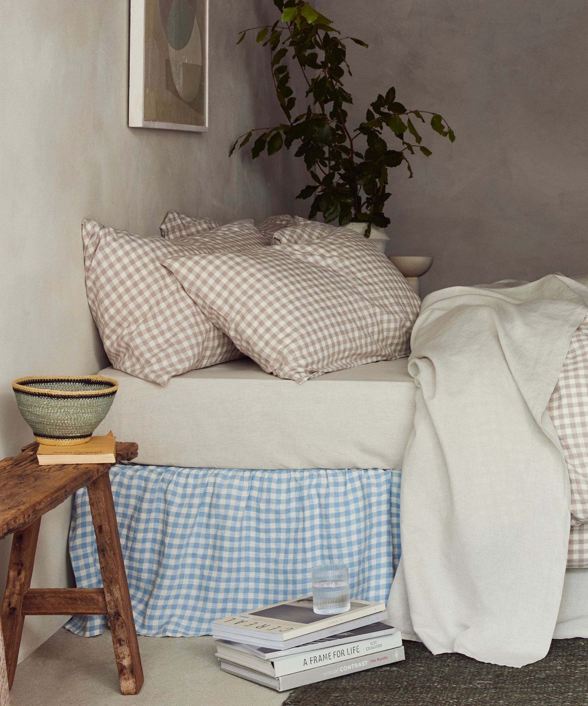
There's a reason why neutral color schemes are often the default choice among designers. Calming, timeless, and extremely versatile, a neutral foundation offers a great backdrop for a home. What's more, by virtue of their neutrality, pared-back palettes also have more widespread appeal. If you're looking to inject a little more personality into your space, however, why not add a splash of color to break up a wall of beige?
Decorating with neutrals is always a safe bet. A tonal scheme made up of ecru, oatmeal, and taupe is simple to construct and certainly easy on the eye, but playing safe doesn't always reap the best rewards. Pepper a dash of pigmented color into your scheme and you instantly add depth and contrast for a more elevated space. It's a popular trick used among designers to not only add visual interest but to make homes feel more characterful and less identikit. The question is, what colors can you count on?