Choosing the right color combinations for your home isn't always easy, but it's an important part of the decorating process. Here, interior designers share their favorite color pairings that are the most classic.
From bright colors to earthy tones, these color combinations create different moods suitable for various rooms and design styles, whether you're looking for a high-impact combo or something more understated.
Read on to spark inspiration for your room color ideas in 2024.
Color combinations for rooms
We’ve asked a panel of industry experts for their views on what color combinations work well together for them – using a color wheel will help you get it right.
1. Green and blue
Looking to combine green room ideas with blue room ideas? Why not use them as a calming color combination?
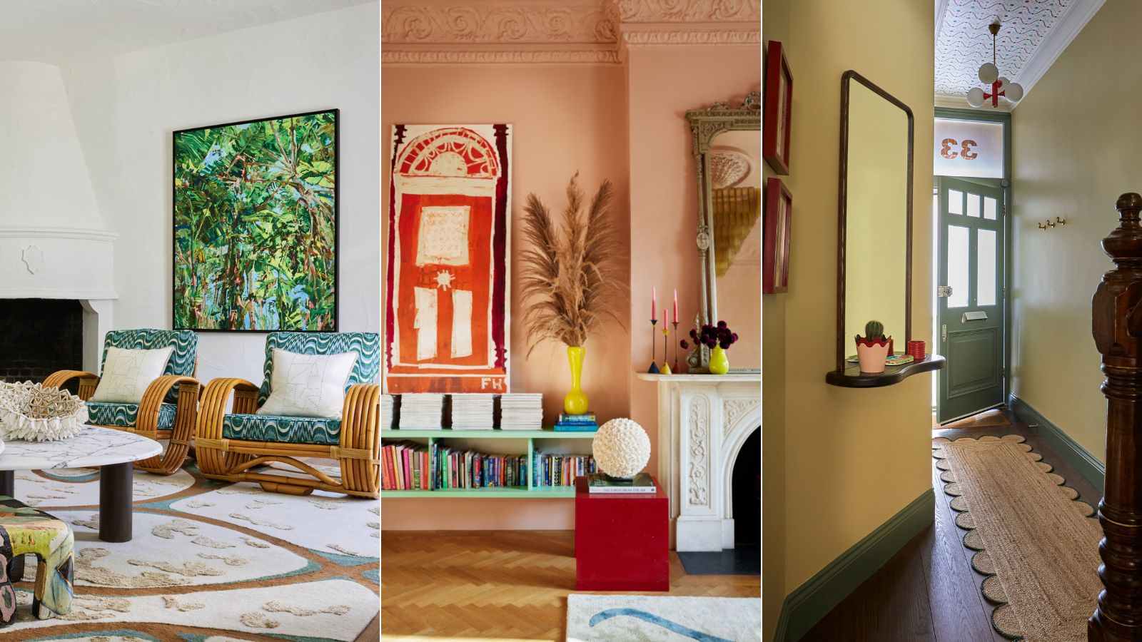
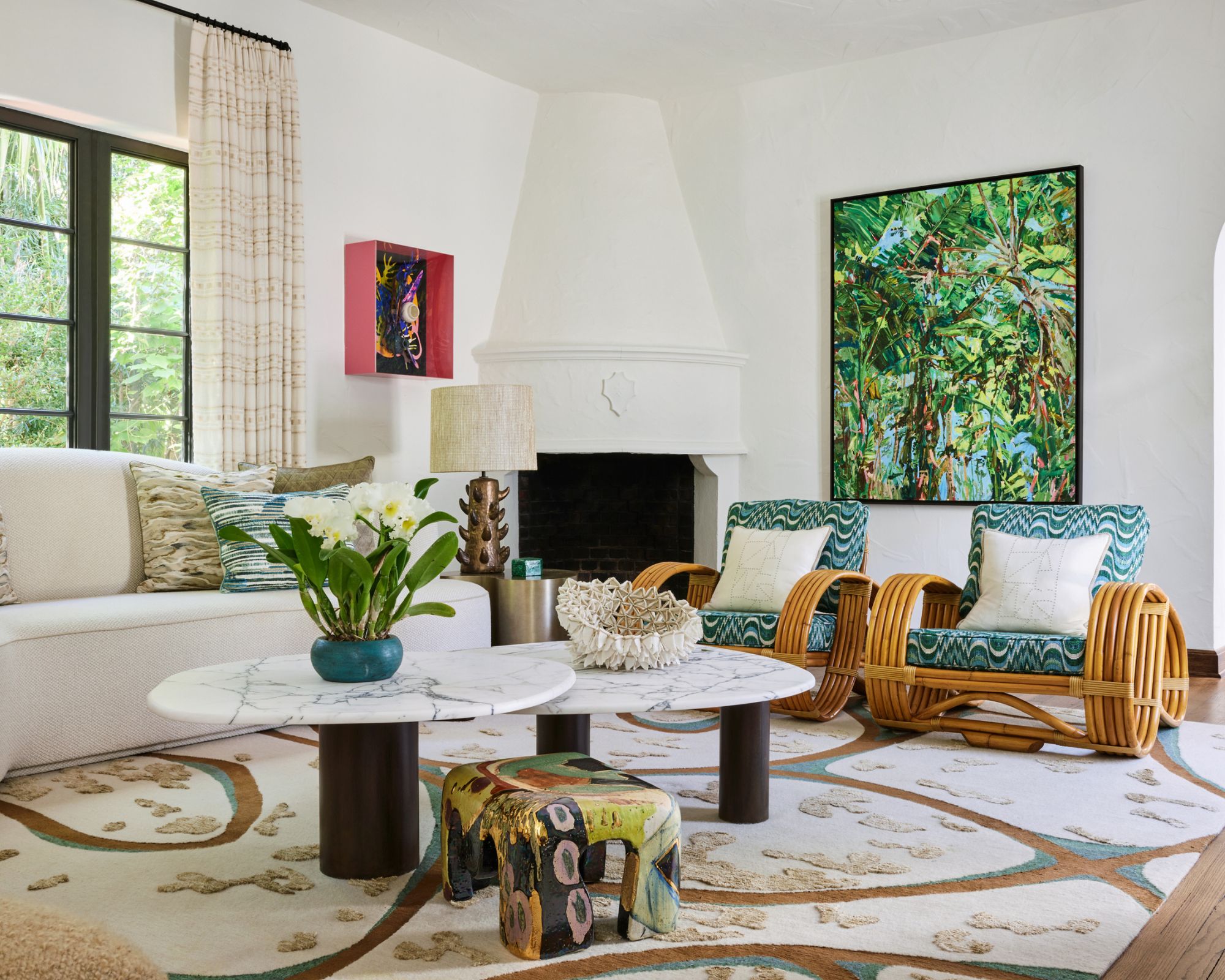
'A color combination I particularly love is blue and green, something I explored with artwork and textiles in this Miami living room,' says interior designer Natalia Miyar. 'Both colors are calming and soothing individually, together they create a space that feels relaxed yet fresh.'
'The combination really evokes the lush and tropical feel of Miami. Nature is another of my big passions and provides endless inspiration. I think this is perhaps what I find so inspiring about the combination, a palette that reflects its beautiful natural setting and is quintessential ‘Miami’.'
2. Neutrals and bolds

Neutral room ideas can be maximalist, too. But where to start?
‘Pick one color as a foundation – from a favorite artwork, image or piece of clothing – to form the thread that runs through the space. Build your palette around this with complementary or tonal shades,' says Charlotte Archer, head of brand, Sanderson.
'My number one rule is: decorate for yourself, not others – choose tones that you love and you won’t go wrong.’
3. Brown and white
The words 'brown living room ideas' don't necessarily conjure up an appealing image – but they can be incredibly welcoming and quite beautiful.
‘The color pairing I keep returning to is multiple shades of brown and white. It is very important to use layers of the same combination to create contrast, depth and the feel of a well-lived-in space,' says Paolo Moschino of design studio Paolo Moschino.
4. Yellow and green

Some design experts are urging us to be bold with colors in the year ahead, such as green and yellow in this Studio Duggan entryway.
‘I feel we might look beyond the nostalgic tones of the past year and be attracted to colors that are full of excitement, but somehow familiar,' says Joa Studholme, color curator, Farrow & Ball.
'I am keen to use more homely, uncomplicated colors that are full of memories. The combination of India Yellow with Green Smoke epitomizes the feeling of optimism so crucial to our homes.’
5. Navy and earthy accents
Want a dramatic room scheme that feels elegant, too?
‘When picking the perfect paint color, I’m typically on board for moody hues of navy, gray, or noir. I love the warm, cozy vibes that darker tones lend to a space. Next, I layer in natural earthy accents such as terracotta, stone, putty, and gray-beige,' says Mikel Welch, owner Mikel Welch design agency.
'Don’t be afraid to walk over to the dark side… just don’t forget your complementary earthy tones.’
6. Earthy naturals
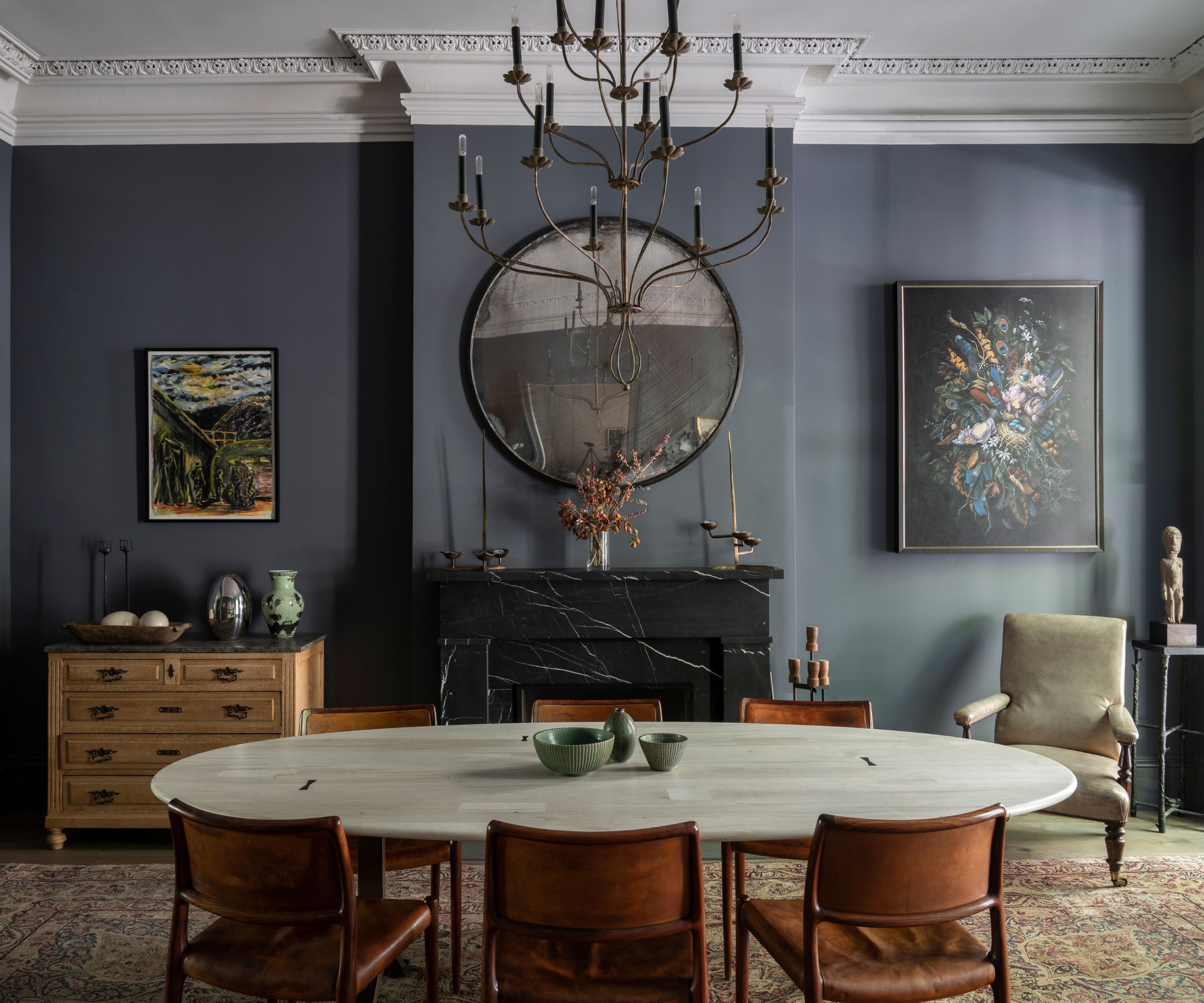
Decorating with neutrals accounts for so many timeless color combinations, as shown in this dining room designed by Studio Duggan.
‘Scale really drives how diverse you can be with color pairings: larger homes can take a looser palette; in smaller homes, it’s best to keep the colors more concise – find three colors that harmonize and use them as a common thread for continuity,' says Charu Gandhi, founder and director, Elicyon.
'I enjoy using ivory, egg-yolk yellows, and hints of navy, mixed with copper and metal accents. Old rose pink, nude, and orange tones are also a nice palette – the combination of dull shades creates a calm but sumptuous aesthetic. We are also using pastel lilac with thistle green and soft amber, which gives a pleasing visual sense.’
7. Blue and red
If it's a timeless appeal you are looking for, return to red and blue.
'A classic yet enduring color combination that I love is denim blue paired with aged antique red colors. These colors combine to create rooms that appear effortless and stylish, offering comfort and embracing the trend for relaxed living,' says Ann Grafton, creative director, GP & J Baker.
As with any color combination, you can adjust the boldness according to your preferences. Vibrant red and mid blues will create a high-impact look, whereas muted reds teamed with powder blues will create a more restful color scheme.
8. Green and pink
Want to impart a summery impression, year-round? Green and pink always feel like such a joyful combination to me, reminiscent of the abundance of florals and botanicals in nature as spring turns to summer. I like to keep it feeling fresh and clean with a good dose of white in the mix.
9. Pastels and strong colors

Creating a surprise with pastel room ideas and deeper shades can work brilliantly if done right.
'I firmly believe that any color pairing can work, it is all a matter of introducing an element of separation,' says Dr Geraldine Tan, creator of the interiors blog Little Big Bell and one of the founding contributors to Instagram’s @design account.
'So what might traditionally be a color clash – really light pastel hues in accessories against a super dark wall color, for example – can work if separated by neutral tones. This, to me, is very important when you decorate with color and creates a more restful space.'
10. Blue and vibrant tones
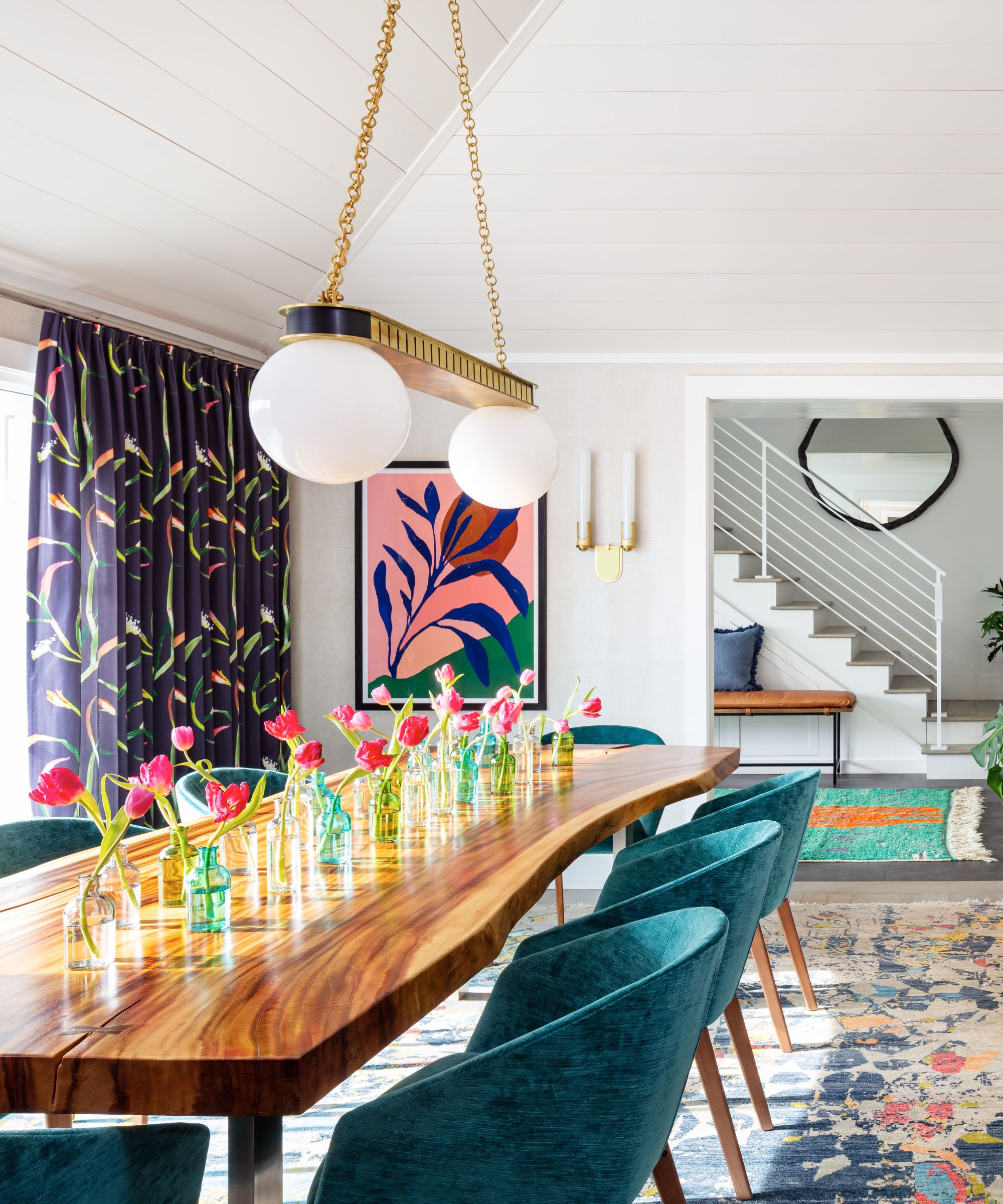
'My favorite color pairing is any shade of blue with any other color in matching tones,' says interior designer Betsy Wentz.
'Blue is universally the most loved color and clashes with nothing if combined correctly. Blue looks incredible paired with rich greens, reds, and oranges, yet can hang with pastel pink and neutrals.'
In this dining room, Betsy uses various shades of blue across the chairs, rug, and curtains and layers other bold and saturated hues to create a lively and cheerful scheme.
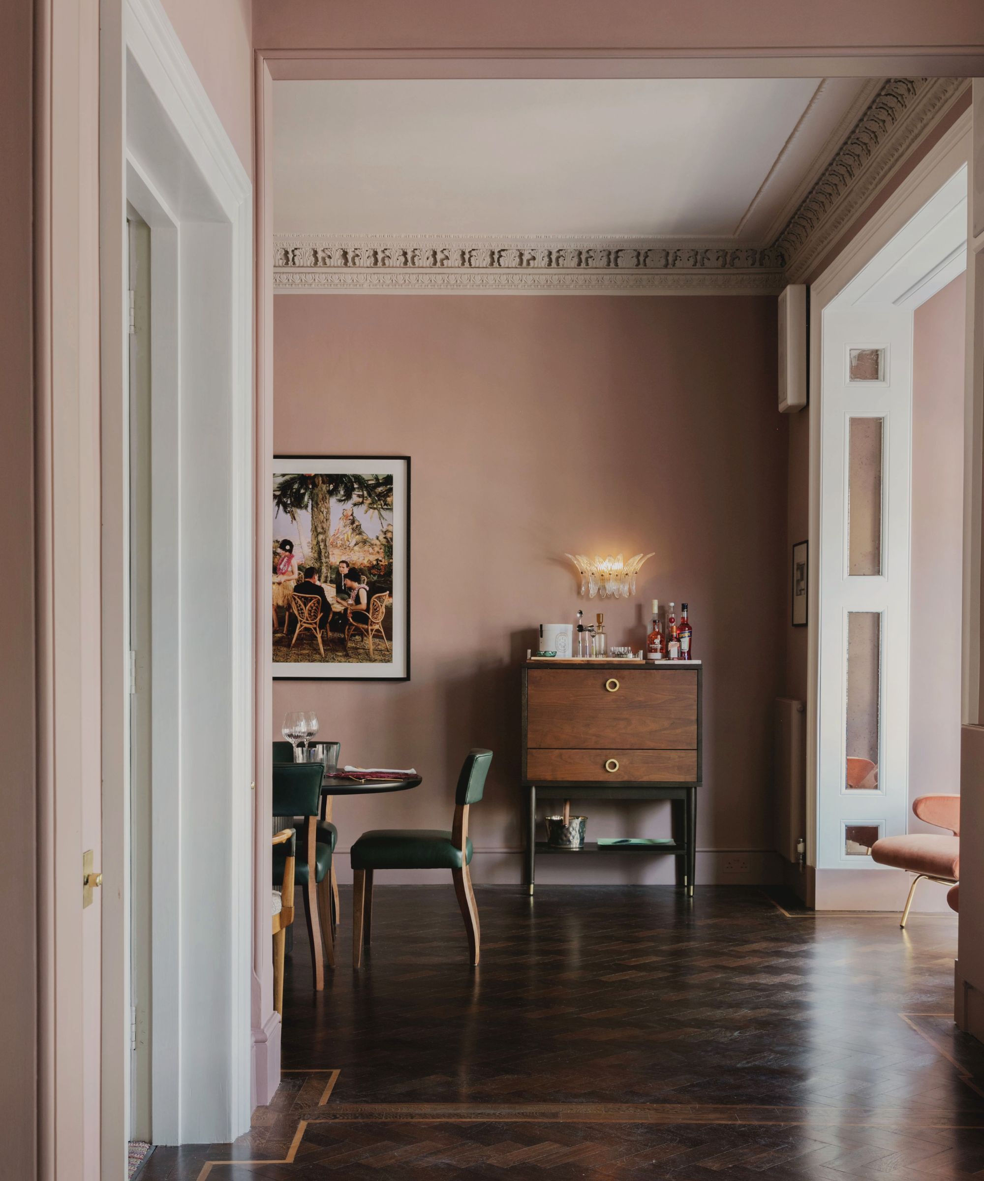
11. Red and pink
Decorating with red and pink is a go-to pairing for interior designer Matthew Williamson, who enjoys using plaster pinks as a room's backdrop color with red accents to ensure a liveable look.
'I used red liberally while working in the fashion industry, but when it comes to interiors, I see it as more of an accent color,' says Matthew. 'Rather than using it as a top-to-toe color, I now use it with restraint to highlight and draw attention to an accessory or piece of furniture that I want to stand out against a softer backdrop.'
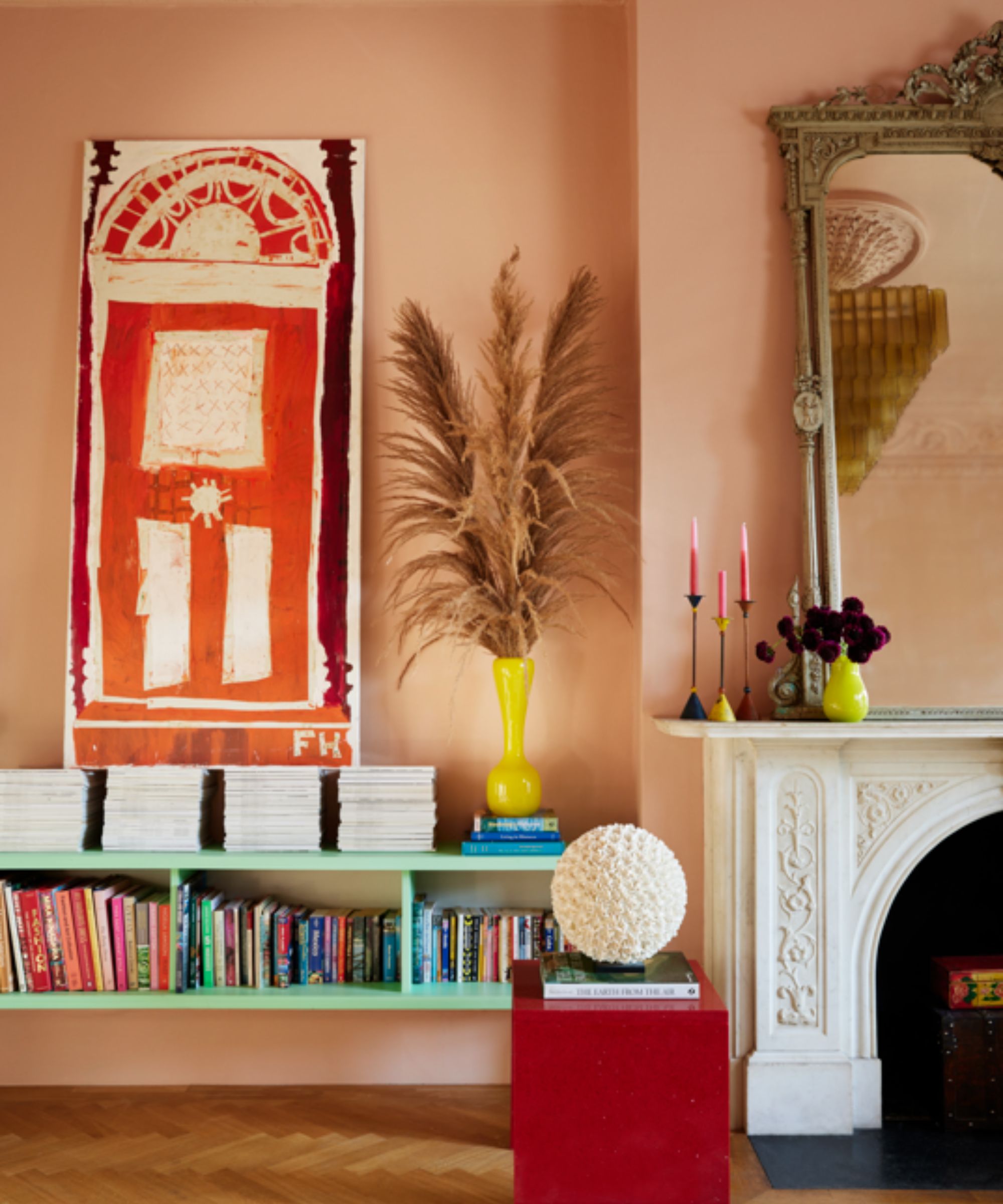
'I am enjoying soft plaster pinks on my walls at the moment, as they feel like a new neutral, and I love the slightly unusual and unexpected combination of these shades with a pop of red for a wonderful contrast. If you’re in doubt about giving pink and red a go, start with some easy-to-change ideas, such as a bunch of red dahlias in a pink vase, or a lampshade combining both colors. A little splash of red and pink goes a long way and you might just surprise yourself with how easy it is to bring into your space.'
There is an endless variety of color combinations that go well together, but natural and calming colors are some of the most timeless.
'I may be biased because I have this combination in my own home, but there's just something so soothing, stylish, and timeless about sage green and off-white,' says interior designer Kathy Kuo. 'Sage green makes a colorful statement yet feels subtle enough to not be overwhelming; the effect is nature-inspired and oh-so-elegant.'
Joa Studholme, Color Curator at Farrow & Ball adds that shades of blue also make for calming color combinations that are always in style: ‘Uncomplicated shades of blue feel familiar, like memories from our childhood, so they have a soothing effect in the home despite their cooler undertones.’