Chelsea FC has unveiled a stylish and invigorated new kit design in line with the football club's highly anticipated upcoming season. Centred around the motif of fire, the new identity is an amalgamation of the team's enduring power and its fan's passionate support.
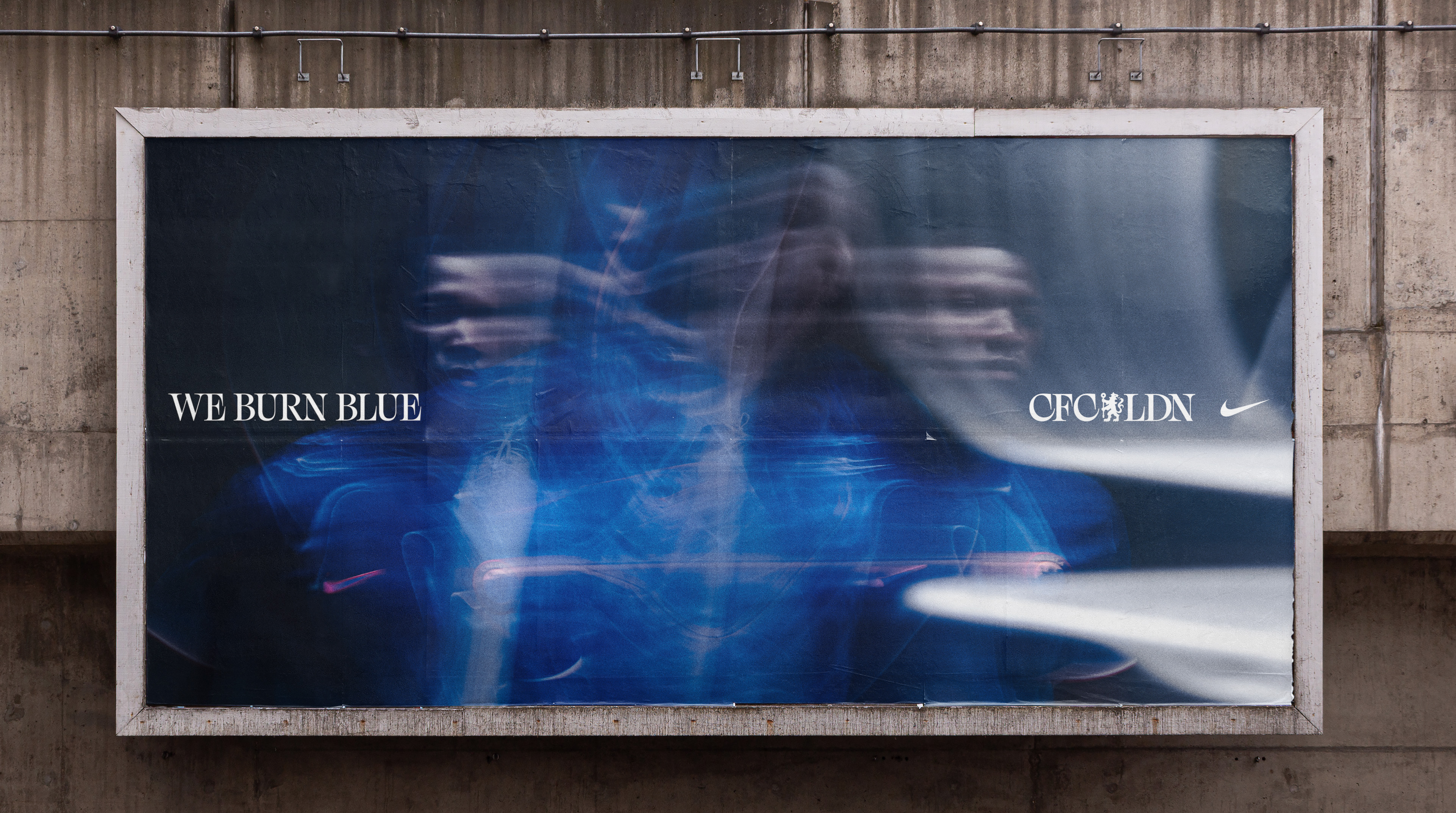
As one of England football's most recognisable sports logos, it was no mean feat to re-energise Chelsea's already iconic brand identity. The new kit debuts alongside a brooding and powerful campaign featuring film, OOH and social touch points that celebrate the football club's fiery new look.

Made in collaboration with creative studio Uncommon, the new visual identity maintains Chelsea FC's iconic blue – a definitive signifier of the team's heritage. Tying into the fire motif, the blue represents the hottest part of the flame, representing the ignited passion and strength of both the team and its fans.
The wider 'We Burn Blue’ campaign features various OOH and social touchpoints, embracing immersive SFX editing to create a dynamic visual story that symbolises a powerful new era for the team. With motion blur, flashy graphics and electrifying imagery, the campaign is an authoritative accompaniment to the new kit unveiling, bringing a revitalised sense of ambition and strength to Chelsea's identity.


Central to the campaign is a slick launch film that debuts the new Chelsea FC kit. The dramatic visuals showcase the team's reignited fiery identity, integrating the vivid flame motif to showcase the kit's new design. With an abstract wavelike pattern and Chelsea's signature blue colourway, the kit exists as a harmonious blend of heritage and clean contemporary style. A pop of orange signifies a new era for the team, sparking a new fire in the team's iconic identity.
“Our new home shirt embodies the passion, drive, and determination that runs through the veins of everyone associated with the club," says Claire Cronin, Chief Marketing Officer of Chelsea Football Club in an official press release. "It is a representation of our history, our present, and our future," she adds. This is only just the beginning — this is about partnering with the fans, players and club to create the brand Chelsea has always deserved, to bring the iconic London club to the world,” adds Nils Leonard, co-founder of Uncommon Creative Studio.
For more design inspiration, check out the National Football Museum logo that's delightfully simple and impressively effective. If you're after more sporting news, take a look at the new England football kit that got an extremely divisive "modern twist" that proved unpopular with fans.


