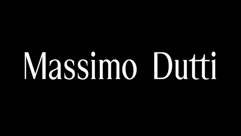
Another fashion logo has succumb to the trend. Massimo Dutti, a Spanish high-street brand from the same stable as Zara, has ditched its quirky cursive logo for a cleaner, more subtle look. In doing so, it follows a long line of fashion brands that have simplified and flattened their logos in recent years.
Cursive logos in particular are increasingly being consigned to the past. Even the Johnson & Johnson logo, one of the oldest logos that was still in use, ditched the script recently. Those bemoaning the explosion of super-minimalist sans serif logotypes can at least be take solace in the fact that Massimo Dutti has gone for a serif typeface. But there's a little detail that's irritating people... Is that a double space between Massimo and Dutti?