Get all your news in one place.
100's of premium titles.
One app.
Start reading
Livingetc
Livingetc
Emily Moorman

Caramel and Bronze Tones Are the "Complex and Atmospheric" Alternative to Pale Neutrals That Designers Are All Over Right Now — Here's Why

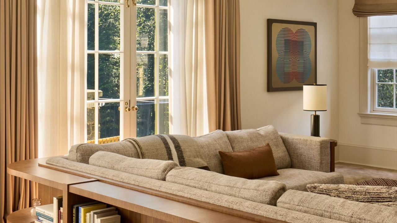
A modern neutral living room with cream walls, French doors with layered neutral curtains, a large taupe corner sofa, with a wooden console table running along the back, with styled books. .

Choosing the right neutrals can make or break a room. And while it's for this very reason that it can be tempting to play things 'safe' with a palette of pale neutrals — think light beige and cream tones — designers are going richer and bolder in 2026.

Caramel and bronze tones are emerging as the warming, elevated alternative to neutrals that can do a lot more for a room than one-tone beige. Once you understand what color caramel is and the depth it brings, you may want to repaint any beige walls.

Here, designers break down this color trend, explaining why these moody neutrals feel a lot more current right now than light tones, and how to bring them into your home in a modern way.

Why Beige Is Being Reimagined in 2026

Beige tones can still work well, but designers are adding more depth and richness to their schemes with warming caramel tones. (Image credit: Nicole Franzen. Design: Zoë Feldman Design)

There's no denying the appeal of beige: it's a versatile, timeless color that helps create quietly warming, neutral rooms where decor can sing. That said, pale versions of this delicate hue are evolving into something richer and more grounding. "People are gravitating toward warmer, more livable interiors," explains designer Zoë Feldman. "Lighter beiges can sometimes read creamier and don't have the same impact as a more saturated caramel or bronze."

"There’s a shift towards interiors that feel more layered and comforting, rather than stark or overly minimal," agrees designer Laura Stephens. "Unlike traditional light beiges, which can sometimes feel quite flat or one-dimensional, caramel and bronze-leaning neutrals have far more depth and variation within them."

The depth of these new neutrals can help to elevate rooms and bring a sense of movement. "They respond beautifully to light throughout the day and shift subtly depending on the time and space," Laura explains. "Although they are still very much neutrals, they provide a richer backdrop that allows other colors and materials in a scheme to really sing."

Why Caramel Feels More Design-Led Right Now

Little Greene's Light Bronze Green, which was used on the wall paneling here, is the perfect example of these elevated neutrals: rich and earthy without reading flat. (Image credit: Leon Foggitt. Design: Matt Smith-Wood)

The appeal of caramel tones coincides with interior trends becoming all about layered, moody rooms that don't play it too safe. "They offer a more complex, atmospheric alternative to the cooler, lighter neutrals that have dominated interiors for so long," explains Melissa Hutley, co-founder of Hutley & Humm. "Rather than sitting flat or purely safe, these shades bring a natural depth and warmth that immediately softens a space."

"They bring an instant hit of character and warmth into a space, which feels very aligned with the move towards interiors that feel more personal and layered," adds Carina Raymond, founder of Studio Raymond.

Caddie by Paint & Paper is a warm caramel shade that adds depth and personality to this utility room. (Image credit: Boz Gagovski. Design: Hutley & Humm)

Caramel also plays to natural light really nicely — feeling warmer in daylight and more subdued come the evening. "I often think of them as an extension of light itself," says Melissa. "When sunlight or even soft lamplight hits a room, there’s always a golden undertone that appears naturally on walls and surfaces. These colors simply amplify that effect, rather than fighting against it."

And while caramel and bronzed tones add more richness to a room than beige, they still offer a level of restraint since they sit within the neutral category. "They work so well because they are neutrals, just richer, more dimensional versions of them," Melissa adds.

Carina agrees. "What I think makes them especially appealing is their sense of softness and ease; they feel more playful and expressive than traditional neutrals, but they are still incredibly liveable," she says.

How to Decorate With Warm Caramel and Bronze

Edward Bulmer’s Cinnamon gives this living room a sun-drenched look and feels more modern than if it were used alongside white paint. (Image credit: Boz Gagovski. Design: Studio Raymond)

Don't be afraid to go bold when decorating with caramel — using a warm paint shade to color-drench a room feels modern and fun. "It creates a really atmospheric backdrop that feels both bold and cocooning," says Carina, who opted for this approach in the living room pictured above.

Beyond the wall color, the key to pulling off this statement neutral is layering. "I like to build in additional layers of neutrals, caramels, and bronze through upholstery, lighting, or decorative pieces, often in slightly varied but complementary tones," Carina adds.

"That tonal variation adds depth and prevents the scheme from feeling flat, while still keeping everything within the same warm, cohesive palette," she explains. "It’s about building richness through subtle shifts rather than contrast."

Farrow & Ball Salon Drab is a darker take on this color trend — a stylish choice for small rooms where you want to amp up the drama. (Image credit: Nicole Franzen. Design: Zoë Feldman Design)

You could take this color trend a step moodier and darker with something like Farrow & Ball's Salon Drab, which was used in this dressing room. While it leans more into bronze territory than caramel, it works well if you want something less warm, but moody and full of depth.

Although Zoë enjoys using dark bronze tones like this one, she also likes to bring this color trend to life in rooms with lighter walls, where it is added through decor and smaller accents.

"I love using these tones through natural materials like wood and unlacquered brass, but also through textiles," she says. "Leather, linen, and velvet all feel luxurious in caramel and bronze. In addition to pairing well with other neutrals, these tones also complement jewel tones and feel right at home alongside vintage pieces."

Caramel paints don't need to be used in isolation. Pairing them with an earthy red feels unexpected and fun, but still considered. (Image credit: Boz Gagovski. Design: Laura Stephens)

You can add more color to your scheme, too, for a more playful look. "I love using a strong contrast paint color alongside a deep neutral to bring a sense of interest and character to a scheme," says Laura. "It’s a really effective way of adding depth without needing to rely on pattern or excessive layering."

In this home office, Laura chose an earthy red for a pop of color, used on the trim. "The red works beautifully with the undertones of the paint color, creating a scheme that feels cohesive but still has contrast," she explains.

"I often find that introducing a contrasting color in this way also helps to highlight architectural details like cornicing, joinery, and alcoves, drawing the eye to the structure of the room and giving it more definition," she adds.

Laura describes Caddie as "a beautifully soft, warm neutral that works well as a grounding base".

This is a favorite for Carina, who says that it "has such a beautiful warmth without feeling overpowering, and works really well as an all-over room color".

Designer Matt Smith-Wood enjoys using Light Bronze Green, saying that it "holds the same neutrality as a beige but with far more depth and intention behind it."

Melissa points to this happy caramel shade, which feels like a more colorful take on this trend.

If you're a neutral lover looking to add slightly more depth and warmth to a room, start with this deeper neutral.

Beyond painting the walls a warming caramel or bronze, the trick to nailing your scheme is all about texture and contrast. Decorating with neutral colors in 2026 is way more nuanced than you may realize.

For more inspiration, subscribe to Livingetc's newsletter.

Paint & Paper Library Caddie Edward Bulmer Cinnamon Little Greene Light Bronze Green Mylands John’s Pantry Graham & Brown Toasted Teacake
Sign up to read this article
Read news from 100's of titles, curated specifically for you.
Already a member? Sign in here
Related Stories
Top stories on inkl right now
Our Picks
Fourteen days free
Download the app
One app. One membership.
100+ trusted global sources.