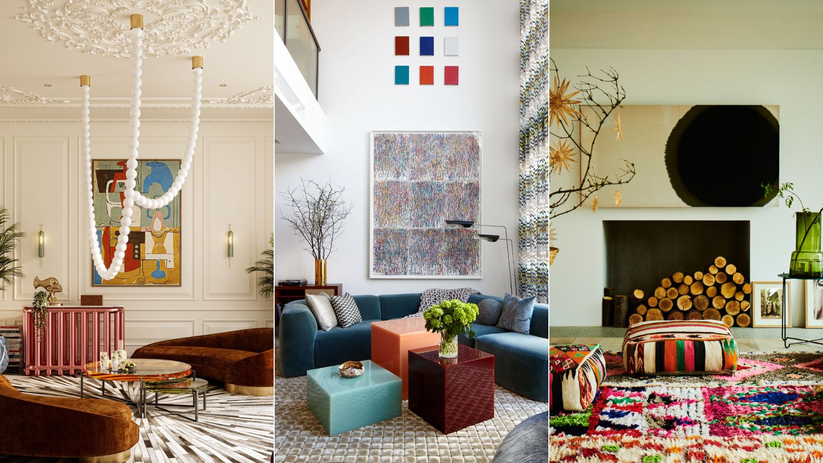
In the interiors world, minimalism and maximalism are at the opposite ends of the decorating spectrum. Minimalist interiors are pared-back, clutter-free spaces centered around simplicity and functionality. Maximalist spaces, on the other hand, revolve around the idea that more is more. Maximalist interiors feature layer upon layer of color, pattern and texture, and every surface is an opportunity to be creative. The question is, can minimalist and maximalist styles ever work together?
Simply put, the answer is yes. While they might be at polar ends of the scale, the reality is most of us are looking for spaces that sit somewhere in the middle. If you like to decorate with color, texture, artwork and cherished possessions, but still want livable, clutter-free spaces that won't give you a migraine, then you’ll probably look to combine elements from both looks. You might even say you are a 'midimalist'.
Striking the balance between minimalism and maximalism is a fine art, so to help we reached out to interior designers for their tips on how to seamlessly combine the two styles to achieve balanced, characterful spaces.
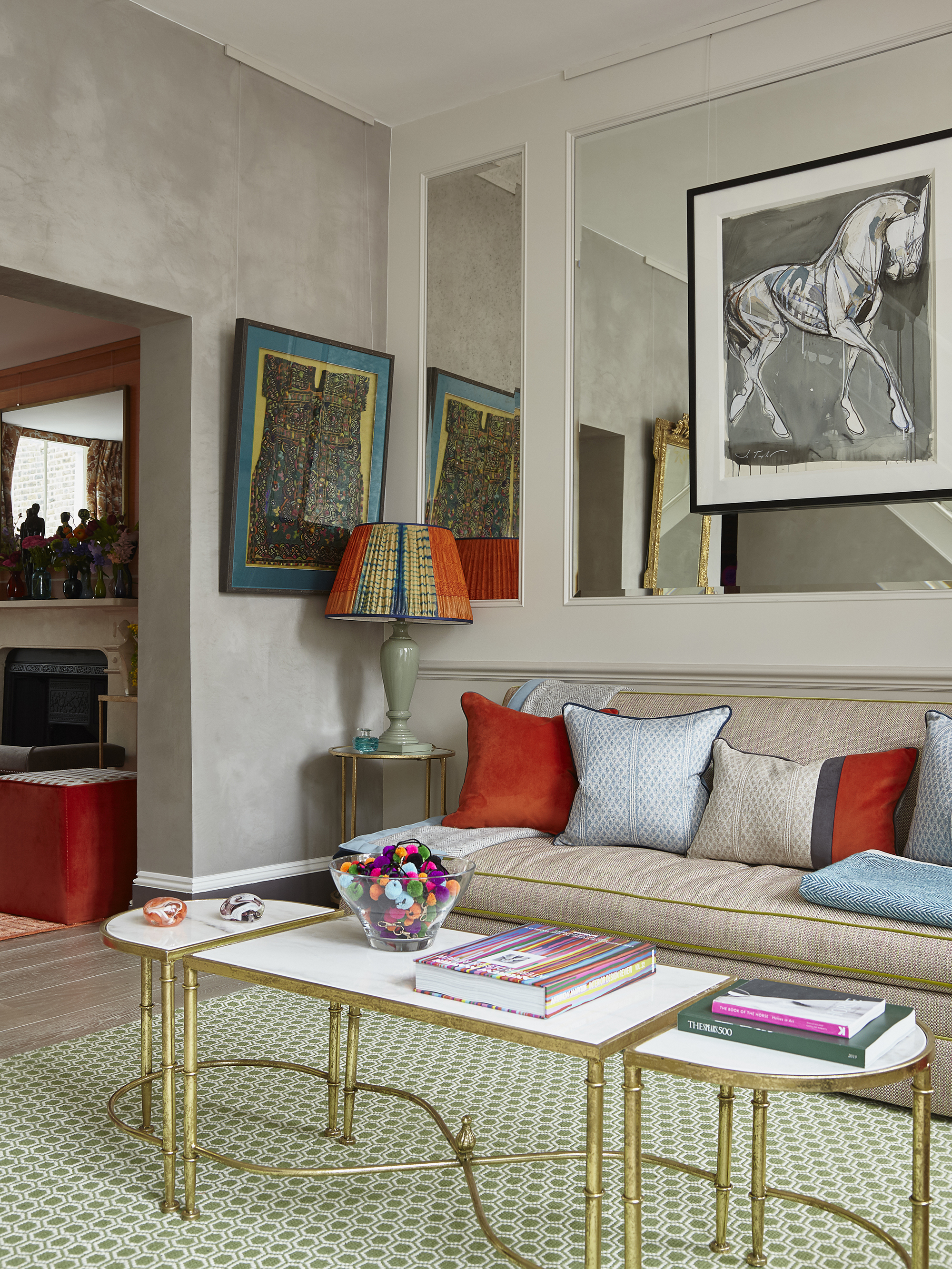
Can minimalist and maximalist styles ever work together?
There are many ways to achieve a balance between minimalism and maximalism within interior design. Although the two design philosophies are poles apart, both can be tricky to live with and often combining elements from the two is the best way to create timeless spaces with personality – some are also calling this look the midimalism trend.
‘Yes interiors can combine both maximalist and minimalist elements, and that is our specialty. Modern is often perceived as sterile while maximalist can be visually busy, to my eye neither is livable,’ explains Elena Frampton, founder and principal designer at Frampton & Co. ‘It is our goal to create balanced interesting and livable spaces that combine maximalist and minimalist elements.’
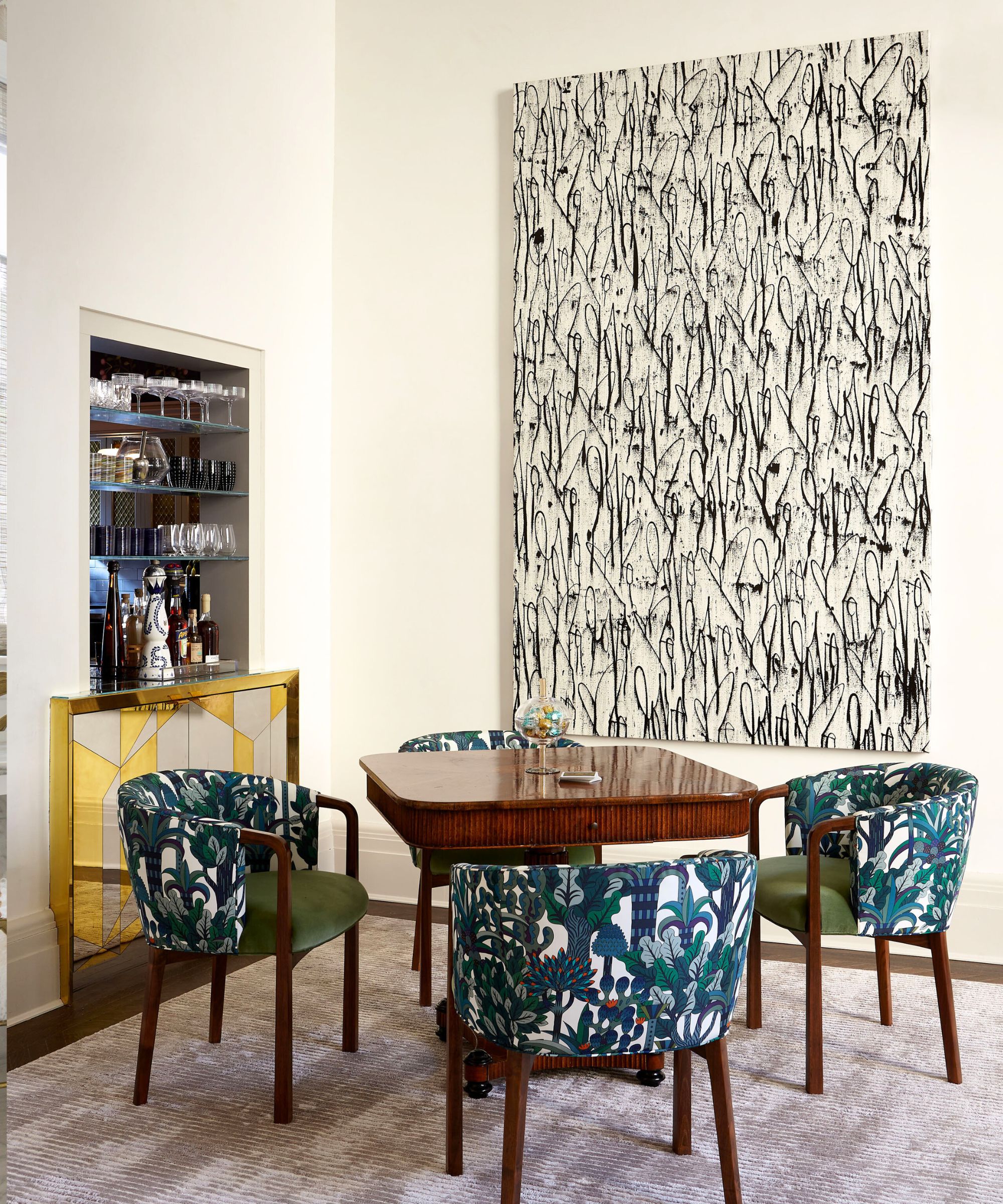
Emma Deterding, founder of Kelling Designs, agrees that the two looks ‘can harmonize perfectly when both are used in a balanced way.’ Adding that, ‘Maximalism focuses more on simplicity, functionality and of course clean lines and neutral color palettes paired with just the essential pieces.'
Maximalism contrasts this starkly, embracing the bold, with lots of layers, colors, pattern and personality. That being said, you can fuse the two design styles together to create a unique and dynamic aesthetic that combines the clarity of minimalism with the vibrancy of maximalism.'
How can you balance minimalism and maximalism in interiors?
Working with an interior designer who knows how to create balance in interior design is always a recipe for decorating success, alternatively, if you're embarking on your own design, we've gathered some key ideas from the experts on combining minimalism and maximalism to help you on the way.
1. Layer bold furnishings against a neutral backdrop
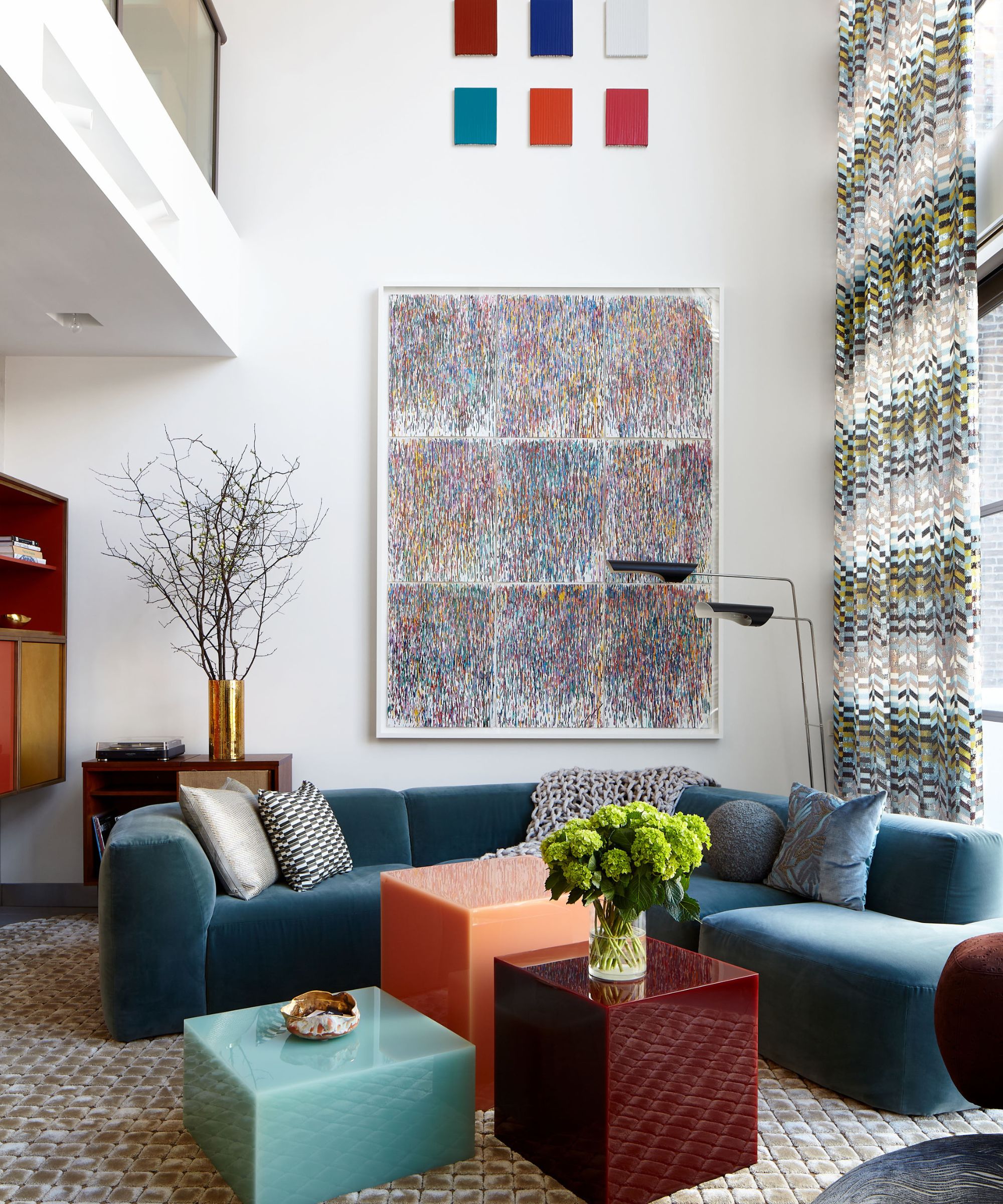
For a stylish, calming space that still has wow-factor – and beautifully balances the minimalist and maximalist styles – think about using a neutral backdrop to showcase bold, statement furnishings say the experts. Choose furniture in bold maximalist colors, but use them sparingly so as not to overpower the space.
'We tend to utilize form through light fixtures and tables. I love textiles and rugs and tend to add color through upholstery and pattern through draperies and rugs. I personally find beige sofas boring,' explains Elena Frampton. 'I ensure pattern, color and form remain balanced within a space, first through careful study, and then by determining the priorities and what elements I want to emphasize.'
Interior designer Gaia Guidi Filippi, founder of Gaia G Interiors, also likes using this technique to create balanced interiors. ‘As someone who loves prints, color and varied texture and interesting pieces of furniture, but who also hates clutter, I get that desire to want minimalism and maximalism at the same time,’ explains the interior designer. ‘The way to do this is to go ahead and be bold with the items you select – choose the fabulous prints, the decadent finishes, and highly textural fabrics, but do so with restraint.’
2. Color drench a pared-back room
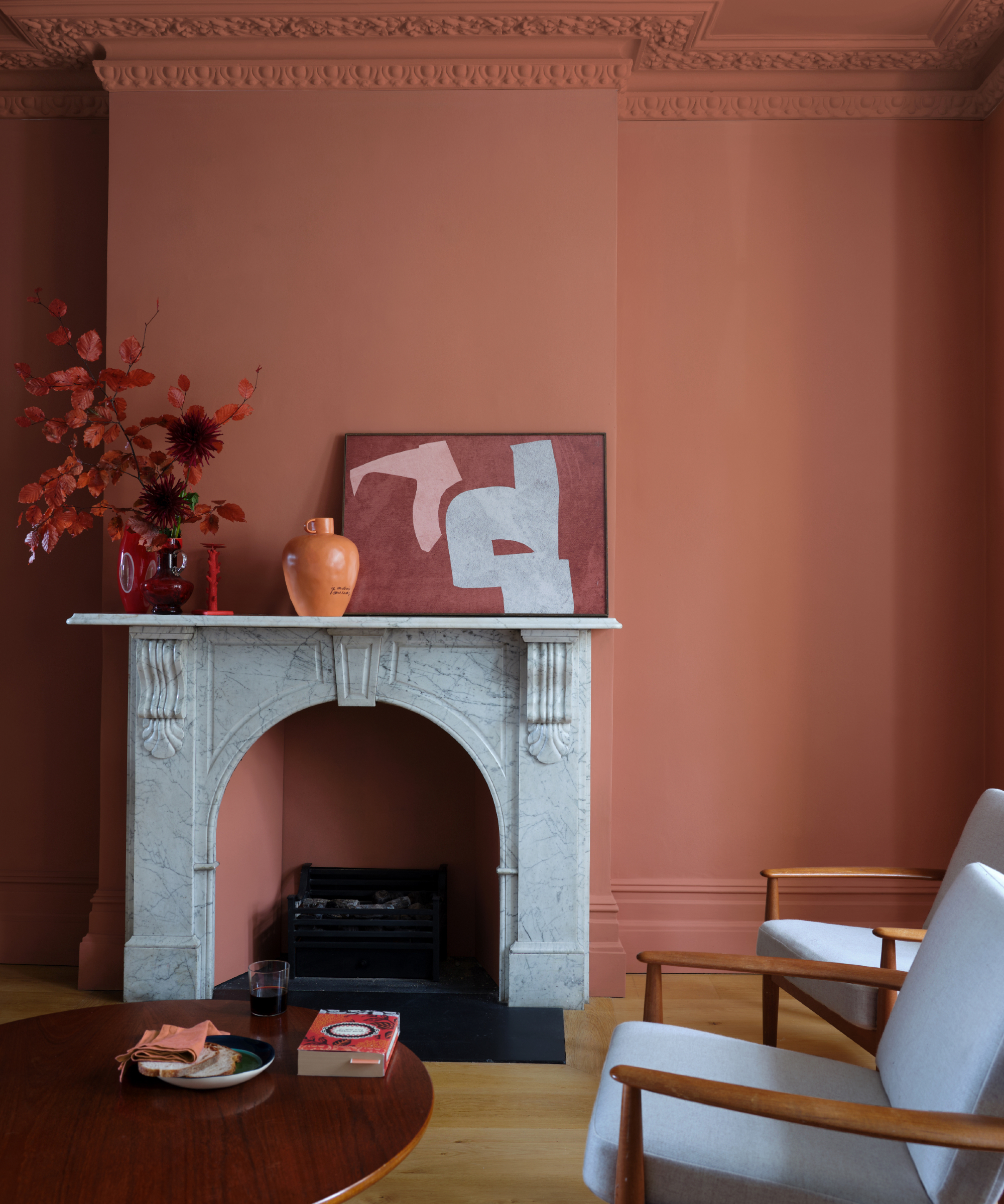
Color-drenching walls, ceilings, and woodwork in one bold shade is a wonderful way to embrace maximalist style whilst keeping spaces feeling harmonious, unified and clutter-free. Pared-back spaces with limited furnishings can often feel cold and sterile, but introducing a warm color over all walls is a great way to add coziness and a touch of maximalist style without them feeling over-stimulating.
'Play to the limitations of the room by choosing a mid to dark shade and painting it all over walls, ceiling and woodwork,' says Patrick O'Donnell, brand Ambassador at Farrow & Ball. 'Even though dark colors ‘advance,' you will blur the boundaries where all the plains stop and start (e.g. where the wall meets the ceiling, a built-in cupboard or a utilitarian radiator). Try color-drenching across your trim, metal and walls in our new Dead Flat finish.'
2. Go for bold accessories and artwork
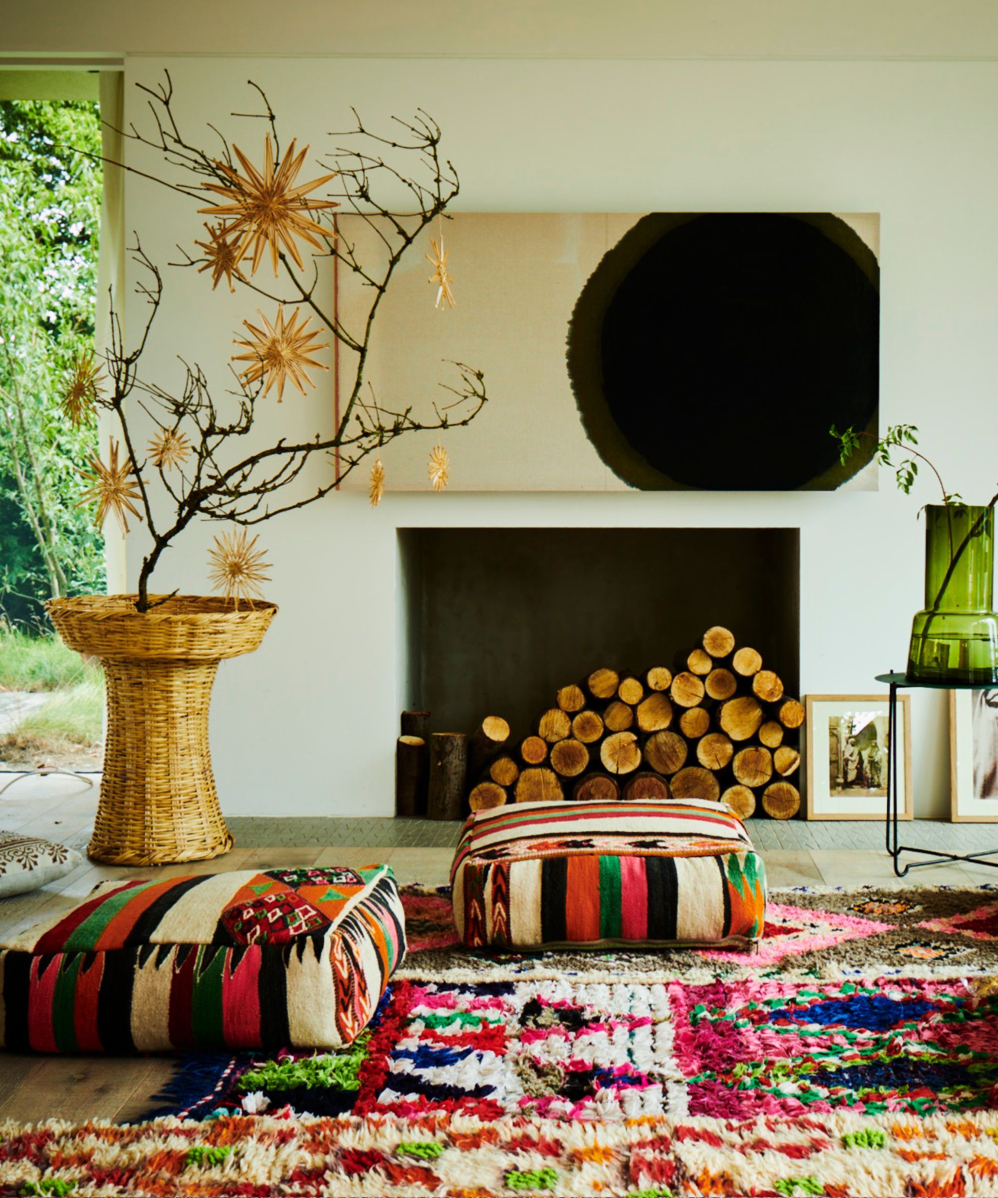
‘In a room with minimalist architecture and furniture, you can bring energy by incorporating really bold artwork, statement lighting or a few, thoughtfully placed patterned accessories,' says Emma Deterding, founder and creative director, Kelling Designs. 'It creates a contrast where the minimalist backdrop allows the maximalist, statement-making pieces to shine without overwhelming the space. The result is a balanced environment that feels both dynamic and calming, offering the best of both worlds,' adds Emma Deterding.
Above, boho Moroccan rugs and pouffes from Raj Tent Club combine with bold contemporary artwork and statement vases to bring fun and life to this stark minimalist space.
3. Use striking natural materials against a minimalist backdrop
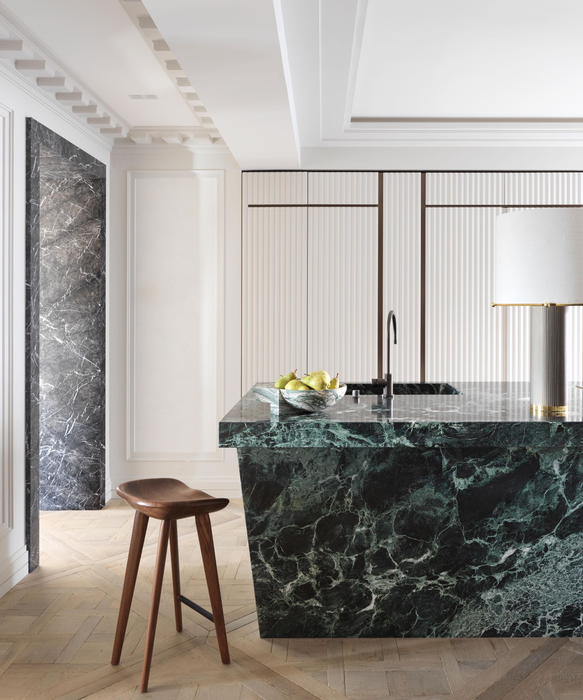
In addition to introducing statement furniture, art and accessories, interior designers are increasingly striking natural materials in contemporary ways, balancing the intricacy of the materials with sleek, pared-back design. In this kitchen by Humbert & Poyet, a stunning green marble island brings maximum impact to the space when set against the minimalist backdrop.
'The brief was to create a kitchen that radiates bold and timeless elegance while remaining entirely functional,' explain Emil Humbert and Christophe Poyet, interior designers and co-founders of Humbert & Poyet. 'We aimed to integrate the kitchen into the broader living environment, using luxurious materials like the rich green marble and fluted cabinetry to elevate the overall aesthetic, ensuring the kitchen complements the classic architecture of the home.'
Kitchens which part with conventions and introduce statement materials and colors in order to integrate with living spaces are a growing trend we’re noticing more and more at the moment - we're calling it the camouflage kitchen trend. Increasingly homeowners are working with kitchen designers and interior designers to create striking yet functional spaces, often with islands and cabinetry that double as functional works of art.
4. Choose a tonal color palette
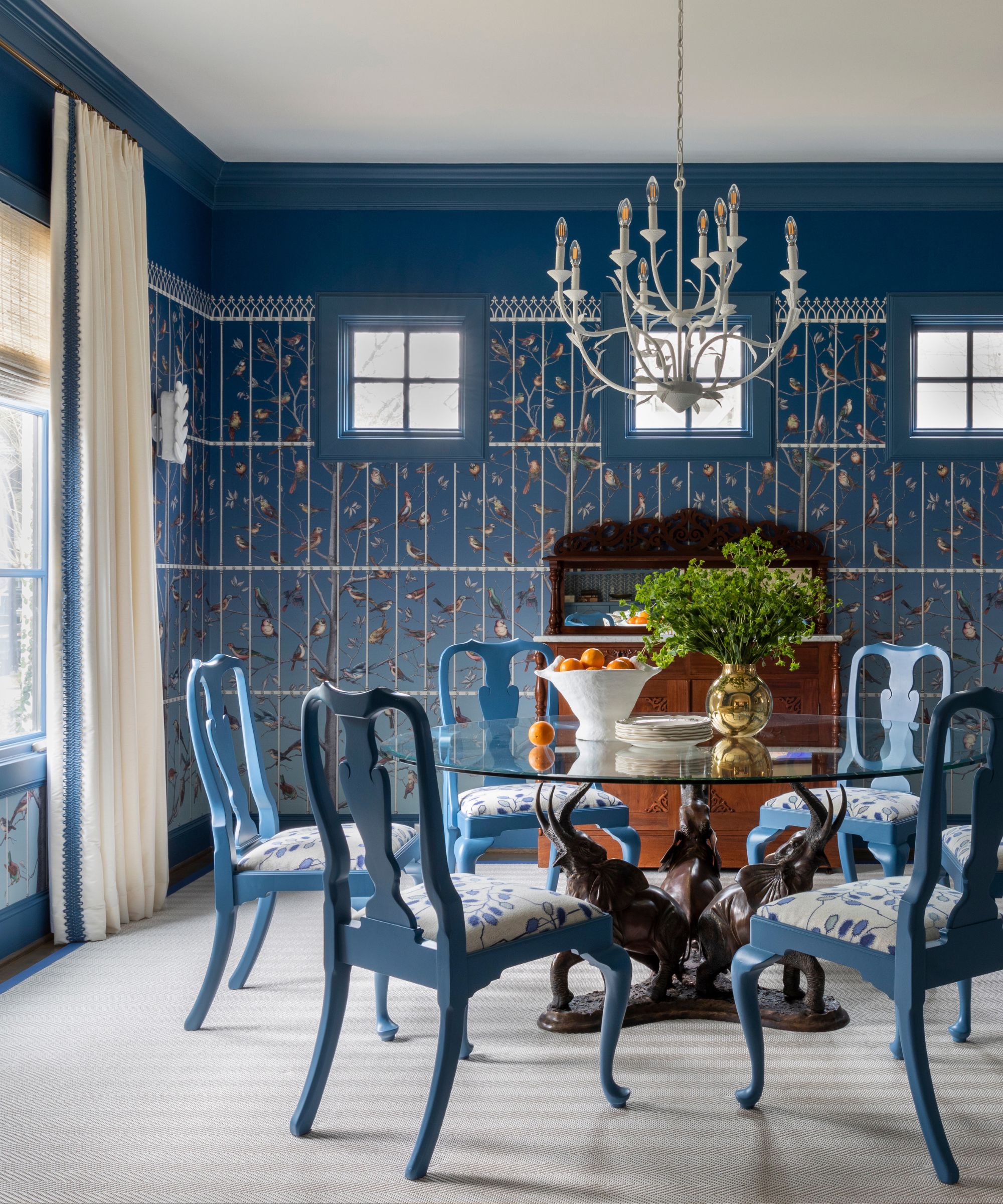
If you love pattern but don’t want to overwhelm a space, try limiting your palette to a tonal scheme. Layering different prints within the same color palette will bring a maximalist feel in a muted way.
‘This dining room is maximalist in pattern but measured in the color palette. It's blue and white, which is measured for me,’ says Courtnay Tartt Elias, founder of Creative Tonic Design. For Courtnay Tart Elias, decorating with blue and white is a failsafe color formula that always works. ‘Blue and white is always right - right? I love to play with this rule because there are so many shades of blue to choose from - sky blue, cornflower blue, navy blue… the list goes on! I love using white with any shade of blue because it really makes the color pop.'
'In this blue dining room, I chose to make the ceiling, door trims, draperies, chandelier, rug and chair seats white to complement the white geometric lines in the wallpaper. I then matched the top ombré blue in the wallpaper and carried the same color up the wall and onto the crown molding, making the space feel wrapped in the shade and the ceilings feel taller.’
Tash Bradley, color psychologist at Lick, also suggests that using tonal schemes are guaranteed to bring harmony. ‘Tonal schemes are a fail-safe option and are becoming more and more popular. Tonal schemes (also known as monochromatic color schemes) include one color in a variety of tones, tints, and shades of it. It's an easy-to-use, fail-safe option as you're only working with one segment of the color wheel, so it's difficult to get it wrong, yet the effect is cohesive and harmonious.’
6. Go for a neutral maximalist scheme
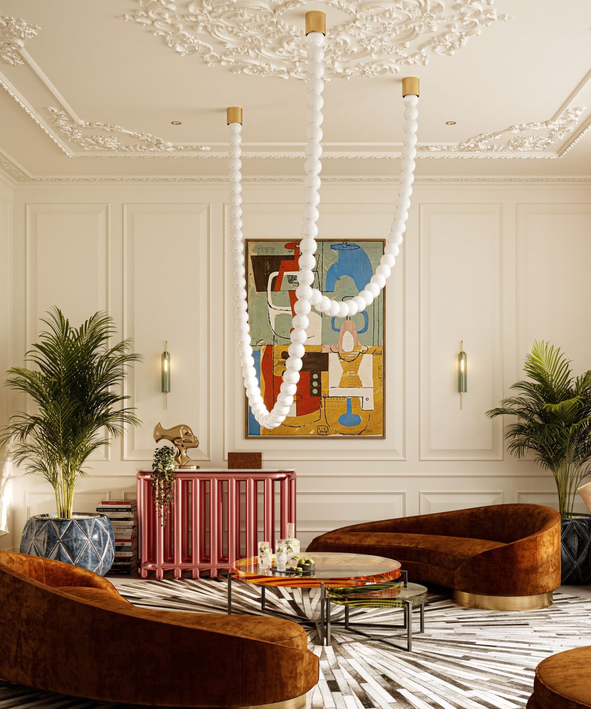
An effective way to bridge minimalism and maximalism is to go for a neutral maximalism or muted maximalism. This look combines a variety of layered, neutral tones paired with statement furniture and lighting to create spaces which are both calming and engaging.
When decorating with neutrals the key to achieving depth and interest is to mix textures and forms, say the experts. Here the sculptural Cameron Design House pendant light, monochrome tonal rug and velvet upholstery all help create essential depth.
'I believe that achieving a balance between maximalism and minimalism is all about understanding positive and negative spaces,' explains the interior designer Erik Munro. 'Minimalism leans heavily on negative space to create an airy, clean feel, often with fewer materials and finishes. Lately, I’ve seen a shift toward something in between - layered, organic, and softer than the strict lines of minimalism. Perhaps using bold statement pieces to create spaces that have maximalist traits yet are still refined,' adds Erik Munro.
'Maximalism isn't just about more of everything – it’s about creating dynamic spaces through layering patterns, colors, and textures, but in a way that still feels elegant. In many ways, both approaches can coexist when done thoughtfully, allowing for a design that feels rich and considered, without overwhelming the senses.'
So, blending minimalism and maximalism is definitely achievable. In fact, designers encourage it. The result is a room that feels filled with character but not overly cluttered, curated but not void of personality.


