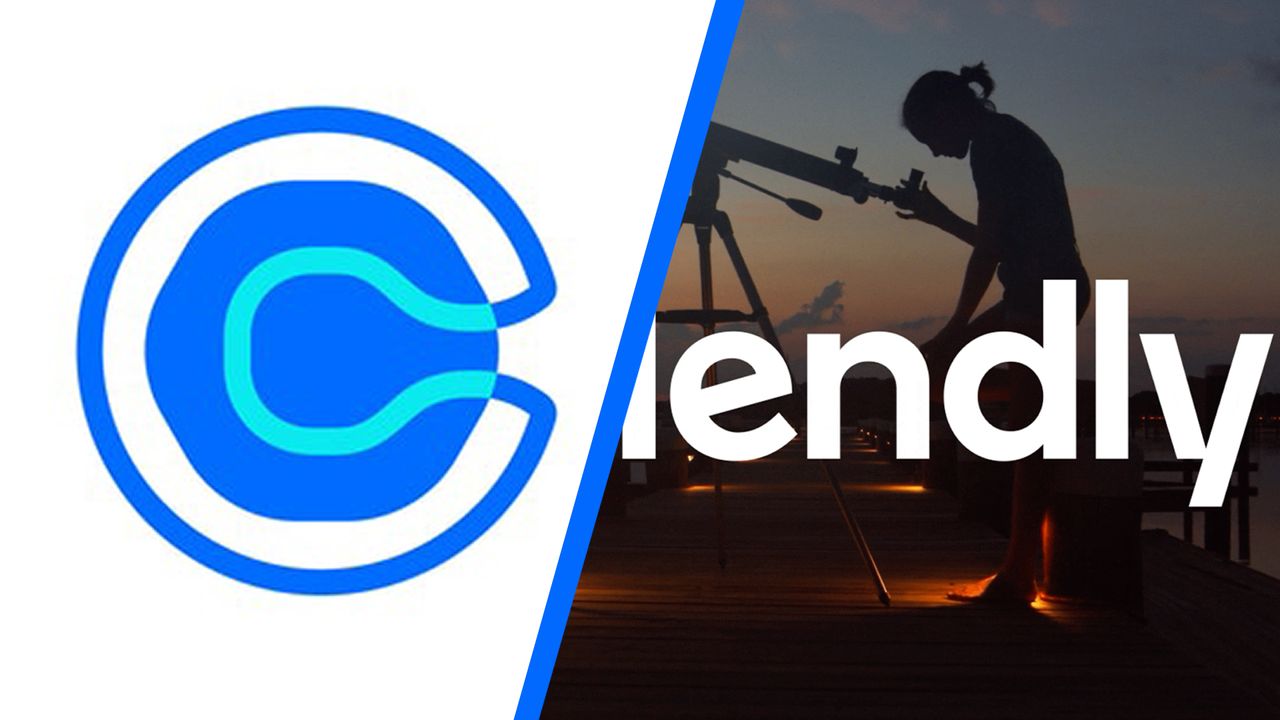
Some thought the last Calendly rebrand five years ago hit a bit of a bum note. While theoretically resembling a letter 'C', the symbol in the brand's logo design was quickly interpreted as a bird's eye view of a loo over on design Twitter.
The online calendar and scheduling tool has finally pushed the flush button on that, not because it looked like a toilet (or at least not officially), but because its product itself has evolved considerably in the intervening years. More than just a scheduling app, it now has a range of AI-powered productivity tools, and it needed to reflect this expansion.