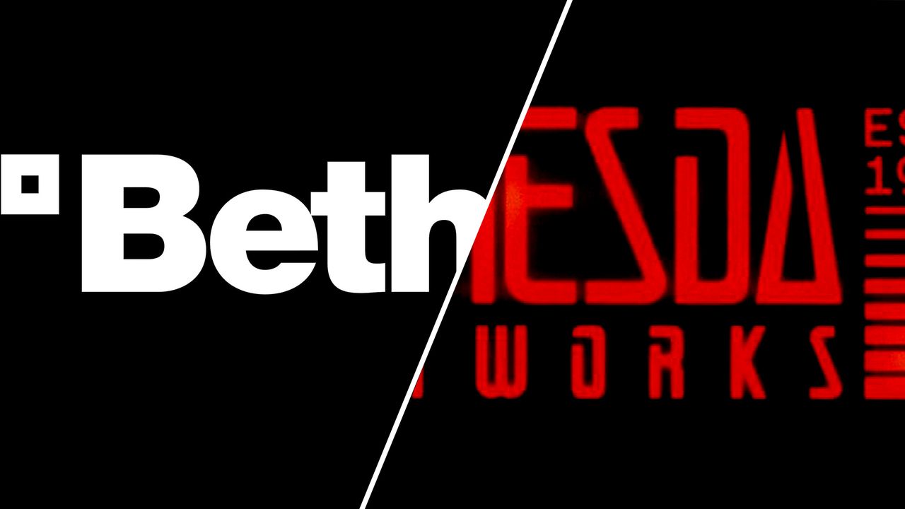
Bethesda has a new logo design, and it has so much character that it's hard not to approve. It also demonstrates that clean legibility doesn't always need to be the priority in brand design.
The boring utilitarian aesthetic of the brand's most recent identity, which had been in use since 2010, has given way to a more inspired, evocative and playful design. The retro futurist reminds us how long the publisher behind games like Fallout and Elder Scrolls has been in business while also making it clear that this is a video game company not an architectural firm or a provider of digital security solutions.