Baseball obsesses over expansion. More franchises, more playoff berths, more postseason rounds.
And more uniforms.
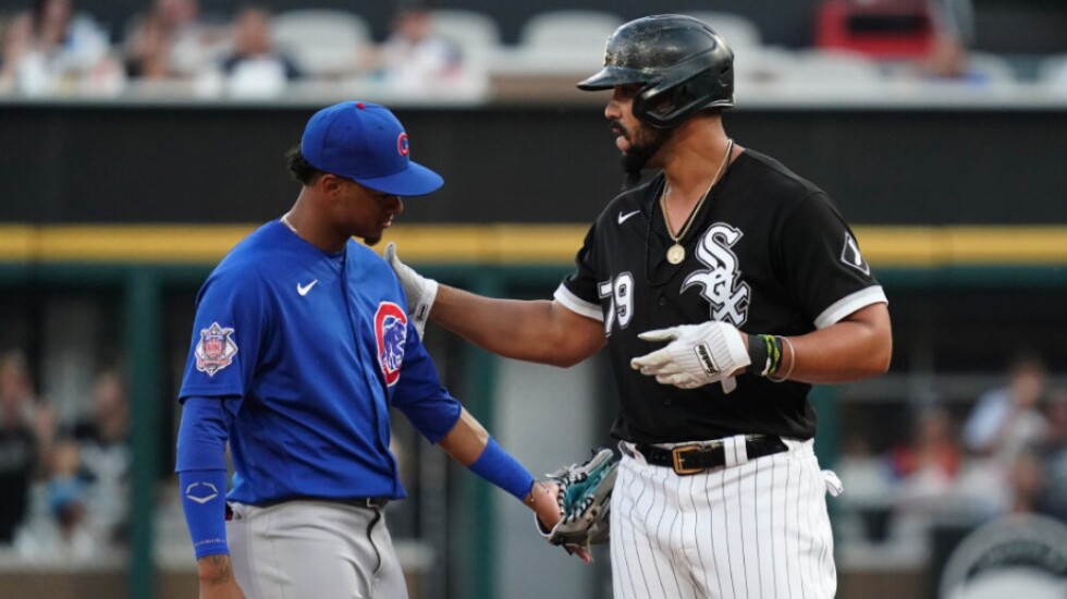
It’s no longer only home whites and road grays. Teams continue to add arrays of colorful alternates, nostalgic throwbacks and holiday-themed getups. It has gotten to the point where MLB and Nike, the league’s official outfitter, instituted a “four plus one” rule this year. It limits teams to four uniform designs, plus the avant garde City Connect uniform each team has been introducing since 2021.
The Cubs and White Sox participate in the visual onslaught. The Cubs have worn blue alternate jerseys and the Sox have donned black tops frequently in recent years. Both clubs also fully embrace City Connect, repping Wrigleyville and the South Side.
Yet, primary home and road unis still serve a purpose. They evoke feelings of connection and tradition. Alternates, while sometimes admittedly attractive, chip away at that sense of familiarity.
What are Chicago’s best primary uniforms over the years?
WHITE SOX
5. 1912-20 HOME
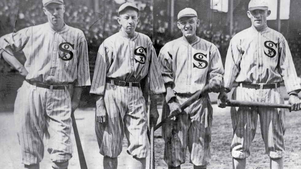
Though infamous for the Black Sox Scandal, the 1910s uniforms are the best of the White Sox’ old-timey looks. Pinstripes, a distinctive logo on the chest and actual white socks. No hat logo, but a contrasting bill. Of course, because of its place in baseball history, the uniform is now a part of pop culture — it was seen in ‘‘Eight Men Out’’ and ‘‘Field of Dreams’’ (plus, the Sox wore it for their Iowa game in 2021). Fun fact: A slightly different uniform, with a cap logo and placket trim, worn in the 1917 World Series title season became pro sports’ first on-field throwback. The Sox turned back the clock for a game in 1990, starting the retro uniform craze.
4. 1991-PRESENT ROAD
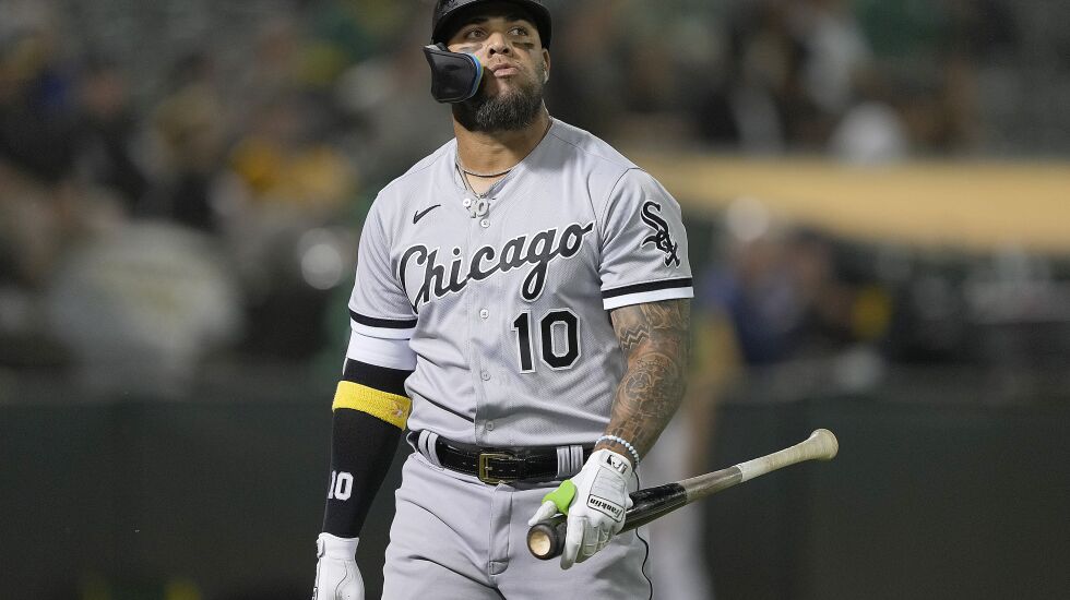
Unlike other sports, road teams in baseball wear gray. Back in the days of train travel, the legend goes, it was difficult to launder uniforms during road trips, and gray hid the dirt better (also, fabric dyes were hard to purchase during World War I, so darker uniforms of the era were phased out). While it may be tough to get excited about gray, the road set the Sox have used since their 1991 redesign are perhaps the best primary away unis in the league. The “Chicago” script is clean, the sleeve stripes are subtle and the white and black pop against the gray.
3. 1987-90 HOME
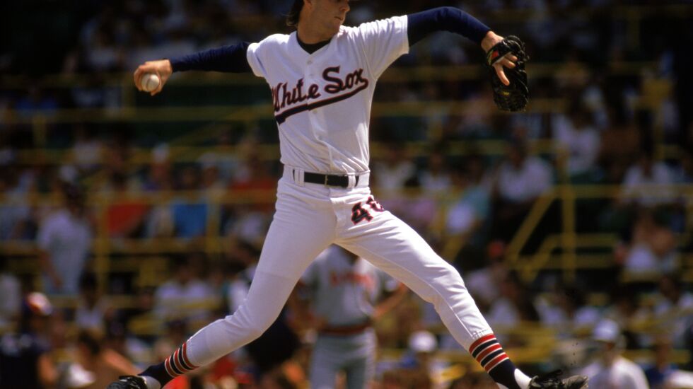
The Sox weren’t afraid to mix it up. In the 1960s, they wore blue pinstripes at home, and in the early 1970s, they flipped everything to red (note: both of these narrowly missed this list). They sported powder blues on the road for a while. The late ’70s brought “leisure suit” untucked jerseys with big collars and old-fashioned lettering. The early 1980s were the “Winning Ugly” era, in part a reference to their futuristic uniforms. It’s amusing that the Sox undid everything and got back to basics in 1987. Conservative but very sharp, the unis had a gorgeous script, a cheery “C” logo and a pleasing blend of navy and red. It’s an underrated classic.
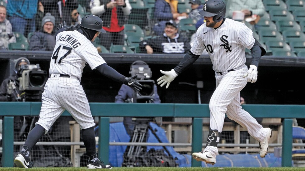
2. 1991-PRESENT HOME
Like the road grays, the Sox have worn their current home uniforms for more than 30 years. Why mess with a good thing? They’ve found something timeless. The centerpiece is the gothic monogram logo: It obviously says Sox but could also stand as an abstract symbol. The Sox’ balance of silver and black connotes toughness without going all-out on badass-ness like the NFL’s Raiders. This uni set is actually a reimagination of what the Sox wore in the 1950s. Back then, red was an accent color — also a good combo, but silver wins out.
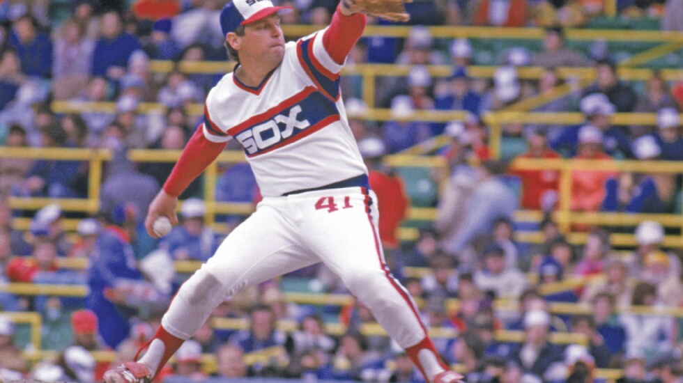
1. 1982-86 HOME
This flies in the face of what a baseball uniform “should” look like . . . but it totally works. The “beach blanket” uniform, as it was known, had a pullover top without buttons, large stripes across the chest and sleeves, huge lettering and the number on the pants. Sure, it is a product of its era, but the SOX wordmark is sleek, the colors are bold and there’s a nice simplicity to it. The Sox have worn these as throwbacks since 2013, mostly on Sundays. As a form of flattery, versions of the design have been adopted by high school and college baseball programs across the country, including locals such as St. Rita, Prairie Ridge and Sandburg.
CUBS
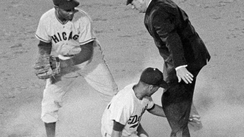
5. 1958-68 ROAD
The Cubs featured an elegant road design for 11 seasons. “CHICAGO” in blue with a red outline, no front uniform number, with thin red-and-blue stripes on the sleeves, collar and pant legs. Fantastic. And then came years of road indecisiveness. They switched to pullovers in the 1970s, first in gray and then in powder blue. In the 1980s, they wore solid blue jerseys (and white pants) as a primary. By the 1990s, a uni set with a generic block “CHICAGO” wordmark was replaced by a jersey with a script “Cubs,” which actually looked like “Cuba” instead. While their current road uniform is good, in 2014 and 2015 they wore an alternate gray jersey with “CUBS” across the chest in huge letters. It never quite looked right.
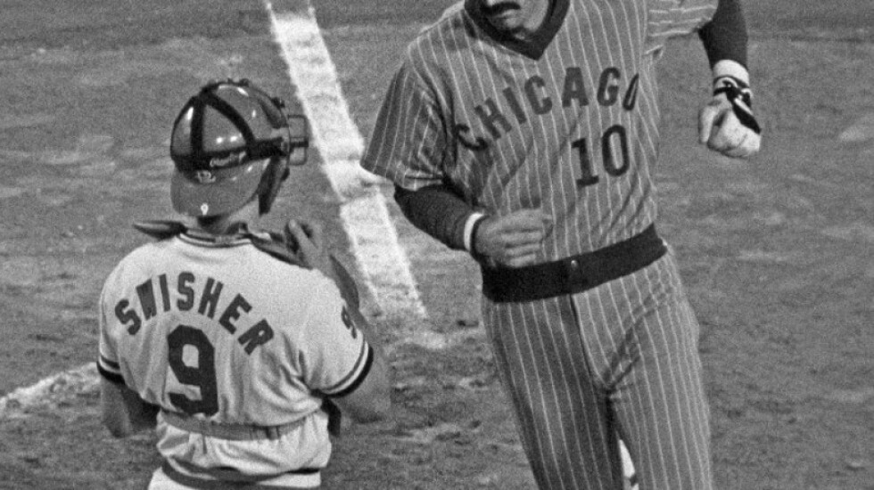
4. 1978-81 ROAD
They’re so funky, they’re endearing. Powder blues with reverse pinstripes and blue letters and numerals. Polyester pullover jerseys with no belt. Thick V-neck collar. Just a total relic of that era. Speaking of that era, powder blue road uniforms became popular in the 1970s, as teams thought a jazzier tone would look better than drab gray on color TV. Coincidentally, it was the Cubs who first introduced powder blues, as an alternate, back in 1941. And then, the 1964 White Sox started the leaguewide powder-blue trend, using the color for their primary road uniform.
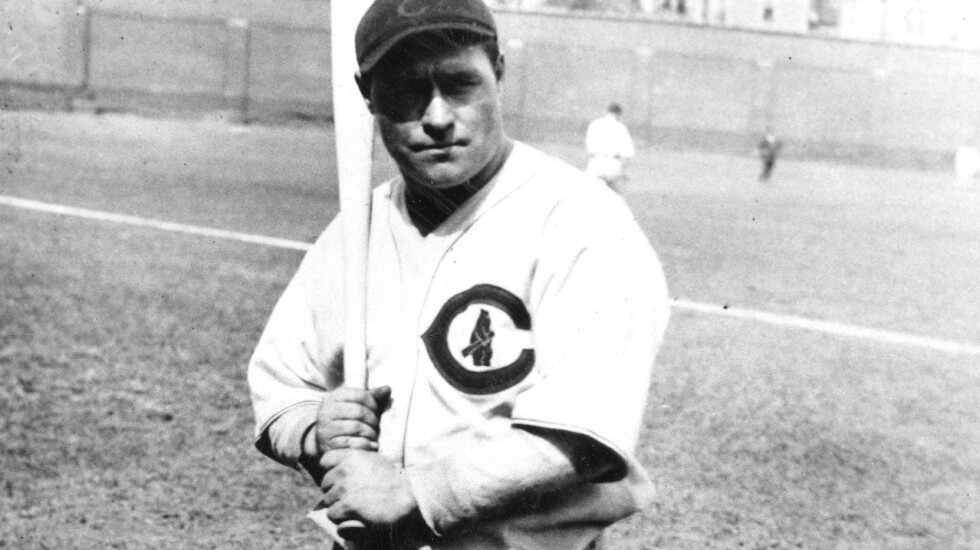
3. 1927-36 HOME
These should be familiar — the Cubs wore these jerseys during their “Field of Dreams” Game in 2022. No pinstripes, but there’s enough going on to catch the eye: blue-and-red striped socks, thin stripes on the sleeves, an outline on the placket frame and a neat wishbone C with a cub holding a bat in the center of it. While the wishbone C is not unique to the Cubs (the Reds and Twins have used it for ages), it does have Chicago roots. The logo was first adopted by the University of Chicago in the 1890s, and the Bears have worn it on their helmets since 1962.
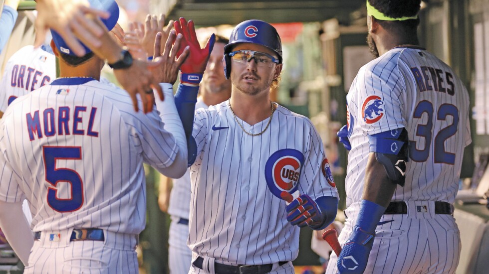
2. 1997-PRESENT HOME
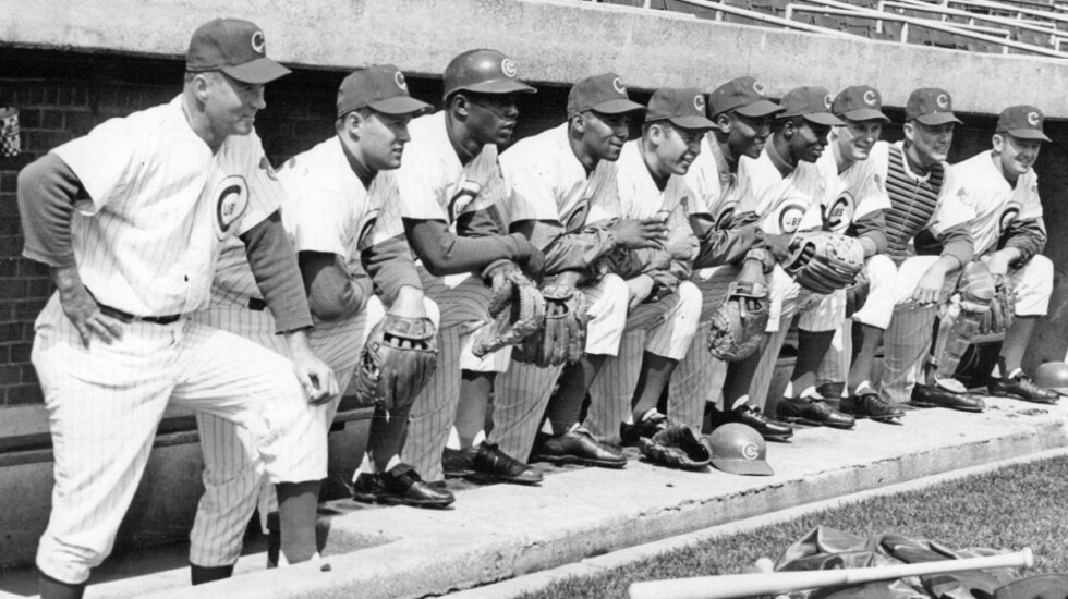
The Cubs started wearing their familiar home white pinstripes and blue hats with the circular C in 1957. The look has basically been the same ever since, with details and materials evolving to match the styles of the times. The unis have gone from button-up flannels to polyester pullovers to polyester button-ups. Sleeve and collar stripes were added and removed, as were names on the backs. The Cubs started wearing their current set in 1997, and they’ve been a contender for the league’s best-dressed team ever since.
1. 1962-69 HOME
The gold standard. The set is similar to what the Cubs wear now, but the chest logo was a bit thinner and smaller, the numerals on the back didn’t have an outline and the cartoony bear logo on the sleeve was a bit more playful than the current walking bear. Plus, back then, guys wore stirrups. It’s a textbook example of baseball aesthetics: Think of a breezy, sunny summer day game at Wrigley Field. The ivy, the scoreboard and these uniforms as a final touch. That can’t be beat.
