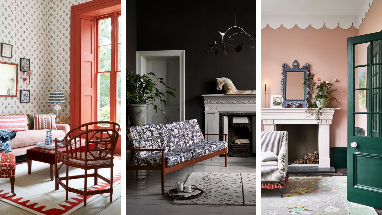
The color combination you choose for any room can make a difference to how and when you use the space, and this is especially true for living rooms.
Living rooms generally serve two purposes. One, is to be a cozy and cocooning haven where you can escape the hustle and bustle of the world and curl up after a long day. And the second, is to be a comfortable and stylish space to catch up with friends over a cup of coffee at the weekend, and play games with family.
Choosing a color combination that meets both of these needs is no mean feat. Living rooms hold a lot of furniture - with sofas, armchairs, footstools, rugs and curtains providing more fabrics than any other room in the home. These must all be taken into account when considering your living room color ideas to ensure a clean and coherent scheme.
What are the best color combinations for living rooms?
It's important to consider the aspect of your room before you begin thinking about colors. A south-facing room will make shades look warmer, and a north-facing room will make them look cooler.
This is why you must use paint testers on your living room walls and look at them at various points throughout the day. A color combination with cool undertones in a space with an already cool light could feel clinical and unwelcoming. And this is exactly what we don't want.
If you're struggling to know where to begin with choosing a color combination, a good place to start, is to choose one color that you love. Then, you can choose a shade that compliments this color, be it a base neutral, or a vibrant contrasting hue.
These are the best color combinations for living rooms, and why they work so well...
1. Black and white
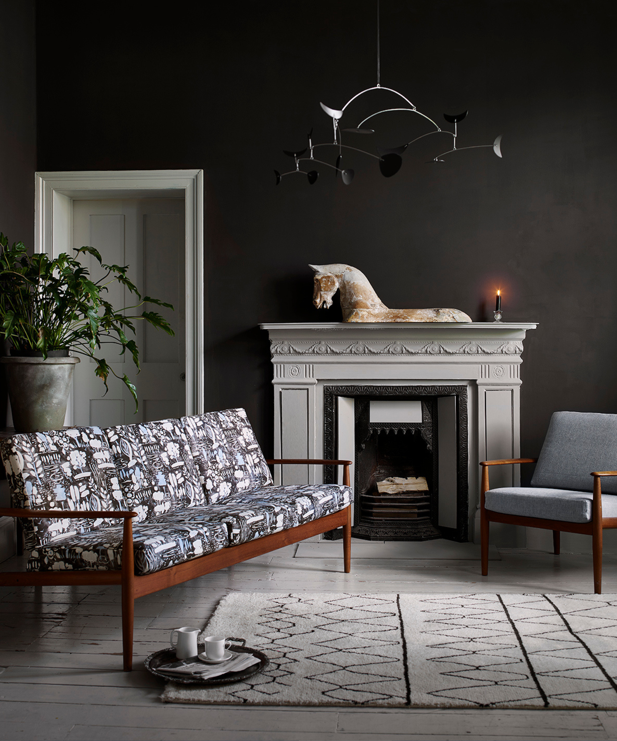
Black and white is a color scheme match made in heaven, and while it works in every room, when used in a living room it provides a particularly deep, moody, and luxurious feel.
'Black and white is a classic and timeless color combination that will forever be chic,' says Sandy Yen, found and principal designer at Yen Collective. 'You can't go wrong with this color pairing.'
While black absorbs light, white reflects it, meaning that when used together, they create a scheme that's calming on the eye and easy to live with.
Using black on the walls, as shown here, creates a cozy and cocooning feel that's perfect for living rooms or TV rooms – a black and white living room is undeniably the perfect space for hunkering down and curling up at the end of a long day.
The white floorboards, door, fireplace, and rug work to balance out the scheme and create a harsh contrast to the walls. The upholstered mid-century style sofa becomes the centerpiece of the room and draws the monochrome scheme together.
'Black and white instantly gives a living room contrast and drama, but also works as the perfect neutral backdrop to introduce interesting shapes and textiles to allow for versatility and personality,' says Sandy.
2. Red and white
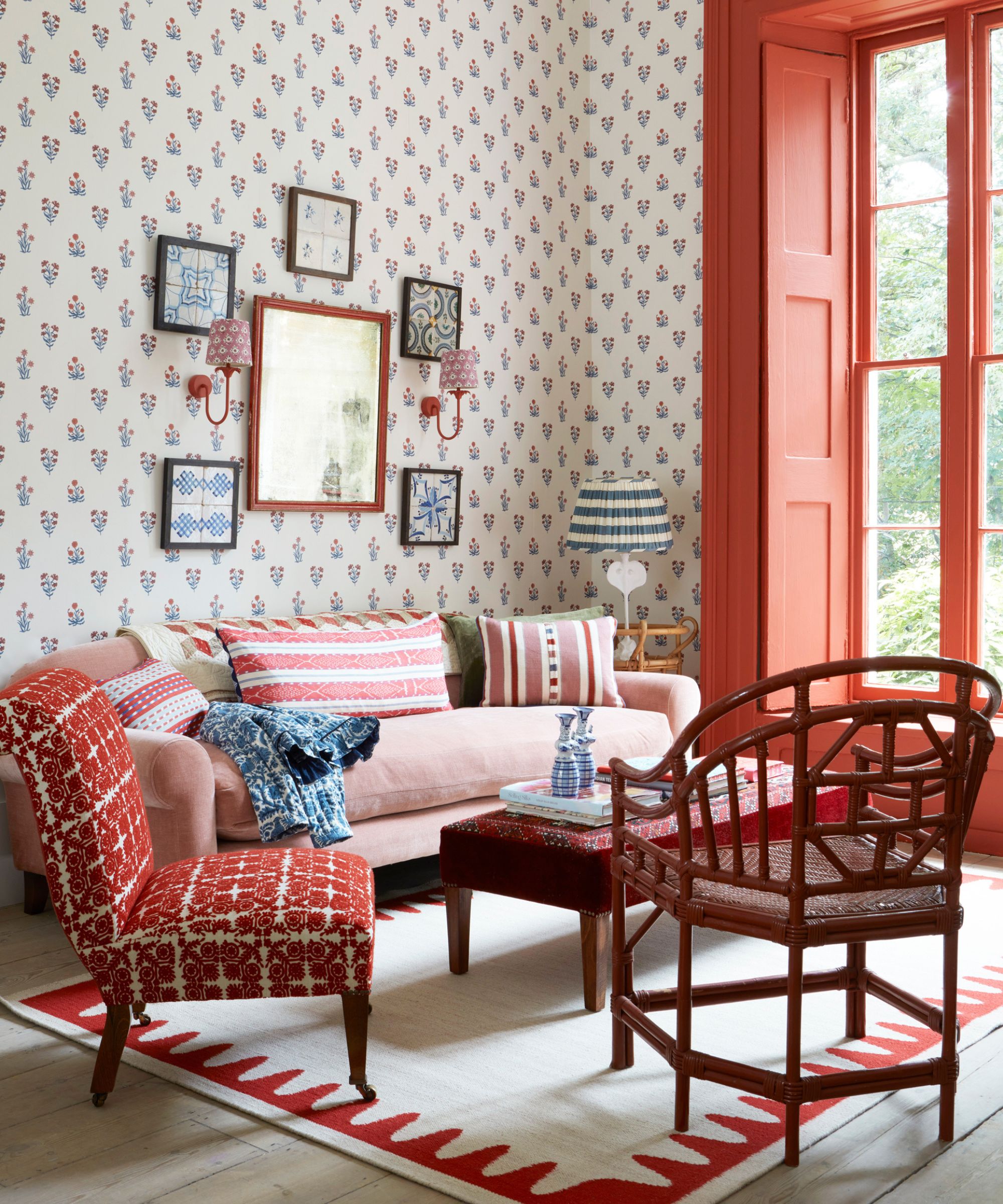
A combination that's often overlooked, decorating with red and white, when done the right way, can create an energetic and fun living room.
Using white on the walls and injecting coral red through the window frame and upholstery creates the perfect balance of light and bright, neutral and bold. 'Consider the saturation and brightness of your base color; pairing a muted color with a bright or deeply saturated counterpart can create an appealing contrast,' says Philippa Radon, paint expert at C2 Paints.
Here, the pink sofa acts like a bridge between the two shades, softening the overall look and making the contrast between the red and white a little less harsh – ensuring the space remains relaxing and inviting.
3. Baby blue and soft pink
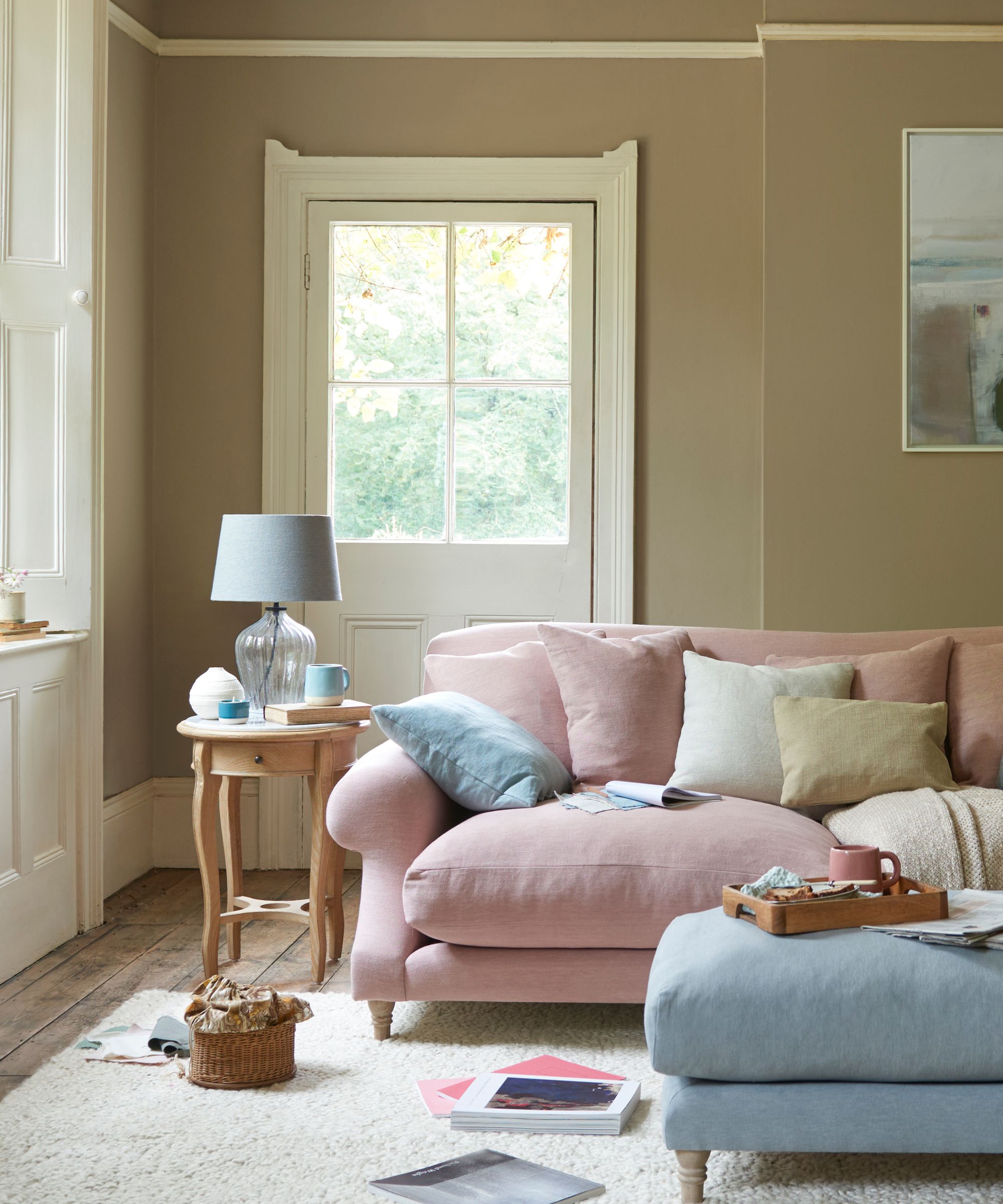
As an unusual pastel room idea, these two shades are not commonly used together, but they can create a soft and soothing scheme that's perfect for relaxing.
'Designing with baby pink and baby blue is a fresh take on pastels that doesn't have to be exclusive to nurseries,' says Sandy. 'Pastels immediately soften the energy of a living room, but can also be a very daring backdrop when it comes to adding interesting colors and textures.'
‘Homeowners usually wish to make their living rooms look bigger and brighter than they are, since it’s a space that tends to hold a lot of furniture and one of the most used rooms in a home,' says Sue Wadden, director of color marketing at Sherwin Williams. And these light and airy shades will do just that.
Here, the baby pink and baby blue furniture and accessories are given a more grown up, sophisticated and grounding twist thanks to the soft mocha, almost brown, walls. 'One of my current favorite combinations for living rooms is light blue and brown. I especially love pairing soft, airy blue with brown wooden furniture,’ says Sue.
4. Green and red
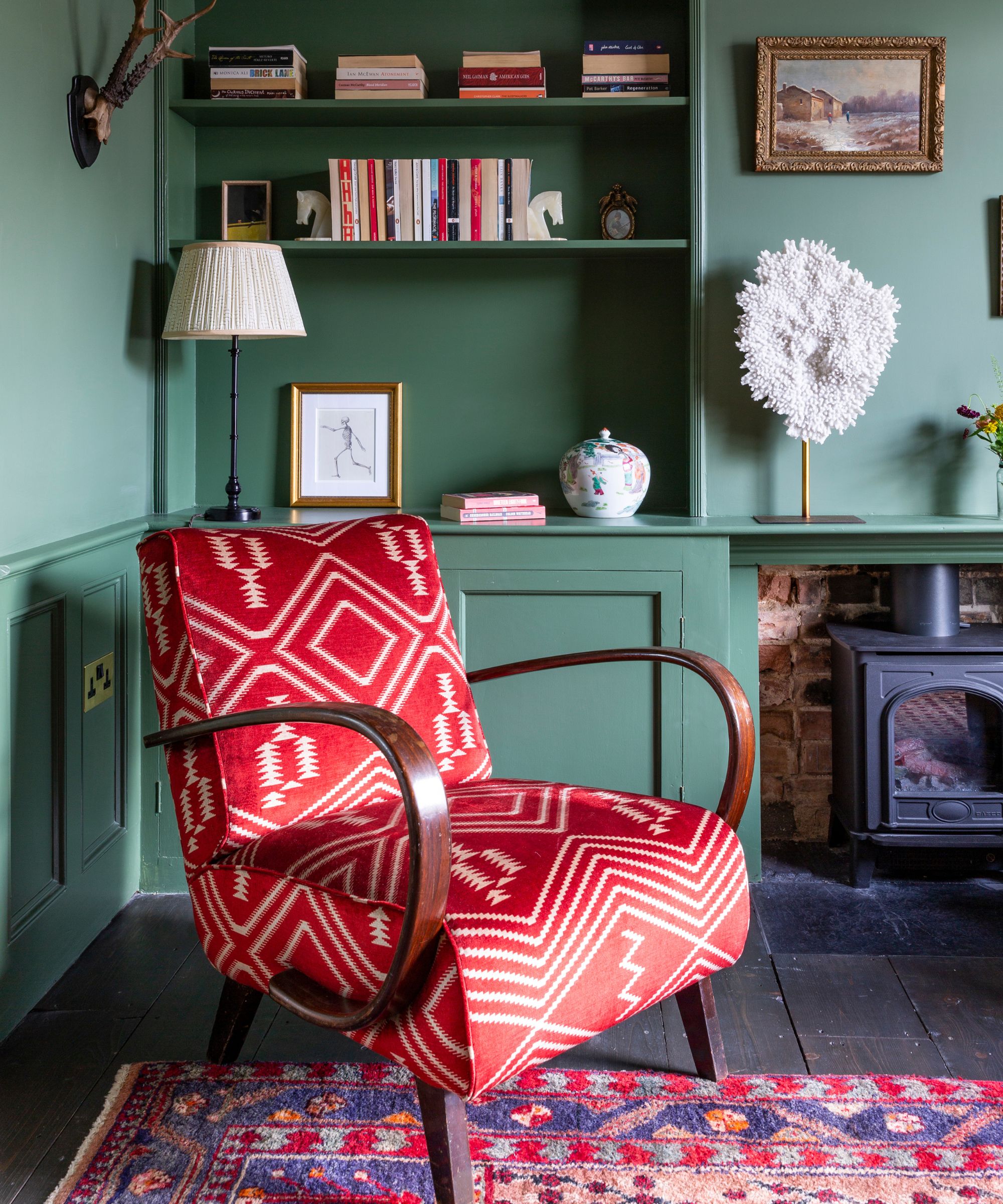
If you're looking for green room ideas, this is a great example. The ultimate in cozy and warming, a rich red set against a mid-tone green is the perfect push and pull of fiery and natural. As the two shades sit opposite each other on the color wheel, they're ideal if you're looking for a statement contrast.
'Green and red is such a great combination - classic yet timeless,' says Emilie Fournet of Emilie Fournet Interiors. 'This green has a lot of yellow in it which is why it works so well with the rich and indulgent red. It's a perfect match for the dark floors and it also picks up the warm terracotta of the exposed bricks,' she says.
This space is a perfect example of a room scheme that's driven by how the homeowner wanted to feel in the space. 'This room needed to feel cozy, the perfect sanctuary to pick up a book and sit in contemplation but also it had to be a place for gathering and socializing as well,' says Emilie. These two clashing shades achieve that perfectly.
5. Blue and yellow
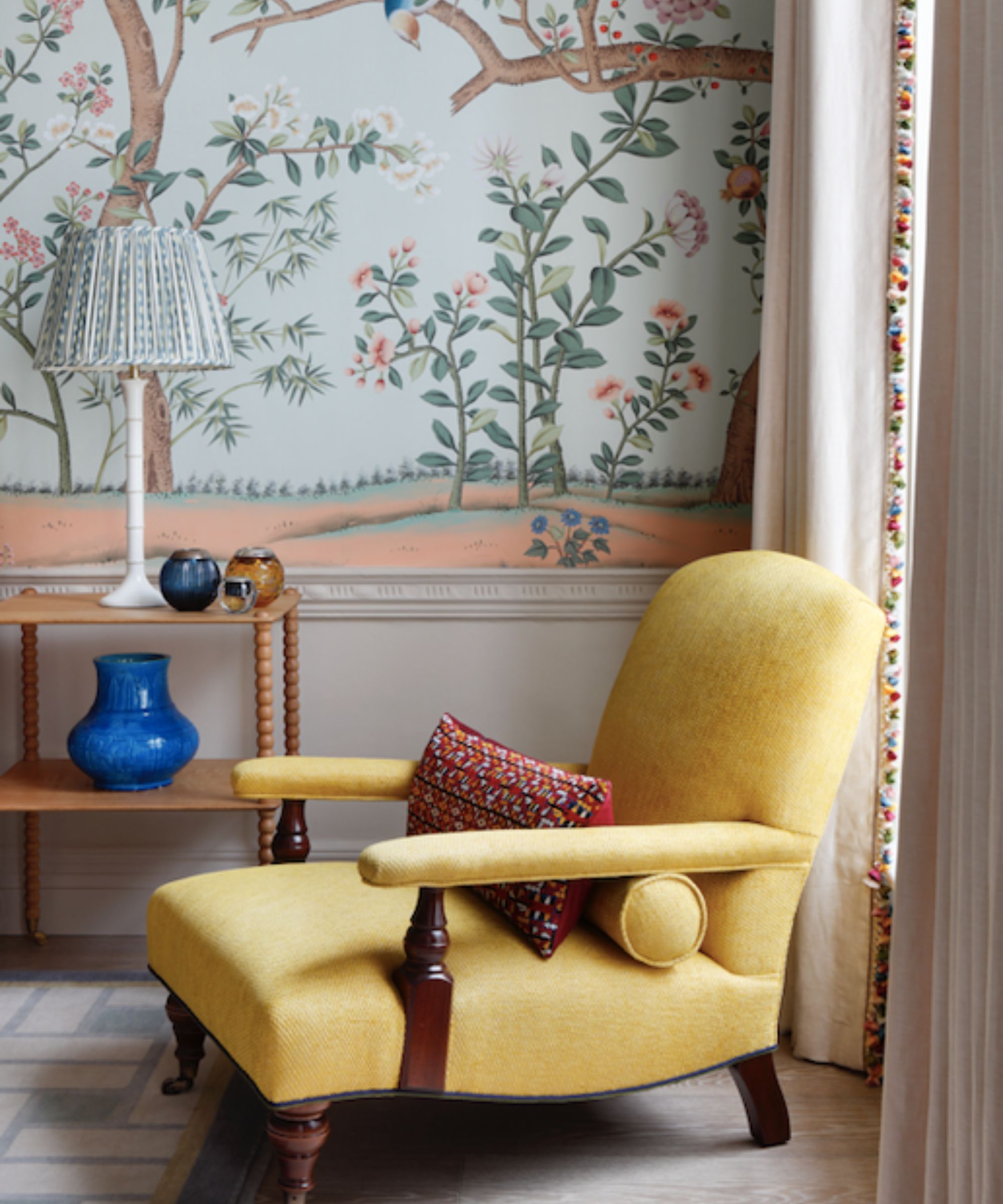
When choosing a color combination, it's not just about the colors that you choose, but it's about the specific shades of the color that can make all the difference. 'Always consider the saturation and brightness of your colors,' says Phillipa.
In this largely blue living room, the soft, pastel blue sits beautifully against the butter-yellow chair, creating a whimsical and dreamy scheme. The soft and muted shades complement and enhance each other, rather than fight against each other.
'Consider the classic color wheel – colors next to each other are analogous and offer a more harmonious feel,' says Phillipa. Blue, yellow and green sit next to each other on the color wheel, which is why this scheme evokes feelings of calm and tranquility.
6. Pink and green
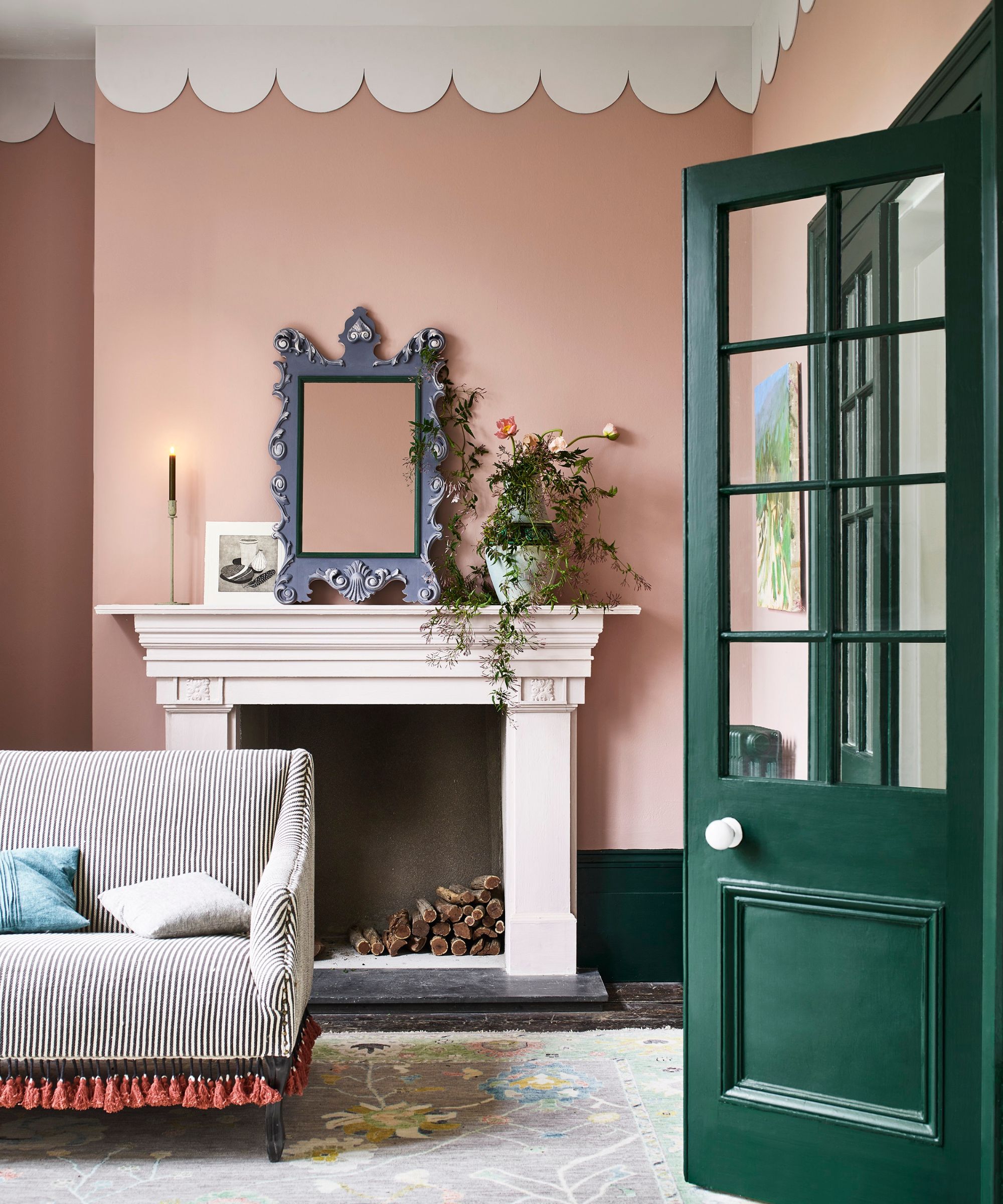
When decorating a pink room, green is the perfect accompaniment. Pink and green is a color combination that's taken the interiors world by storm the past year or so. And for very good reason.
'Pink and green is such a fun color combination,' says Sandy. 'Independently, both of these colors are instant mood boosters, and they pair beautifully together to form an uplifting space.'
Here, the deep, forest green of the doors contrasts greatly against the muted pink walls to add depth and drama to this otherwise soft and pretty scheme.
7. Terracotta and pink
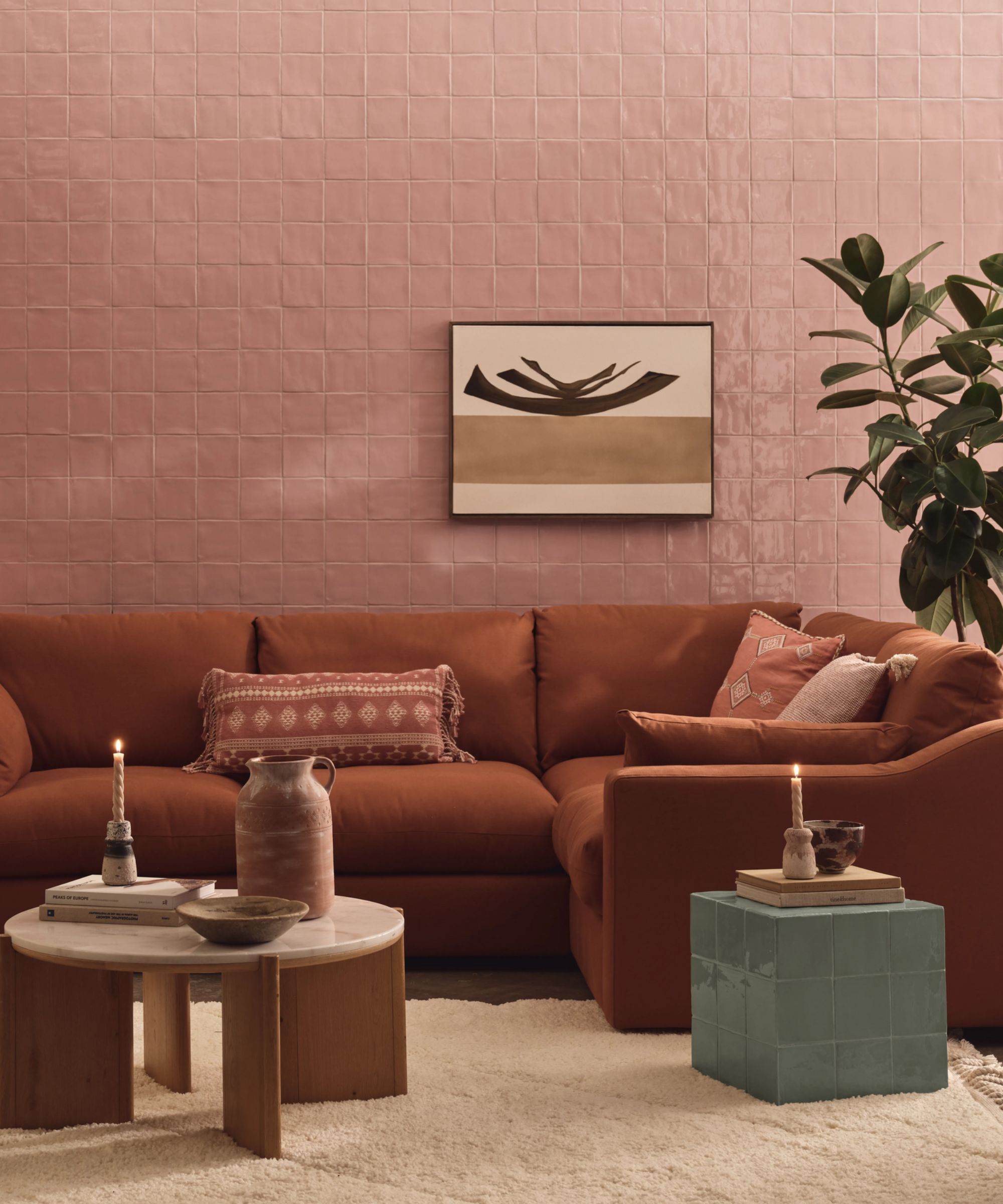
Terracotta decor has been popular throughout 2023 and 2024, and it creates a rich and grounding feel. The shade is an earthy red, so pink is not a shade that we'd typically combine with terracotta, but sometimes throwing out the rulebook creates the best results. These two warm hues combine to create a cozy and comforting vibe.
Given the warming nature of both of these colors, it's important to consider the aspect of your room before going all out with this pairing. 'The amount of natural light a room receives can greatly influence color choice. North-facing rooms often get less light, making warm colors a better choice to offset the cool light,' says Philippa. Terracotta and pink work especially well in north-facing rooms, as it balances out the more blue light and creates a comfortable and soothing ambiance.
8. White and green
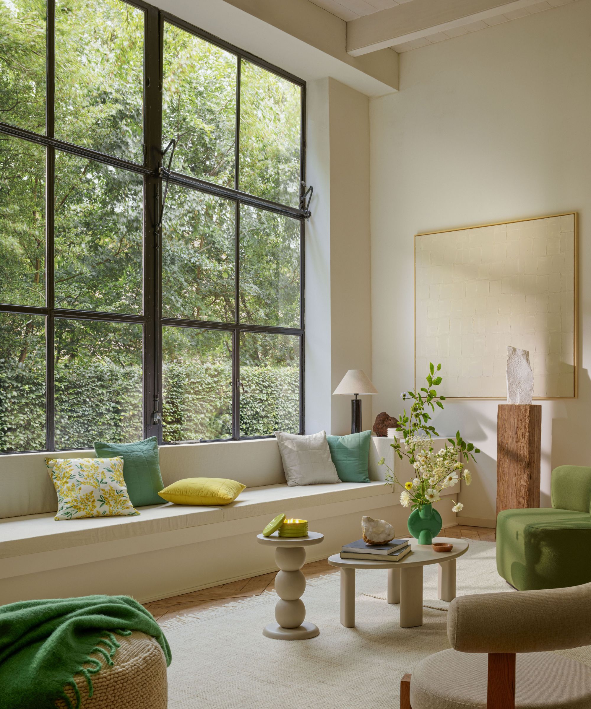
If fresh, bright, and zingy is what you're looking for, a white living room with pops of grass green, lime, and yellow will provide this by the bucket load.
Here, the simple white base color allows the architectural, curvy pieces of furniture to hold their own and stand loud and proud within the space.
With the tall Crittal-style windows creating a gorgeous frame for the trees outside, the bursts of vibrant green within the furniture and accessories helps to link the inside and outside, creating a light, fresh, and breezy feel.
9. Pink and purple
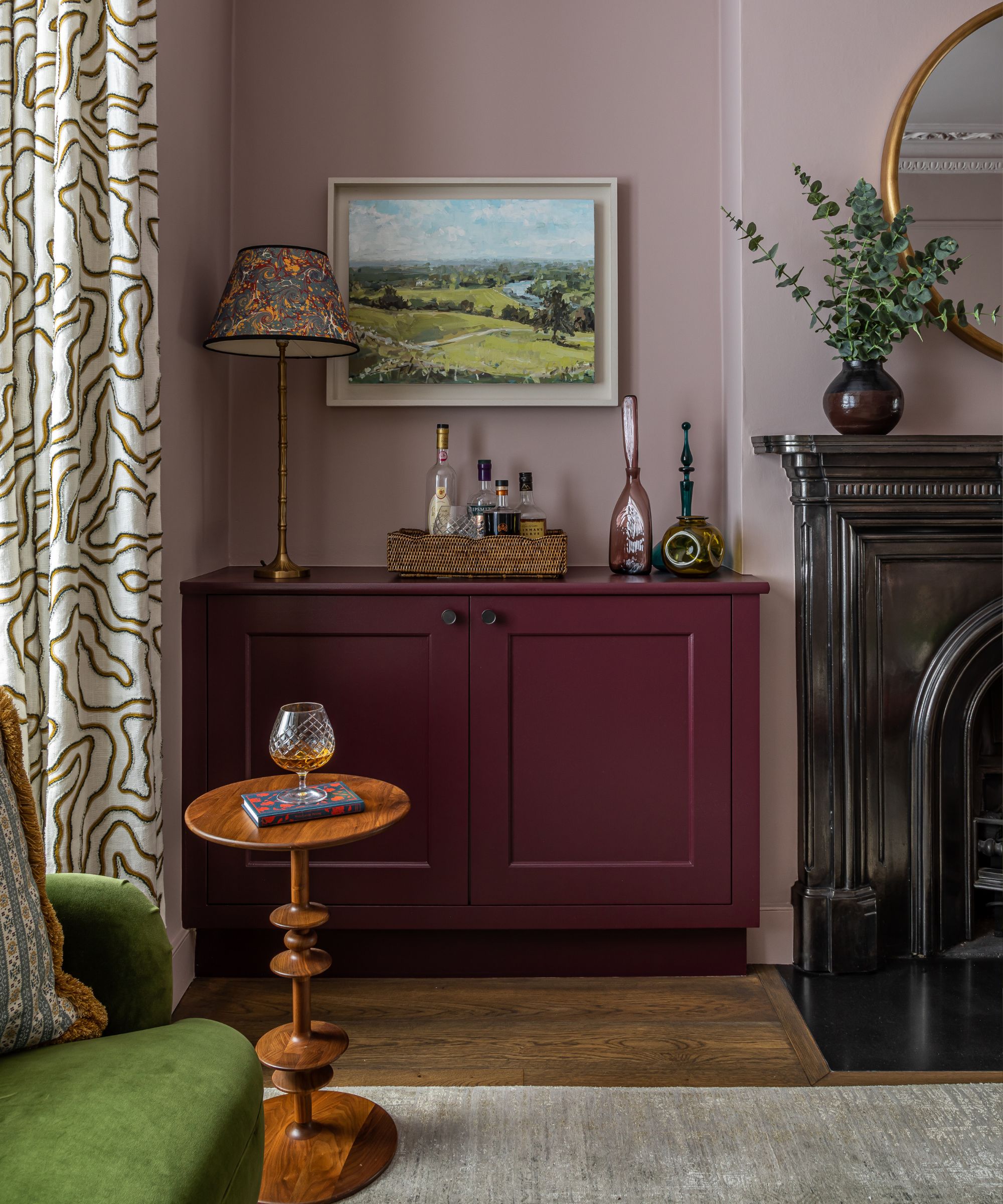
How pretty is this little corner? While the little girl in you may have dreamt of a pink and purple decorating scheme, these shades give this playful color combination a grown-up and stylish spin.
'Layering different tones of pink with Paint and Paper Library's Plaster V on the walls, and Farrow & Ball's Brinjal on the joinery, this scheme becomes calm but also rich and enveloping,' says Ali Johnson, director at Otta Design.
As part of the same spectrum of colors, the muted pink walls act like a neutral, while the bold joinery bring a sense of drama and confidence.
'To add extra freshness, we contrasted the pink with this verdant green couch in velvet and accents of mustard on the cushion fringing and curtain pattern,' says Ali.


