Gone are the days when pastels reigned supreme during the spring season. With character and playfulness replacing stereotypical interior design, more unexpected hues are cropping up in this year's spring color trends.
Woven with familiar muted tones and zingier, more unpredictable hues, Benjamin Moore's spring color palette sets the benchmark for a spring filled with color. From subdued yellows that feel traditionally seasonal to a fiery red that sets off the hushed tones, the palette is a refreshing move away from the usual pale pinks and baby blues that dominate color trends this time of year.
Helen Shaw, Director of Marketing (International), Benjamin Moore, explains, 'This palette takes its cue from classic spring tones, reimagined with added depth and complexity to celebrate the beauty of the present moment.'
Composed of six serene shades, Benjamin Moore's spring color palette feels refreshing yet livable. While each shade feels seasonal (without being obvious), they're also room colors that add subtle vibrancy that lasts beyond the spring season.
While it wouldn't be spring without some muted tones, from a soft sage green to a pale lemon yellow, these light shades feel spring-appropriate without straying into the obvious or juvenile pastel room ideas.
'Lighter, brighter shades that lean into soft pastels bring a sense of freshness and uplift,' explains Helen. 'They thrive in sunlit rooms, where shifting light reveals their subtle undertones. Raindrops on Roses carries the gentlest hint of lavender, energizing yet flattering, while Fresh Dew, a delicate blend of green and gray, both soothes and invigorates with its feather-light presence.'
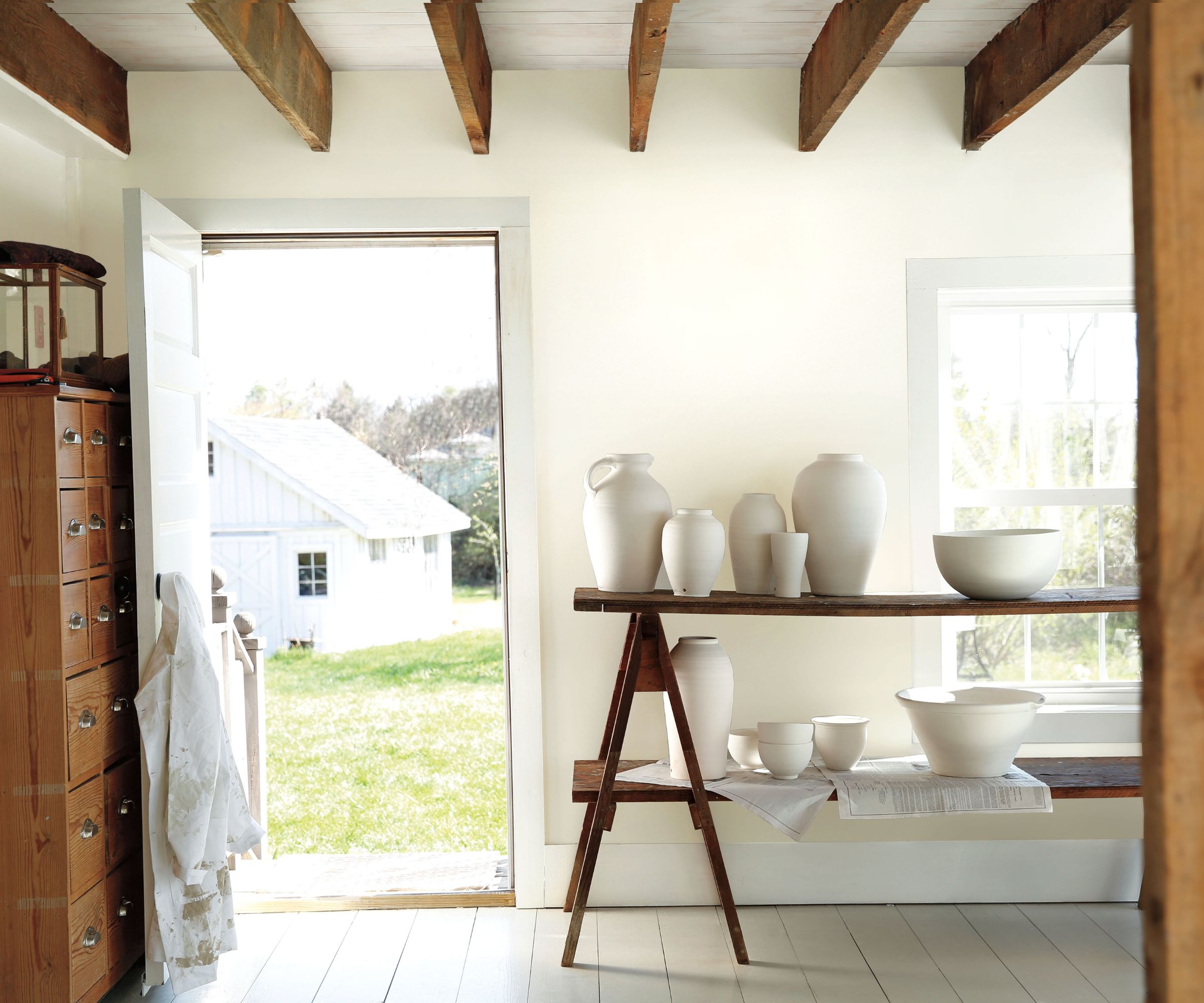
No color scheme is complete without a good white. Benjamin Moore's Simply White is the grounding neutral that pairs beautifully with the hushed pastels and brighter shades. Arianna Barone, Color Marketing Manager at Benjamin Moore, says, 'Simply White OC-117 is a brighter white paint color with a hint of yellow. This Benjamin Moore staple has just the right amount of cheer and warmth. The perfect use-anywhere hue, pair it with warmer neutrals and off-whites for a fresh but still welcoming look. Bring in pale pastels, leafy greens, and sky blues for the ultimate spring vibe.'
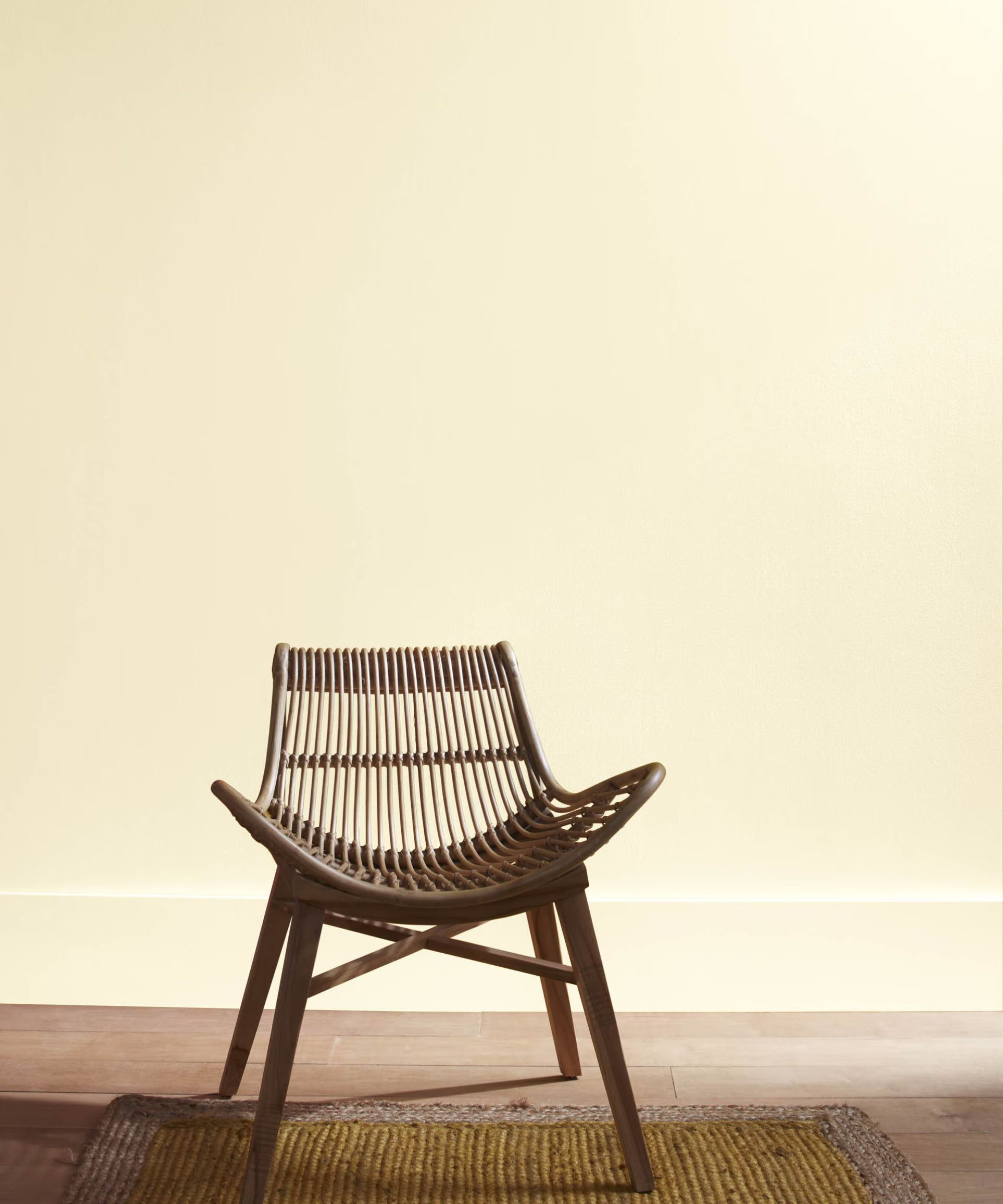
Fresh Air 211 is a more stripped-back take on butter yellow. Helen explains, 'Nothing captures the essence of spring quite like the soft glow of lemon and buttermilk, and Fresh Air embodies this beautifully. Its pale yellow base, grounded by subtle brown undertones, strikes a perfect balance of fresh yet gently anchored, never overly sweet. Swept across all four walls, it creates a space that feels calm and quietly uplifting. Layered with natural textures or offset by playful accents, it delivers an understated brightness that endures.'
Grounding earthy neutrals bring depth and contrast against the pale hues. While colors like Mountain Lane 488, (Arianna describes it as 'An earthy hue that conjures up thoughts of lush hillsides') might be unexpected, they couldn't be a more welcome respite from the muted tones. Helen says, 'It evokes the calm sophistication of a plant-filled veranda and pairs effortlessly with other nature-led tones like soft browns, warm beiges, and gentle greens.'
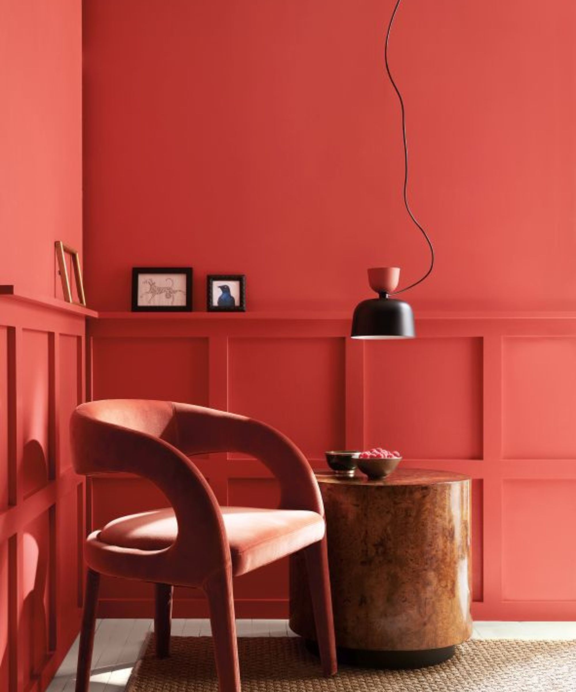
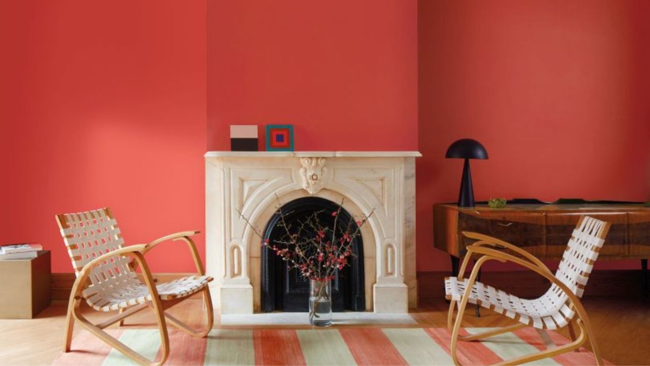
Perhaps the most playful, unexpected shade of them all, Benjamin Moore's Raspberry Blush 2008-30 sets off the deep green and pale pastels, bringing some much-needed vibrancy and surprise that makes this palette feel so unique.
Arianna says, 'A vivacious shade of coral-tinged with pink, Raspberry Blush brings personality and vibrancy to a color palette. Take a playful spin on the classic red dining room by using this charismatic shade.'
Helen adds, 'Shades tinged with coral, such as Raspberry Blush, come alive throughout the day, especially in sunlight, radiating a charismatic, vivacious energy inspired by the vibrant colors of the kitchen. This lively coral, touched with pink, feels bold yet approachable, offering the perfect unexpected pop of color for a modern take on the unexpected red theory.'
Colorful Spring Shopping Picks
Finished in a zingy red tone, this charming bobbin lamp is perfect for uplifting an empty bookshelf or coffee table.
Add some earthy depth to an armchair or sofa with these deep sage green pillow finished with a fringed border.
Finished in a butter yellow glaze, this delicate vase is best paired with long vibrant stems.
For a subtle dose of color that doesn't overwhelm your scheme, try this Bobbie picture frame painted in a muted lavender hue.
Bring a hint of luxury into your living space with the Rigby daybed finished in an enviably smooth sage green velvet.
Bring some charm and whimsy into your cooking space with this Mackenzie-Childs spoon rest covered in a violet check pattern.
Benjamin Moore's spring color palette is delightfully refreshing. Filled with sophisticated pastels, an earthy olive green and a zingy red, it's a palette that perfectly balances light and dark and everything in between.
Love beautiful design ideas, expert advice, and inspiring decor trends? Sign up for our newsletter and get the latest features delivered straight to your inbox.