Gone are the days when Spotify playlist art was just a collage of album covers from the first few tracks. Now, the Browse section of the app is a menagerie of striking, bespoke designs – and leading the charge is Vasava Studio.
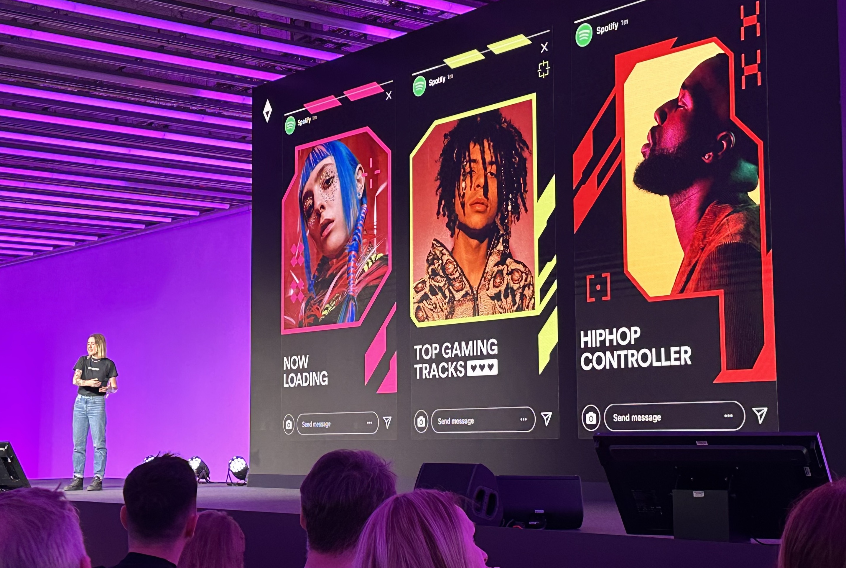
Speaking at this year's OFFF Festival in Barcelona, the studio's hometown, Vasava took to the stage to explain the process of creating 6 of the most popular playlists covers, and explain what makes working with Spotify such a unique design proposition. (Looking for more design inspiration? Check out the best print ads of all time.)
01. Hits Different
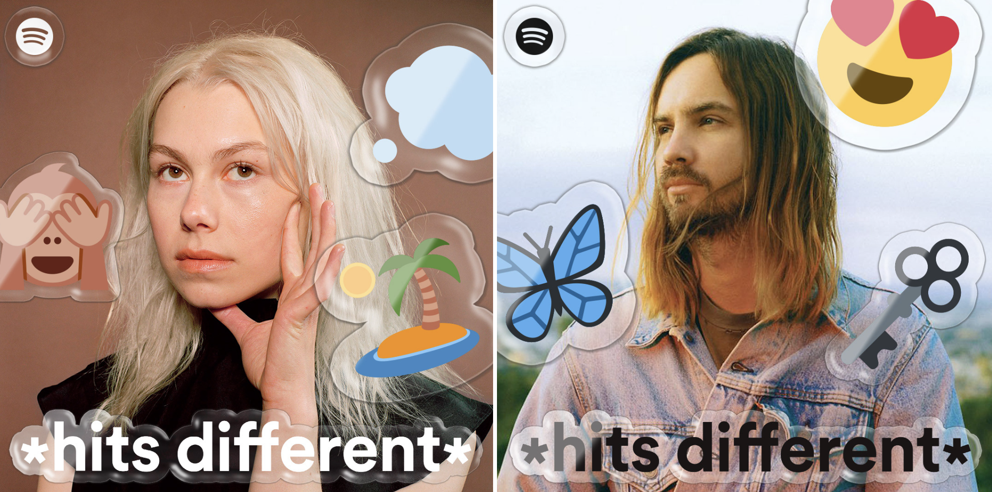
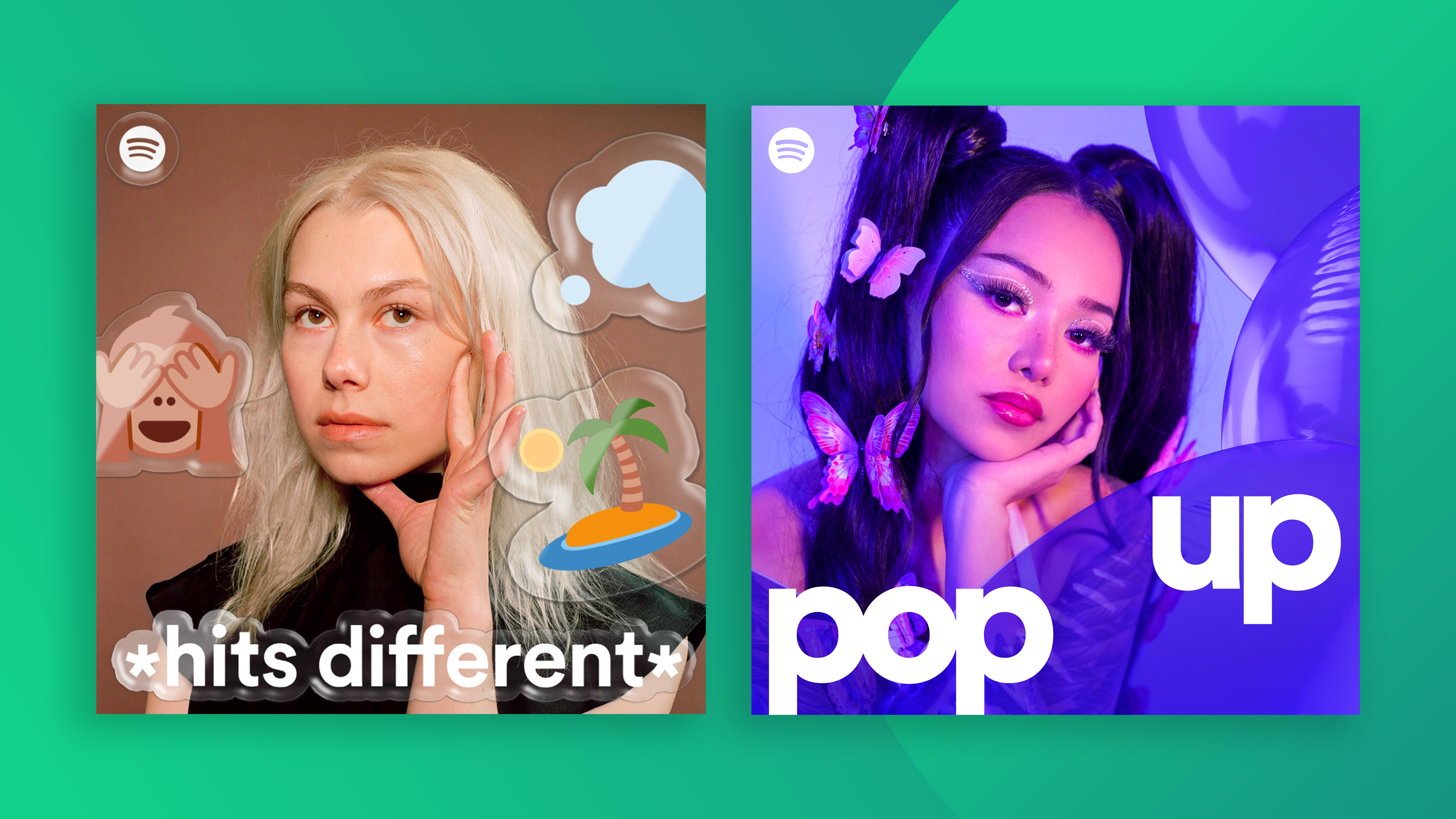
As the name suggests, *hits different* is a playlist of songs that hit you in a different way. "The main challenge here was to connect with Gen Z," Vasava says. "We had to use symbols they identified with like emojis. We took the main titles and emotions from the song representing the cover, turning them into stickers. They communicate what they feel and can be as complex as any other form of language." This helped make the playlist not only sound different, but "also look unique and very typical of the generation that listens to this playlist."
02. Pop Up

One of the most listened to playlists on the platform, Pop Up highlights, yep, pop music. "We wanted to emphasise the ephemeral nature of this genre by using something that gets big then small: balloons. Because pop music changes so fast." The visuals feature a collection of semi-transparent 3D inflatable frames which appear alongside images of the featured artists. "The main challenge of this project was to find a visual language capable of grouping together all the artists in the pop scene, without it seeming forced."
03. KrOWN
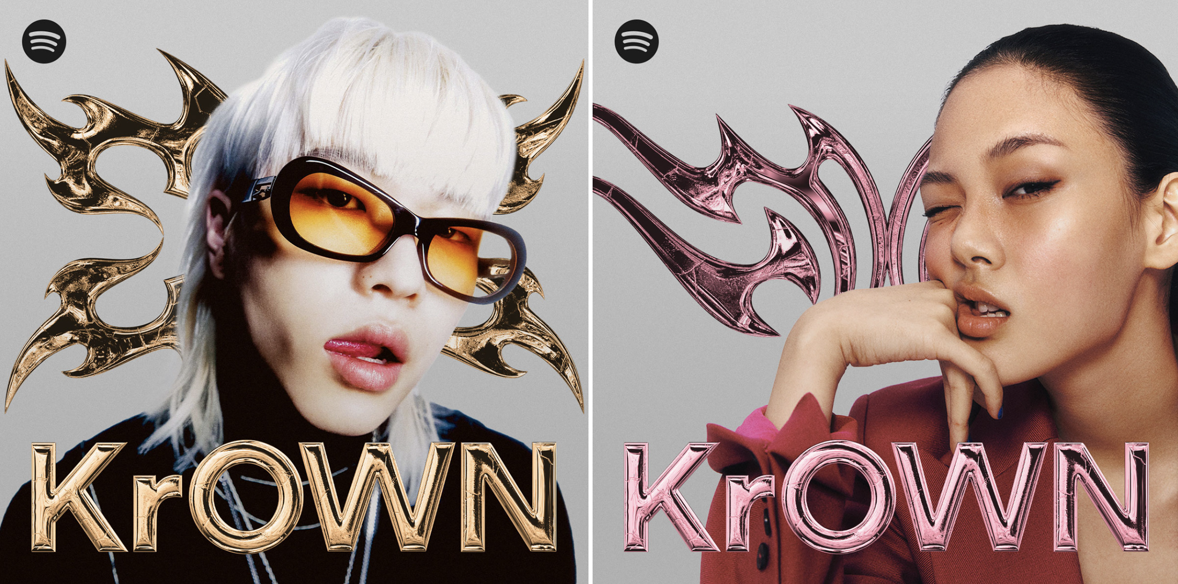
Previously titled K-Hip-Hop +82, KrOWN gathers ""the best rhymes and rhythms from Korea," with over 400k Likes. "K-hip hop artists are constantly referencing thrones, crowns, gold and jewels so we rely on bling bling and symbols of royalty to symbolise power and kingship. We created a series of five crowns in shapes similar to tribal tattoos. We gave both the crowns and the lock-up a metallic, three-dimensional aesthetic, to make them part of the jewellery that "crowns" the artists. We created these elements in five different colours, to be combined with the styles of the protagonists of each cover."
04. FINO
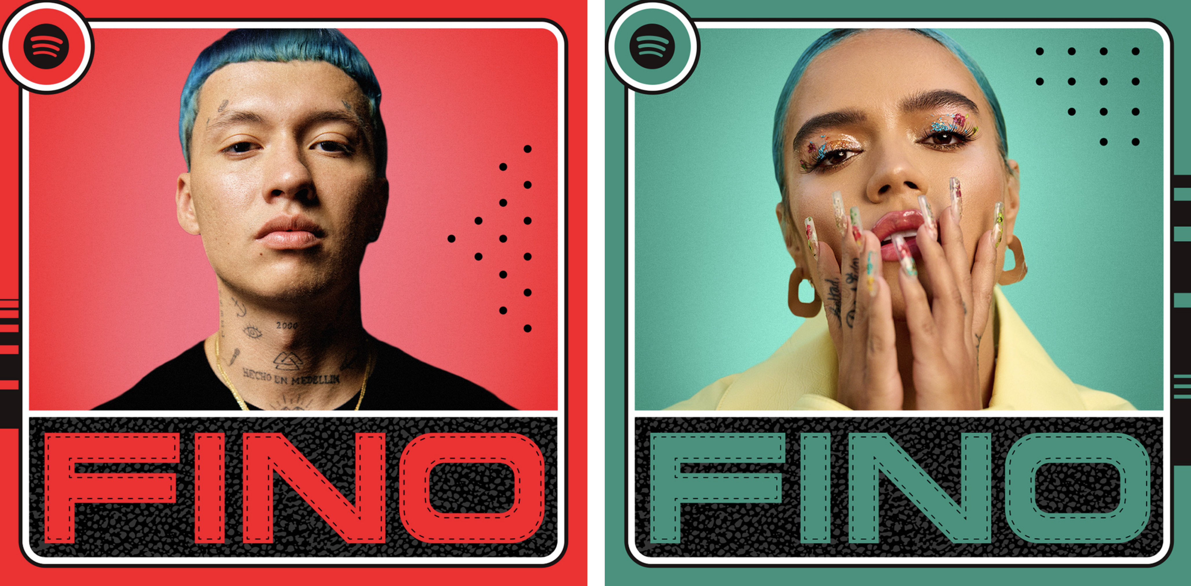
FINO is a Spotify playlist that features the best reggaeton from Medellín. Here, Vasava needed to create a "very sleek and refined identity," focussed more on the aesthetic surrounding the artists than the music itself. "Trademarks in their universe include sportswear and sneakers. We used details and textures from sneakers to create a lockup that’s stitched and has sweat dots and stripes. In this way, FINO reflects the new luxury that characterises the aesthetics of Medellín's reggaeton."
"We've done lots of projects with Spotify," Vasava says, and each presents its own fun and unique challenges. "We have to connect with the audience listening to the music in a visual way, and also get new listeners interested. They're projects where we can explore different styles, and it’s fun to reach people in a unique way every time."
