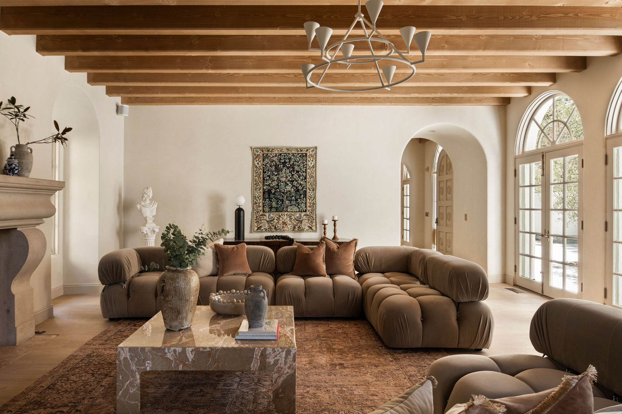
This 5,034 square feet home was built in the 80s in Century City, LA, and while it had good bones, its decor was in need of a modern touch. For this project, the home's owner reached out to Safir Shamsi of Studio Roi for the villa's design, and Francesca Grace for the furnishings.
"As thankful as I am to the prior owners for creating a space with volume, scale, and original charm there was a tremendous amount of potential that the property had yet to see," shares Safir. "I wanted to completely convert it from A Western/Adobe aesthetic to a true Spanish Coastal Villa with the modern amenities. That’s where the brainstorming started."
While Safir transformed the home's larger architectural and design elements, Francesca infused her signature style of warm neutrals, organic shapes, and pops of color to add personality and charm to the home.
This modern home is now inspired by a soft, romantic feel filled with curved lines, soft accents and earth tones. Take a look at its makeover story to inspire your home's next reno.
Entrance
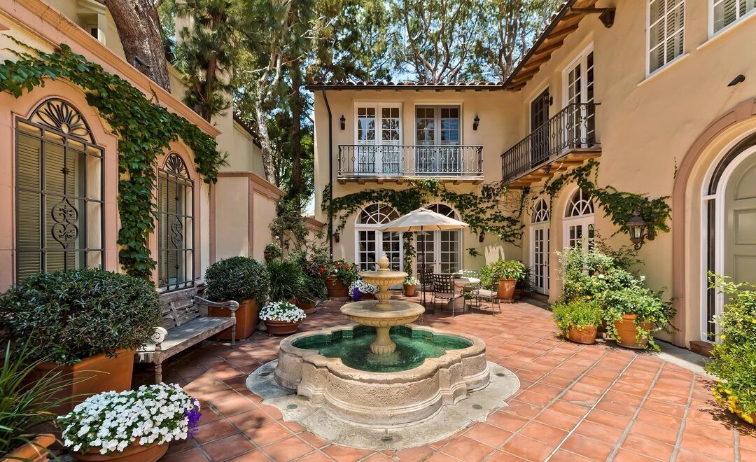
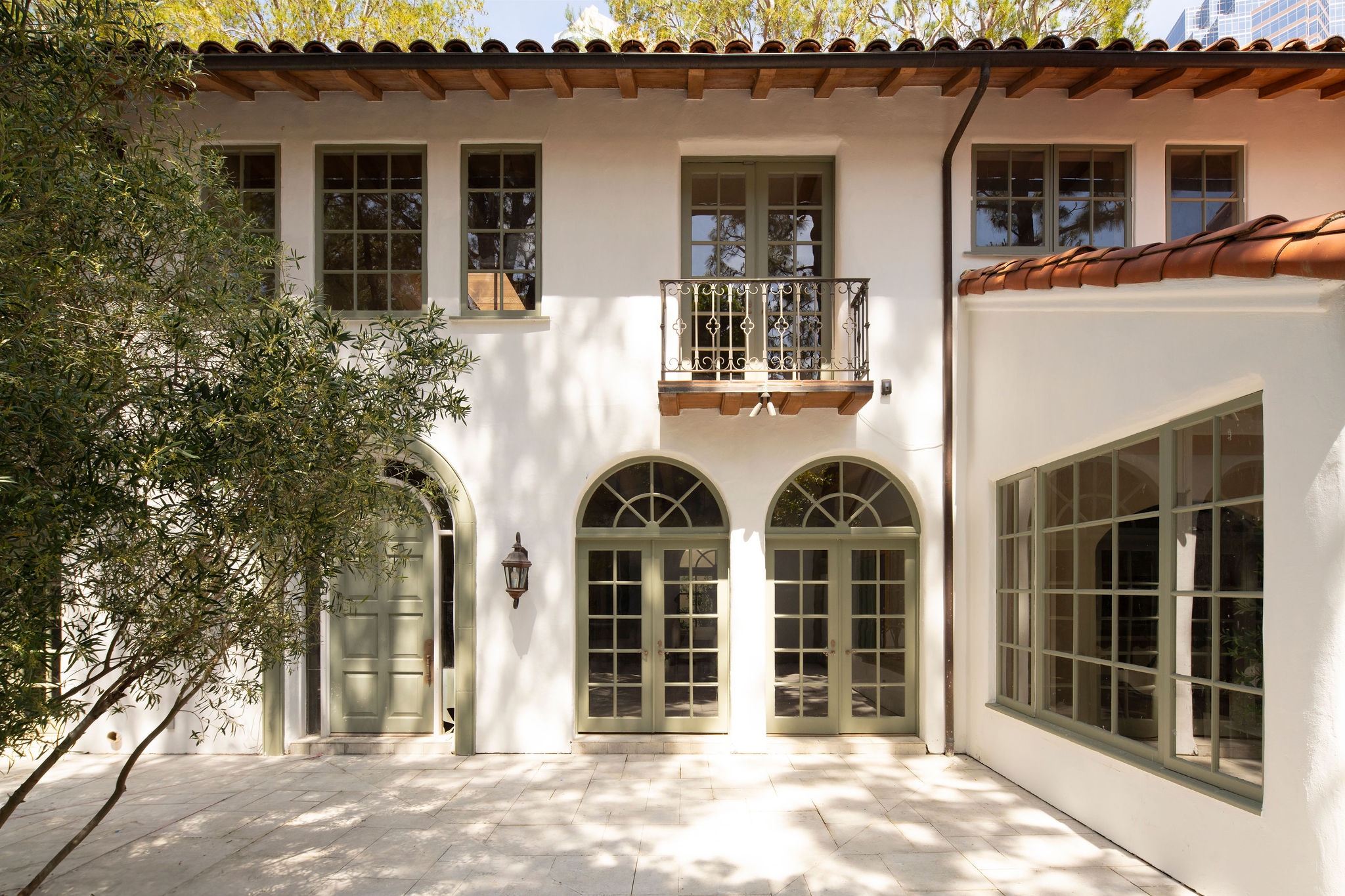
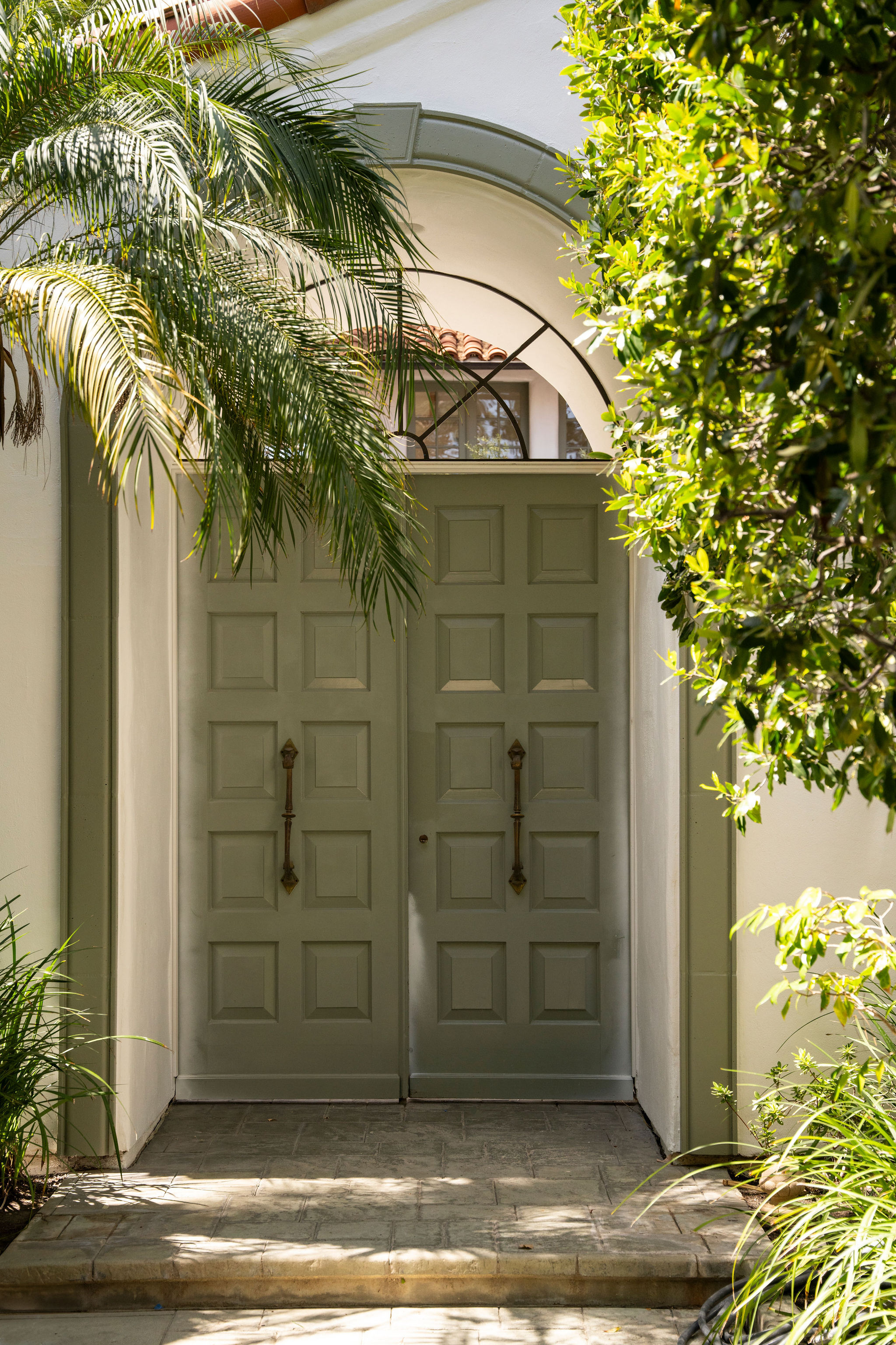
The tiled roof, sage green windows, and tall trees set the stage for a luxurious, vintage-inspired Spanish villa. Thanks to Safir Shamsi, a developer and founder of Studio ROI, and designer Francesca Grace who breathed new life into this Century Woods estate, the villa now has an inherent, warm, and welcoming feel. The front door, vintage outdoor lights, specially chosen handles and hardware, along with the tiled flooring, all beautifully blend a vintage and contemporary charm.
"Before sprucing up this home, I wanted to make sure that the furniture I was selecting would be complementary to all of the design elements Safir chose," avers Francesca. "It was imperative to me that the pieces I chose would accentuate and emphasize all of the intentional details he selected for the home. This home is a perfect blend of true Spanish charm with a contemporary twist so I wanted to make sure our staging reflected this blend of styles."
KITCHEN
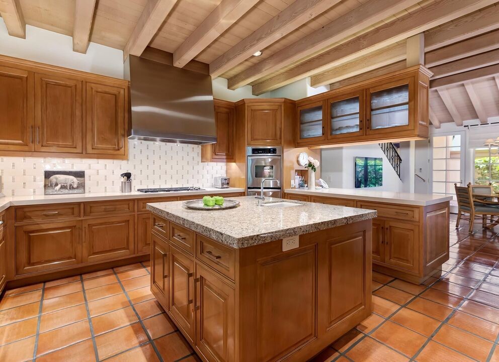
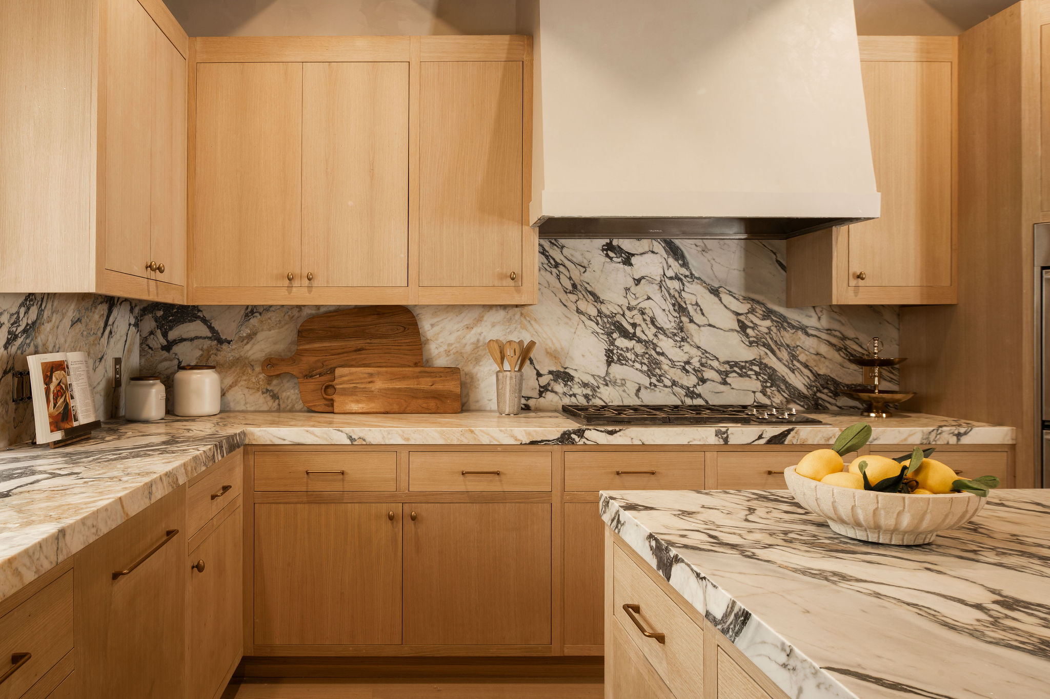
The kitchen previously was a dark, wood-dominated space with red, terracotta tiles. The large kitchen island block, also in wood sat in the center of the room with exposed beams right above the space.
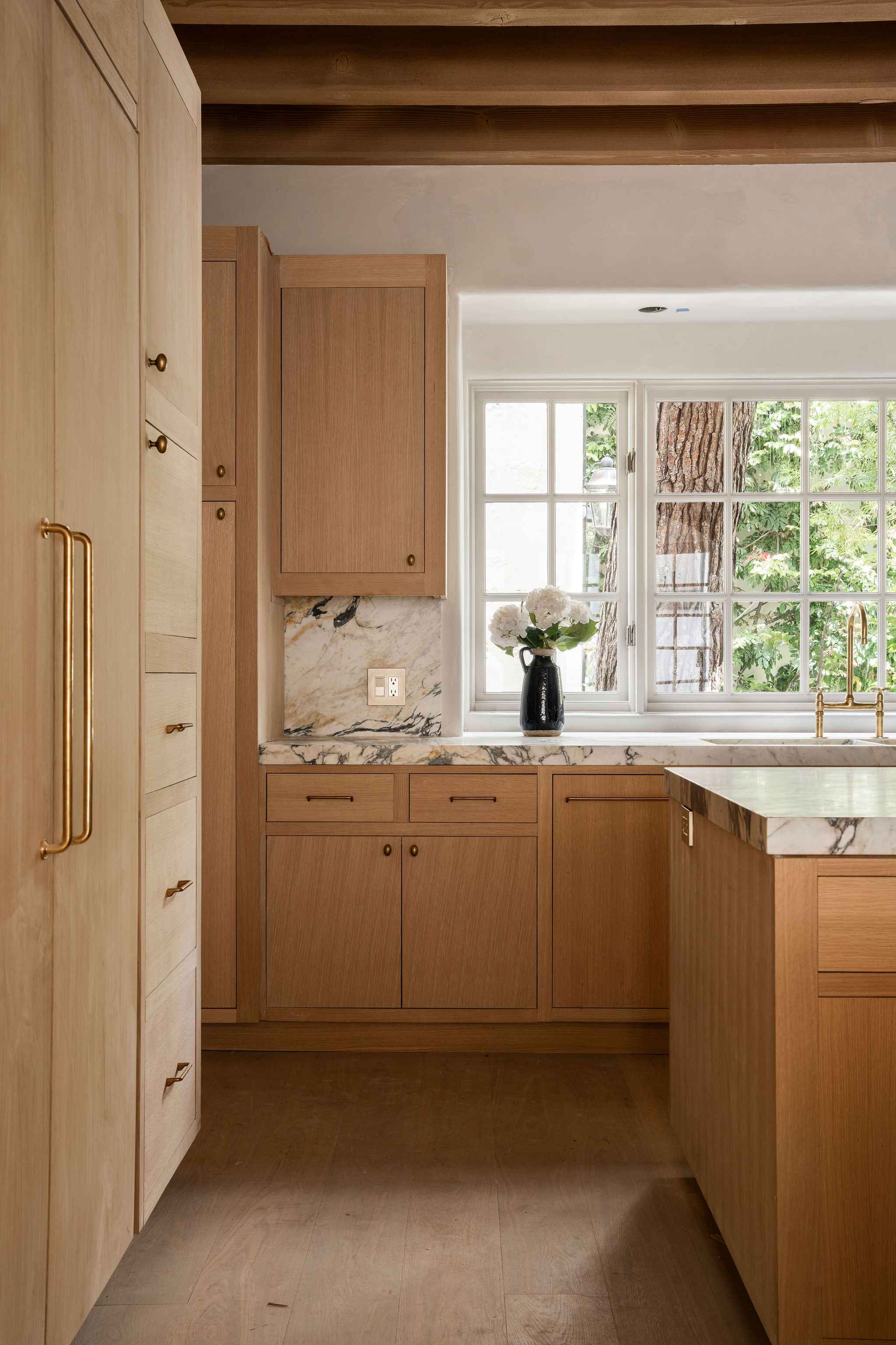
But the renovation was all about creating a modern kitchen look with smart materials that are also practical. "Both the counters and backsplash were fabricated with an Antolini Calcutta Viola imported from Italy," says Safir. "I spent hours looking at different batches to find the right Viola that had both violet and golden hues to the veining to bring in the oak in the cabinets and the warmth I was hoping to achieve that would also compliment the unlacquered brass fixtures throughout."
As for the kitchen storage, the lighter wood truly helps to create a breezy look here.
Safir explains: "Every cabinet and storage unit in the kitchen needed to have a designated and intentional purpose for what was being stored there. We were fortunate enough that there was actually so much storage that we were able to eliminate a portion of them to create a breakfast bar which is a feature all homes of this caliber must have."
DINING ROOM
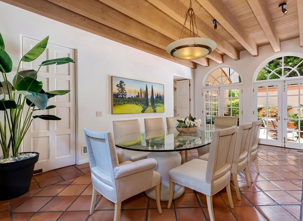
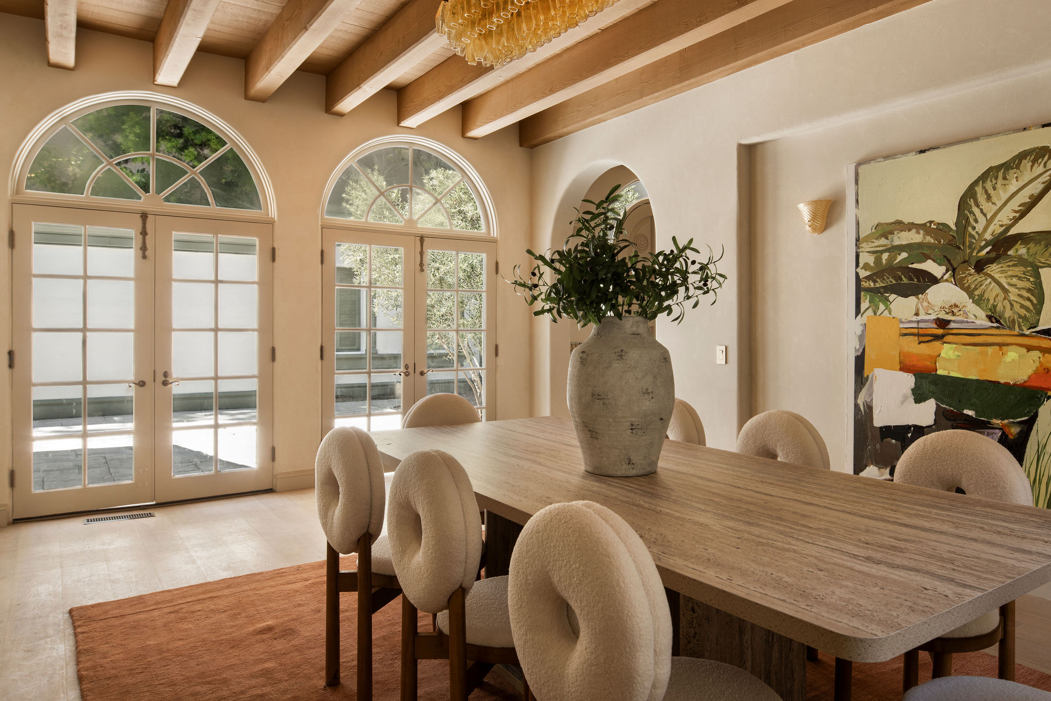
The previous dining space lacked luster, as the furniture design and materiality looked quite dated. Also, the space has a caved-in feel due to the dark flooring and the ceiling above.
But the space was given a beautiful makeover with the magic of neutrals and pleasing artwork. "It was important to me to make the dining room as inviting as possible," shares Safir. "Coming from a Middle Eastern family, the dining room was always the heart of the home. I wanted to accentuate the curved windows and French doors leading out to the courtyard. In doing so, I decided to keep the color pallet very neutral while adding very warm light fixtures. The chandelier is a vintage piece from Italy featuring over 50 pieces of Murano glass. I almost passed out seeing it illuminate in the evening and the ambiance it created."
"The ceiling beams all throughout the home were original to the build date," shares Safir. "It was one of the main reasons my client purchased the home and discovered its unmatched potential."
LIVING ROOM
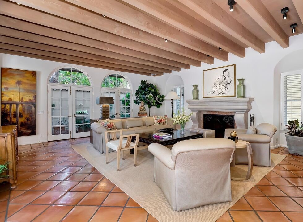
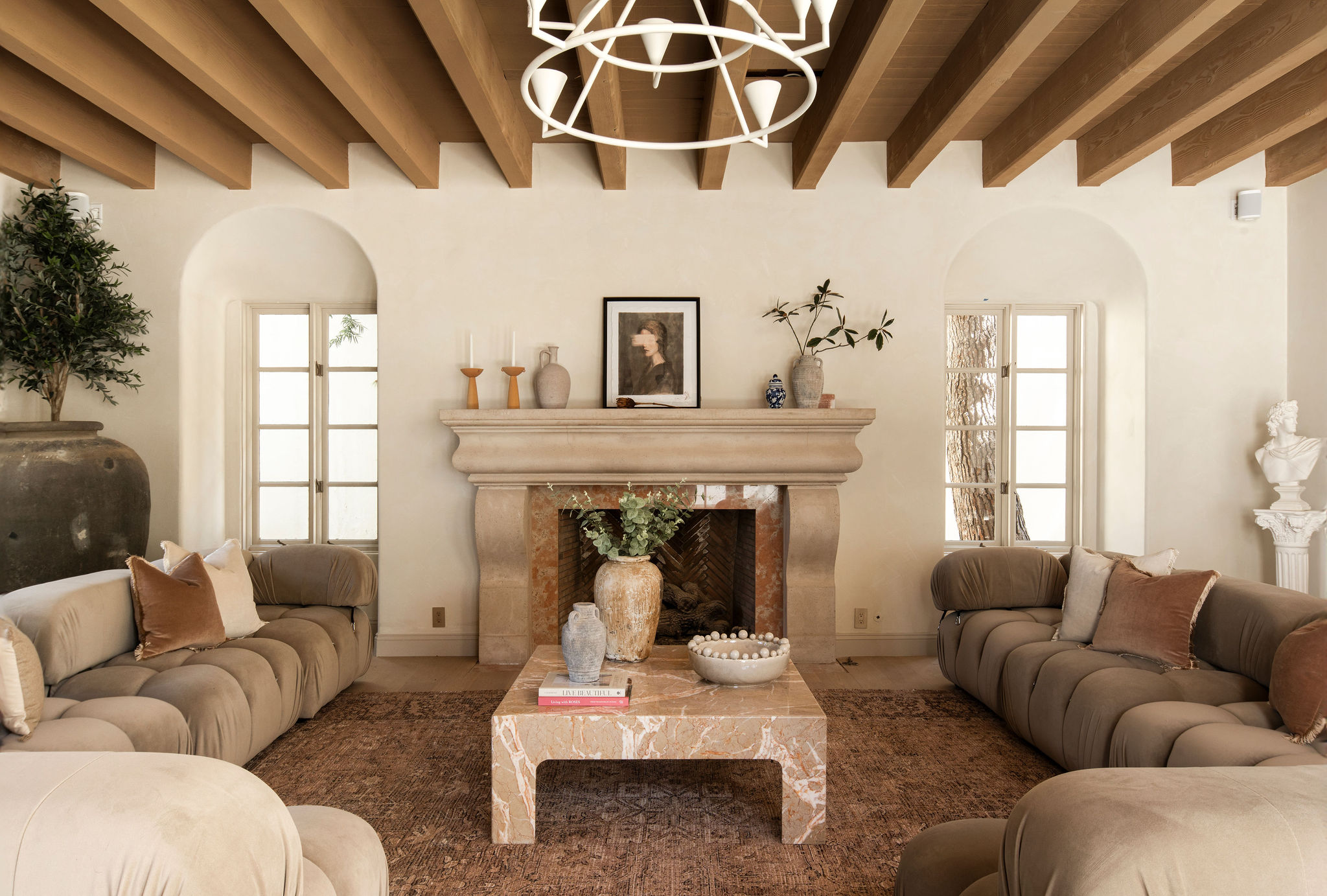

The large living room had multiple seating pieces, all drenched in beiges and creams. The style of furniture was vintage and the setting rather traditional and formal.
The new space is now as elegant as it is comfortable. The large living room sofas sport a modern color palette, making an immediate style statement.
"As this is the main living space in the home I wanted to emphasize how grand the room is so we brought in a huge Bellini sectional to make the room feel extra warm and luxurious," shares Francesca. "I love the curves of the Bellini complement the arched windows and the curves of the fireplace. To me, this coffee table was a no-brainer for this room; it’s a vintage piece that I sourced and the colors of this marble play off the tones in the fireplace so well."
FAMILY ROOM
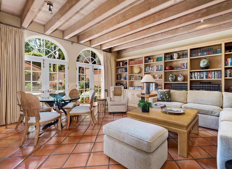
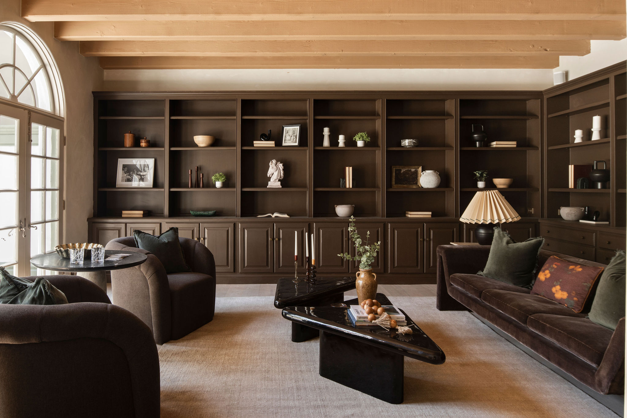
Dark, cozy, calm with a laid-back vibe defines the family room. A built-in bookshelf ensures that the space is a perfect reading room, and a place to spend some quiet moments alone.
"Safir selected a warm and moody color scheme for this space and I followed suit with the furniture I chose," says Francesca. "Unlike the light, bright main living room, this color scheme creates a clearly defined separation between the two rooms. To me, this room feels like a cozy lounge where you might enjoy a glass of whiskey and a game of cards."
"This room was originally designed with a very versatile purpose," says Safir. "We opted for open shelving on top to give the option of styling it to their liking while having closed cabinets on the bottom to store some unsightly items one does not wish to have on display at times. I am a true believer in everything having a dual purpose for maximum functionality."
"I am a huge fan of free-floating shelves along with a lower level of closed cabinetry," adds Safir. "So many vendors now have modular built ins you can purchase at affordable prices. Then the real fun is customizing those built ins to not only match the aesthetic of your home but to also make it look more expensive which comes down to three factors. Paint color, chosen hardware and styling."
HOME OFFICE
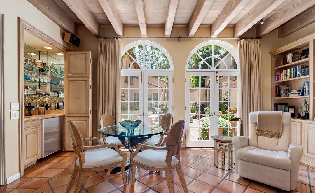
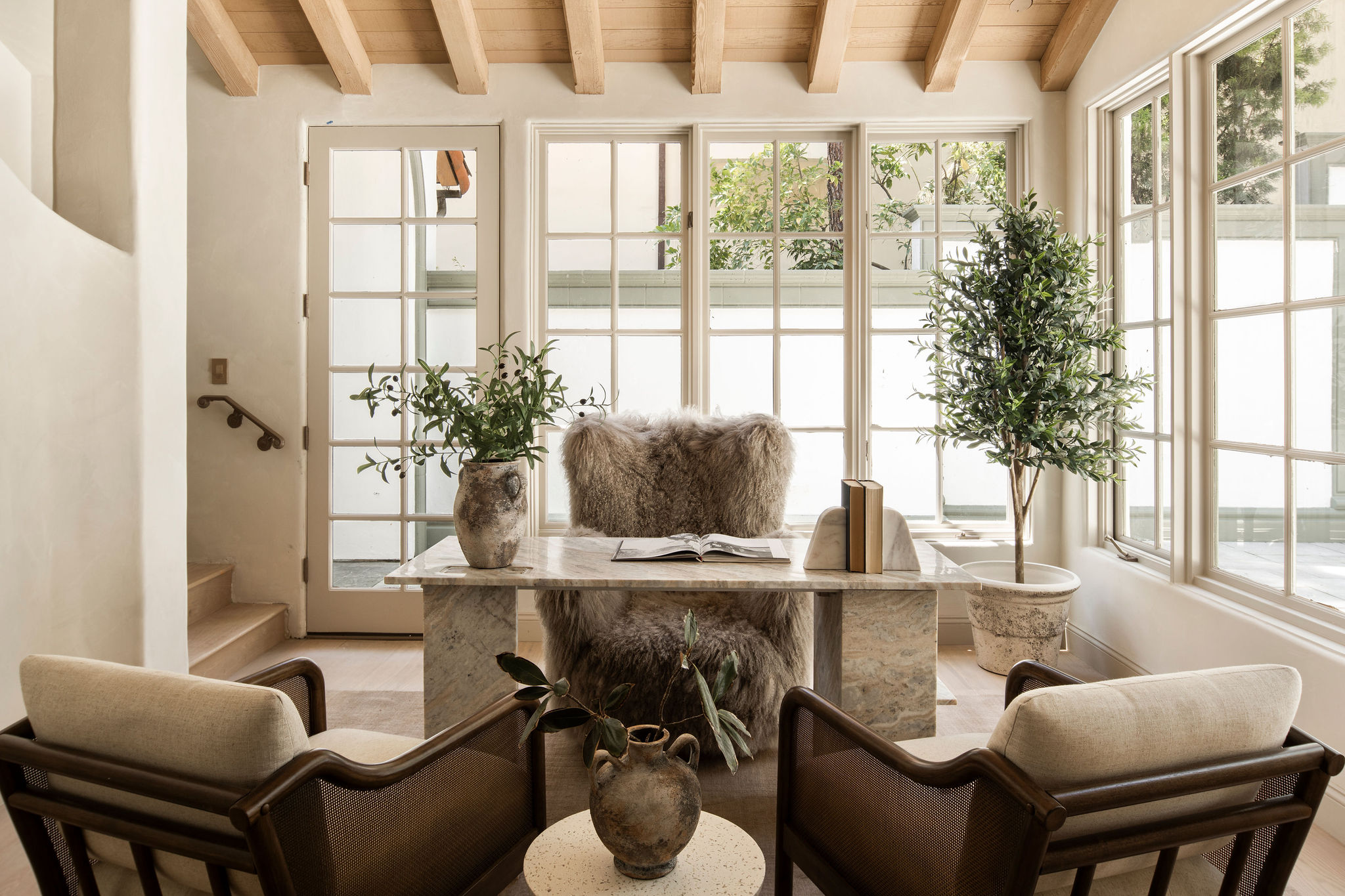
The light-filled home office is a picture of quiet elegance. Carefully selected furniture along with plants and a soft rug make this the ideal space to spend hours in.
Francesca elaborates: "The beauty of this office space is that it really could be whatever you want it to be. Since it is one of the first rooms you see I went with a Bozzi chair from CB2 to really make a statement."
PRIMARY BEDROOM
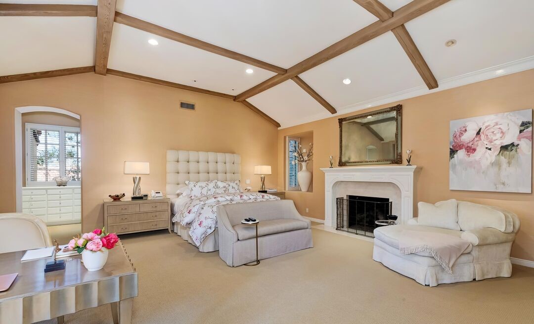
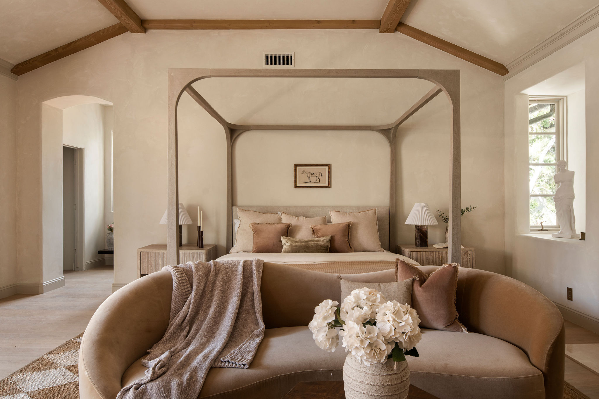
Awash in soft tones and natural finishes, this bedroom is a dreamy space. A small lounge corner makes it an ideal oasis for several activities and uses.
"I love to incorporate a lounge-style seating area at the end of the bed," shares Francesca. "It lets people truly see the possibilities that a room can have and also ensures that the space doesn’t feel empty. I think a lot of people don’t realize that bedrooms don’t need to be just for sleep; adding a cozy lounge to your bedroom can really elevate your space and make it feel more luxurious."
PRIMARY BATHROOM
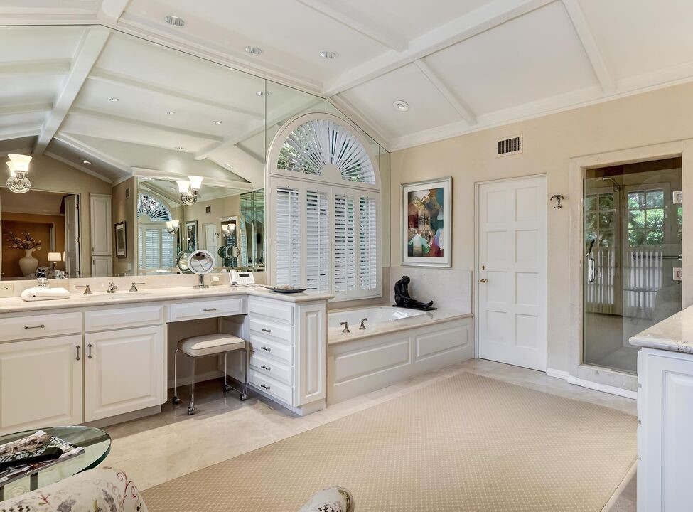
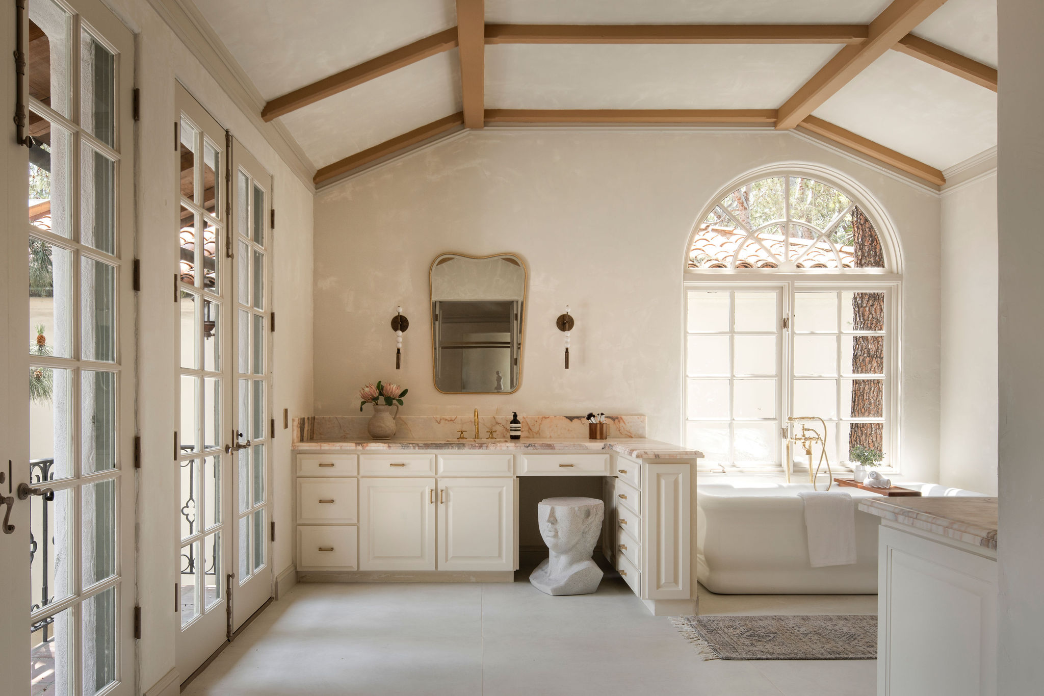
"This is the master bathroom and by far one of my favorite rooms in the entire home," adds Safir "During my travels last summer, I was fortunate enough to stay in a villa that was 10 minutes outside of Marbella. My bathroom had double doors opening out to the courtyard of the property, oddly enough just like this. The bath was free-standing with a brass tub filler overlooking the pool on the property just like the subject property as well. I was so inspired by this one bathroom that when I originally walked through Century Woods, I knew I had to find a way to pay homage to it. I chose another Italian imported marble replicating a Sunset with its rose-colored hues and deeply accentuated veining providing an original coastal villa finish."
The designer fabricated the integrated bathroom sinks out of the same stone along with a floor-to-ceiling application in the shower with a matching arched niche. "Other features include the vintage-inspired free standing tub along with an unlacquered brass floor mounted tub filler perfectly symmetrical to the arched window overlooking the pool," adds Safir. "The execution was flawless."
SECONDARY BEDROOM
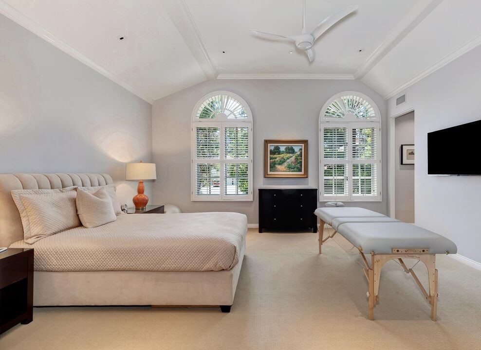
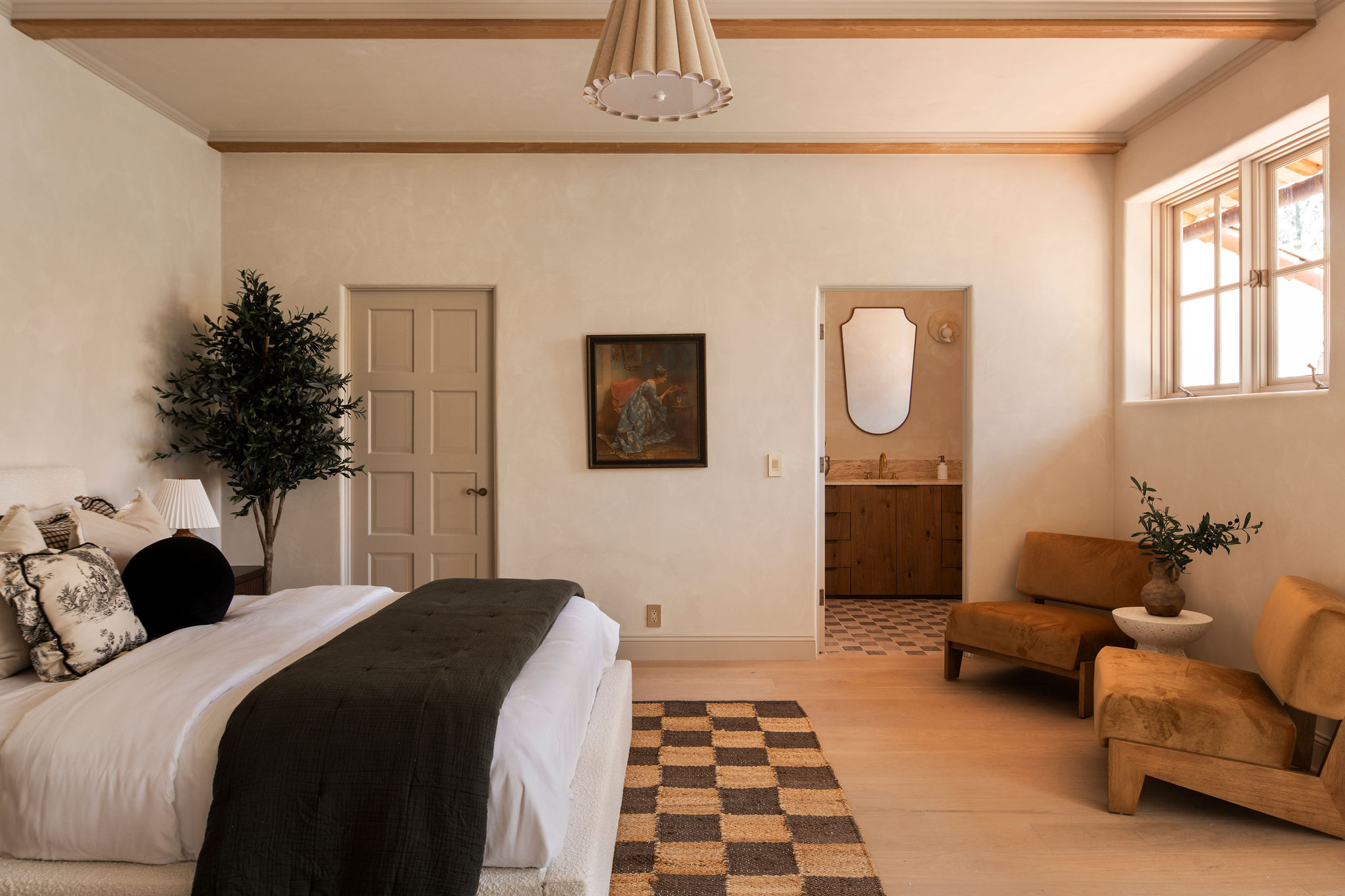
This room has an almost resort-like feel, with the tactical walls, the minimalist light, and low chairs. An earth tone bedroom style like this is the perfect look for secondary spaces like a guest bedroom that needs to instantly feel inviting and calming.
"This bedroom is one of my favorites, partially because of the gorgeous bathroom," says Francesca. "I wanted this room to feel like a suite in the European countryside, hence the vintage art and the toile accent pillows, but to keep it feeling contemporary and in line with the rest of the home we brought in some modern mid-century inspired accent chairs that I think really tie the whole space together."
"A winning feature I wanted to accomplish throughout the home but mostly the bedrooms is creating a neutral but warm color theme," adds Safir. "I used Patagonia from Portola Paints throughout the public rooms and bedrooms in a limewash application. The baseboards and door trims were finished in an acrylic finish adding a slightly darker tint complimenting the original beamed ceilings."
SECONDARY BATHROOM
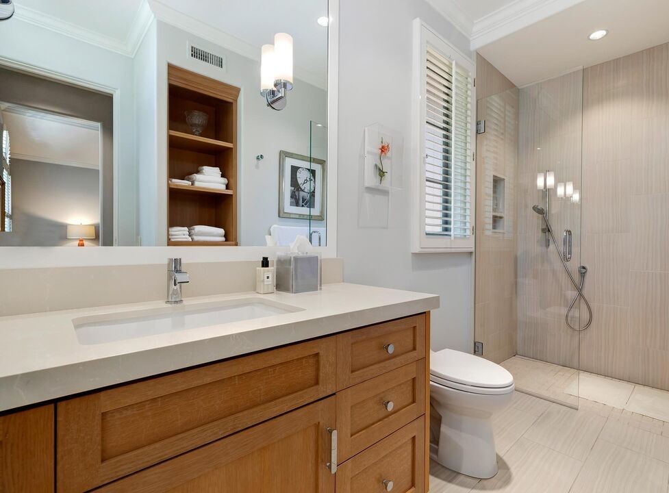
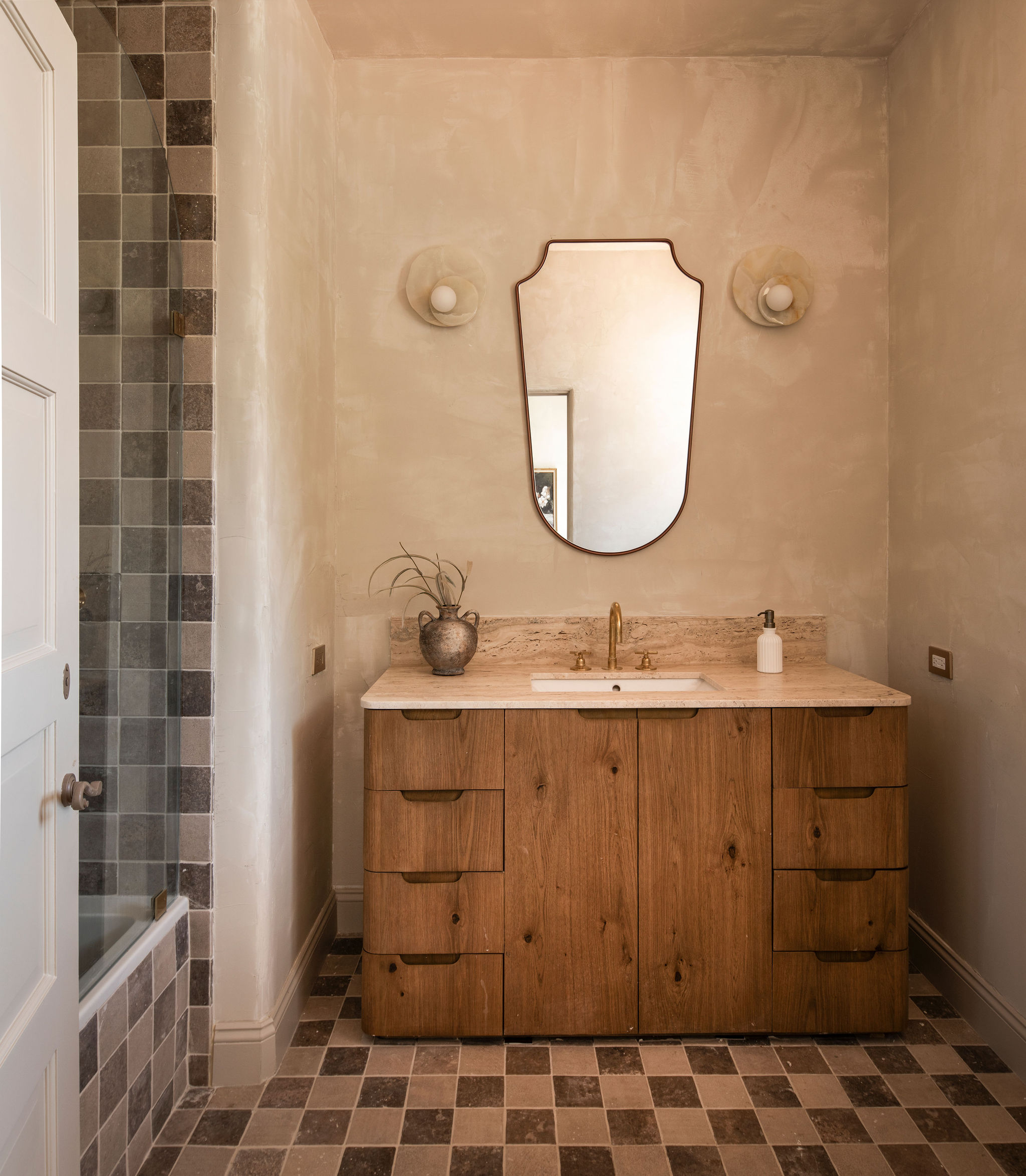
This hotel-style bathroom brings the luxury of vacation to the everyday.
"I opted for a playful checkerboard pattern to give it life and character but kept the pallet very neutral and adult-like with tumbled travertine and stone applied to the floors, wrapped around the tub, and shower walls," says Safir.
The home is a picture of inspiration as old world seamlessly meets new world. High end, modern pieces settle inside the Spanish-inspired villa and the lime wash walls, muted colors and original ceiling structure keep the vibe relaxed and cozy. All primary spaces are opened up to natural light thanks to tall windows. A feeling of tranquillity has made home here.


