It's rather common to find yourself in a space that isn't truly suited to your style and in such cases, it's easy to give up on the home and consider shifting instead of experimenting with what you have. At such moments, it's important to look at the potential of a space and let inspiration flood the home in order to truly recognize that you may be giving up on a gem.
When you first look at this home, you'll find yourself caught up in the cohesive aesthetic that runs like a common thread throughout the layout of this bright space. However, upon further notice, you'll find the subtle elements of color, texture, and print that weave their way through the home, gifting it the charm and personality that make it an admirably warm space.
While looking at the before pictures, I noticed that there seemed to be far too much unused space and rather dim corners for a home with so many entryways for light. But as you make your way through the renovated home, you will find that the designer Barrett Cooke has beautifully played with the space to retain its mid-century modern backdrop while also bringing a new life to this cozy house. Keen to learn more, we spoke to Barrett to find out how she turned this bland space into a sophisticated modern home styled to perfection.
Front Doorway
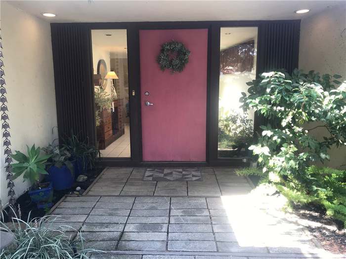
In her experience as co-founder of Arterberry Cooke Architecture, Barrett Cooke has a history of experimenting with purpose-driven design to provide chic contemporary spaces personalized to each client and this project was no exception. Starting with the entrance to the home, Barrett tells us that prior to the renovations, the driveway was a large asphalt area with no hardscaping elements. 'We broke up the driveway and installed a new walkway so that guests could orient themselves to the front,' she says.
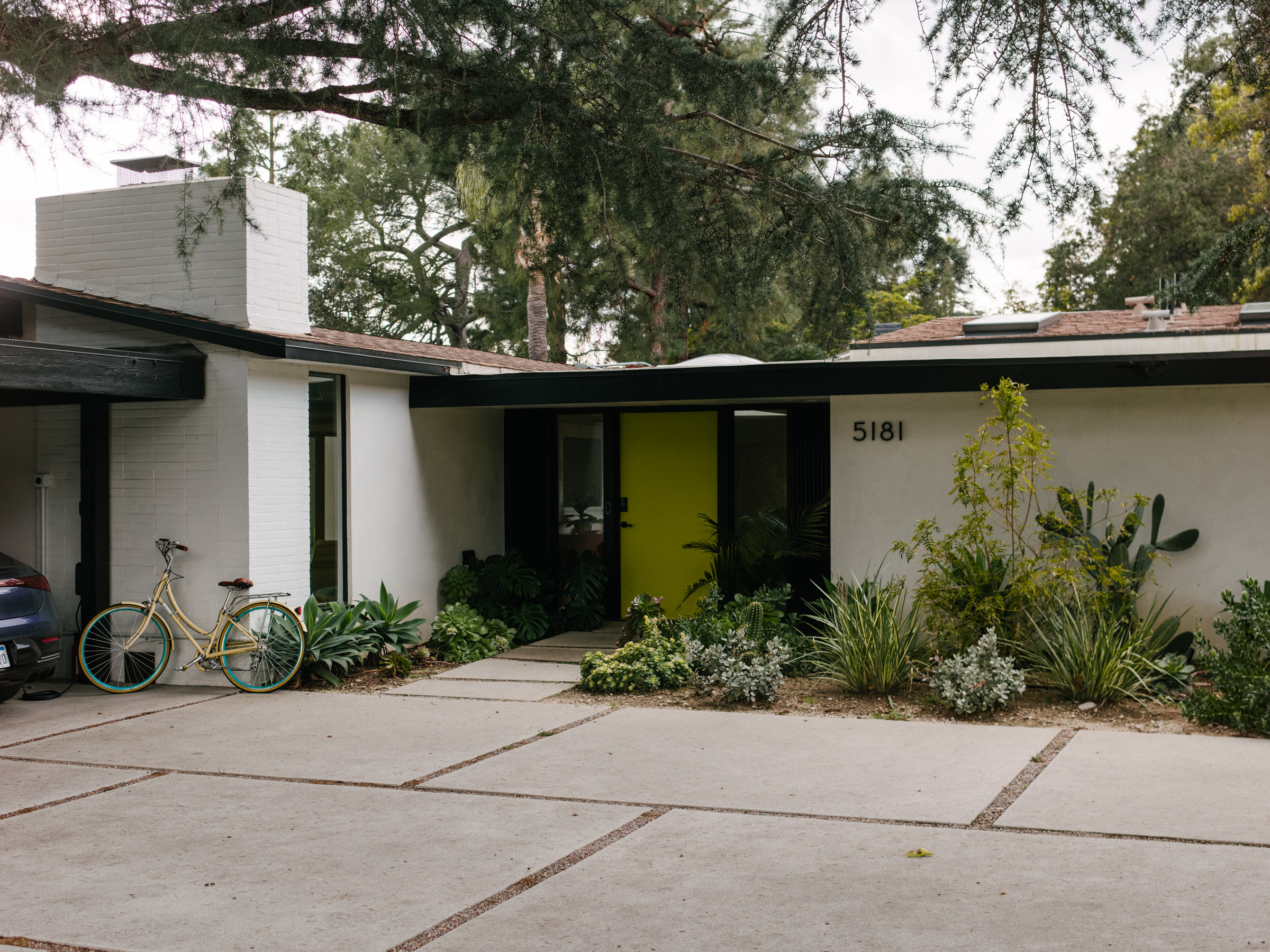
Although overlooked, the area leading up to the front door can set the tone for the entire home and Barrett did not skip out on giving this area the TLC it needed. What was an empty expanse leading up to the front of the home has been converted into a bright entrance area with a plot of lush green plants complimenting the bright front door coated in a summery hue of lime green.
'In terms of color, the homeowners wanted something bold and bright to help direct guests to the front door, as the rest of the exterior was more subdued in comparison,' she notes. The front of any home is crucial to making a good first impression and Barrett ensured that this area was well-designed with great curb appeal.
Living Room
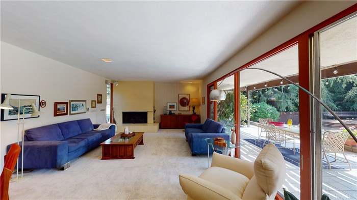
The living room is almost always at the heart of any modern home and this home has been blessed with enough space to create a zone catered to unwinding. Barrett explains that the home was stuck in the past with white tile square flooring and outdated designs that had not been touched since the 80s. 'We stripped away some of the 80s elements and wanted to bring it back to its original roots while incorporating a modern take on mid-century style,' she says.
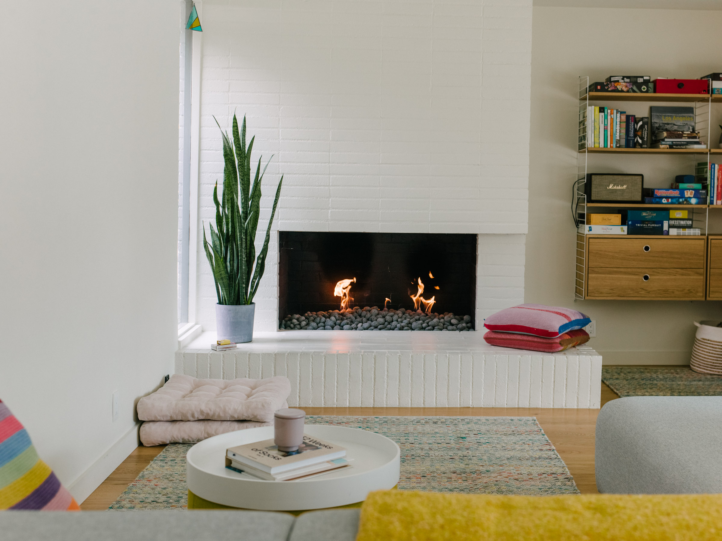
Clean white walls can sometimes come across as plain but the small splashes of color across the space make it an invitingly joyful room to relax in. The colorful floor cushions are a great addition to the room and the sizzling fireplace is perfectly placed for the owners to warm up while lounging on the sofa. All the simplistic details of the room truly make it a cozy living area.
Kitchen
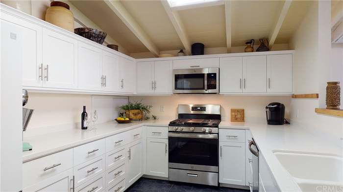
One of our favorite spots in the home is the gorgeous pastel modern kitchen and when you take a look at the before and after design of the space, you'll be in awe of the transformation - just as we were. The kitchen is both whimsical and vintage in design with its playful light green color and the retro-inspired terrazzo tiling featured across the countertops. She explains that the terrazzo countertops have a pragmatic effect of being poppy and fun while also tying into the mid-century look.
'Fun fact - when we pulled up the white tile, there was terrazzo underneath it in some sections of the house, which was the home's original flooring. Unfortunately, the original flooring was not in good condition and while we discussed ways to maintain it, unfortunately, it was beyond repair,' she says. However, she managed to honor the original design by incorporating a hint of terrazzo into the kitchen.
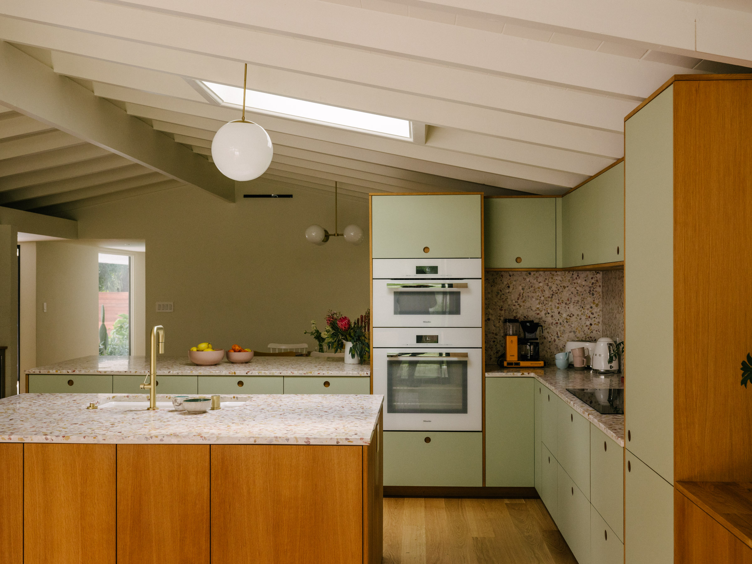
Barrett took dated and generic white shaker cabinets and create beautiful, modern wooden cabinetry wrapping around the space with a quaint kitchen island standing at the center of it all. Not one to gatekeep, Barrett tells us that the kitchen cabinets are from Reform's BASIS collection and the variant is linoleum in pistachio. She also lets us in on the fact that the gorgeous vintage style embellishments are from Concrete Collaborative's terrazzo countertop selection.
Dining Room
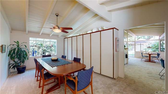
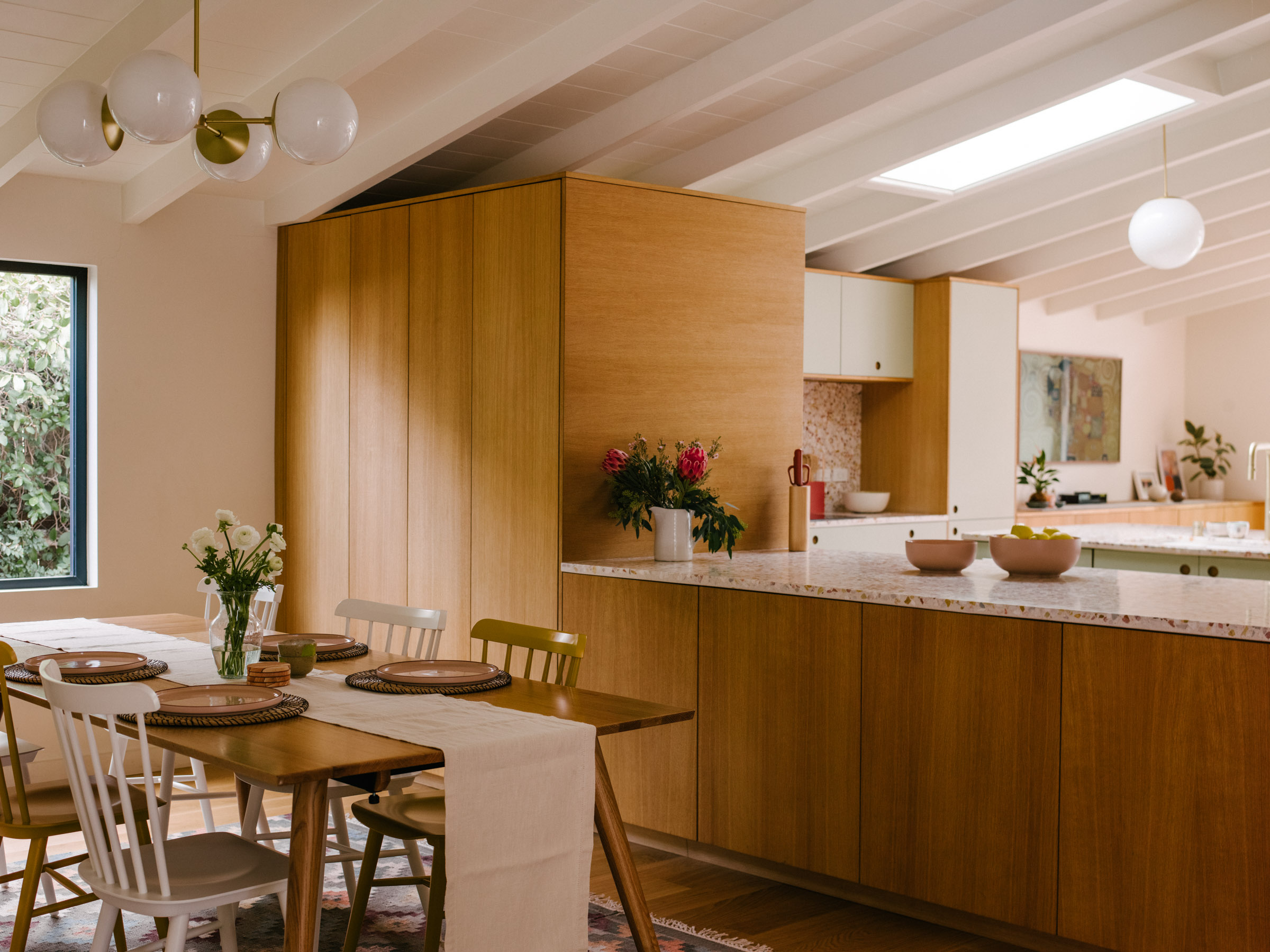
The retro vibe of the space sweeps across the kitchen and into the dining room. From the geometric lighting overhead to the matching wood paneling, this room is packed with charm. One of the first bits to catch our attention was the eclectic alternating of the colored seating by the table. Barrett tells us that she finds it important to bring the clients along on the journey to personalize their homes and that the mismatched chairs happened to be a client-driven design choice.
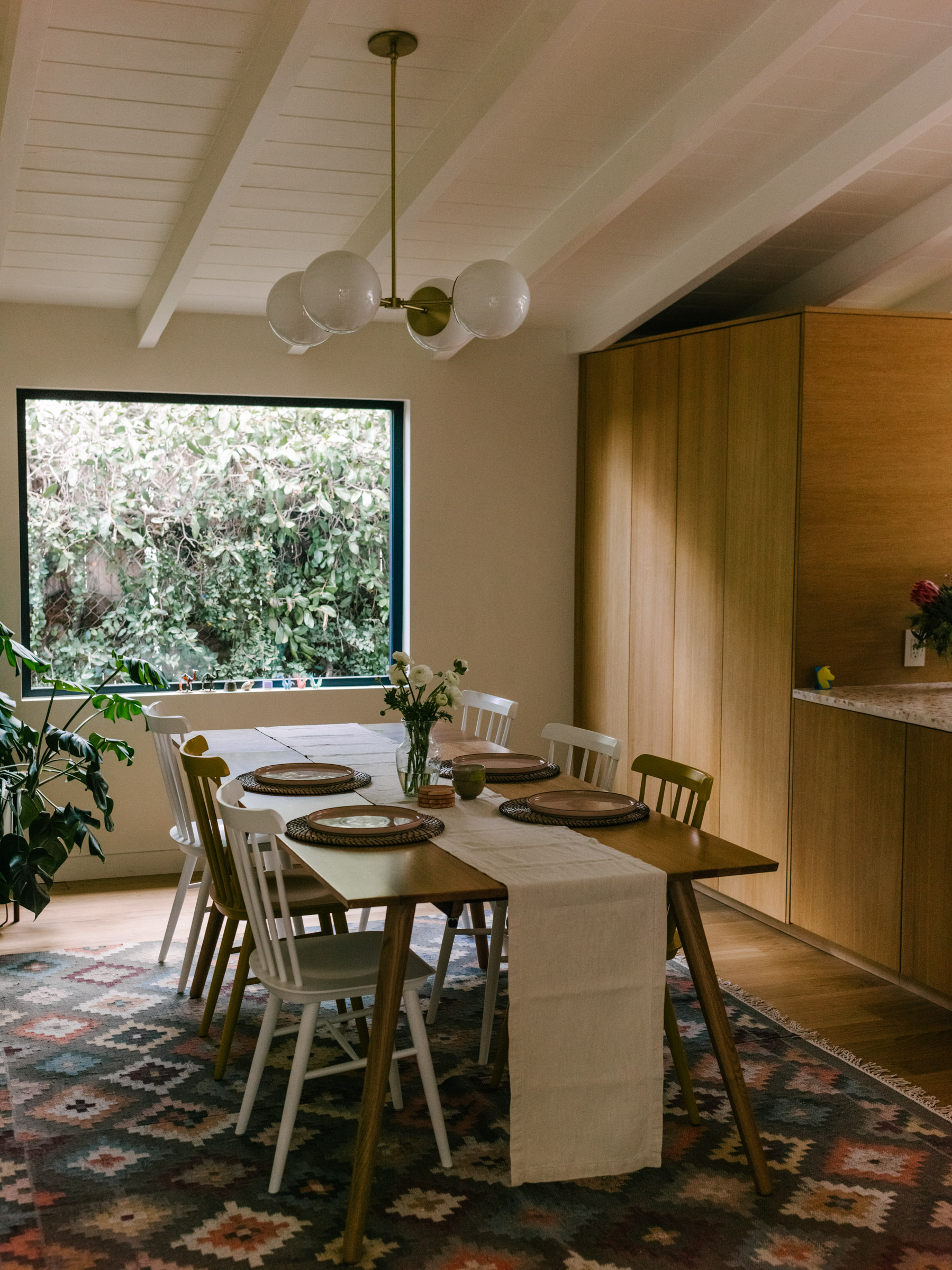
While the dining space had always been accented by a picture window overlooking the greenery outside the interior space, Barrett decided to give the space a slightly elevated look to suit the rest of the room.' The family didn't necessarily need a functional window made to open so it was a great opportunity to frame a little bit of the beautiful view of the side yard,' she says. The dining room is the perfect balance of style and convenience with its ease of accessibility to the kitchen while also being a stand alone room fit for family dinners.
Bedroom
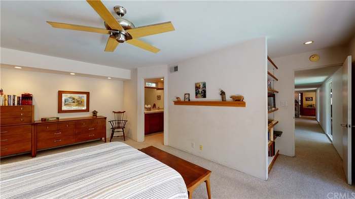
There is a thin line between old-fashioned and vintage chic, and the primary bedroom was not so much an embodiment of the latter. However, Barrett managed to convert the primary bedroom into a modern sanctuary of its own. Mimicking the makings of every great resort, Barrett even had the space restructured to have the room overlook the pool.
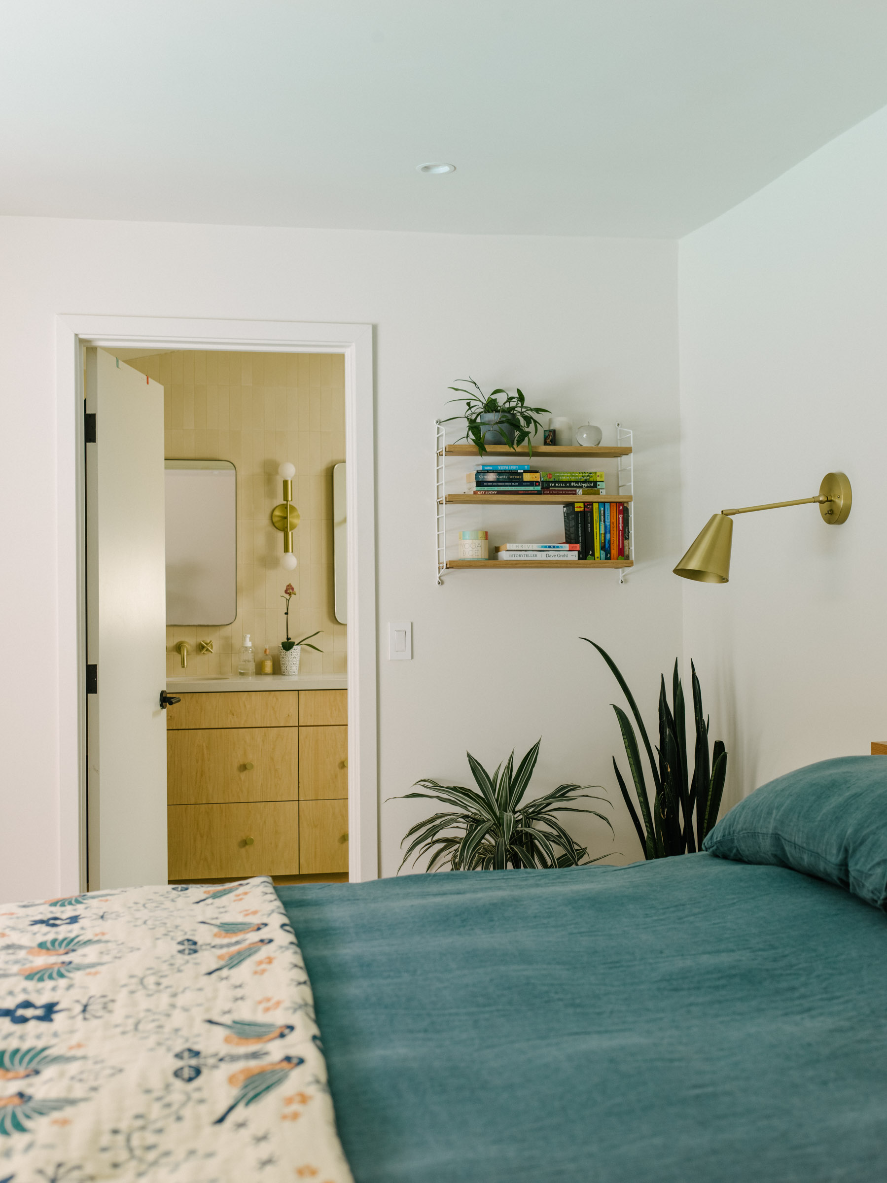
Decorated with gold sconces and lush green indoor plants, these finishing touches make the room a soft haven. 'I think that mixing an earthier palette with some more modern options made the space feel a little bit more current and up-to-date,' notes Barrett. A great trick to remember when sprucing up your home is to use indoor plants to liven up any bare space and is easily adaptable to most aesthetics - as seen across this idyllic home.
Bathroom
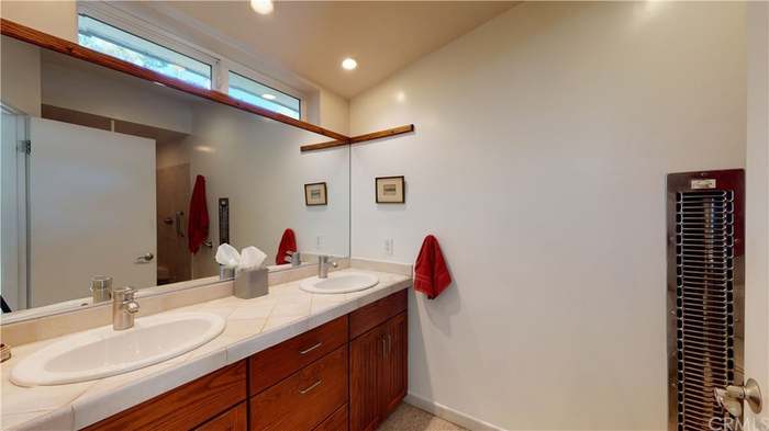
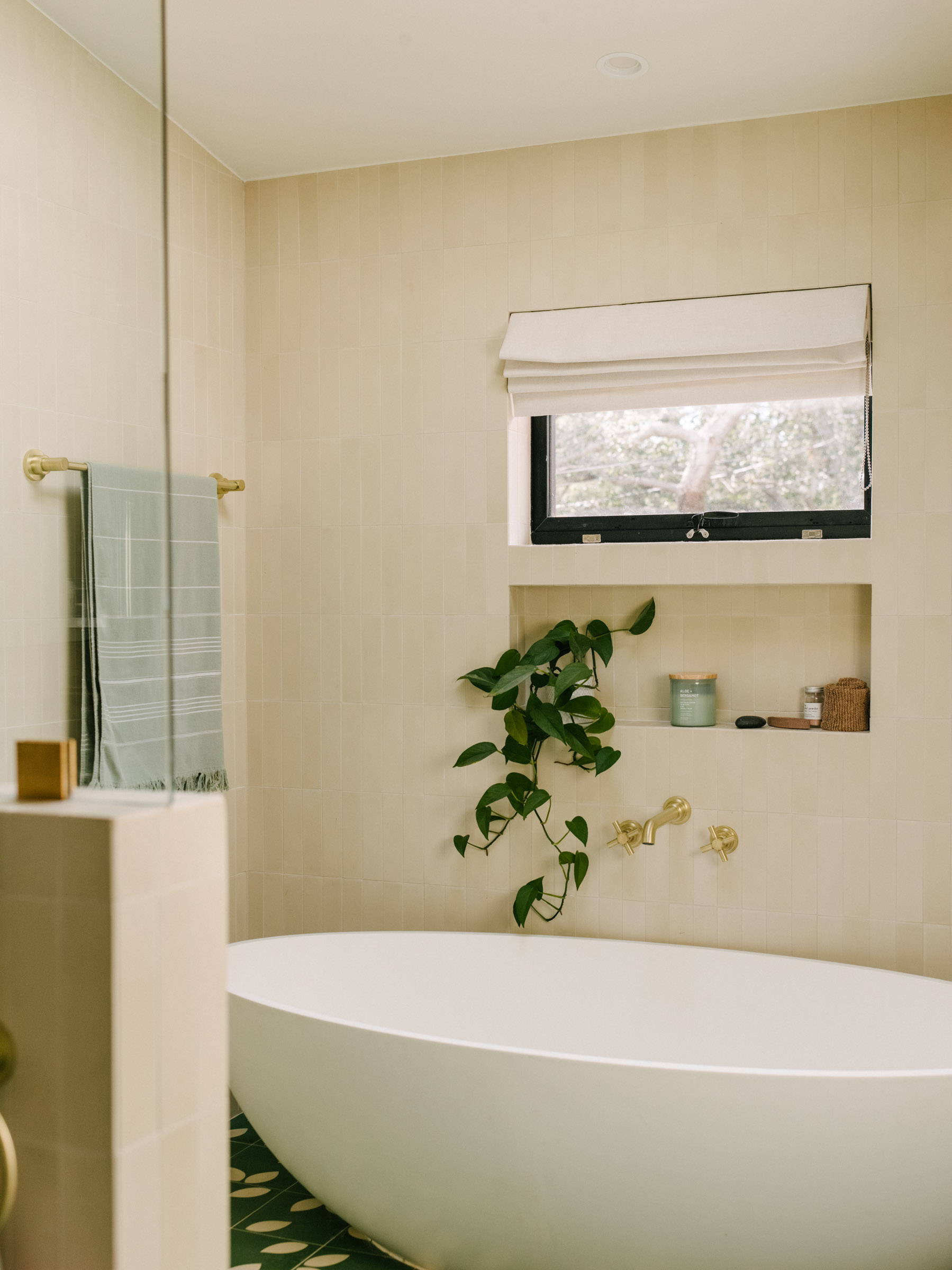
Before the renovation, the bathroom featured heavy dark wood that instantly dated the space, but it now has a spa bathroom feel. These spaces are supposed to bring a sense of calmness and solace to a home, and this bathroom does just that. The beautiful his & hers setup is a must for primary bathrooms and has been executed to perfection. The light-toned walls are complimented by the gold bathware and the warm yellow.
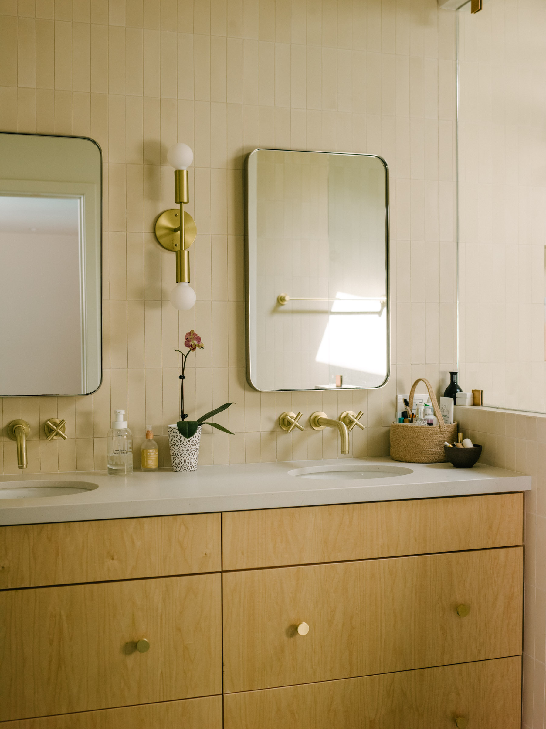
According to Brett, the homeowners were extremely creative and played a key role in making sure that the bathroom was artfully catering to their personal styles. This kind of minimalist bathroom ensures that the space looks tidy and zen, thanks to the neutral color palette of the space. And the patterned flooring adds just the right amount of contrast to balance the chic bathing area.
If you're looking for design inspiration to transform your home, this particular project is proof that any space can be transformed into a charming home full of personality. Sometimes the itch for a home renovation can come at untimely moments when you don't have enough space in your schedule to set aside a large chunk of time dedicated to redoing your home or perhaps you're not in the mood to shell out a load of money for a total overhaul. So we've found a couple of classic items for you to recreate a similar home atmosphere with just a few decorative spruces. After all, you can't go wrong with modern minimalism and this home is proof of that.


