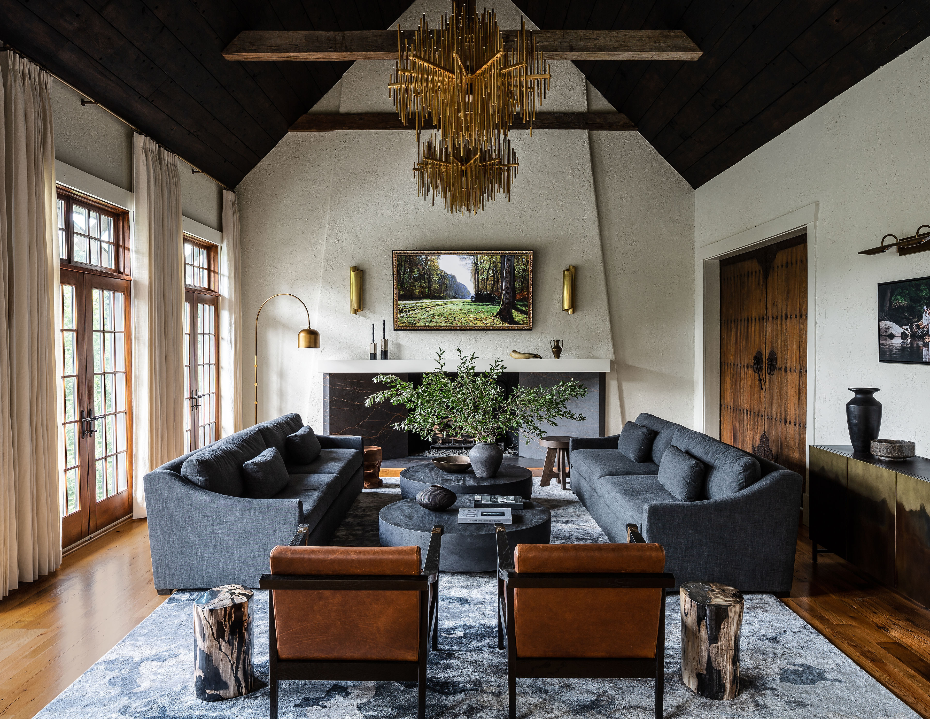
If you're a fan of crisp whites, sunshine shades, or neutral schemes, then proceed with caution. This moody, gothic-inspired space represents everything you're not, but it could be enough to entice you to the dark side.
An earthy palette, dark wood tones, and dramatic features have turned this once drab and dated Virginia home into a seriously sensational space that screams luxury. The 15,000-square-foot Spanish revival home in Great Falls, Virginia was originally built in 1985, and the new homeowners
wanted to simplify some of the gothic elements from previous owners while simultaneously infusing a more contemporary touch. The result is a striking space full of contrasting tones that draw you in.
'When they purchased the home, it was a bit over the time in a traditional French style that didn't feel authentic to who they are,' explains Ann Gottlieb, the principal designer behind the project. 'They gravitated towards dark and moody, contrast and drama, and loved the idea of Spanish Revival meets Gothic.' Here, we take a closer look inside the elevated modern home and learn how Ann transformed the space.
Living room
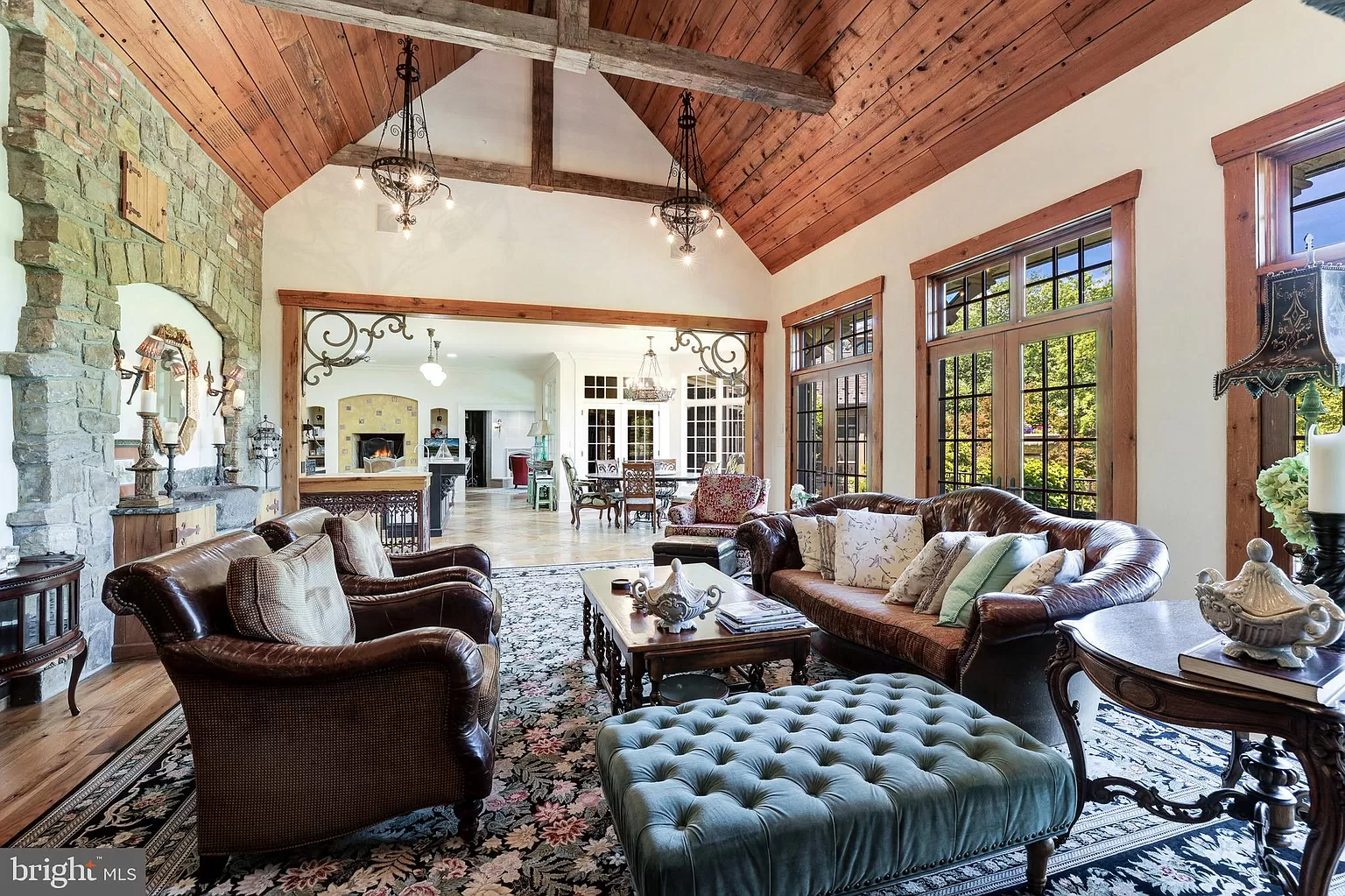
Prior to the renovation, the main living room looked dated despite the thoughtful styling. The homeowners were keen to retain original features but leaned towards a more contemporary gothic style to compliment the home's architecture. 'They love dark moody things, like dark jarring art mixed with high-end style and edge,' says Ann, founder of Ann Gottlieb Design. 'The exterior of the home is mostly stone and feels like a newer home that had been built in Italy or France.'
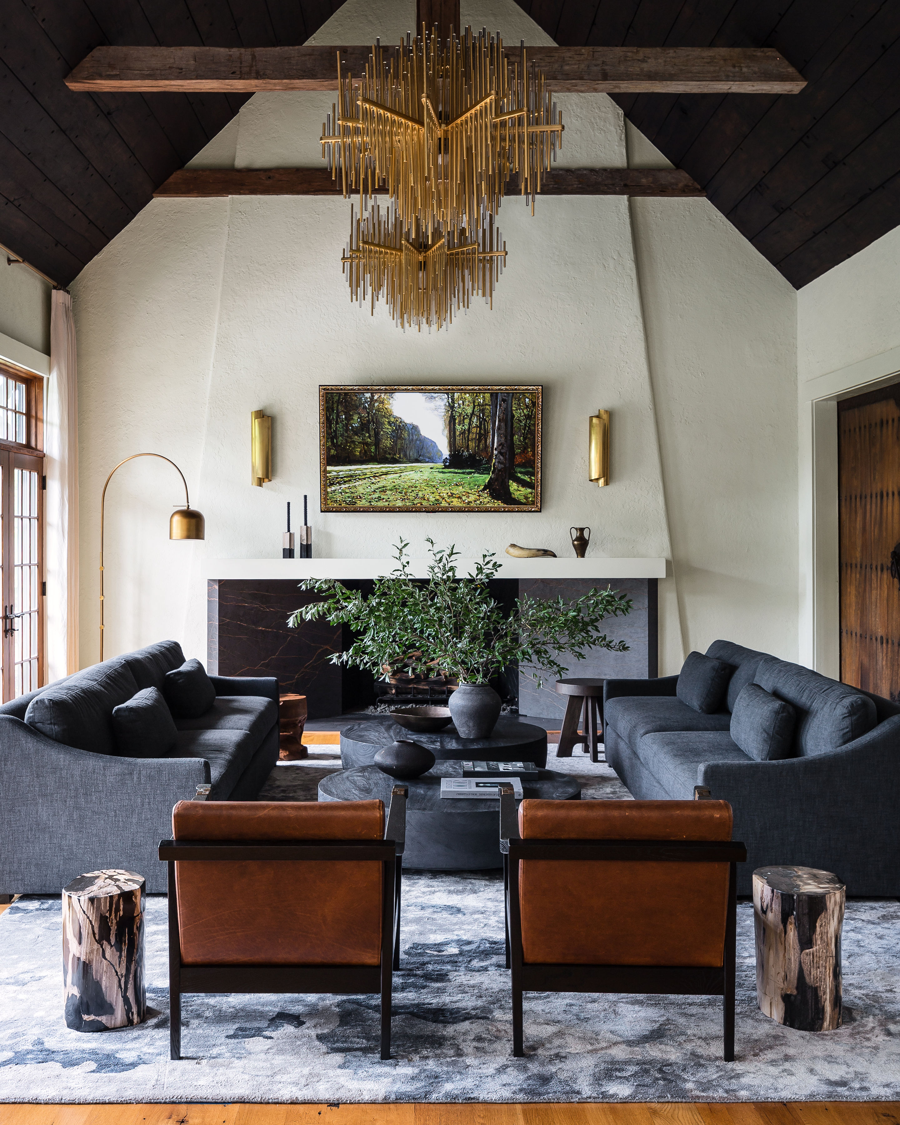
Noticing the potential of the dramatic vaulted ceiling, Ann decided to replace all the lighting, relocate the chandeliers to the center of the room, refinish with a darker tone, and remove the wooden beams. 'The client loved contrast, so the more zones we could add contrast she went for it. The prior stain also did not feel as rich and higher end, and going darker modified that,' Ann explains. 'We tried about 10 different stains to get the right one.'
They also removed the prior fireplace and rebuilt a new one on the adjacent wall. 'The design challenge was to keep an inset firebox opening, while the rest of the wall protruded out,' she says. 'This created a design challenge which had us bump out the wall, while needing to steeply recess the fireplace opening for it to be accessed. Then we stuccoed the entire wall and added in angles for interest.'
Bedroom
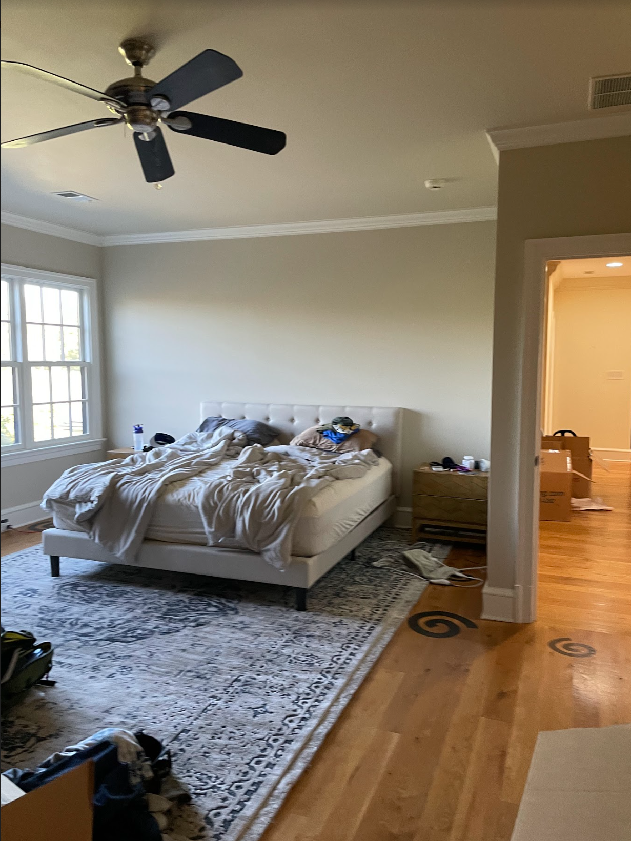
Before the renovation, the primary bedroom lacked any charm or personality. The off-white walls and beige bed made for a washed-out look meaning the space was calling out for color. Enter: a palette of moody and earthy hues, a color trend Ann believes will prevail in 2024. 'People love the outdoors and nature due to the calming effects it can have on you,' she says.
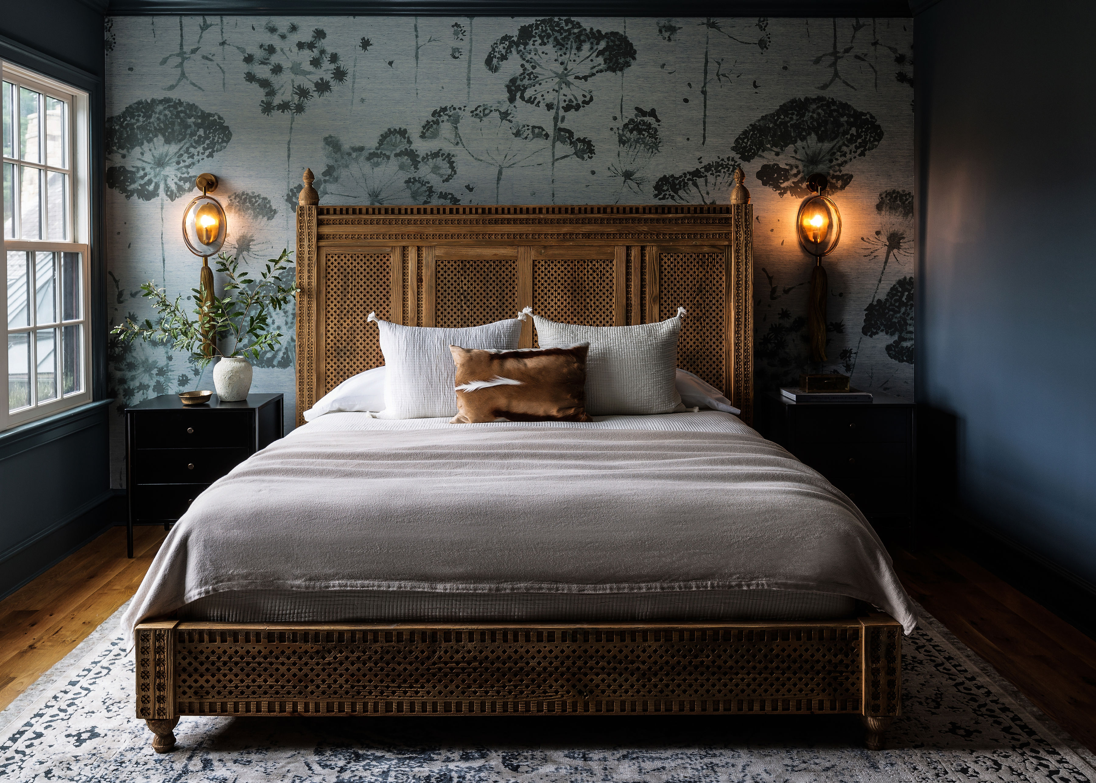
That said, the smokey blue bedroom is somewhat of a daring choice, but Ann defends her decision. 'Blues and blue grays are very calming and relaxing for your mood,' she says. 'The client needed this space to be an escape and her calm space, and blue seemed to be the right color.'
The botanical mural wallpaper echoes that relaxing feel and marries perfectly with the surrounding walls. 'I showed them several mural wallpapers, and they fell in love with this one. From there we used that color blue to match the trim paint and adjacent walls,' notes Ann. 'It kind of happened by accident that the bathroom and bedroom ended up with the same blue/gray color tone.' She adds that murals like this are a great way to bring a unique and personal element to a space.
Bar
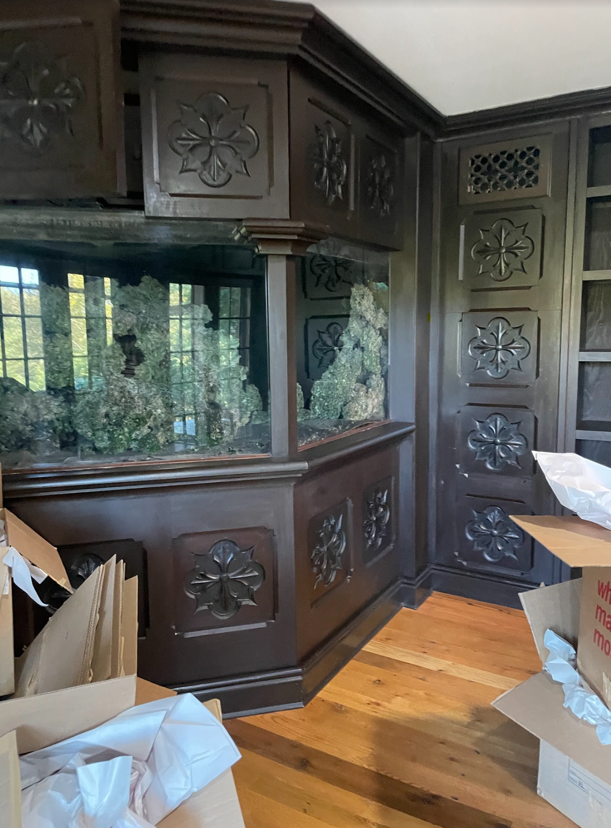
One of the most intriguing features hiding inside this home is the dramatic home bar carved with a gothic motif which, believe it or not, used to be a fish tank! 'The client wanted it removed but wanted the most economical solution possible, so we took it out and turned it into a bar,' explains Ann.
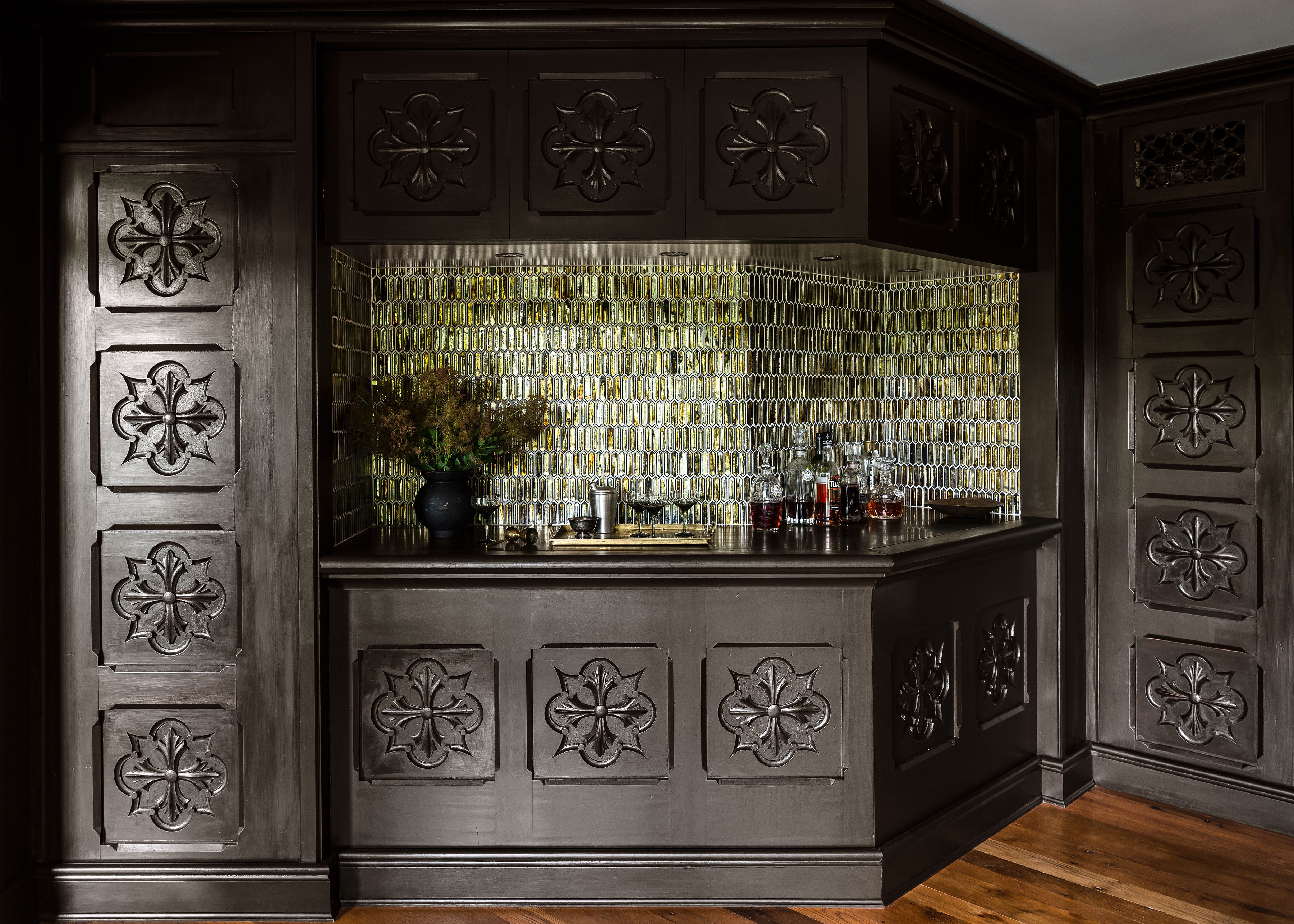
Now, the stylish tavern looks so inviting thanks to the striking metallic zellige tiles. The original finish on the back was gold Moroccan wallpaper, but it was damaged during installation, and we had to make a quick fix,' Ann says. 'These are multicolored glass tiles that actually worked out much better than the original finish! We added in a zebrano marble inset into the counter, added lighting above, and had to replicate and remake some of the existing painted wood paneling to make this design work.'
Primary bathroom
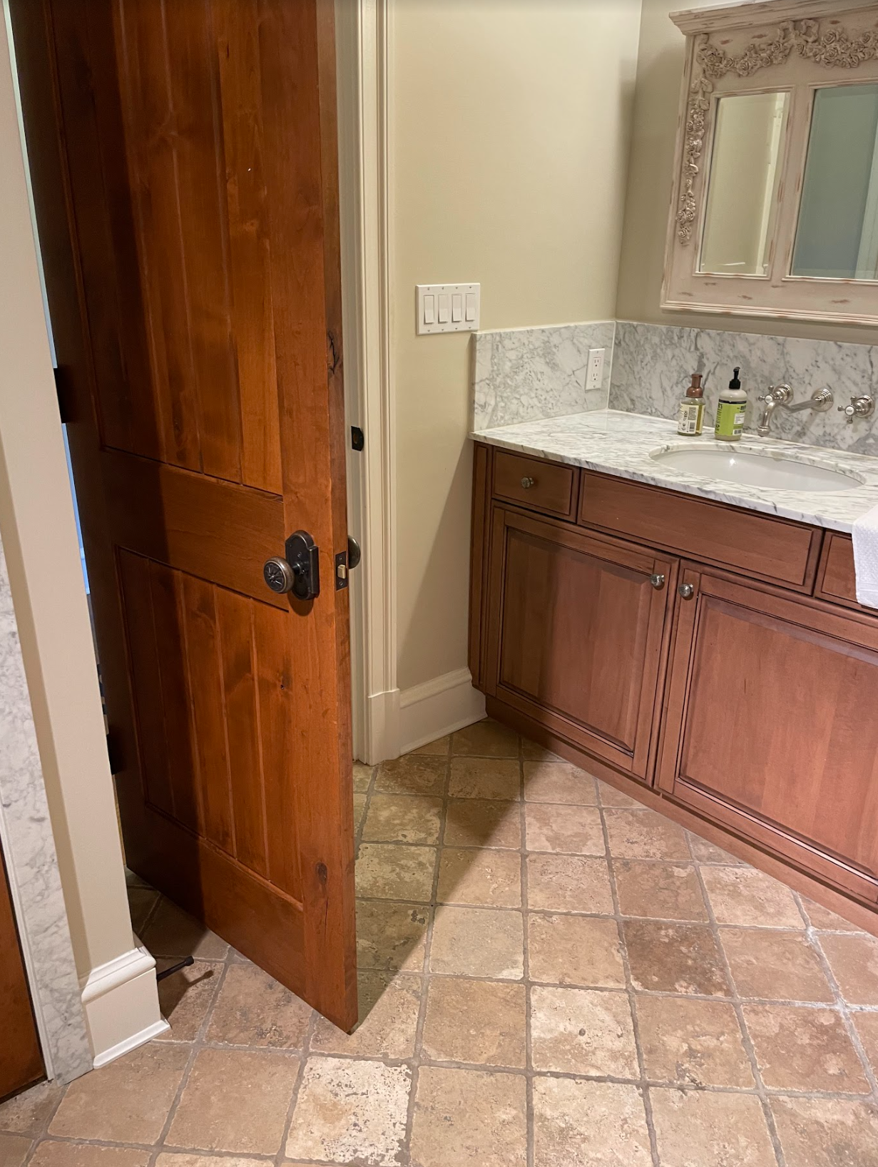
The primary bathroom was a continued tale of lackuster beige before Ann worked her magic. She decided to expand into the adjacent powder room and closet to create a makeup station and family shower with benches. Blue zellige tiles were used in conjunction with a quartz counter that resembles concrete for a soothing, spa bathroom feel.
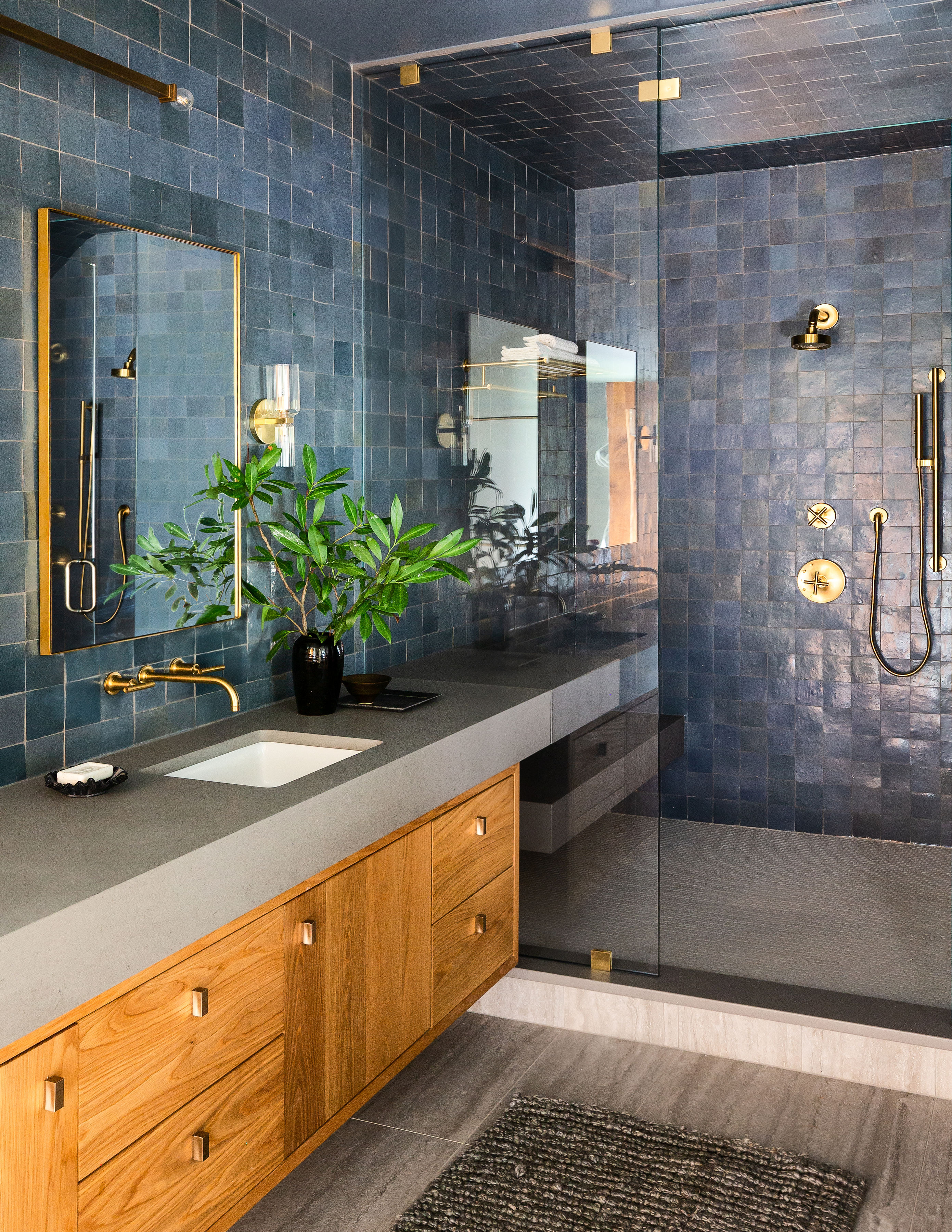
The blue is a wonderful point of contrast to the warm honey tones of the bathroom cabinetry, and Ann has some advice on how to use wooded tones as a standout design element. 'It's all about the balance and scale of how the different materials start laying out in the space,' she says. 'I always start with the architectural moves first, and once they're strong enough, I layer in the materials that work with that architecture while I look at the space in 3D. White oak feels less formal and more inviting to me than a richer more figured wood, which was why I selected that species.'
Powder room
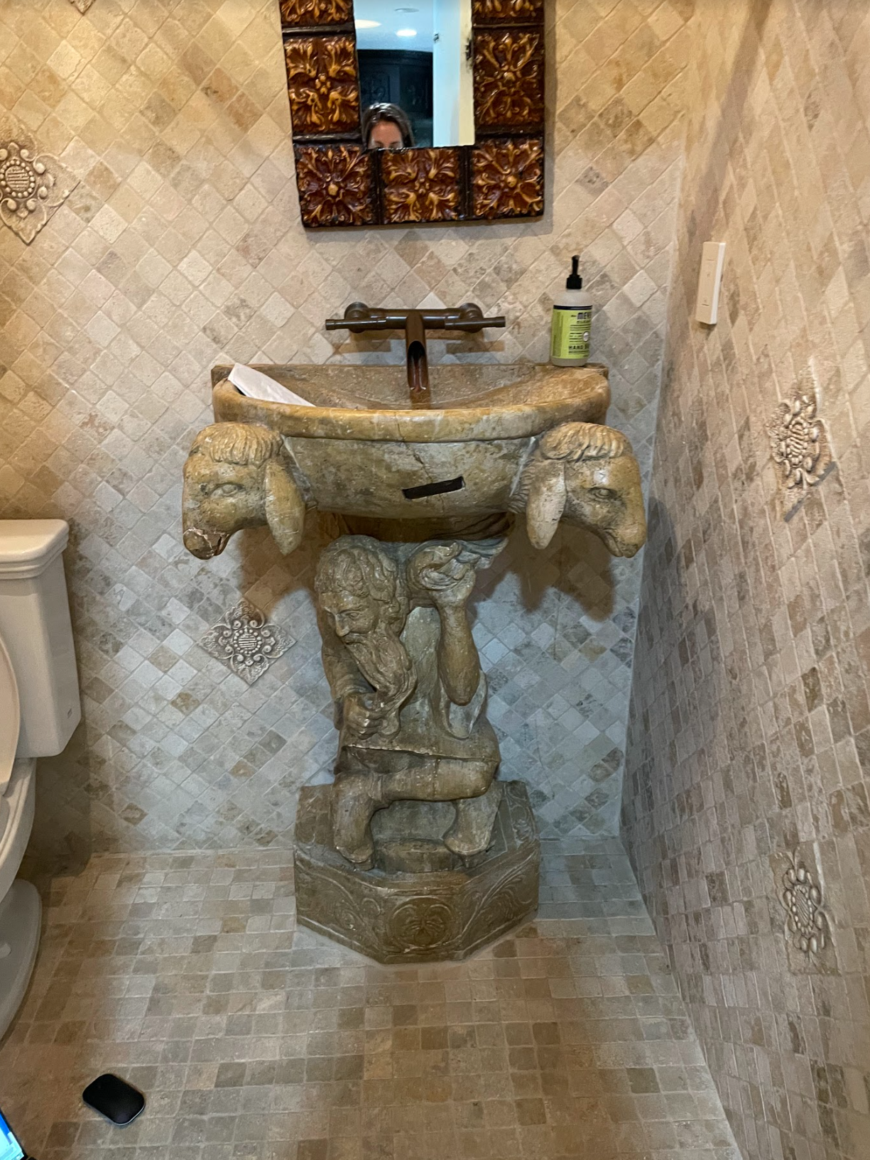
For the powder room, the client wanted to go dark and bold, but also coordinate with the gallery wall paneling outside of the bathroom. The small space lends itself well to experimentation (but it was out with the spooky pedestal sink).
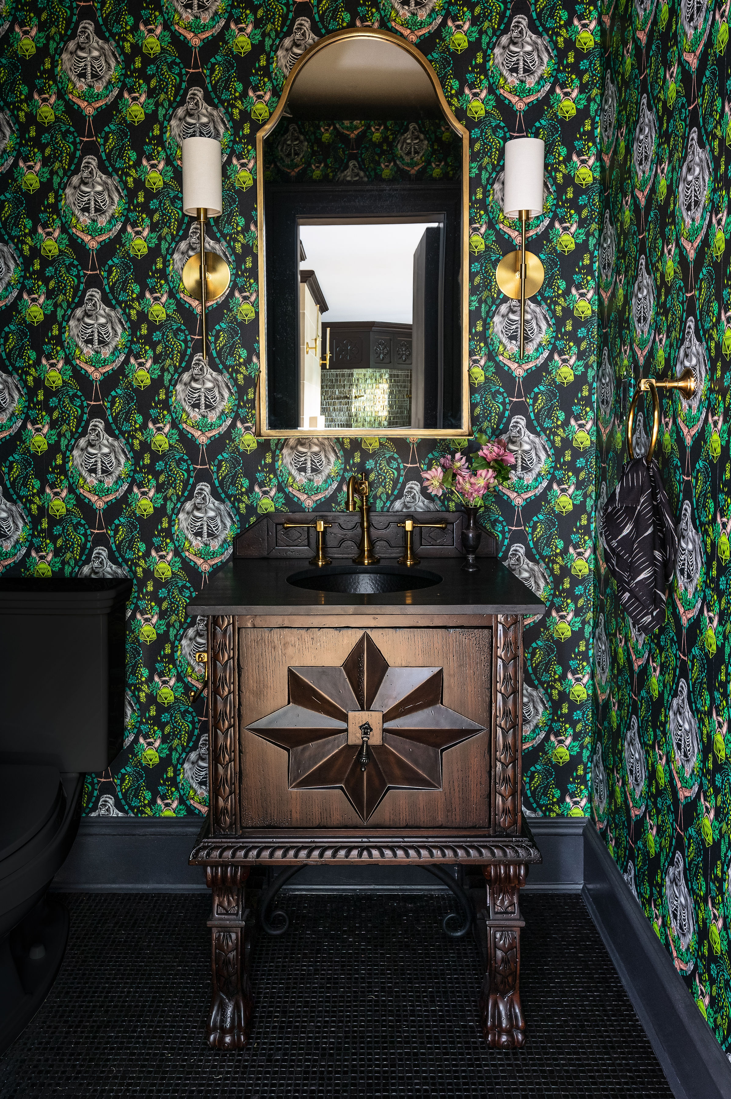
Now one of the most colorful spaces in the home, the powder room features a tille, gold leaf wallpaper, and Zanzibar marble counter. 'I found the most shocking gothic wallpapers I could find, and the clients fell in love with this one,' Ann explains. 'The vanity sink randomly coordinated so well with the paneling in the bar room (prior fish tank room) that was a clear vanity winner.' If the dramatic gothic feel wasn't enough, they also opted for an all-black toilet from Kohler. 'White looked out of place in the dark room with the dark stone floor,' says Ann.
If you've been tempted to go bold with your style for some time, treat this as your sign and take inspiration from this dramatic and moody home. Time to transition to the dark side!


