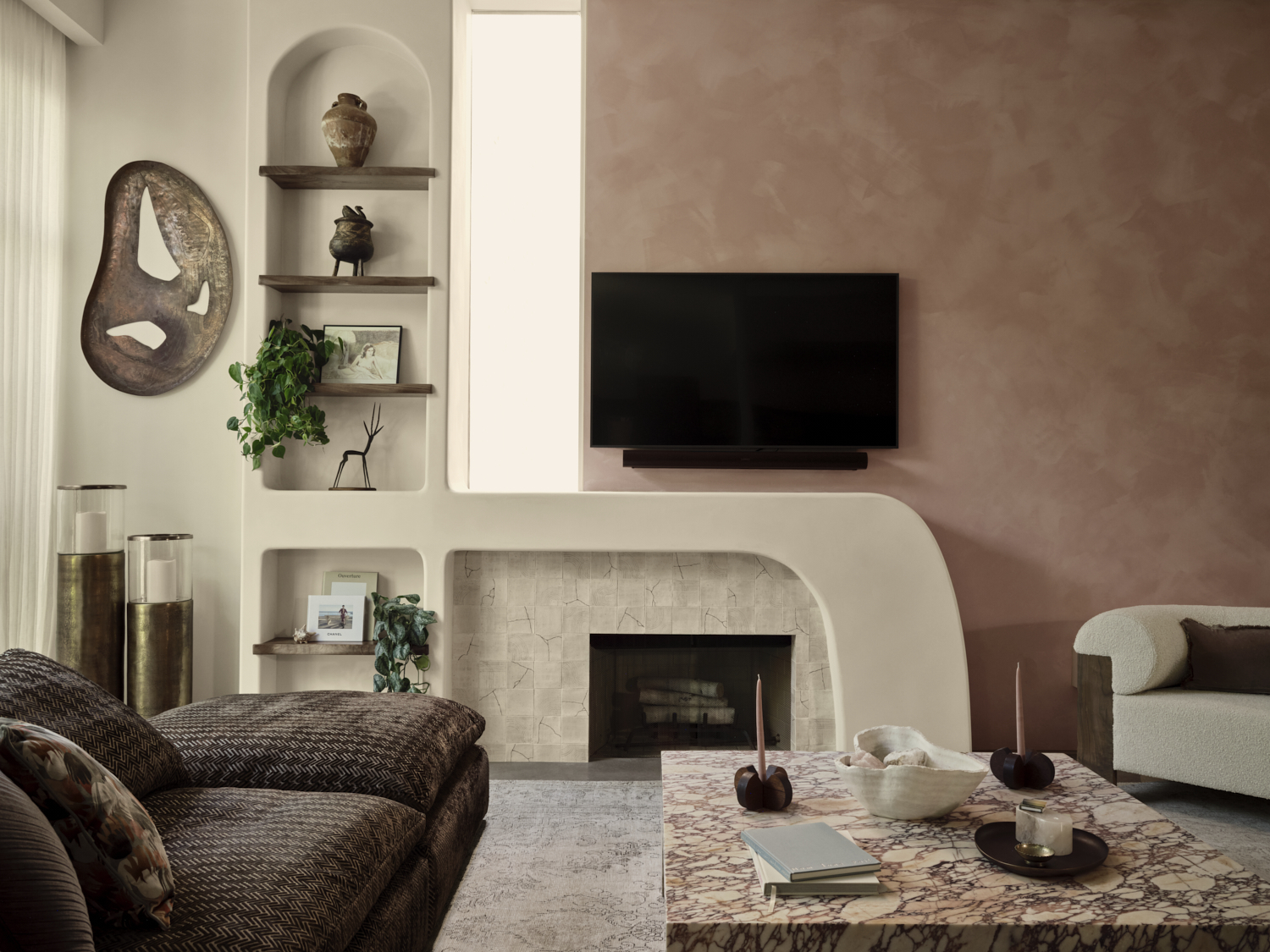
LA's Venice Beach is known for its white sands, enclave of canals, and bohemian spirit, and this beautiful home embodies it all. A recent update from local designer Tamarra Younis of Union of Art Interiors transformed the space from a light and airy boho-style palette to a moodier, modern look while still retaining a relaxed, beachy theme.
Known for her globally inspired world traveler aesthetic, Tamarra outfitted the home with bespoke details, luxury fixtures, and a beautiful pink backdrop. The 2,970-square-foot artisan oasis is now infused with personality through bold color, whimsical patterns, and unexpected textures which culminate in a curated, characterful home.
From the kitchen’s custom-designed cabinetry with hand-drawn organic shapes and curvy plastered fireplace to the mint guest suite and sun-soaked rooftop patio, this modern home is filled with unique collectibles, bespoke upholstered furniture, and luxury designer items sourced from craftsman around the world. Here, we take a closer look at the transformation.
Kitchen

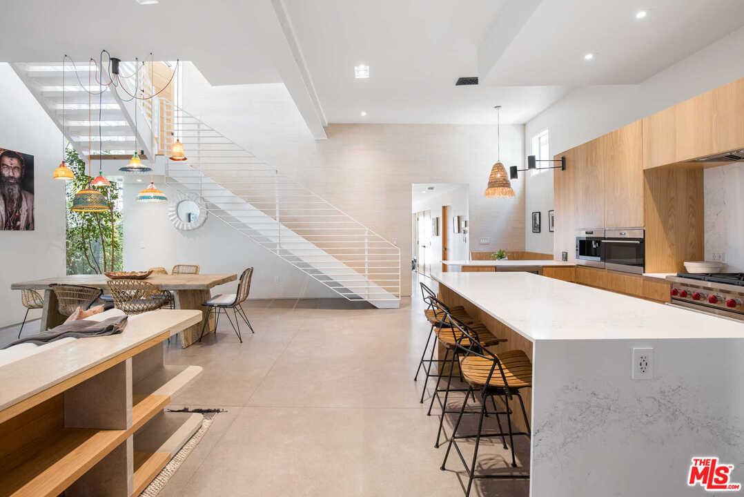
Prior to the renovation, the home still featured a modern interior design style, but the light and airy pared-back color palette wasn't to the homeowner's taste. 'This was the client's first home she had owned and it was important that it showcased her passion for unique and one-of-a-kind objects,' explains designer Tamarra Younis of Union of Art Interiors. 'She wanted to transform this Venice Beach house into a stylish oasis that was filled with color and unexpected moments.'
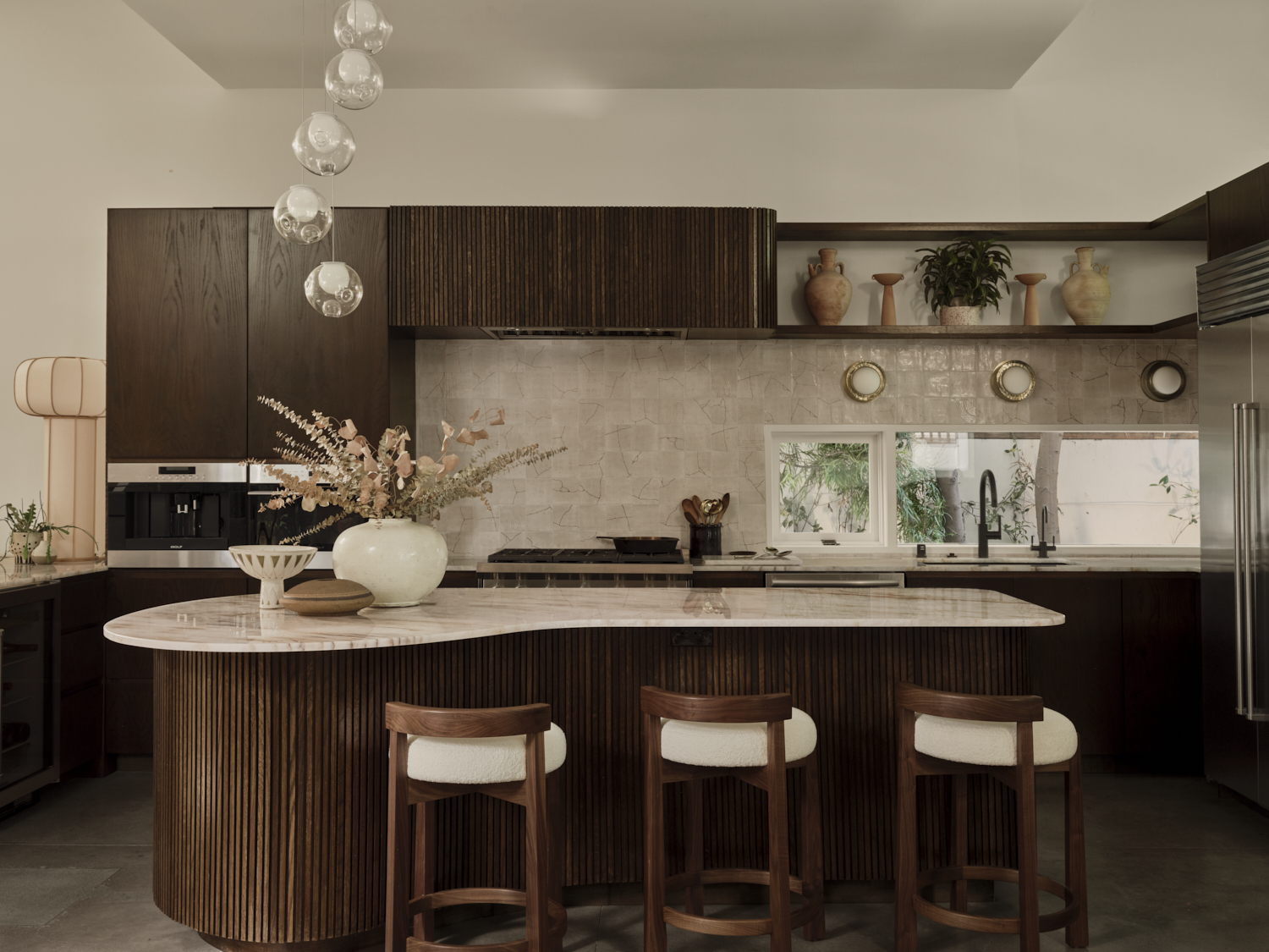
Since Tamarra worked her magic, that's exactly what's been created, and the kitchen is arguably the most impressive transformation of all. Gone are the light wooden tones to make way for beautiful dark bespoke cabinetry, including a fluted curved island that exudes pure luxury.
'The client wanted the kitchen to have a full transformation but we were on a tighter budget and therefore had to come up with ways to give the look without totally gutting the whole space,' explains Tamarra. 'We felt that a strong color change to complement the dark textured brown of the L-shaped sectional was the way to go.'
Having locked down on the color, the next challenge was how to make the kitchen
cabinets contribute to an entirely different kitchen without changing the floor plan. 'We came up with bringing in some sexy asymmetrical soft curves in contrast to the very linear angular lines of the architecture,' notes Tamarra. 'We custom-designed the island to give an unusual kidney shape and by doing this we were able to bring it out into the living/dining area so it would make all three spaces feel more connected.'
Lastly, Tamarra let her creative juices run wild to freehand design the layered wood sculptures on the entry cabinet doors and the cabinet end of the kitchen. All in all, the darker color palette and characterful details help to modernize the room while still feeling timeless. 'I believe that kitchens are moving to color and darker tones, and it's one of the elements that make this home not feel like your standard beach house,' adds Tamarra.
Living room
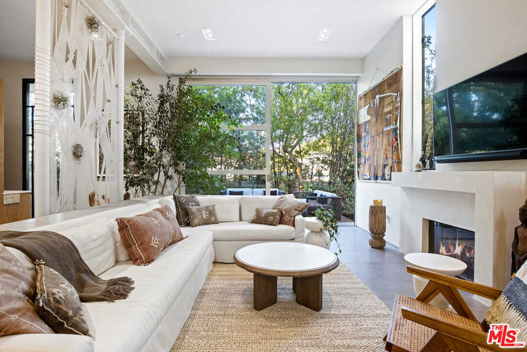
The beachy boho living room featured a wonderful neutral color palette and a large stone fireplace, but it lacked a certain amount of depth and dimension. Blessed with a beautiful floor-to-ceiling window that looks out onto the green oasis beyond, Tamarra knew she wanted to harness the natural scenery outside of the home by incorporating into her design, helping to bridge the gap between outdoors and in.
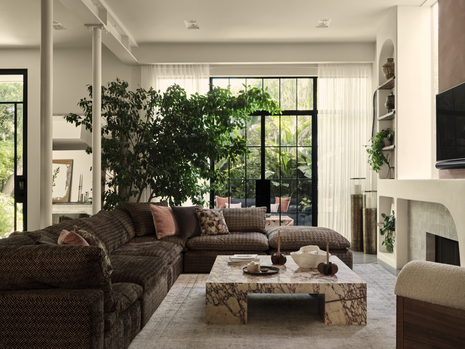
To do that, she again opted for a darker color palette inside which allows the greenery outside the window to really sing. She also brought in a dramatic indoor tree which transforms this living space into a relaxing oasis, aided by the earthy tones of the slouchy sofa, the dark veining of the marble coffee table, and the natural stone of the fireplace.
Dining Area
The color palette is much darker overall which really impacts the mood of the space. A once bright and airy open-plan dining area is now a sultry space that feels so much more relaxing.
'The client was a New York lady at heart and wanted to bring a strength and mood into the space,' notes Tamarra. 'She had a passion for pink and so the main accent wall was drenched in a custom limewash. We felt we needed to bring in the dark wood tones in the entry and kitchen areas to balance the pink and bring a warm tone to the space. I feel it created a sexier more intimate environment that is a little more unexpected in a beach house location.'
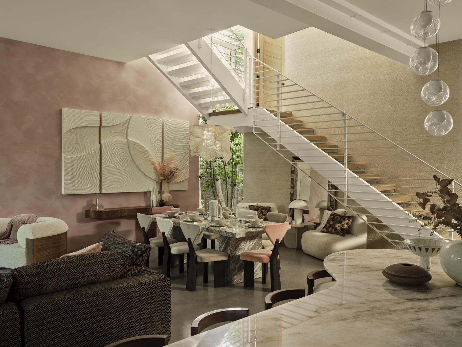
As a paint idea, Tamarra thinks rustic, artisanal applications like lime wash and Roman clay paints are having a resurgence. 'We're being asked more and more often to use this treatment on walls,' she says. 'It's super exciting when people are willing to embrace an old technique and give it a new spin. The trick is to find the right place for it to shine and not look at odds with the rest of the house.'
Garden Room
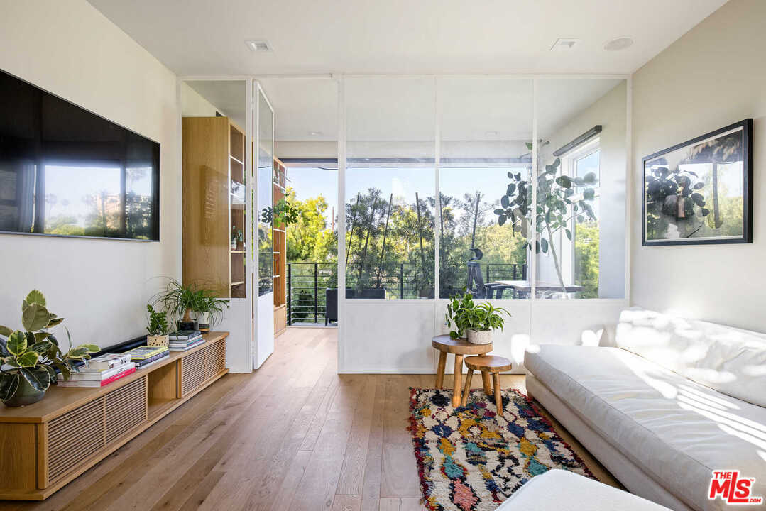
Despite making some drastic changes in terms of color and texture, the home's style still feels beachy and bohemian yet more refined than before. In the garden room, for example, white linen sofas have been replaced by a curved velour ochre couch and dark accents take center stage over the previous light oak.
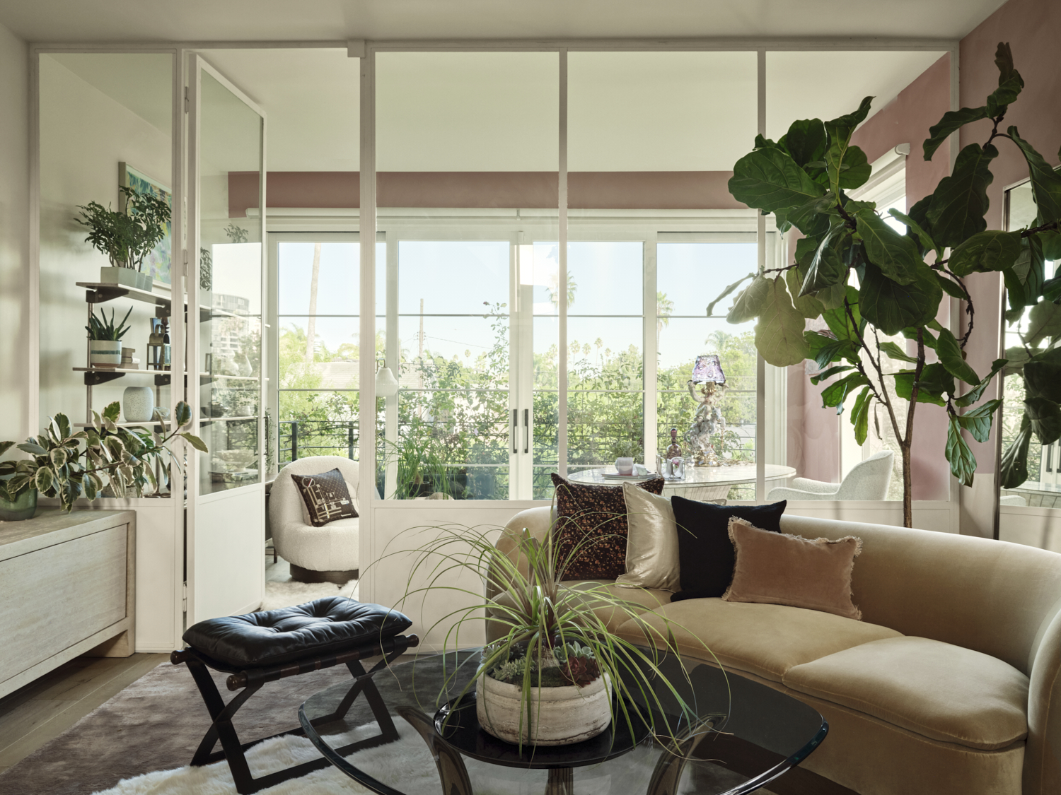
According to Tamarra, this was all about injecting her client's unique style into the space, and adding personality through small details. 'We didn't approach the design of this house in the usual way one may tackle a beach house - it was more about reflecting the client's style and needs,' she says. 'We feel the refinement came in with all the wonderful artisans we had the good fortune to work with, from local artists to lighting and furniture designers from all over the world. We had the fun job of showcasing everything.'
An eclectic style that showcases a range of different materials and styles to reflect your unique preferences is always vital when designing a home. 'There's something about style that stands the test of time when you commit to things that you love and a style that speaks to you,' Tamarra adds.
Bedroom
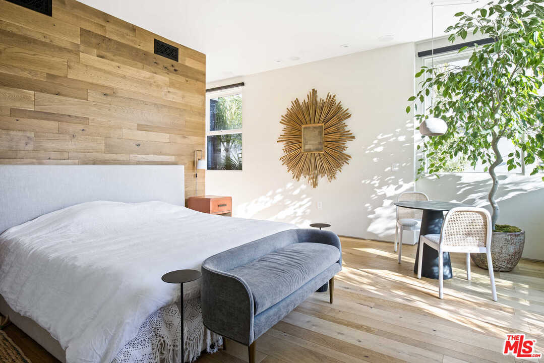
The bedrooms were warm and welcoming, but Tamarra and her client felt they needed a more unexpected twist that played into comfort. 'We felt it was key to bring in some bold strength in color to other areas of the house,' she says. 'This decision helps to complement and balance the pink statement wall. It was important when picking other colors throughout the house that they were harmonious to each other, even if they were in different rooms.'
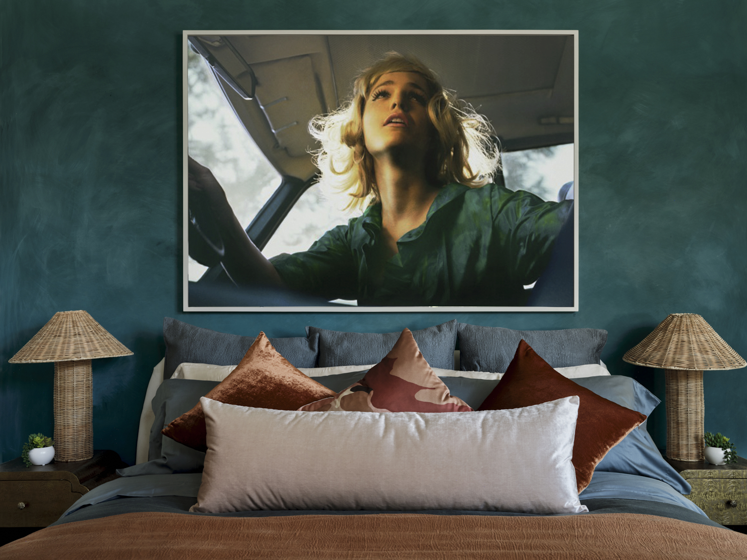
Some color choices are very unexpected. A beautiful teal shade is used in the guest bedroom to drench the space for an ultra-cocooning feel. The cool tone is quite an unusual decision for a sleep sanctuary, but Tamarra says the softness achieved through the lime wash application and the warm textures of the surrounding furnishings create a relaxing feel.
'For the mint guest bedroom, we wanted to give the feeling that you were cocooned in this soft shade of calm green,' she notes. 'We felt that if you only did an accent wall it would not achieve the desired design goal. That's why we opted for tonal mint silk curtains and even a green abstract rug. Our client wanted each space to have its own unique vibe so we nicknamed this room "glamorously quirky".'
Bathroom
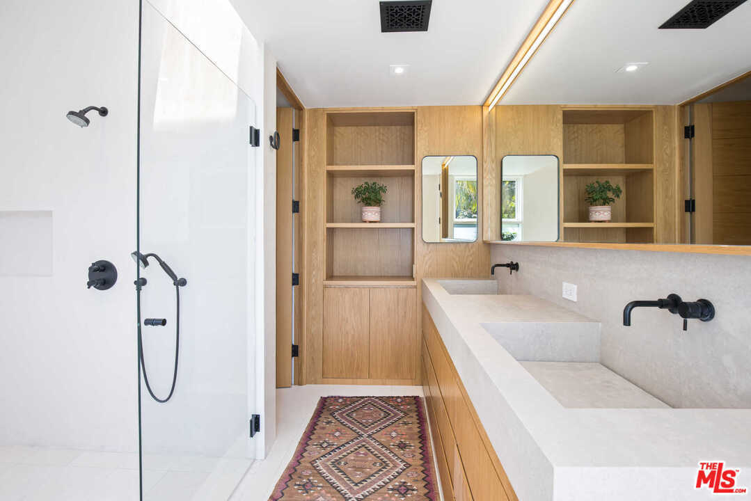
Lastly, the primary bathroom was already a serene space, but Tamarra has given it a far more classic style that plays into the quiet luxury trend. Light wooden and matte black hardware has been replaced by darker tones, brass accents, and a deep veined marble that ties it all together.
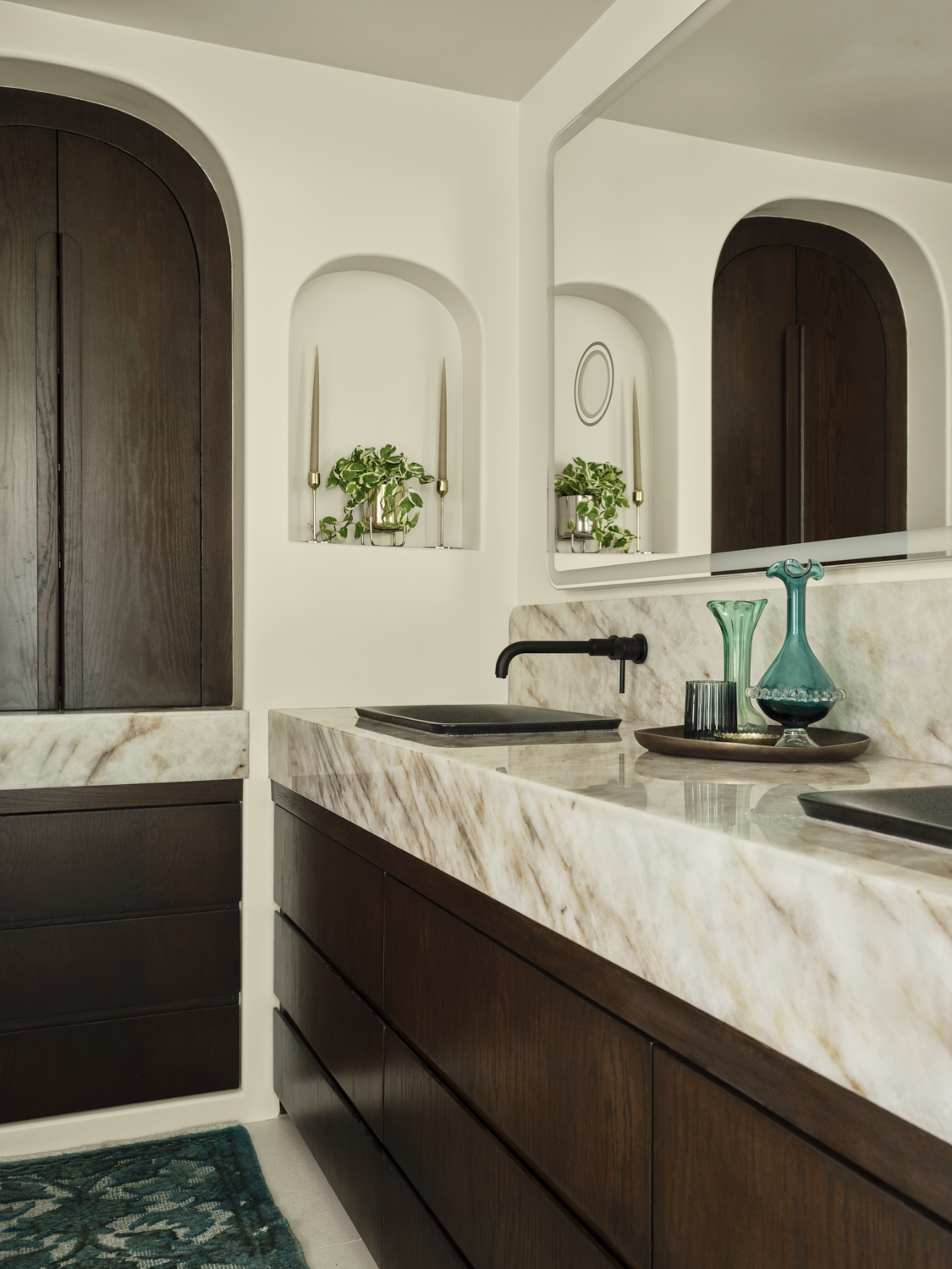
The minutiae of the smaller details really give this bathroom its character. The tapered candles in the wall niche and the decanter on its brass platter really elevate this space into a shower room with a spa-like quality fit for royalty. If this was our bathroom, you'd rarely see us leave.


