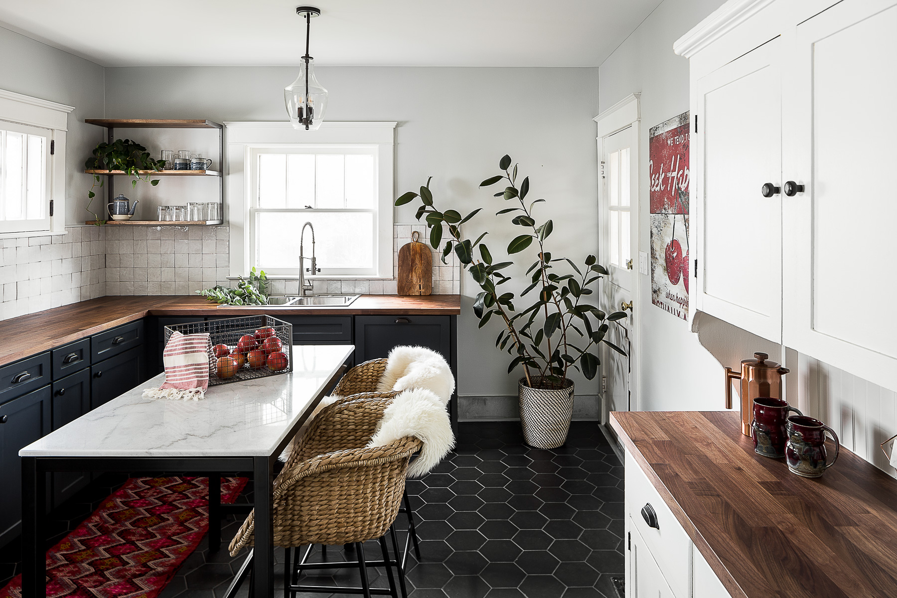
Small spaces do not have to mean compromised style. There are several ways to open up these rooms to inspiring designs, timeless touches, and in many cases, more space. All you need is the right palette and materials to give tiny rooms a much-needed glow. Such is the story of this kitchen located in a neighborhood of Louisville, Kentucky called Deer Park.
'This area was developed as a "streetcar suburb" of downtown Louisville at the turn of the last century,' says Bethany Adams of Bethany Adams Interiors. 'Most of the homes—like this one—are bungalows built before 1920. The whole home is only 1100 square feet, of which 168 sq ft is this kitchen.'
The kitchen, being the heart of the home was in dire need of a refurbish. Not only did it require a fresh aesthetic but also more circulation area, with proper storage. Bethany transformed this kitchen by merging both design and practicality, and in doing so, created a lovely jewel box space within this modern home. Take a look at the fascinating before/after.
Before
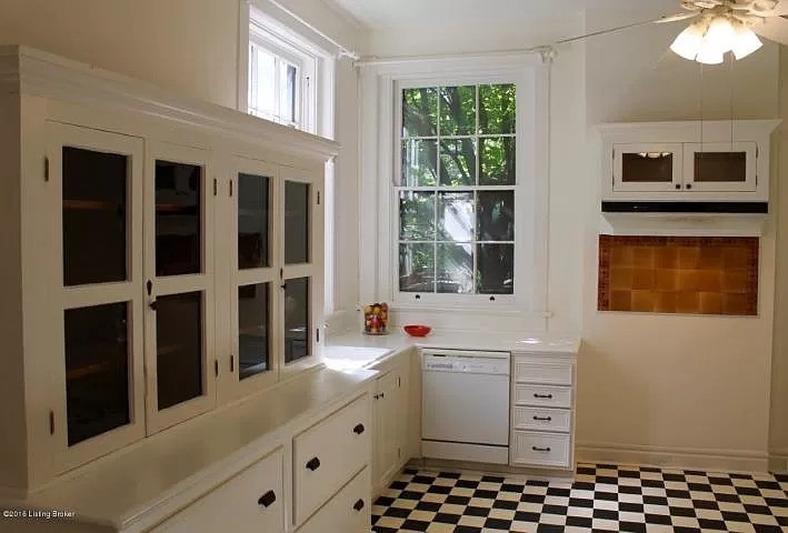
'As much as I hated to disturb the historic kitchen, it was divided in half with a breakfast nook on one side, so the actual kitchen was only 80 square feet,' says Bethany Adams of Bethany Adams Interiors. 'The client was a single woman and even she couldn't make that work.'
To convert it into a modern kitchen that's both practical and a pleasing to the eyes, the designer had to rework its palette, the flooring, kitchen island, the furniture and more.
After
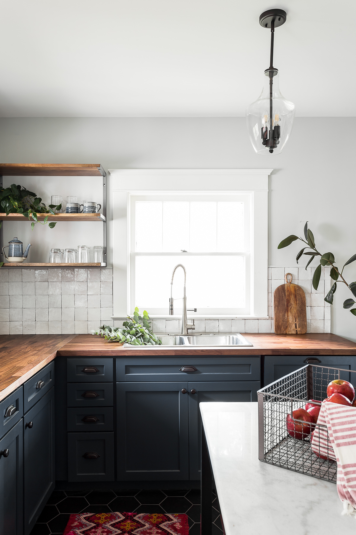
'Since the client already had a moody palette for the rest of her home (the home is in an old neighborhood full of low bungalows and leafy trees), a darker color for the kitchen cabinet just felt right,' says Bethany. 'The space is small and the ceilings are low though, so for the top section, we kept the palette lighter.'
For the kitchen flooring, 'I chose a hexagonal ceramic tile for a modern and budget-conscious touch,' shares Bethany. 'Black is a very forgiving and grounding color for a kitchen floor. Keeping all of the dark colors at the bottom of the room and then lighter ones as we go up is a trick to make the space feel taller. It's almost an ombre effect.' To give the flooring a further touch of layering, a kitchen rug in red adds to the scene. It not only adds a punch of color to the space but also movement and pattern.
The dark-to-light palette gives the small space a big personality, and the windows that allow plenty of natural light do not let the space feel boxed in.
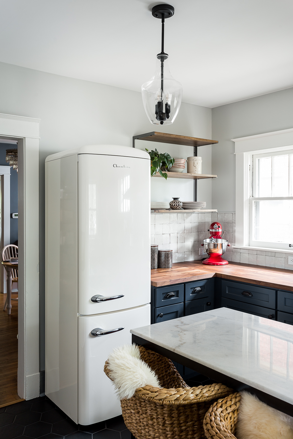
The small kitchen island is made of steel and Carrara marble. 'Since we removed the breakfast nook, the client didn't really have a place to have her morning coffee and she liked having friends over for dinner and everyone gathering in the kitchen while she cooked,' says the designer. 'Since the space is so small, we selected this prefabricated island from Crate & Barrel that is just the right size for a small space. Because the legs are open, rather than filled up by extra storage, the piece doesn't take up as much space visually.'
For the kitchen island lighting, Bethany sourced the pendant from Shades of Light. 'Again, it was such a petite space that a single pendant was needed,' she avers. 'I didn't want anything that would overwhelm the space, but I also wanted to get a lot of lumens out of a single fixture. The clear glass and wrought iron materials were so simple and in keeping with the home's bungalow aesthetic; the piece easily lights up the whole room at night.'
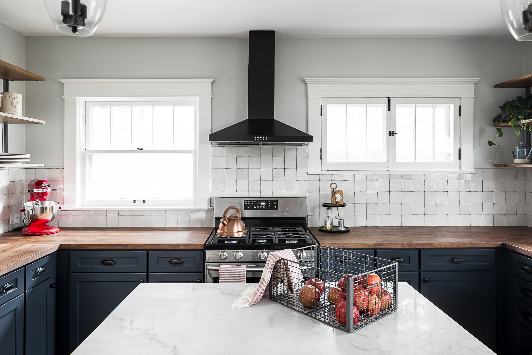
The kitchen color is largely muted, with neutral walls adding a breezy touch to the room.
'We painted the walls in Benjamin Moore's Horizon OC-53,' says Bethany. 'It's a very light gray with some blue to it so it looks really lovely with the opalescent zellige tile below and picks up on the blue of the cabinetry. An interesting fact about the kitchen backsplash: I designed this kitchen a few years ago and zellige was a relatively new material in the US; especially in Louisville, Kentucky. I had a very difficult time explaining to the installer that it was supposed to look like that! I think he thought I was crazy.'
The room spells elegance and natural warmth now. 'The kitchen has an organic, earthy feel and in such a small space you don't feel boxed in by the elements,' shares Bethany.


