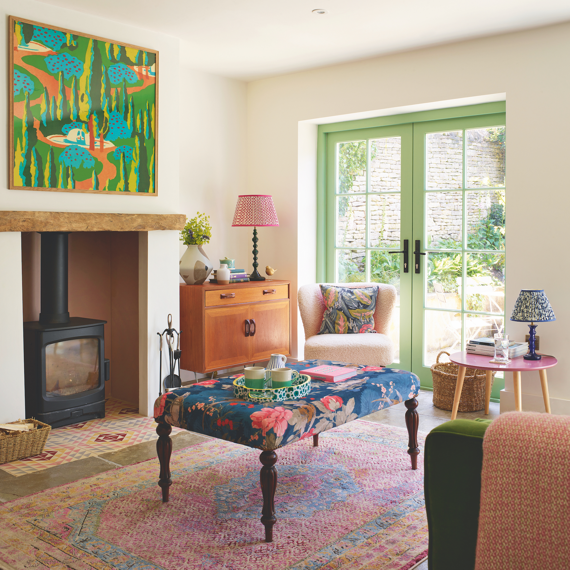
Amelia Harvey never tires of seeing her visitors’ astonished expressions when they first set foot in her multicoloured Cotswold home. ‘From the outside, it’s fairly unassuming and traditional, but that is certainly not the case inside,’ she smiles. ‘Behind the subtle green front door, there’s a riot of colour and pattern; it’s quite the surprise.’
This jewel-toned gem is a huge departure from the neutral, Scandi-style house in London where Amelia was living four years ago. When lockdown struck, the entrepreneur reassessed her life and snapped up a handsome Grade II Listed cottage and its annexe, located in the peaceful village of Shipton-under-Wychwood. Between June and December 2020, Amelia embarked on an ambitious, whirlwind renovation journey, transforming the annexe and cottage, as well as the cottage next door.
Maximising the layout
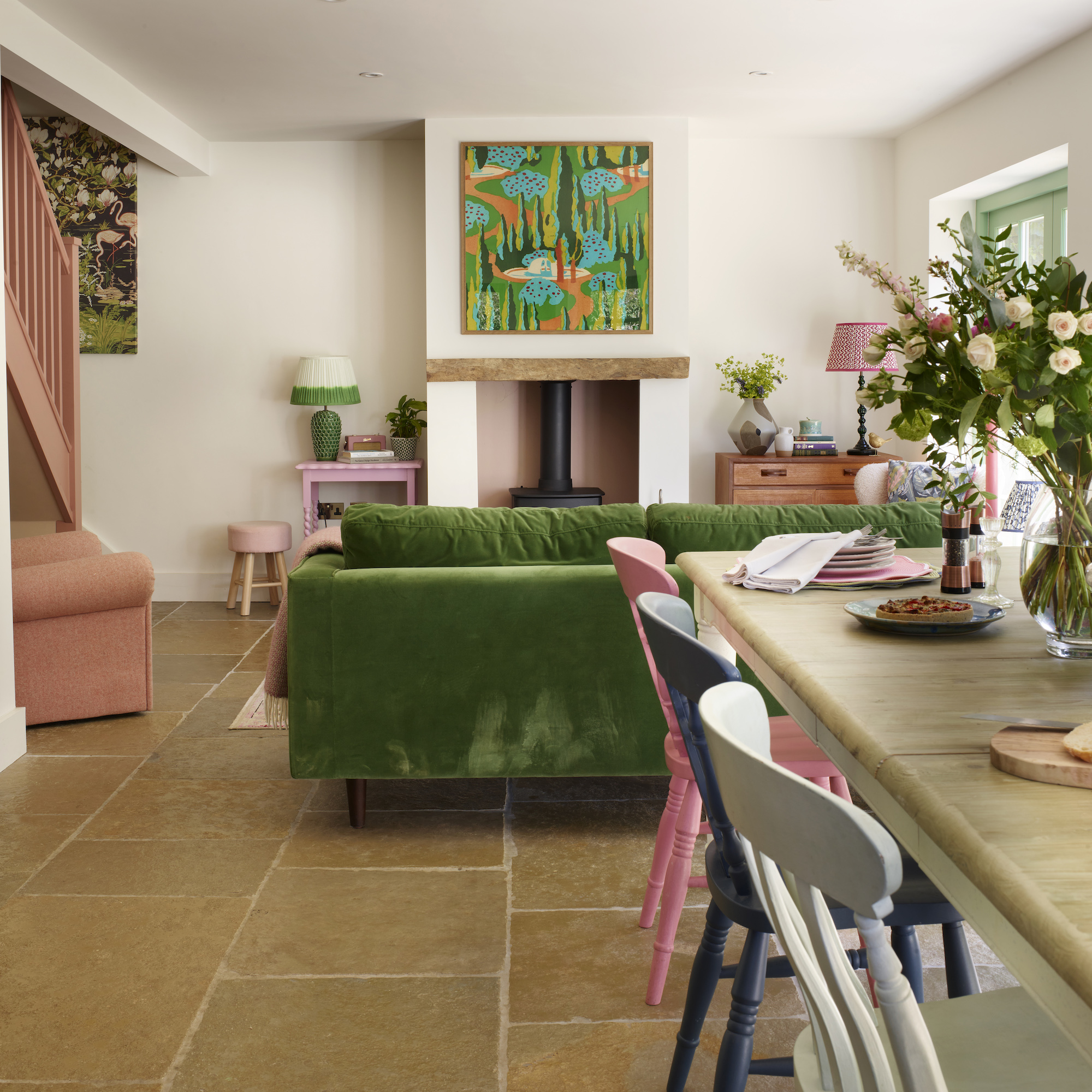
Built 35 years ago, the Cotswold stone outbuilding originally comprised a garage, office and log storeroom at the front, plus a kitchen, living room, two bedrooms and bathroom at the rear.
‘I felt that the layout could be improved,’ Amelia explains. ‘So while my builders, Karl Moore Construction, were renovating the main cottage, they did some exploratory work here and discovered several areas behind plasterboard that were unnecessary voids.’
Keen to maximise the bijou building’s potential, Amelia contacted RRA Architects in Cheltenham for advice on rejigging the layout. Ideas included moving the staircase by a metre, relocating the downstairs bathroom, and removing doors to create an open kitchen-dining-living area, plus a hallway, snug and utility room.
Going bold with colour
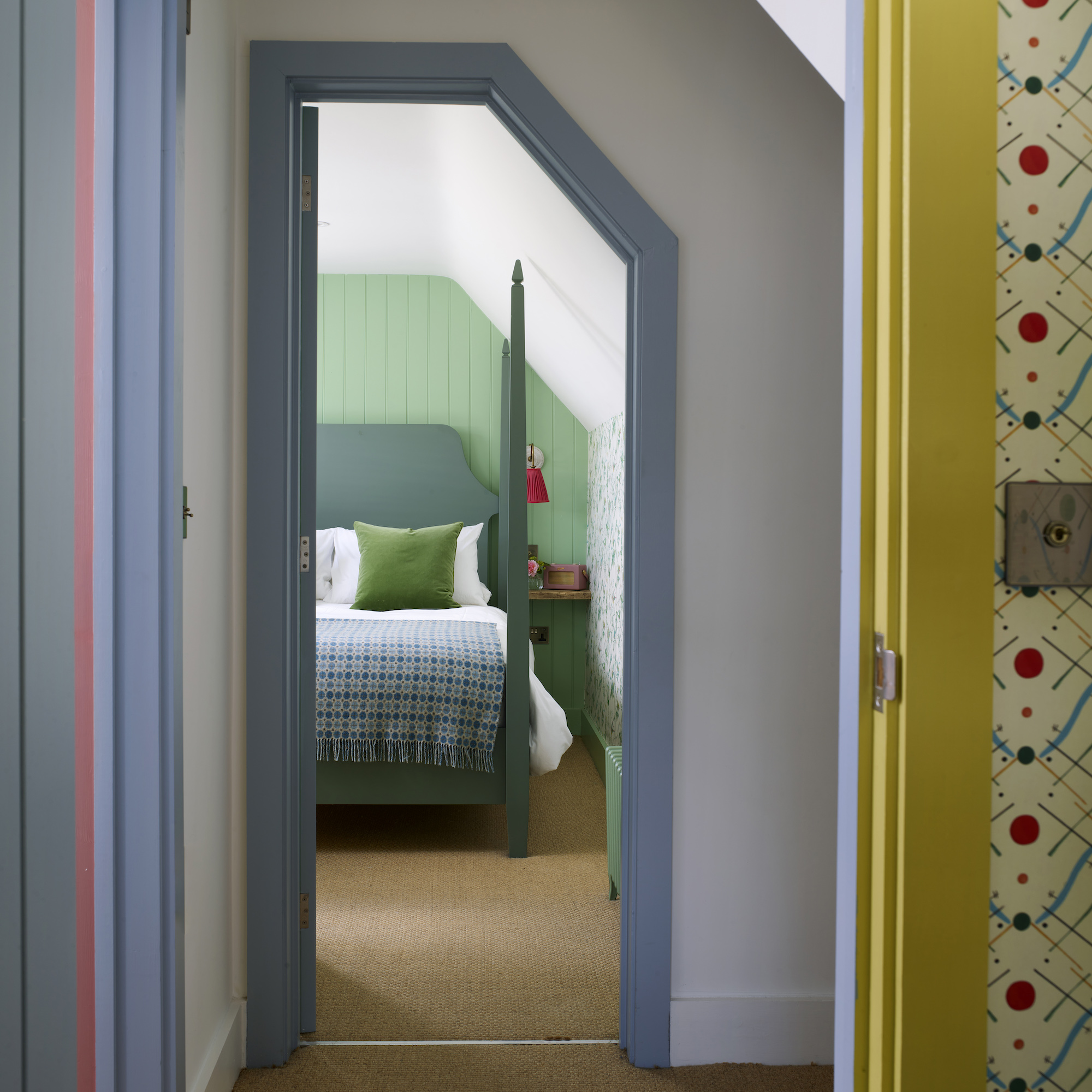
Having recently enlivened the two historic cottages with a rich palette of bold colours, Amelia couldn’t wait to put her special stamp on the annexe.
‘Injecting the cottages with predominantly green, pink, blue and ochre hues instantly brought both properties to life,’ she says. ‘I felt emboldened by these projects, and ready to go all out with the annexe’s transformation.’
'The annexe is such a joyous home-from-home and a truly uplifting base.'
Living area

The walls may be white but this room is filled with colour from the bold furniture and artwork.
‘As the annexe didn’t have the character features of the cottages, I had to rely on my decorating choices to lend personality,' Amelia says. ‘I had great fun choosing colours to layer the spaces with vibrant hues.’
A fresh green colour on the doorframes encourages the eye out to the garden beyond. Inside, Amelia sourced a colourful rug to soften the living area – it's now become a firm favourite with her labradoodle, Ralph. The contemporary painting above the fireplace creates a focal point.
Dining area
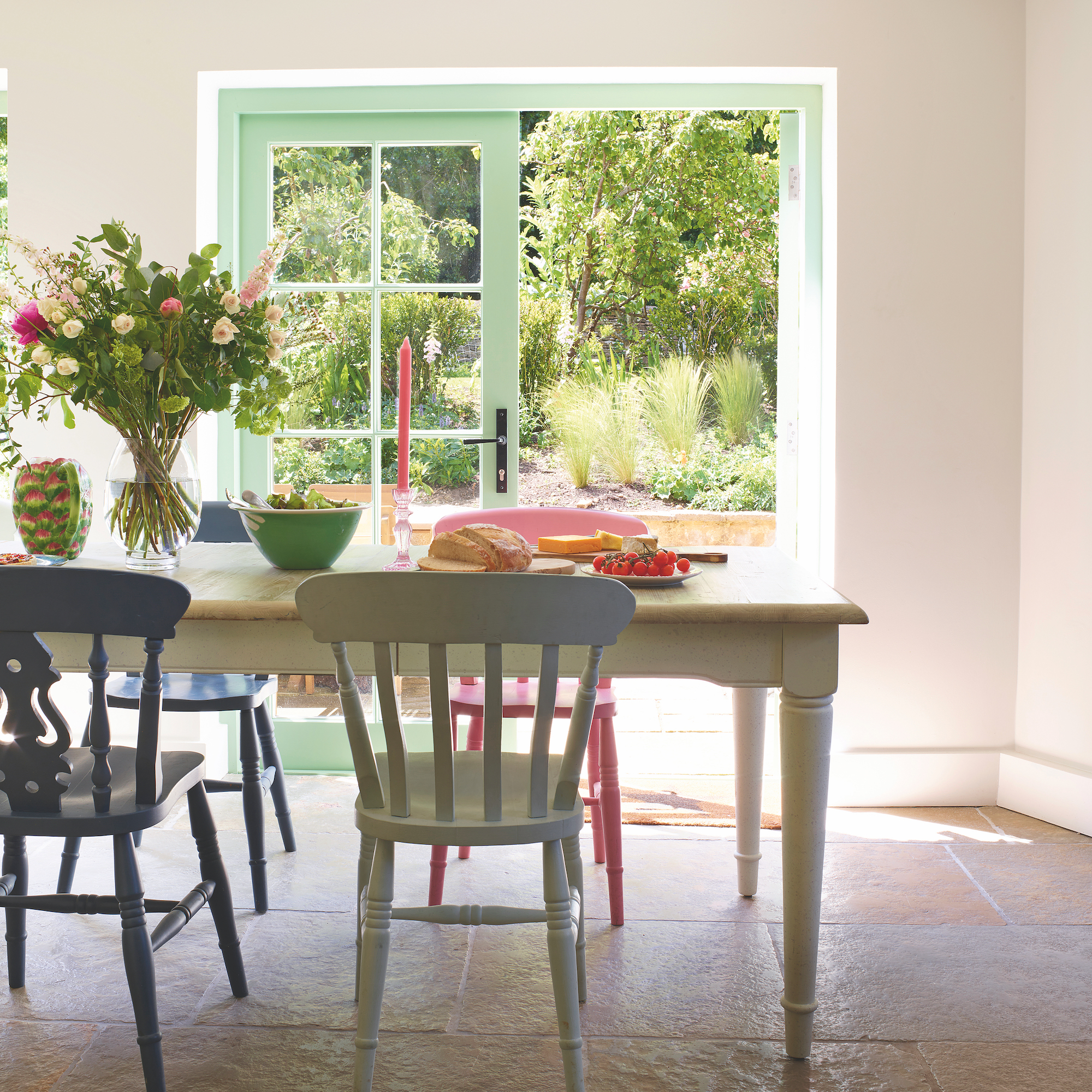
The main living space of the annexe is an open-plan kitchen-dining-living room, all linked by the cheerful colour palette.
Around the dining table, a set of chairs painted in bold contrasting colours adds a playful touch, while the beautiful stone flooring adds character to the newly renovated annexe.
Kitchen
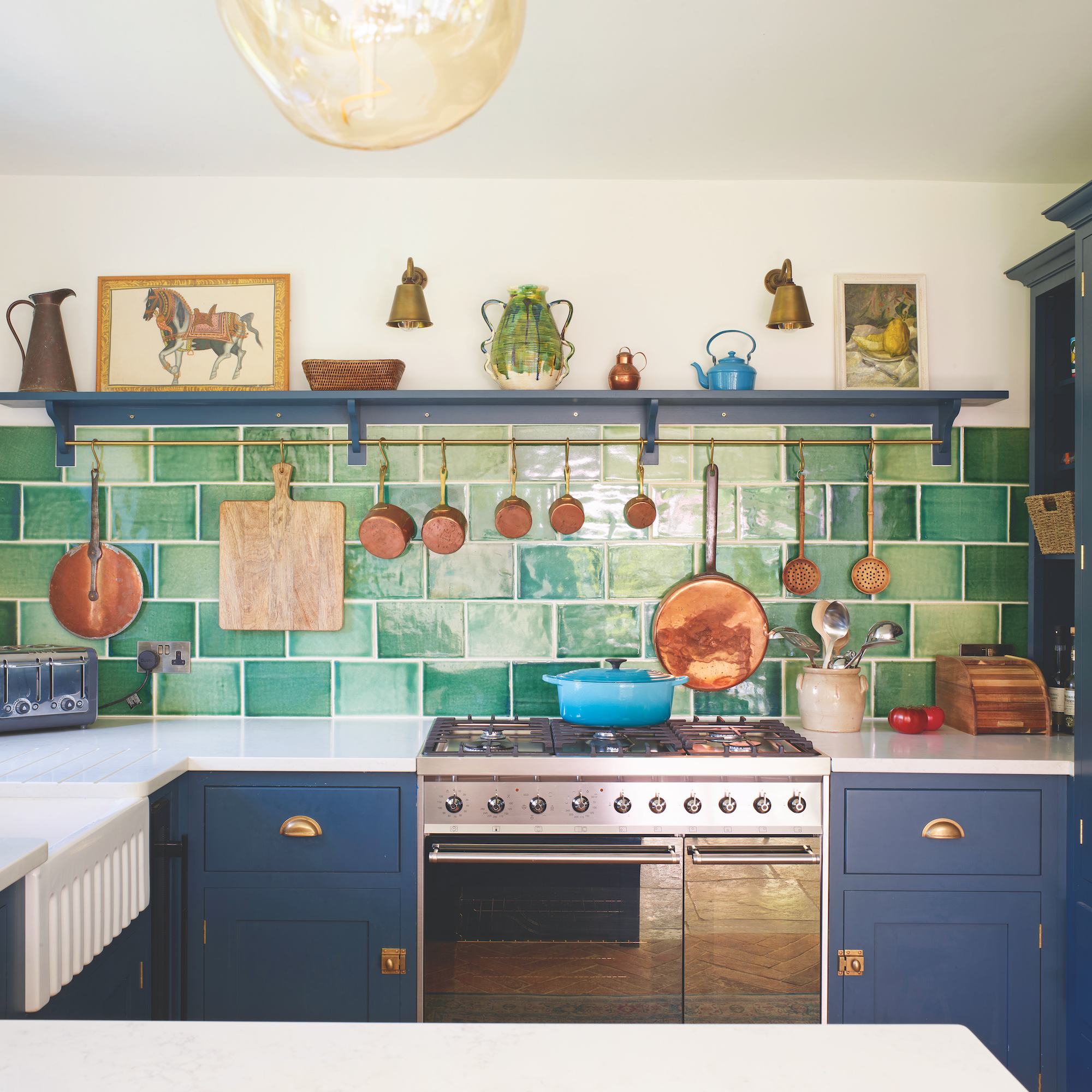
Removing the old bathroom has freed up space for a handy breakfast bar but it's the deep green tiles are the stars of this space. Hand-glazed, their tonal variations bring visual impact to the splashback.
To stop the small kitchen from appearing gloomy, the dark paint finishes for the island and base units have been contrasted with light-coloured work surfaces.
Hallway
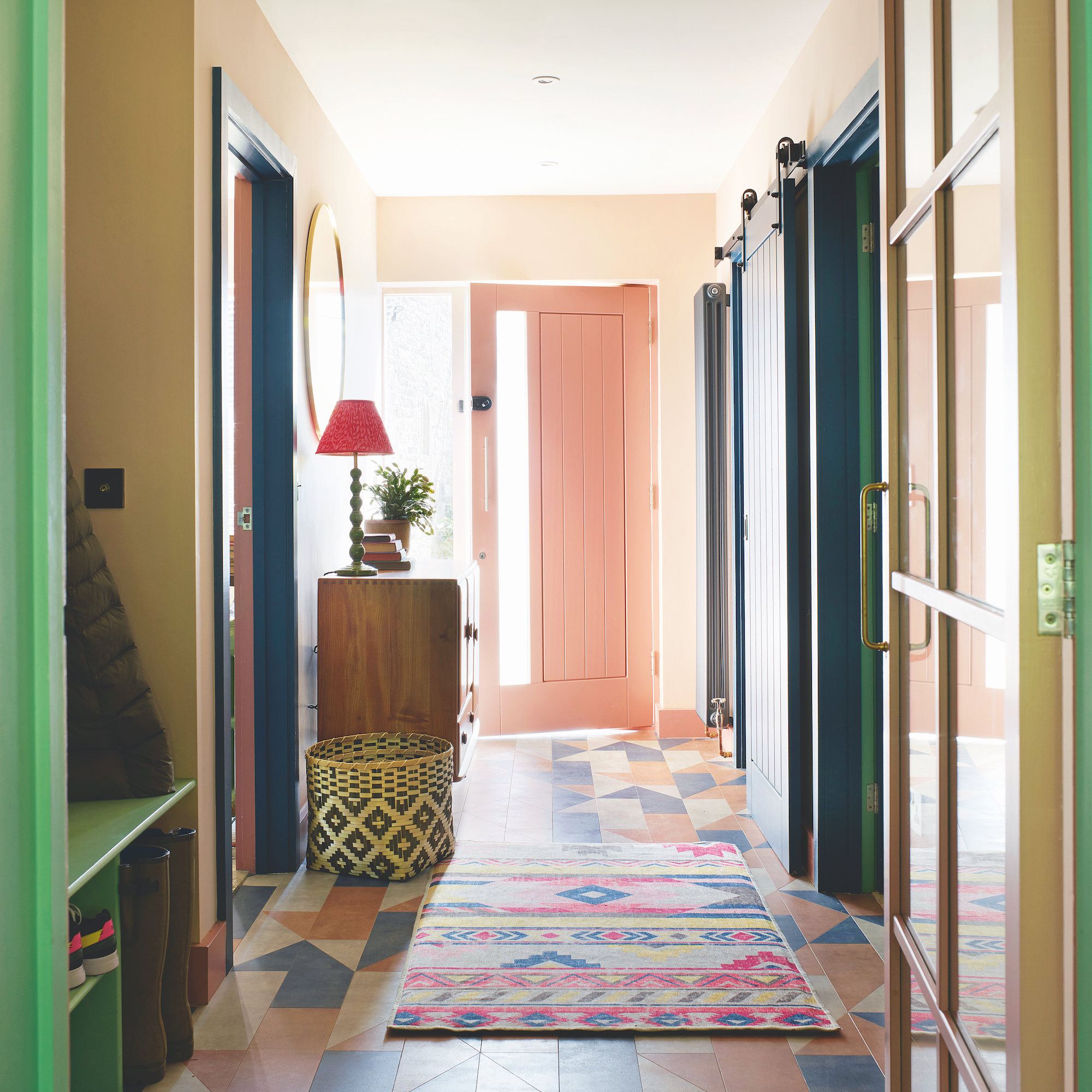
Hallways are perfect places for an injection of pattern and colour – here, the pink front door sets the tone, complemented by a striking space tiled floor.
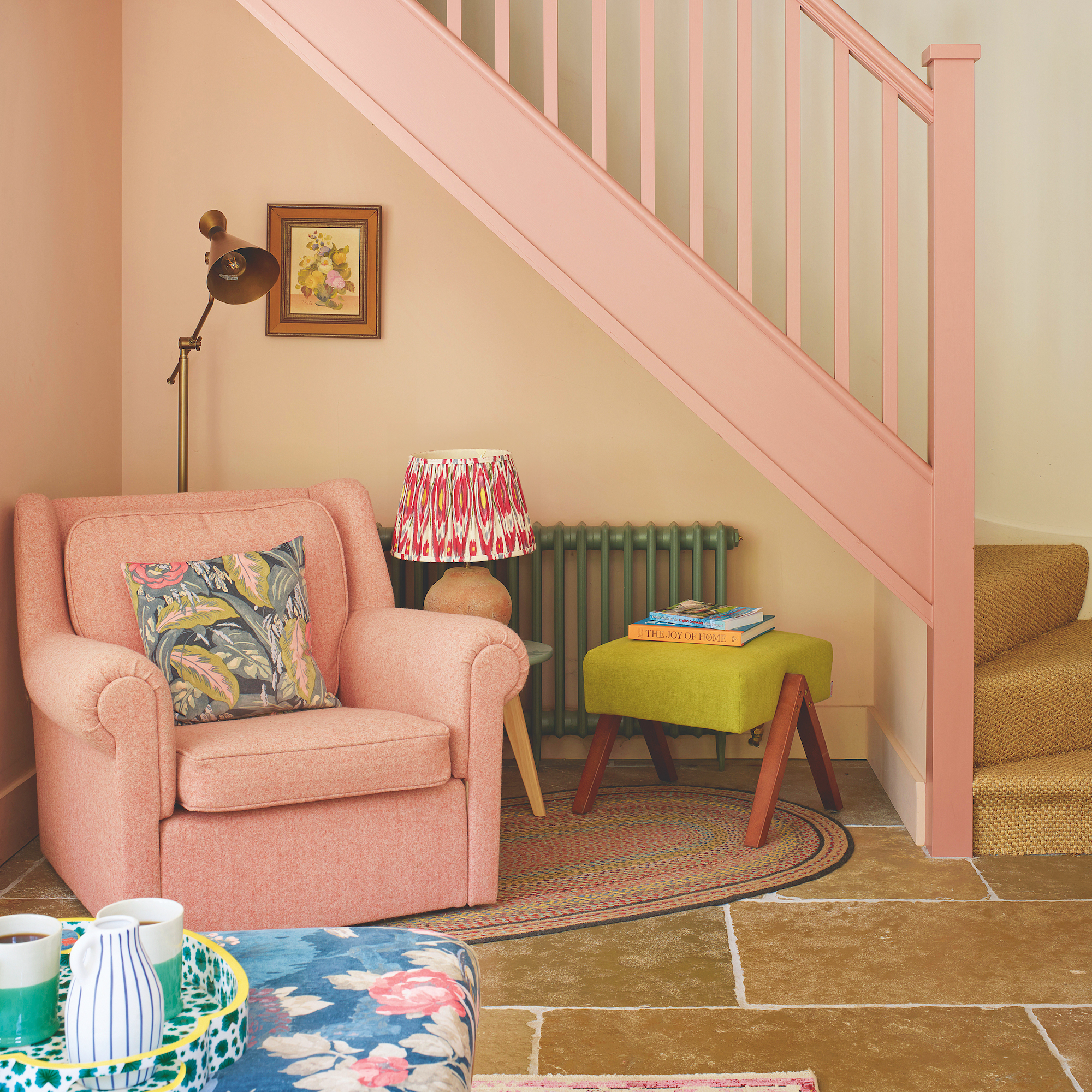
The same pink is used on the staircase, creating a soft and pretty visual flow throughout the house. The armchair was given to Amelia by a friend, and makes a cosy nook to curl up and read a book.
Snug
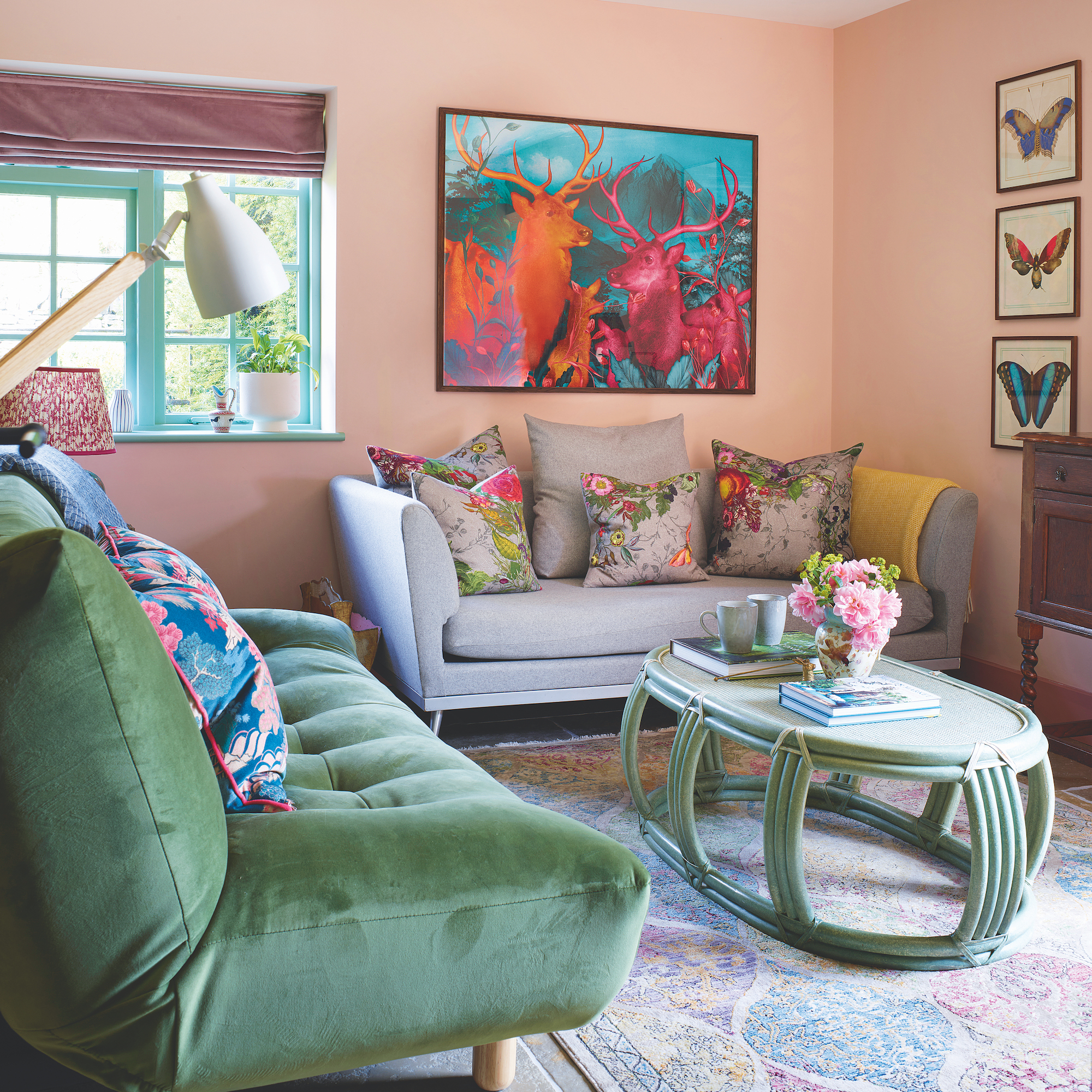
This flexible space doubles as an extra bedroom. Colourful artwork and floral cushions add a lively note to the smaller proportions of the snug, while the pastel pink skirting adds a fun finishing touch.

Amelia, who has rediscovered her love of horse-riding since moving to the countryside, couldn’t resist this nature-inspired mural.
Downstairs shower room
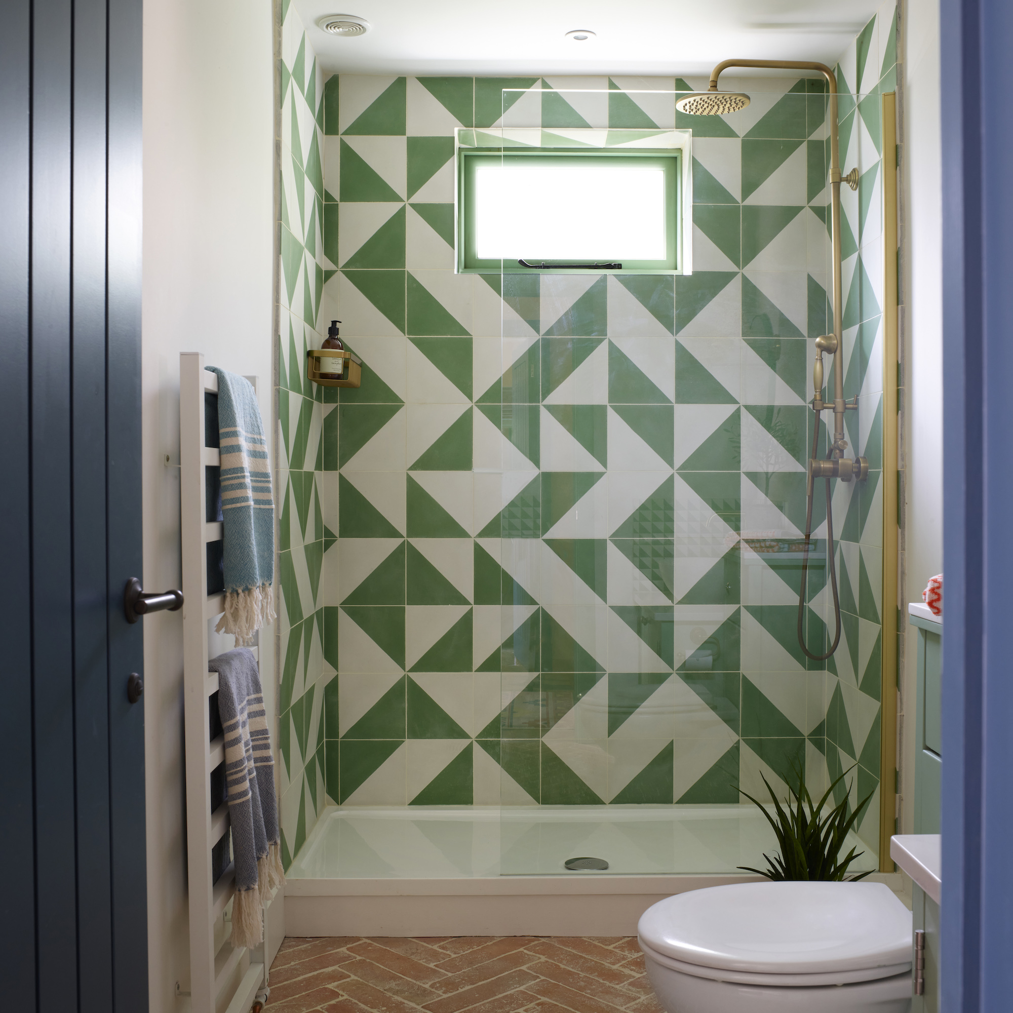
Contemporary wall tiles in the shower enclosure have been paired, to great effect, with more traditional herringbone tiled flooring.
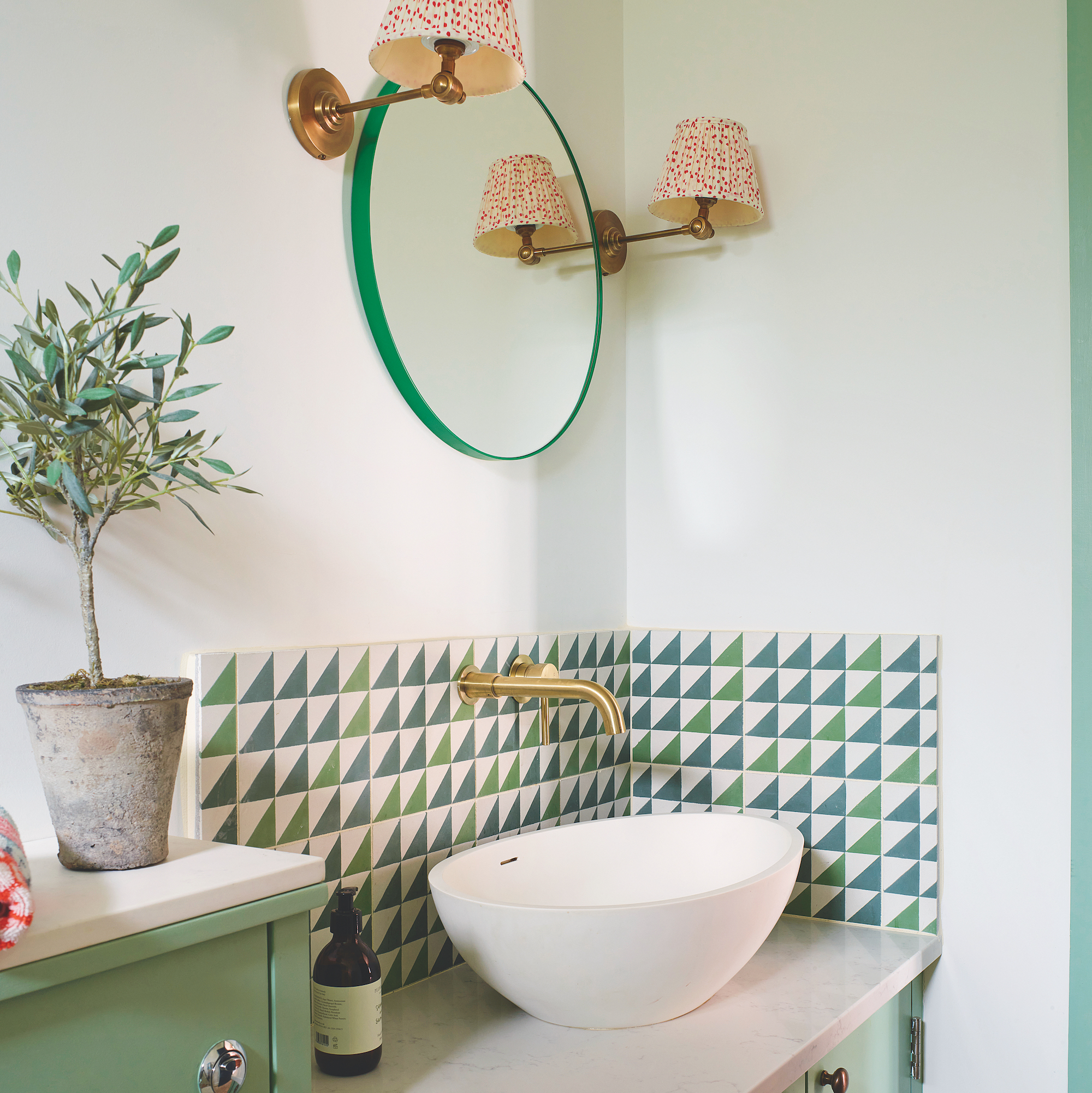
Around the basin, graphic wall tiles are softened by a circular mirror and pretty lampshades in this compact space.
Main bedroom
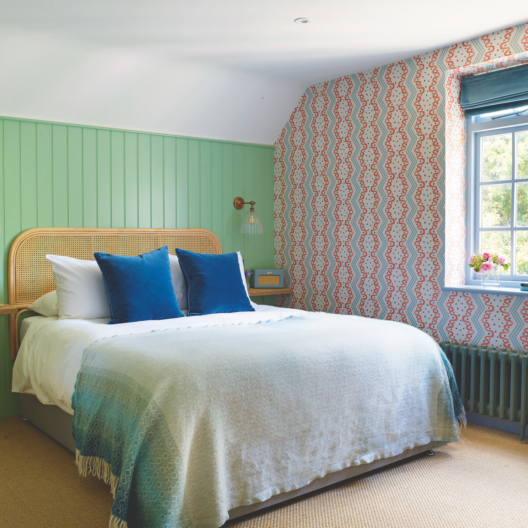
Like the downstairs, the first floor of the annexe was reconfigures to make more of the space. 'The architects suggested repositioning walls and doors to gain another bedroom, bathroom and handy en suite for the main bedroom,’ Amelia explains.
Pattern comes to the fore in the main bedroom, where, inspired by one of her favourite designers, Amelia wanted to incorporate this fun wallpaper. Don't hold back on pairing painted panelling with bold wallpaper – together, they add drama to a space.
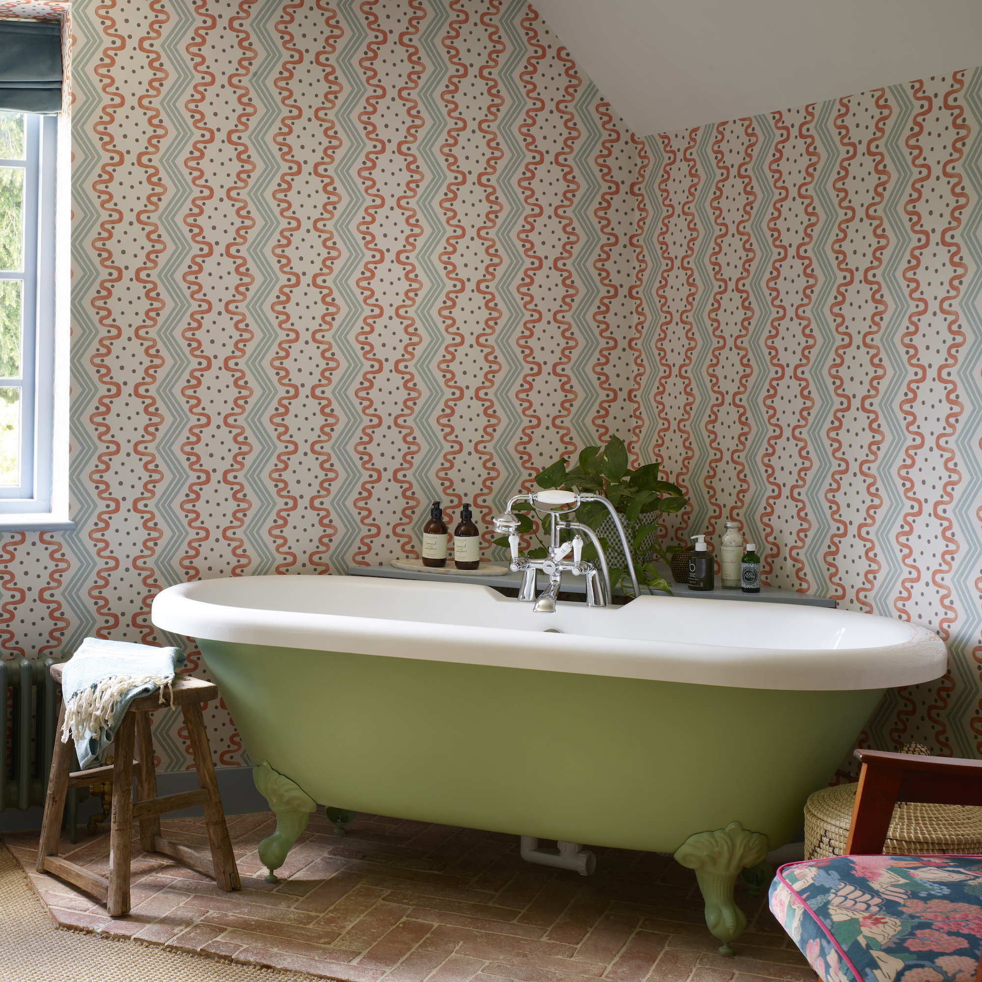
Injecting boutique hotel chic to the bedroom, Amelia also zoned a corner of this space for a freestanding bath with a practical tiled floor.
Second bedroom
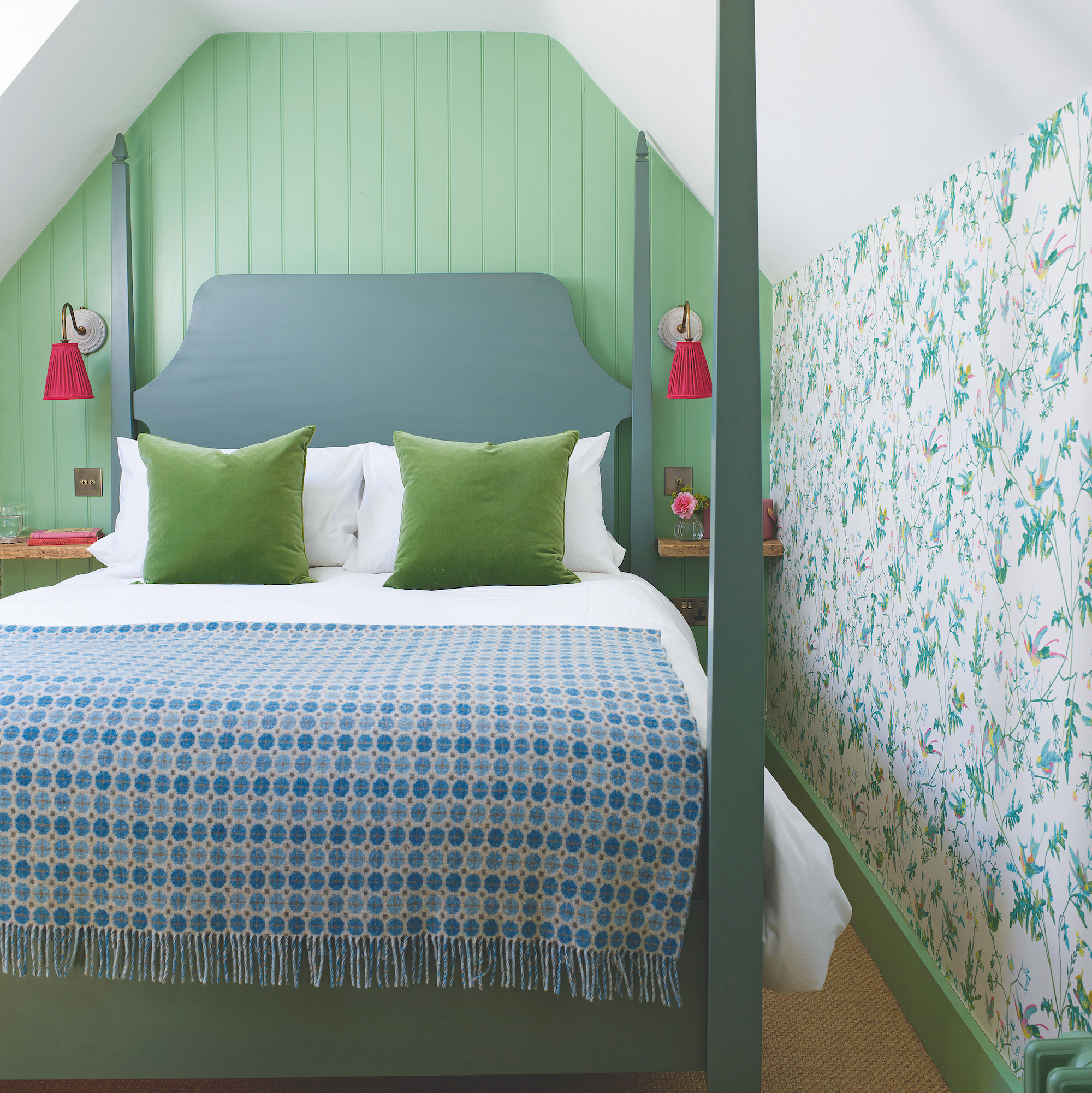
It may seem counterintuitive, but going big and bold in a compact space can make it feel bigger.
To create a luxurious feel in this bedroom, Amelia sourced a four-poster bed for the space. She also chose a patterned wallpaper that blurs the proportions of the room and appears to increase its size.
‘The only hiccup was the four-poster bed which was too tall for the room. Thankfully, cutting 10 centimetres off each leg solved that problem,' Amelia says.
Third bedroom
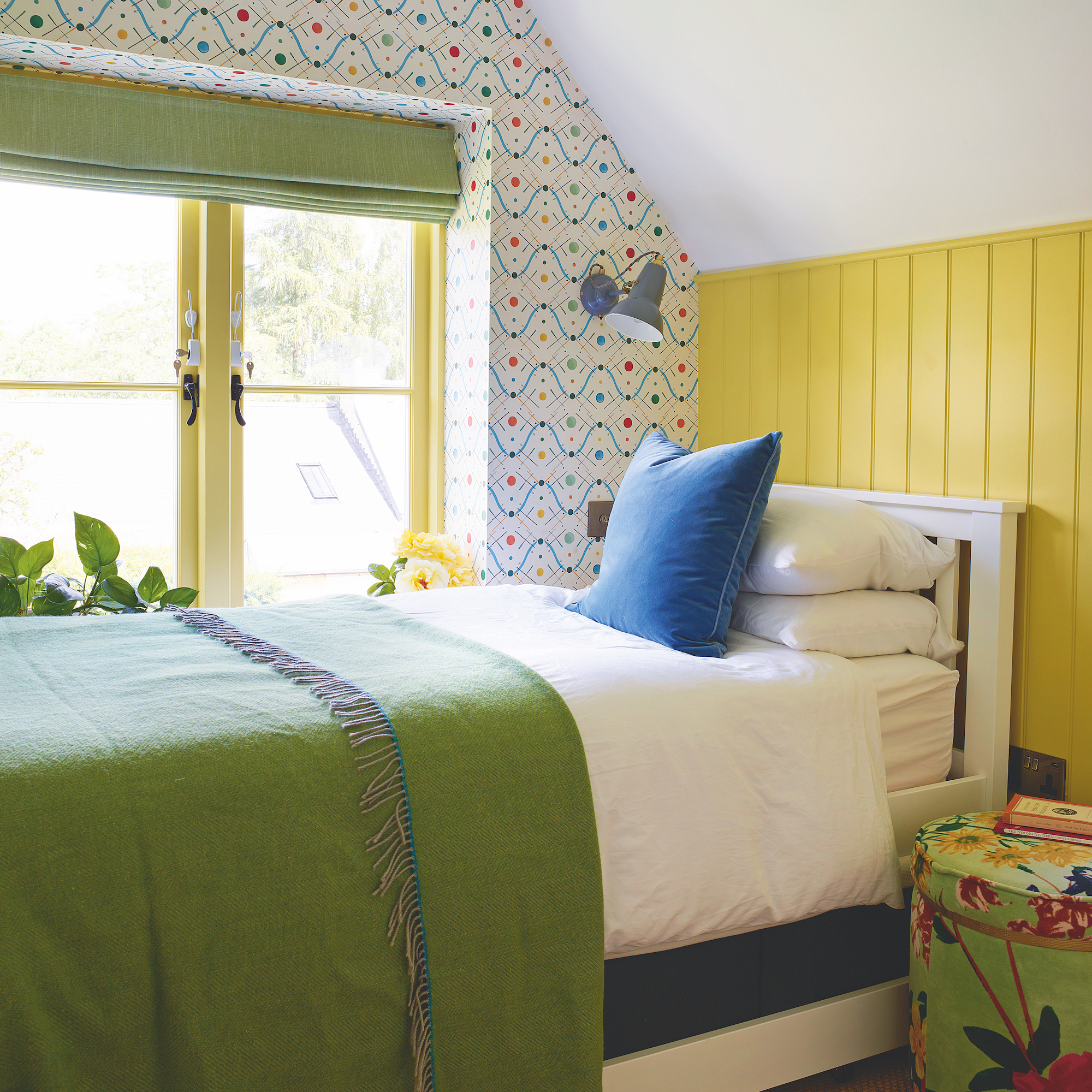
Rejigging walls created this extra bedroom with its cheery yellow and green theme. The primary blue and yellow tones, and playful wallpaper, bring a lively note to this small space.
Exterior
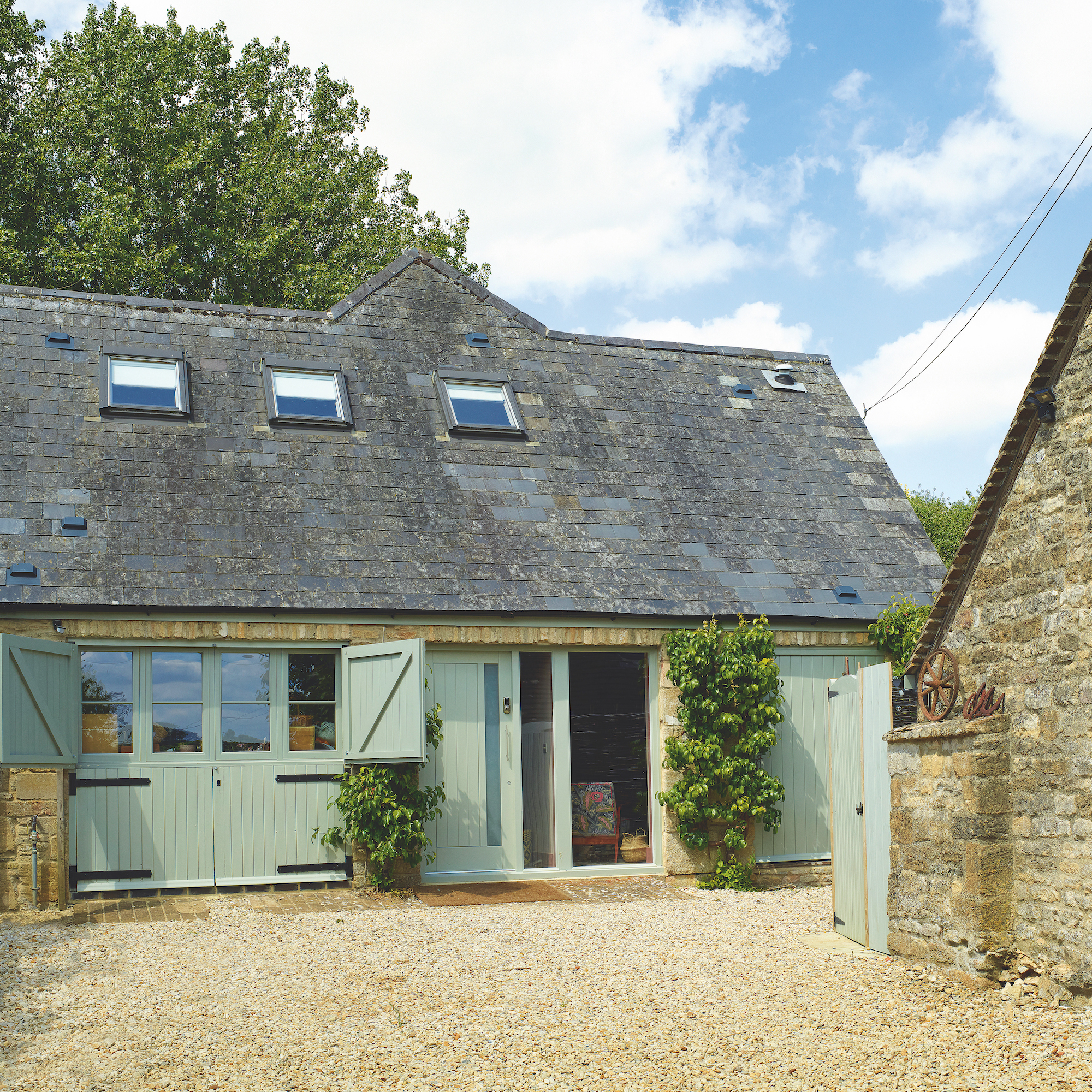
Amelia replaced the old garage doors with more in-keeping stable-type doors and windows at the front of the annexe.


