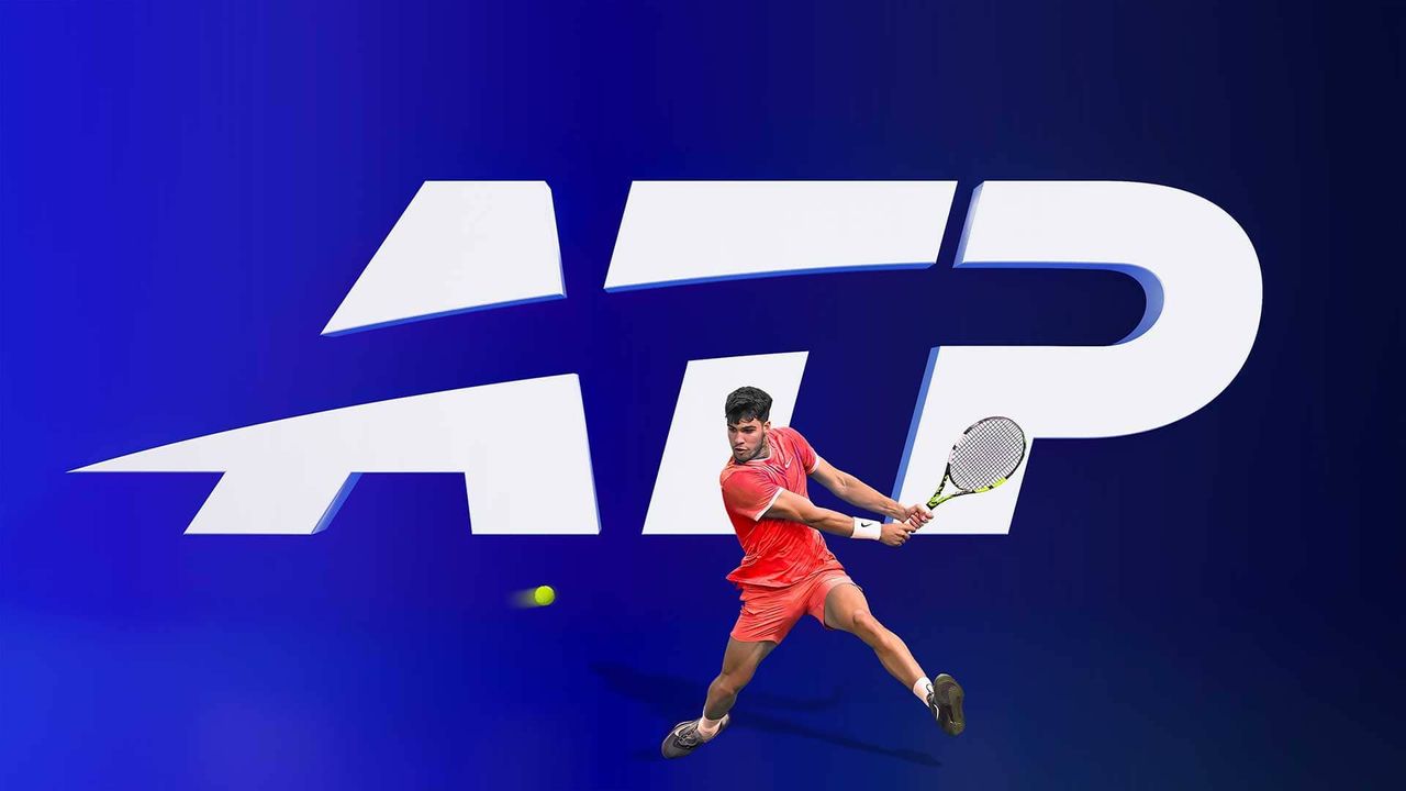
The Association of Tennis Professionals (ATP) has launched a new logo and brand identity. The new logo is the sixth in its 54-year history. It gets rid of the word 'Tour' and ditches the tennis player in favour of a swoosh that is supposed to reflect "the motion of a tennis ball in play".
You can see how it works with the tennis ball in the video below (skip to the end to see it in action unless you're a super tennis fan).
The new look was created by Chermayeff & Geismar & Haviv and is part of a long-term strategy to engage younger audiences and build deeper fan connections.
Recently, ATP has launched content partnerships with TikTok and Overtime, as well as its Brand Impact Award winning campaign, ATP Tour by NOT Wieden+Kennedy and a marketing campaign It All Adds Up, developed by Wieden+Kennedy.
ATP says that it is committed to evolving the way tennis is experienced: faster, more digital and more expressive than ever.
"Tennis is constantly evolving," says Eno Polo, ATP CEO. "To keep pace with our global fan base, we need to tell our story with creativity and energy. Our new identity captures the drama, precision, and momentum of the Tour, connecting with today’s fans while inspiring the next generation discovering tennis for the first time."
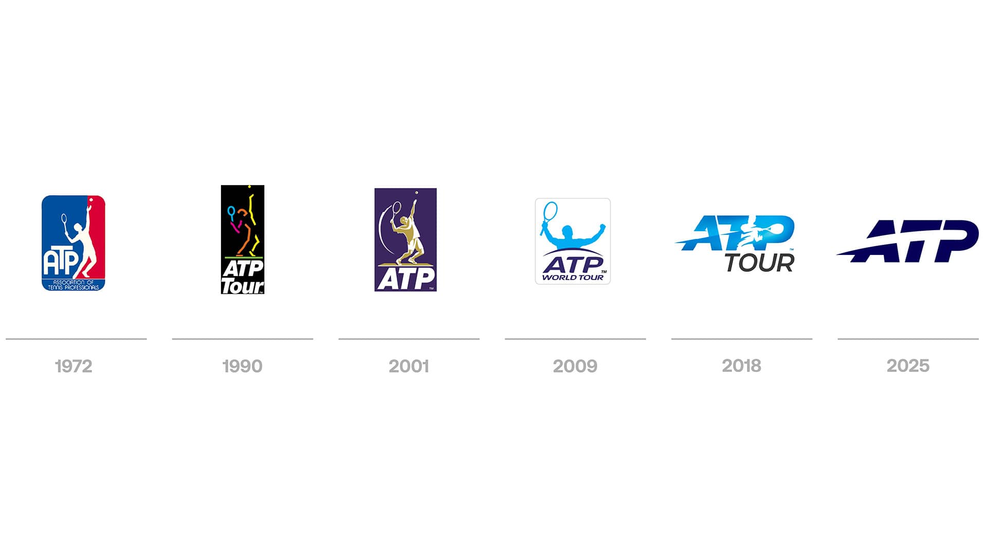
It's interesting to see how the ATP logo has developed over time. The initial logo looks not dissimilar to the NBA logo and I love the '90s vibes of the 1990 logo.
When you look at the logos as a whole, it does feel like there has been an evolution. We started off with the whole tennis player, then that tennis player became integrated into the text and now it's just the tennis ball's trajectory that remains.
Find out more about Chermayeff & Geismar & Haviv.