Photo apps have come a long way since the launch of Instagram in 2010, but the platform still reigns supreme for content sharing, editing, and community. Whether that’s because it’s free and easy to use or because it offers insights into the lives of hundreds of celebrities and influencers, I couldn’t say. But as a photographer, I’ve lost my love for the ‘gram big time. And I’m not the only one.
Instagram is used by millions worldwide, but it’s falling out of favor with plenty of stills photographers. Ask them why (and I have), and they’ll say that saturation is up, discoverability is down, and there’s little room for artistry. It’s no secret that the Meta-owned company has prioritized video reels over images to compete with rival network TikTok for user attention. Or that its algorithmic feed shows popular rather than chronological content first, making it harder for photographers to get their work seen.
I’ve been looking for an Instagram alternative for a while, and I think I’ve found it in the photo editing and sharing app VSCO. Short for Visual Supply Company (very hipster), VSCO launched in 2012, just a few years after Instagram. It’s one of the best photo editing apps for mobile that I’ve used, and now that I’m a few weeks into a paid plan, I wish I’d discovered it sooner.
This is part of a regular series of articles exploring the apps we couldn't live without. Read them all.
I recently downloaded VSCO from the App Store, and it's completely elevated photo editing on my iPhone 15 Pro. Although I've got Adobe Lightroom and Photoshop Express, I prefer VSCO's minimalist interface and pro-grade filters, and I can't wait to start sharing my edits with a whole new community and creative space.
There's a palpable sense of quality over quantity among VSCO users, and I've loved trying out the app's filters and collages. Are there any groundbreaking features on offer? Not really. Like Instagram, VSCO is one part community and one part photo editor, but the whole package is slicker, and there's a coolness factor that I just haven't seen replicated elsewhere.

Plus or Pro are the way to go
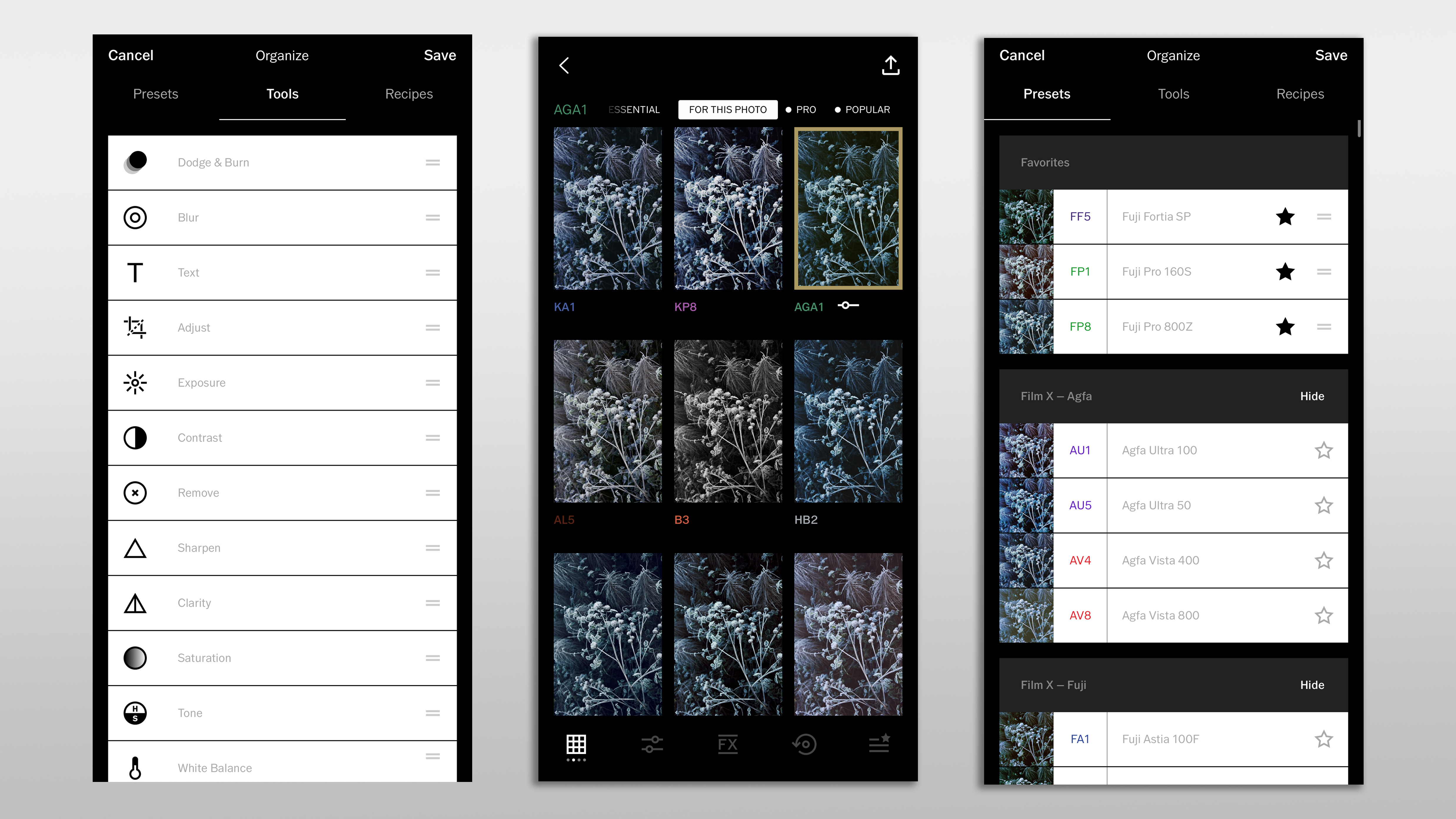
VSCO is free on iOS and Android, but that only gets you a measly 15 presets and basic exposure adjustments. I found this plan too limiting and quickly signed up for a 7-day trial of the Plus plan. For $7.99 a month or $29.99 annually, that unlocks over 200 presets, a video editor (plus GIF editor), and the types of editing tools you find in Lightroom Mobile - think Dodge & Burn, HSL, and Clarity. You also get unlimited “recipes”, which are the equivalent of saving your own presets, so that you can apply the same visual looks to images again later.
The Pro membership is only available on iOS, and for $12.99 a month ($59.99 yearly) it gives you everything in Plus, as well as VSCO’s web editor, Pro presets, and a Pro Membership badge on your profile. When you consider that Snapseed is a totally free mobile photo editor, VSCO starts to look very pricey. Especially when some of its previously free features have been put behind a paywall.
It's a good thing the film emulations reproduce the look of analog photos so well, then. VSCO is still sure to appeal to the demographic of people who love the best instant cameras, people like me daft enough to pay for a trendy aesthetic, and photographers who want to get the most from their best camera phone without ever having to use full-fledged desktop photo editors.

All about the Presets
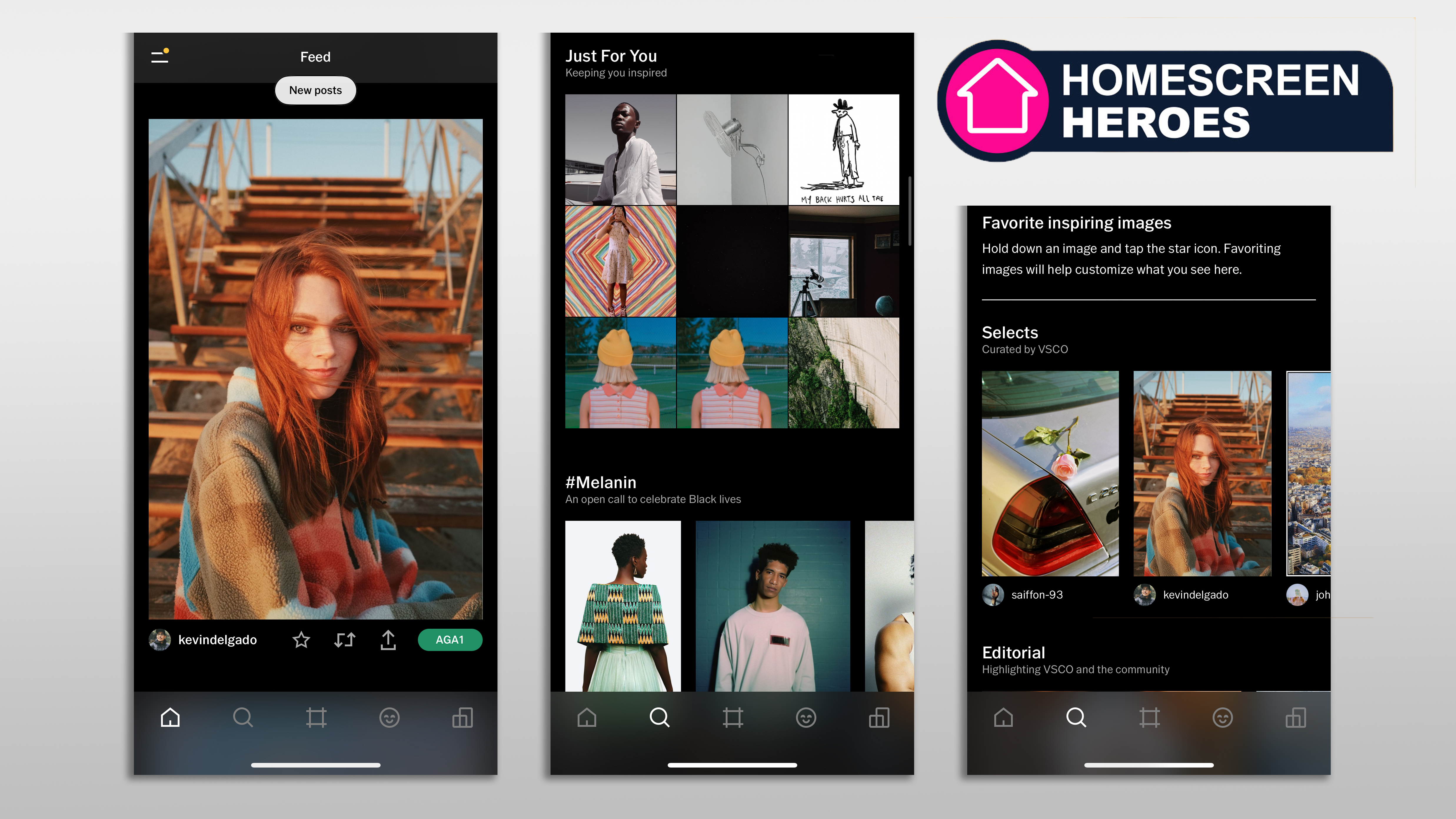
The VSCO interface is tidy, and it's easy to navigate thanks to the five main sections at the bottom of the screen – Home, Discover, Studio (the editing bit), your Member Profile, and Spaces. Discover is where you'll find inspirational feeds from the VSCO community (curated by VSCO staff), broken into sections like "Geometric" and "Style". So far this is the area I've used least, and it's a little like delving into the hipster galleries of a college photography department. Still, I find the content much more realistic than the perfection of Instagram's Search & Explore function – which now gives me more cat videos and comedians than creative imagery (blame it on my browsing, perhaps).
It takes moments to add photos to Studio from your camera roll or phone folders, and I imported a batch recently shot on the Leica M11-P so that I could test out the presets on some pro-grade files. Once your images are there, it's a neat touch to be able to sort through them with options like Edited, Unedited, or Not Saved.
Studio is where I've spent the most time tapping so far, and where photographers will find the most value – even if they never use the app's other functions. Most photo editors are either too basic (Instagram) or too advanced, with so many sliders you can barely fit them on a small phone screen. What I love about VSCO is that once you tap on an image and hit edit, you're given a huge range of presets – some recommended for the photo – that you know will be a great starting point.

Getting advanced
If you think the presets make things too easy, then VSCO's editing tools provide a whole suite of ways to tweak and enhance the tonal levels, color, contrast, clarity, and more using incredibly responsive sliders. The effect of an edit is instant, but if you don't like what's changed then you can go back with a tap of the Undo icon. The FX tab is my guilty pleasure; another step in the Studio editor that lets you add frames and textures to images to make them look like aged film snaps. My digital photos are nothing of the sort, of course, but there's an inescapable level of nostalgia from adding noise and light leaks to photos. Crucially, VSCO does so in a way that looks genuine rather than artificial and gimmicky.
The whole editing process is like using Lightroom, and I imagine anyone who's ever touched an image editor will be able to find their way around VSCO without hassle. Once you've finished fiddling, VSCO gives you the option to post to the platform, save it to your camera roll, or a whole host of other sharing options depending on your device – on my iPhone, WhatsApp and an AirDrop to my iMac are the most helpful. You could quite easily rely on VSCO as a high-end image editor, share your shots elsewhere, and never touch the community element. Or you could use VSCO's camera to add funky effects like double exposures and prism effects.
I've been exploring ways to make use of the app's collage and montage features to create professional-looking graphics that I can email out to potential clients without ever having to boot up my computer. VSCO has made me feel more creative and yet more consistent, and the Recipes function has been a game-changer in making my portfolio look cohesive.

Artsy without an algorithm
I said that VSCO was an Instagram alternative, and in many ways that's true. It's given me in-app editing, sharing, and connectivity in one good-looking ecosystem. But without comments or likes, it's for photography purists who aren't worried about building a comprehensive social network. Maybe it's what Instagram could have been for creatives, had its owners not been focused on building an ad and algorithm-heavy behemoth.
I know many creators who have joined supportive communities (UK shooters being a great example) built entirely around Instagram, and it's undoubtedly fantastic for location inspiration and interacting with others. Maybe it's because I've never put in the time or effort to build up my Instagram following, but I love the minimalist social component of VSCO and how the low-pressure environment leaves you free to experiment. No one sees a photo I've shared? Then it's no biggie and there's no embarrassment.
The longer I spend in the world of tech and cameras, the more I'm looking to curate my gear, my tools, and my experiences. While Instagram will always be the most versatile way to share images with the biggest audience, VSCO lets me explore untapped niches. Pegged as a space for creators, by creators, it makes light work of heavy edits so that I can get professional-looking photos on the go.


