Branding is a minefield these days, with social media ensuring that everybody can share their immediate gut reaction to anything from a new logo to an advert or poster design. Consider the reaction to the Jaguar rebrand and the AI Coca-Cola Christmas ad as a just couple of recent examples.
But sometimes the vehemence of public reactions to rebrands is so strong, it can be hard to tell if people are being serious or ironic. Take this recent viral Twitter thread. A user has shared a list of 'the worst redesigns'. But while they may not be the best rebrands ever, the list contains so many sensible ones that I'm not sure if the post is intended to be serious or a satirical take to the usual outcry that greets some new identities.
WORST REDESIGNS A THREAD 🧵 pic.twitter.com/MCaGKBCui2November 20, 2024
At the top of the list is the recent Jaguar rebrand, obviously. This is probably what prompted the post, and it's well justified as a candidate. If ever a car logo redesign was unnecessary, this was it. The Kia logo, one of our pet hates at Creative Bloq is also on the list, quite deservedly.
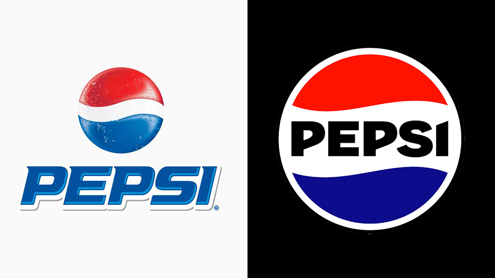
But things quickly become less clear cut. The new Pepsi logo a downgrade? I'd disagree (although we can certainly debate Pepsi's redesigns of OTHER brands' logos). The same for the Coca-Cola logo and Burger King logo, both of which were made cleaner and simpler without sacrificing their distinctiveness.
Sprite gets worse everytime pic.twitter.com/cAZCh8t7XgNovember 20, 2024
But it's this simplification that a lot of people seem to take issue with. Simplicity has several benefits in logo design, aiding interpretation and memorability as well as the practicality of actually applying the logo in different locations. And often the simplification has involved stripping out elements that were very much of a certain time, like drop shadows or gradients, thus making the identity feel more timeless. But it seems that for some people this equates to soulless.
Disney lost it's magic pic.twitter.com/fVxTwECfpXNovember 20, 2024
WWE lost it's passion pic.twitter.com/6hgz5kWiOLNovember 20, 2024
THIS IS NOT THE BEST OF BUY pic.twitter.com/sqEEpQtHspNovember 21, 2024
It's when someone brings up the 'redesign' of the Japanese flag that I start to wonder how seriously people are taking this thread!
Japan is still the worst pic.twitter.com/7TGwDbDkIGNovember 20, 2024
Of course, there's one clear winner for worst rebranding of the past year or so.
pic.twitter.com/dIb8D0jeYSNovember 20, 2024
Need to upgrade your own design software? Don't miss the Adobe Black Friday sale. For more branding inspiration, see the new Chester Zoo logo and the new Upwork branding.


